Soft Shadows
-
I combined the soft shadows with the Sketchy Shadows, and this does show some promise for softening the edges of the shadow lines...
-
How is this done?
Would this work with ordinary SU lines (meaning no styles)?
I'm extremely interested in this getting nicer shadows out of SU.
Can you set how soft the shadows will be and how many "time samples" it should use?
About your Sketchy shadow image, the direction of the sketchy shadow lines are not consistent. What causes that?
How would it look in animation? Would the Sketchy shadow lines flicker or be screen bound?
Would it be possible to get colored shadows? Please! -
@pixero said:
How is this done?
Would this work with ordinary SU lines (meaning no styles)?
I'm extremely interested in this getting nicer shadows out of SU.
Can you set how soft the shadows will be and how many "time samples" it should use?
About your Sketchy shadow image, the direction of the sketchy shadow lines are not consistent. What causes that?
How would it look in animation? Would the Sketchy shadow lines flicker or be screen bound?
Would it be possible to get colored shadows? Please!I don't mind sharing how these things are done - because hopefully once you get the idea, you may think of other similar things I could do. Basically we are doing things you could do yourself using a paint program and saving images from SketchUp. The advantage of NprTools is that is does it with a single click of the button.
The soft shadows will work with or without special styles. What I do is simple here (suggested bu Chris Fullmer in this post: http://www.sketchucation.com/forums/scf/viewtopic.php?f=80&t=18480)
I save 36, 49, or 64 images varying the date and shadow time between each image and then combine them all into a single image. (The number of samples and the time between samples is a parameter on the Soft Shadows dialog)
Here is an example from a simple SketchUp model (3D Warehouse - Potted Topiary by Surya Murali)
(This was done with 36 different sun times. You will get a smoother image with more samples)The "trick" for Sketchy Shadows is to apply a pattern for the shadows to the entire model, and then mask it using an image of just the shadows. We did this because we did not want to just overlay a pattern onto the shadows. We wanted the pattern to change for faces in different planes (ground, roof, walls), and we wanted the pattern to get smaller for objects further from the eye.
Here is an image of the shadows in a model.
Here is an image of a sketchy pattern applied to the entire model
(All these images are saved directly from SketchUp and then merged using NprTools)
here is what you get when you combine the images.
And finally, the result when the soft shadows are used to modify the sketchy shadow image.
(This image was actually created with a different pattern for the shadows)You can do this with any pattern for other effects, and thus get colored shadows.
Although this could be done for animations, (the processing would take 2 to 5 minutes per frame), I don't think I will be adding it to NprTools yet. Because the Sketchy Shadows are just textures applied to faces in SketchUp, they should move with the model and should not flicker.
-
Hey, Al; not that much on-topic, but an easy way to make realistic sketchy masks is to actually sketch them. Take any high black pencil, like 5 or 6B (or my personal choice, a charcoal pencil) and scribble on a sheet of paper. Scan it in greyscale, invert colours and voila!
-
Actually drawing your own textures is right on topic. My first reaction when I saw the need for some Non-Photorealitic Tools for SketchUp (At the Art Directors Guild DVis Expo in February 2008, after watching presentations on using SketchUp by Jim Bissell and Dan Jennings) was that I could create some NPR effects if I could create some Sketchy Textures by hand. However, I think it would be better if someone more artistic than I helped create the textures. I do have some ideas on some ways to turn these sketches into repeatable patterns (beside mirroring them - the obvious solution).
If you applied your texture the the SketchUp model using a watermark style, try masking the style to it applies only to the model and not the background. I will grab your image, and see how it works with Sketchy Shadows.
-
In my post I was mostly talking about style watermarks, and I don't quite get what you mean...
Anyways, here's the file, containing the style, and another style I made (not as good, but good concept. I should improve it...). They both use sketchy edges from one of the sketchy style in the style competition winners folder.
a bunch of google components in a simple scene... styles in model, and also found in components/materials/styles part of SCF. -
BTM - Here is a Sketchy Shadows example using your texture (I rotated it for repeats) for the shadow mask.
This could be done better with a little more effort, but I wanted to give you and others an idea of how you can use your own textures to define the Sketchy Shadows.
-
@unknownuser said:
I don't quite get what you mean...
Thanks for sending the model. You did have masking turned on for the watermark. It didn't quite work the way I thought it did (I thought it applied the watermark to only the model and not the background when masking was on. But that is not what masking does.)
-
Nice!
I tried making a tillable version of the texture using gimp.
...and another possible one.
-
that's because I added sky and ground, I thought it looked better
Oh, and sorry, I have a habit of editing my posts after I post them -
Here are the Sketchy Shadows with you tileable mask.
Thanks for the help with this. Hopefully we will get the Beta Test version of NprTools out soon so that you and others can try this yourself.
-
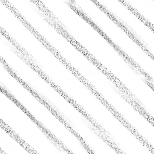
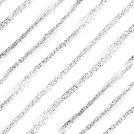
BTM - If you get a chance send me two tileable sketches for Criss Cross (a separate for image for left to right, and for right to left). I am working on a concept where I will use the only the first image for the light parts of the shadows, and combine both images for the dark parts of the shadows. It would be great if I could have some good images to use for this.
The first image will go from light to dark in the 1st 1/2 of shadow intensity, and then the first image will stay dark as the second image goes from light to dark as the shadow intensity goes from 50% to 100%. (If that makes any sense. If not, send me the images and I can show you)
-
Your images are awfully similar - but that may be all right (You would be a better judge of that then me)
Don't worry about quality - we can improve that after we see if the idea works.
(I am planning to offer you a free copy of NprTools in exchange for 6 to 10 images which I can include in it. Not a great deal for you because I don't think we will charge much for NprTools. I have already offered free copies to everyone who has helped with it - and that just about equal the number of people who might be interested in it when it is done.)I suspect that the individual lines may be too thick. You should paste the two images on top of each other to make sure you are happy the effect the cross hatch will have.
(This isn't quite right - because I simple pasted them together rather than blending them together.)
Here is a sample from another web site.I don't really like their result, but it reminds me that I may want too allow 3 or 4 layers instead of just 2.
I am trying to achieve an effect something like this.
-
Ah, don't worry, I think I know what you mean.
First set just made Tile-able with GIMP, second was edited to match up better in the texture.
_First set:
_Edited set:
All images were done with a 6B pencil.
The tiled images aren't that big, so they might not look too good. I can redo them in a few minutes though.
-
Hmm... My post was a bit messed up. you were right about them being similar, I just flipped them vertically, and the latter (better) 2 images are messed up, and are showing the same one
i'll try to make some thinner lines (more detailed too). Might get them up soon, or have to wait 'till tomorrow. -
@unknownuser said:
Hmm... My post was a bit messed up.
And you need to stop editing your posts after I have already started my reply.
-
Thanks - I'll give them a try - but it may take a day or two...
-
@unknownuser said:
Oh, and sorry, I have a habit of editing my posts after I post them
, again.
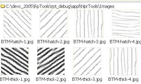
... Newer cross-hatching textures
Oh, and i don't know how well these will work, but I made tile-able thinner lines.
Don't pay attention to the file names, they aren't in any order at all
-
... Tomorrow I'll probably make another set, more of a straight-thin-pencil style though.
-
Thanks for the pattern, BTM. I got the criss-cross shadows to work - the first pattern is used for the lighter parts of the shadow, and the second pattern is brought in for the darker parts (and overlayed over the first pattern).
Also, I made these shadows red (someone had requested colored shadows, so I added a shadow color button) (I can't see that they are red. (Someone just told me that this model didn't look very good. Pay attention to the technology of the shadows, not the model or the final result. If someone has a small model which would be better for these examples, sent it to me.)
Advertisement