Sketchup artist
-
Very nice image.
I have also bookmarked your site.
Good stuff. -
Nice work, Tony! I like your subtle use of color that brings out the line work.
-
I don't know what designs are yours but the brick detailing on your site was soooo sweeet. love your use of colors also...
-
stumped by those detail shots on your blog!!
really nice work. Inspired me to revisit and do some native SU outputs. -
Tony,
Excellent! SketchUp in its natural state can be so good. You have mastered the art. The design doesn't have the flat panel look we often see, and you have the right amount of conceptual elements to give context. Your good graphic sense that along with your skill is impressive. Thanks for posting your link.
John von Buelow
-
Yeah, I was blown away too. Your color and detail choices make all the images look so elegant. Nice work indeed!
-
Love your work!!!
I'm beginning a similar service as yours and I must say that your blog is a great inspiration. I too i've bookmarked it;)
Regards
-
some of you, from the old SU forums, will remember the techniques from Denis and Grant.
I just felt the urge to practice once more. Hope you like it.
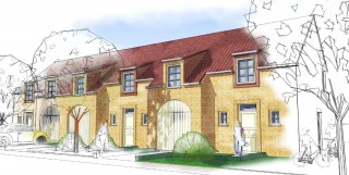
-
this is no post production, just native sketchup;
a style with sketchy lines and a touch of fog. Done in a second and yet a nice effect, don't you think?
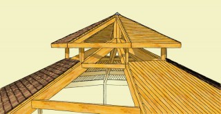
-
Toponypy
Thanks for the tips. Love your style using sketchup.
Alan -
Tony, very nice result with the fog effect! What colour of fog did you use?
-
Did you make your own lines too? They seem to be much more controlled and finer than the ones I've explored in the included packages.
Kelly
-
Gai, the color for the fog is RGB 216,216,174
-
Kelly, no special linetypes involved, all standard stuff.
-
trying to minimalise, down to earth.
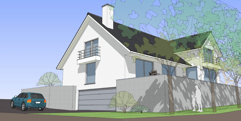
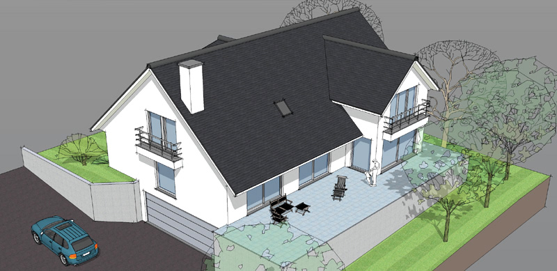
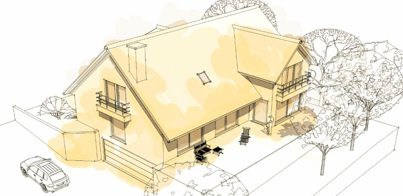
-
Nice. Simple yet finely emphasizes the important parts.
-
so you do everything in SU and nothing else?!?!
WOW!
amazing work! truly an inspiration for someone of lesser skills as myself!
-
Cheers!
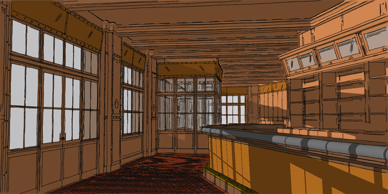
there are more pics from the bar on my blog.
Hello! It looks like you're interested in this conversation, but you don't have an account yet.
Getting fed up of having to scroll through the same posts each visit? When you register for an account, you'll always come back to exactly where you were before, and choose to be notified of new replies (either via email, or push notification). You'll also be able to save bookmarks and upvote posts to show your appreciation to other community members.
With your input, this post could be even better 💗
Register LoginAdvertisement


