How to get that real effect
-
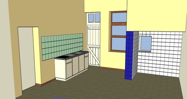
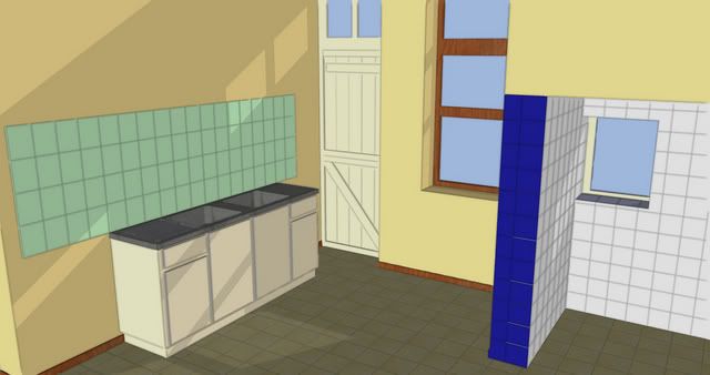
So i have been trying several things out with SU, the results are each time nice (to my standards, nothing compared to the works of art that some people here make)
However, there is one thing that i just can't do (yet) .. making my project look "real"
Every project i made was each time in 1:1 scale, exact dimensions, the exact colours, ... but they still look like a PC-made design.
While most of the projects posted here have that "yes we are virtual, but we look mighty real" effect.
How do i manage to do that ? is it playing with light-effects ? (i've tried shadows but it didn't improve that much) or do we go and make some details with Photoshop ... ?
Your advice would be highly appreciated.
If you have links to manuals, guides, ... to do such things (even with external software) please link me .. i just love to learn and try
-
Maxx,
What kind of look are you exactly looking for?
There are as many styles as there are people
on this forum.If You have something in particular
that You like - someones work from this forum
send a pic or a link and there will be someone
that will be glad to help You.
In the meantime You might check the tutorials
in the tutorial forum like the dennis method,
the bayan method, rob moors photoshop tutorial
just to name some, You can also check styles
by ross macintosh on the:You can also post some of Your images for
us to see and give You some tips on how
to improve.Hope this helps for now.
-
Hi maxx,
There are many rendering devices working from SU that can help make it more real...
like Artlantis, Podium, Kerkythea, Vue 6, Indigo and so on, apart all the styles you can create
directly in SU.
And of course Photoshop or other similar apps helps a lot in the final look.
Good luck!Patrice
-
Maxx, if you look at Paul's images here (most straight SU output) you'll see a lot of the "real" can be accomplished in SU by adding detail and better materials...I'm still struggling with same myself: that choice of "what is worth the bytes?"
As Mateo suggested, post a couple of images and we will all benefit from the advice you get about them, thanks.
-
I've posted pictures of my kitchen in the gallery section


-
If you would post your .skp file here (it doesn't look too big) we could experiment with styles and shadows, light dark settings, textures, etc. and repost for you to study.
-
O man...I need to save you before I happens to you. I am talking about the sleepless nights and lost hours on getting that "real" effect we have all fell victim too.
Dont get me wrong and I have been scorned on other forums for saying this but I feel the urge to save you from the apocalypse of photoreal imaging.Dont get trapped in trying to get that photo realistic image just yet, there is a abundance of literature online that educates on lighting,texture,etc that will give you understanding as to what features do to one another(for every action you get a reaction from the most hidden objects).Do your homework on render engines and which best fit you,there is so many now its like shoes and finding which ones are the most comfortable.
Final but not least look for the one style of final image that you are satisfied with. Some of the best images I have ever seen are right here in the forum and there are not even close to the "real" effect.There are watercolor,sketchy,canvas,toon effect, I could go on but just take some personal time to to some research on what final style would make you say...whoa!
Yes we here all strive to achieve "real" at one point or another but for my case its due to client demand for certain projects but when it comes to sharpening my skills on my time I am looking towards "sketchy","clay",and some toon rendering as well.
I noticed you have downloaded KY but in my opinion if you are just out of the gate on rendering I would recommend Podium due to the easy interface. But dont give up on KY as it is the stuff also.
The End.
-
Maxx,
Here's a little house(kitchen)warming gift to start "mess"ing up your model (sorry no feet or shadows):http://www.sketchucation.com/forums/scf/sas/Gallery/gavin.skp (will import as a 2d faceme sans table&chairs)

Also, you might...? ask a mod to combine these two similar threads (or pick one to redirect people to the other) 'cause lots of good info in both!
-
If you have photoshop, here is a trick that I use on all of my drawings. First, export the image as a line drawing with shadows on. Second, export the the image in color without the lines and with shadows. Open the two in PS and copy the B&W on top of the Color. Now, change the layer blending setting of the B&W layer to multiply and reduce the opacity to 33% (my personal favorite). The result is an image with a hint of edges but not the bold dark outlines SU alone produces. See Attached
.jpg)
Florida Fire Station
-
Jfmalone...
thats a pretty nice trick!! thanx!!! got anymore tricks up ur sleeves??

-
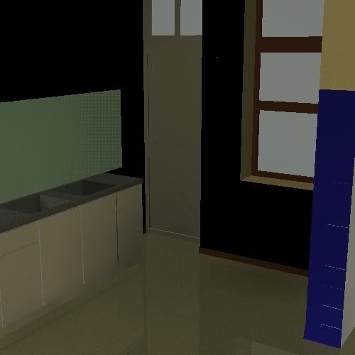
So i've been trying some tricks with Podium ... but i think i don't really understand the function of the program

No matter how hard i try, i keep on getting dark images such as this one

Ok - the photorealistic effect is there - but its not the point to have a view "by night"
-
@unknownuser said:
No matter how hard i try, i keep on getting dark images such as this one
"Man often becomes what he believes himself to be. If I keep on saying to myself that I cannot do a certain thing, it is possible that I may end by really becoming incapable of doing it. On the contrary, if I have the belief that I can do it, I shall surely acquire the capacity to do it even if I may not have it at the beginning."
- Mohandas Karamchand (Mahatma) Gandhi
-
There are videos on podiums website that give you a good understanding along with there forum.
Basically.....you have to select a plane within a group and then you choose the light and reflect settings along with its texture. Its a routine process that is time consuming but once you get on a roll it becomes easier.
Keep you head up and breath my man we here for you.Watch those videos!! They helped me in the beginning.
-
The photoshop trick gives me a real good effect there

now lets get back to the render-thing ...
-
I guess, you should try with turbosketch too, its not as good as podium but guess it good for beginners.
-
One easy way to get a more ambient type of lighting, for interiors, within SketchUp itself is to reverse the position of the sliders on the shadow setting. Pull the Light setting down to around 20 and push the Dark one up around 50. This will give much softer shadows. They will still have a hard edge, because they are vector-based, but the overall effect will no longer look like the model is set outside in strong sunlight.
Hello! It looks like you're interested in this conversation, but you don't have an account yet.
Getting fed up of having to scroll through the same posts each visit? When you register for an account, you'll always come back to exactly where you were before, and choose to be notified of new replies (either via email, or push notification). You'll also be able to save bookmarks and upvote posts to show your appreciation to other community members.
With your input, this post could be even better 💗
Register LoginAdvertisement


