House with one wall
-
Hi guys, long time no see...
This is something I started some time ago, well actually a few years ago, but that I managed to try to finish only now after I forsaken it.
It is a nice three floors semi-detached house in Switzerland designed by Christian Kerez.The peculiarity of this house is the fact that it has only a single shaped wall, hence the name, on every floor that, running longitudinally, divides the two flats. The dividing wall is the only wall in the entire house and it cannot be crossed anywere. It is the load bearing structure and the installation core, its folds define all of the rooms and it determines how the view from the entirely glazed building is divided between the two living units.
The space I wanted to represent should have been empty, not yet inhabited or by now uninhabited, without furnitures and with almost no technological systems, taking a set of nice photographs as a reference.
In fact, I think that this kind of spaces are at their best if represented like this. Almost as if, as soon as they were built, they were already an abandoned ruin.Despite the apparent semplicity, a bit of time was spent on the details of the model, tuning the materials and in the building of the context around the house.
For the lighting was used a HDRI. Sketchup and Thea 1.5 standalone. The post-pro was done in Photoshop and ArionFx.
As usual, feel free to comment.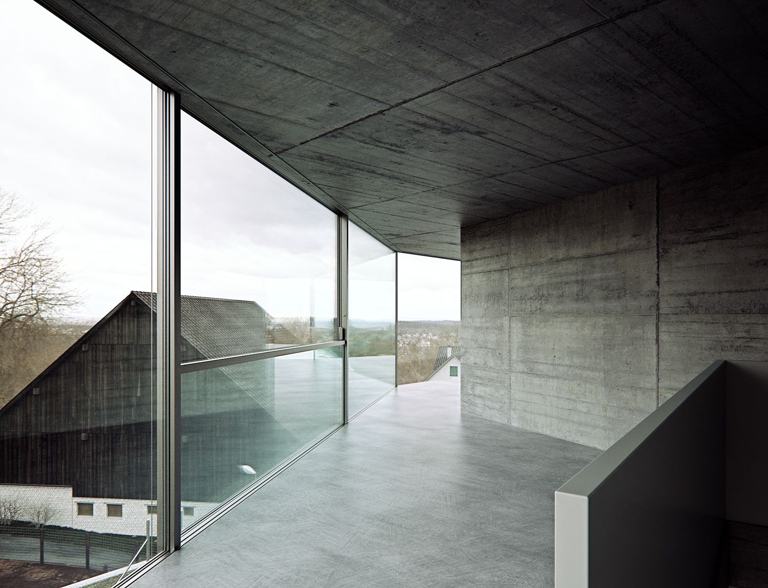
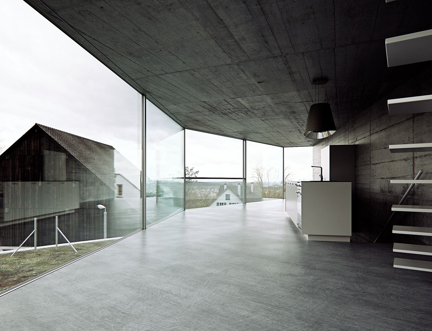
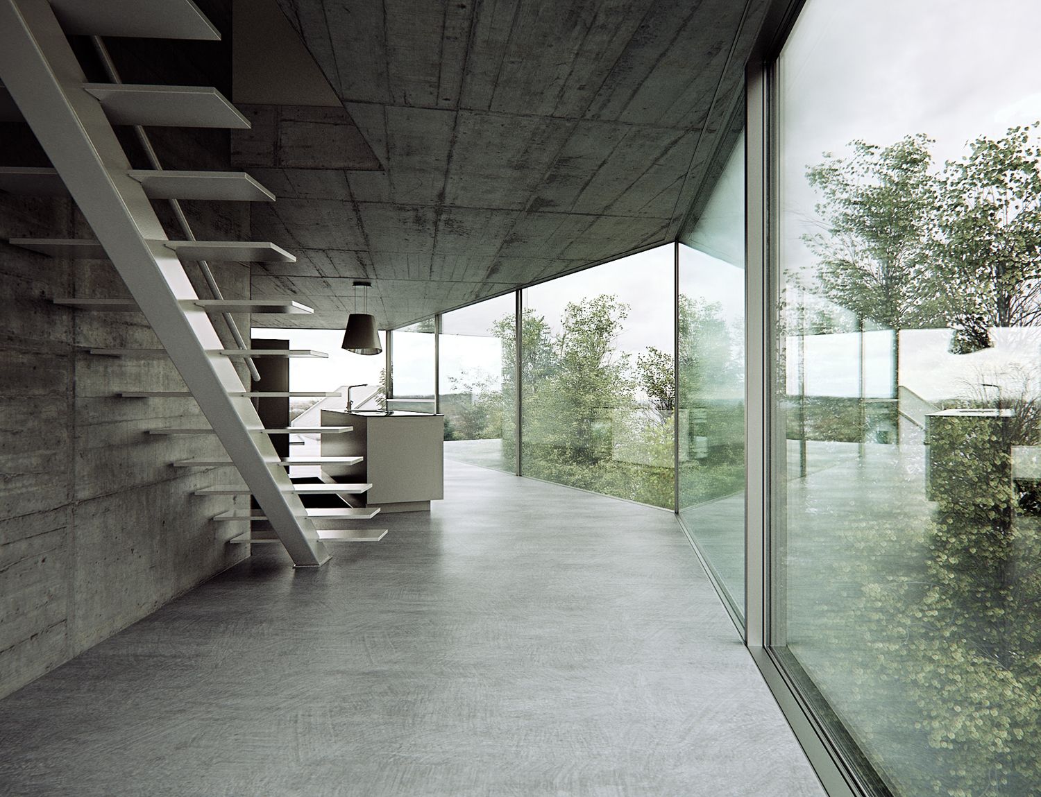
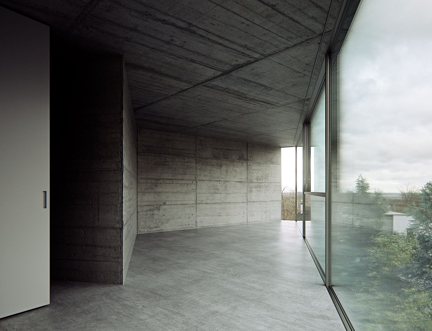
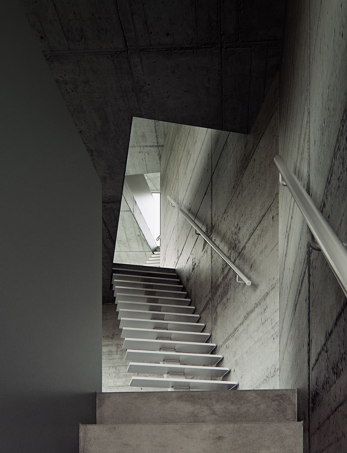
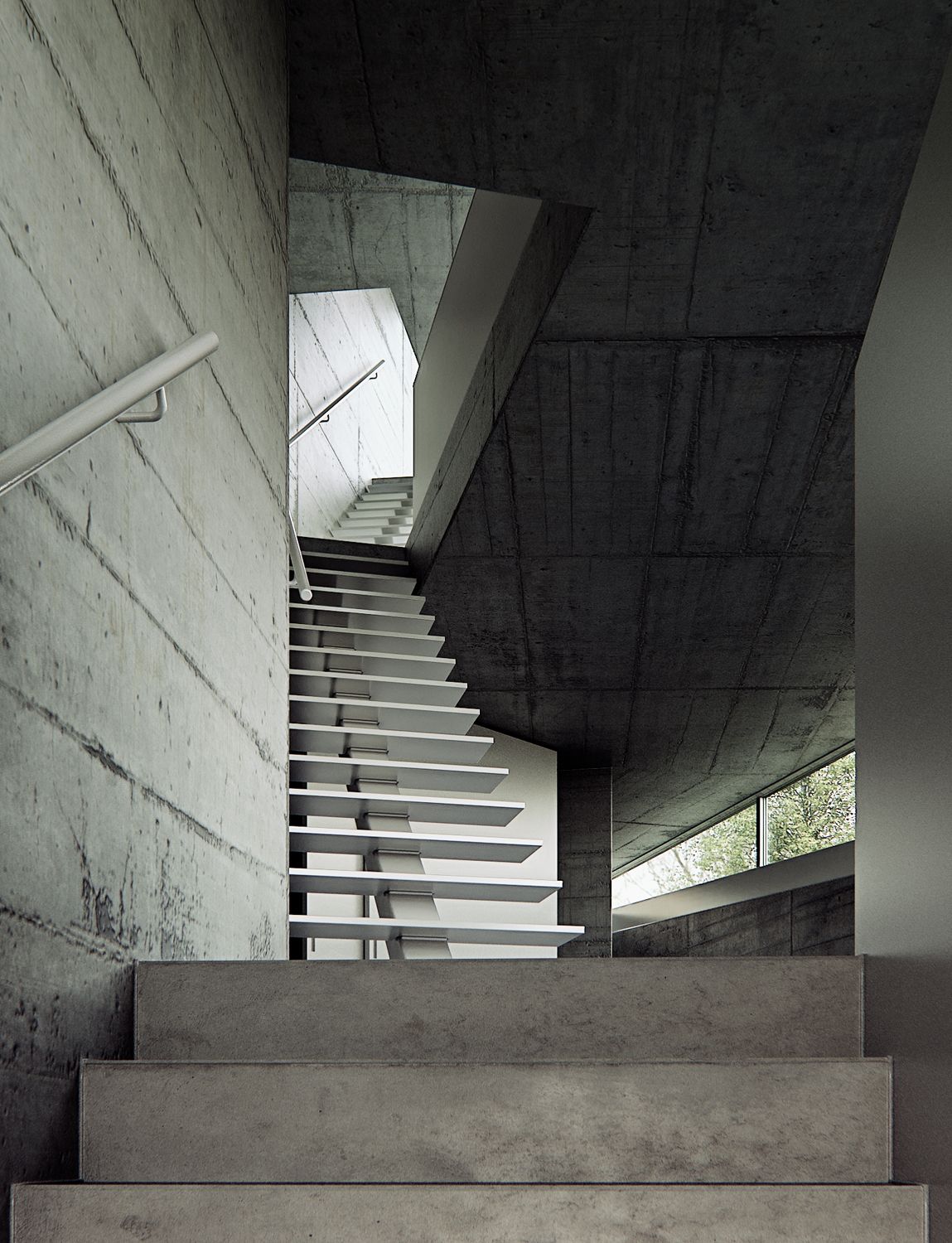
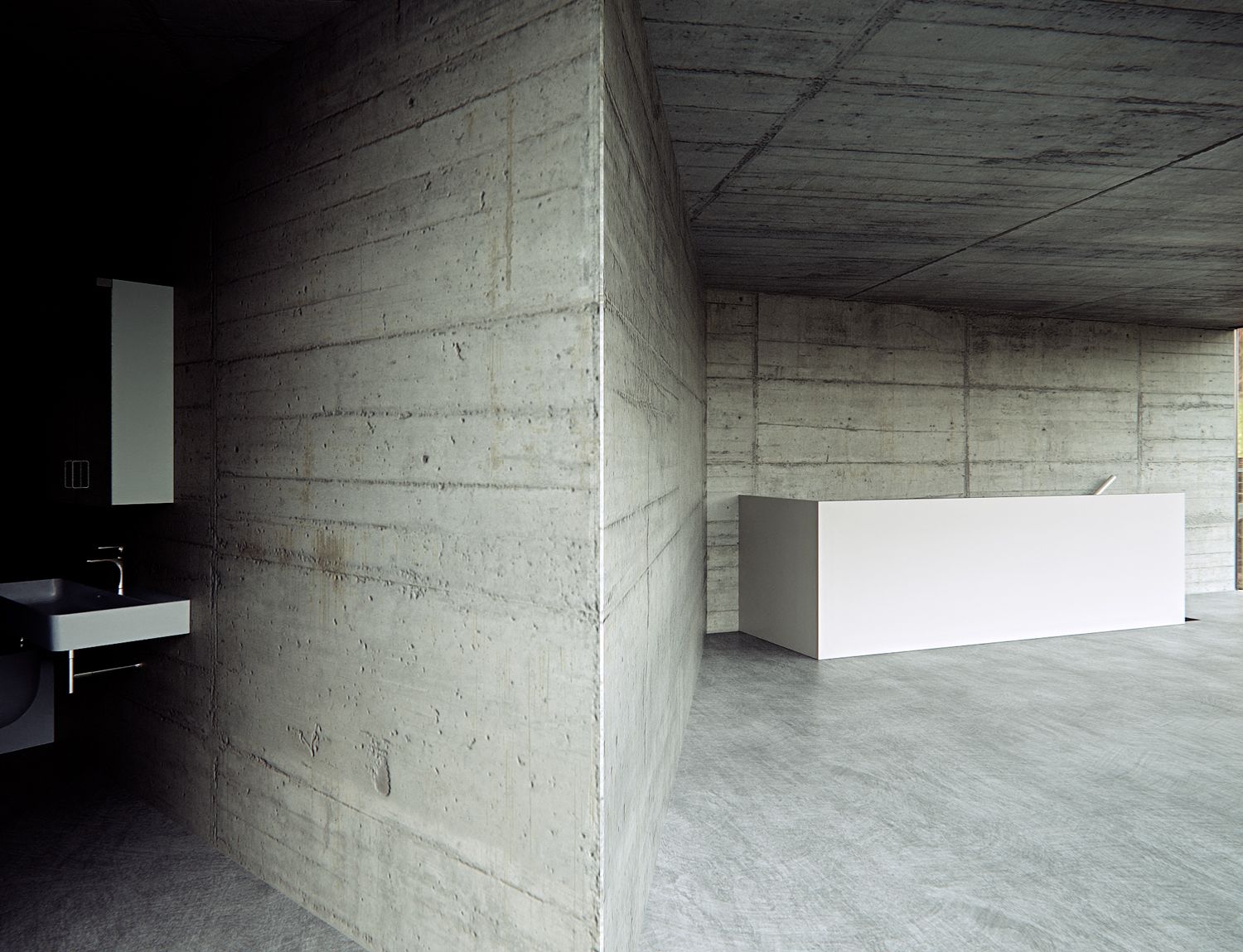
-
Just when you think 'I can render' the legend returns and reminds me that I can't.
The attention the detail is insane. I'm in awe

-
Wow! Just wow.
-
Thank you very much guys.

-
Very, very nice indeed


-
Wow, this photography forum just got a LOT more interesting. Mind well and tru;y blown into next month and want to to that when I gorw up.....
-
For some reason I am drawn to the material. So much so I ended up look for real world interior shots. My first thought was some type of galvanised steel.
You actually mimicked camera positions of photographs!
https://www.archdaily.com/604014/house-with-one-wall-christian-kerez
If you jump between real world shots and your renders its nuts!
-
@Rich-O-Brien said in House with one wall:
For some reason I am drawn to the material. So much so I ended up look for real world interior shots. My first thought was some type of galvanised steel.
if you mean the low wall at the right of the stair actually should be an enameled wall. The stairs are concrete and those little strips at the end of the steps should be some kind of silicon I guess.
It was not easy at all to manage the lighting in those two shots with the stairs though.@Rich-O-Brien said in House with one wall:
You actually mimicked camera positions of photographs!
Indeed, just as I wrote.

if you have some good images to look at its very useful trying to reproduce them In order to tune lighting and materials. You can then, if you like, try some different shots.
The main problem of those nice images is that they are clearly post-produced so non so easy to understand how real things are. -
@Rich-O-Brien said in House with one wall:
If you jump between real world shots and your renders its nuts!
Also this was maybe the first time that I started by founding a good post-pro process first and then, after, by tuning everything (materials, lighting etc.) in order to accomplish that.
-
@ L i am
@ Mike AmosThanks.
-
I love it, as usual excellent rendering. A lot of us struggle with photorealism in our own renders but I guess it's a gradual process.
@massimo said in House with one wall:
Almost as if, as soon as they were built, they were already an abandoned ruin.
Yes, abandoned by the builders first.
-
@nickchun Thanks.
"Yes, abandoned by the builders first."
Do you mean that the house seems unfinished? If so I agree with you.
After all this is part of the charm of spaces like those. -
"A lot of us struggle with photorealism in our own renders but I guess it's a gradual process."
Indeed. What we need to understand is that before the "how" there is the "what".
What I mean is that we must learn to see and decide what we want to represent. How to do it comes later and is somehow easier.
This is why taking seriously photographs helps a lot in my opinion. -
@massimo Yes, I wonder with projects like those, what the builders actually think of them.
I've started looking more seriously at photos in terms of how materials actually look in an image as opposed to how you think they should look. Well composed photos are a great inspiration. -
@massimo said in House with one wall:
What I mean is that we must learn to see and decide what we want to represent. How to do it comes later and is somehow easier.
That's great advice. You really see this in your renders especially when you see the reference photos.
The glass in the windows is it a solid volume or 2 planes? It is incredibly accurate in terms of how it is reflecting. There's more at play rather than a simple glass shader.
Thea really is a good engine.
-
@Rich-O-Brien said in House with one wall:
The glass in the windows is it a solid volume or 2 planes? It is incredibly accurate in terms of how it is reflecting. There's more at play rather than a simple glass shader.
I modeled the windows more or less like the real things. Well, of course, more schematic. So there are two glass panels with thickness and with a cavity between them.
Here you have a rough section in SU of the big windows next to a floor slab.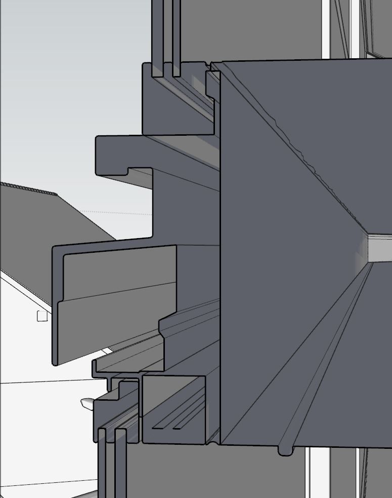
The material is a thin film glass with a slight blue-green tint in the trasmittance slot and a very slight and enlarged perlin noise procedural as a bump map in order to simulate some imperceptible distortion.
Here you have a SS of the material.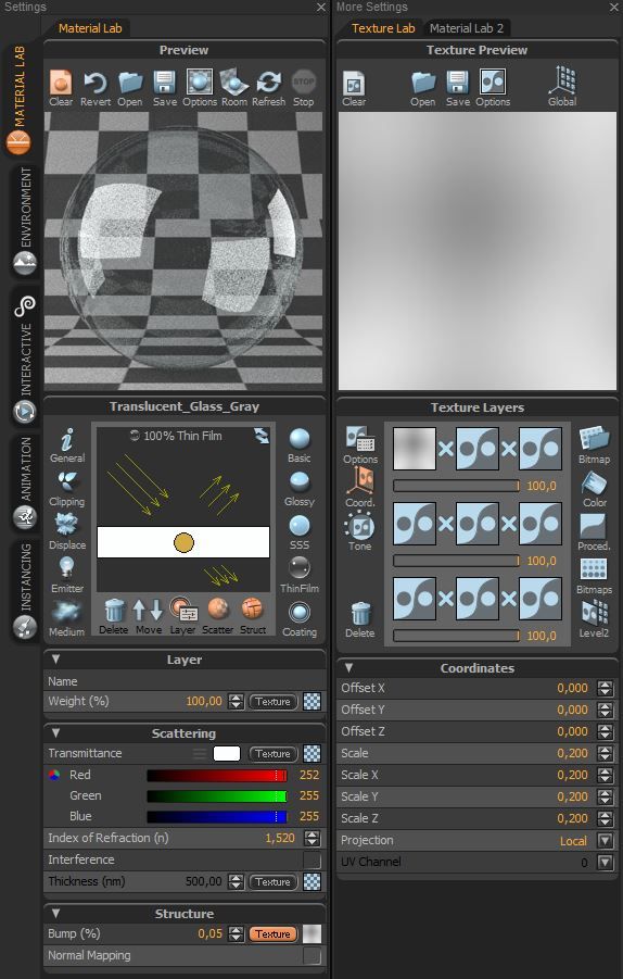
@Rich-O-Brien said in House with one wall:
Thea really is a good engine.
Indeed and, regarding materials, I think that glass and metals is where Thea really excels.
-
@massimo I'm gonna try this in Rayscaper. It uses the newer PBR disney shader and I wonder how it handles glass when you apply real world properties to both geometry and the shader.
It has a classic glass shader along with the 'Fast' glass. But when I see how Thea produced such accurate results it would be interesting to see.
Thanks for sharing that. The glass reflections really were on point in your renders and now I can see why.

-
@Rich-O-Brien said in House with one wall:
I'm gonna try this in Rayscaper.
Good, and then share the results please. It's always nice to see these experiments. I recommend you to choose a photo of the real thing and then to try to mimic it.
Here, for example, you have a comparison between reality (first pic) and render (second pic).
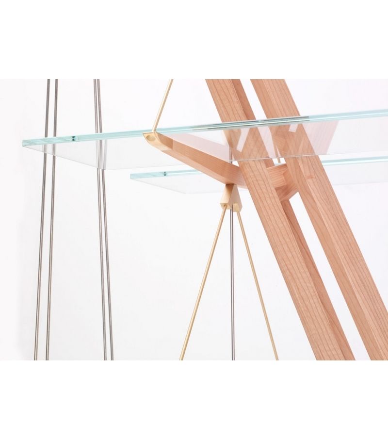
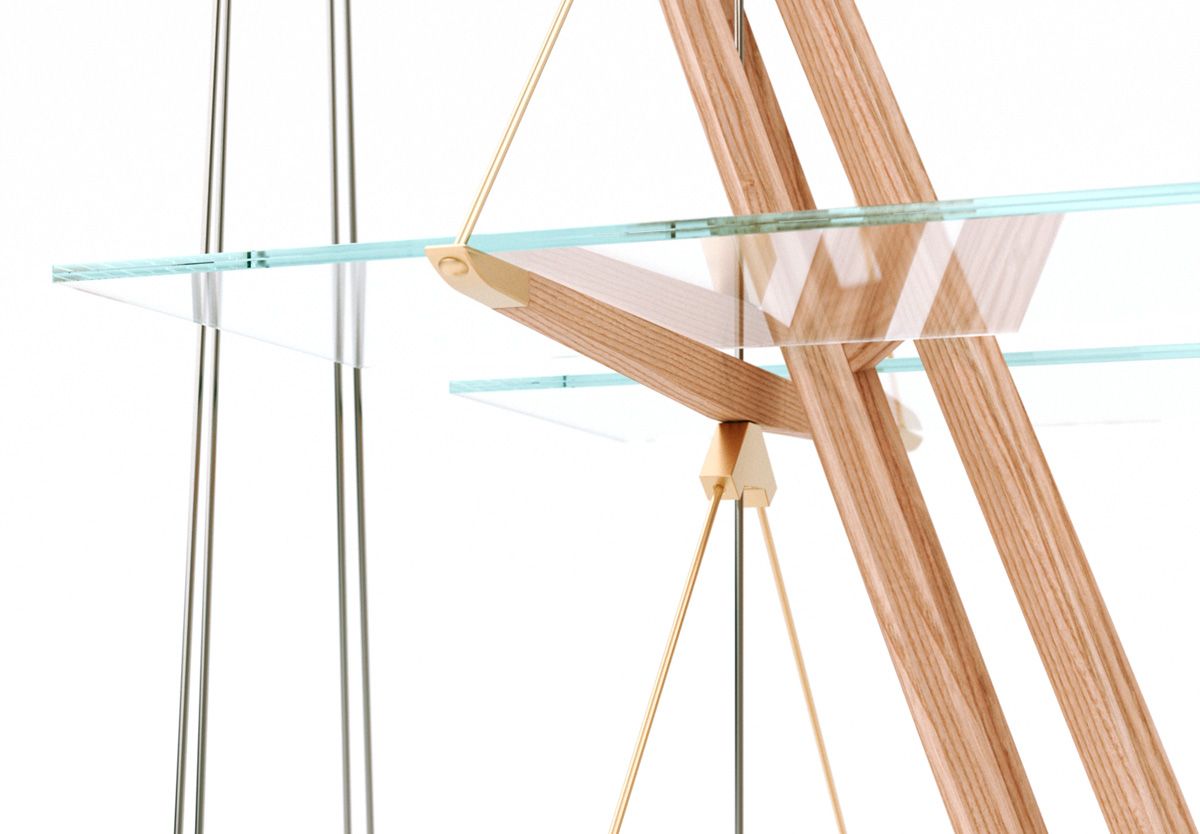
The render was made long time ago and it's one of a set of images I made of the "Veliero" bookcase by Franco Albini.
https://community.sketchucation.com/topic/143370/bookcase-velieroIn this case, however, the story was way more complicated because the model was more articulated and also some plastic thin film between the two glass panels was involved. So, if I remember well, I had to use also Thea's container feature. I achieved the result with trials and errors by working on the model and materials at the same time.
@Rich-O-Brien said in House with one wall:
Thanks for sharing that.
You're welcome.

-
@massimo Stunning work. Glad to see you posting again.
-
@tuna1957 Thanks a lot Tuna.

Hello! It looks like you're interested in this conversation, but you don't have an account yet.
Getting fed up of having to scroll through the same posts each visit? When you register for an account, you'll always come back to exactly where you were before, and choose to be notified of new replies (either via email, or push notification). You'll also be able to save bookmarks and upvote posts to show your appreciation to other community members.
With your input, this post could be even better 💗
Register LoginAdvertisement


