Kemp's Outpost
-
Decided to set up this as a repository for occasional posts from time to time. In no particular order (date related), I'll start with the most recent Sketchup/rendering related work. This way, I'm not making posts for each project, but one page for all I share.
-
Grande Station Library or Steampunk Station An examination of SketchUp’s Diffusion extension:
SketchUp 2020, SU4iPad, SU2023 Diffusion:
Conclusion:
A very fast, powerful, one eyed, nearsighted thoroughbred race horse with blinders on but, wonderfully fun to play with. My findings are described below as to why that is my conclusion along with my observations of it’s strength and weakness in context of a large model.The Project:
A collage of personal work brought together for these Diffusion tests, was originally started back in 2019 from a vision of a much larger, expansive project combining a great library, social hub and train station mixing steampunk and ancient, extinct, titanic civilizations megalithic stone structures in the background to include allot of air transport with a focus on this train. The train itself is an ongoing project that is not meant to be presented strapped to tracks, but instead, floating locomotion via electromagnetic generators. It’s inspiration comes from the work of Arcadeous Phoenix, who also built the original rail system here (now modified) and the transformers sticking out of the roof. Nothing here is completed. The train has work to be done, the station is not complete (piping, ventilation, accessories, tunnel entrance/exit points, smaller square windows frames to fit in these larger roof frames, etc.)However, in the interest of working with a larger scale model, these original assets were edited to present this version specifically for these Diffusion tests.
Motivation:
Testing Diffusion on smaller models and seeing so many examples of Diffusion created by other users, I was curious how well the extension would handle allot of geometry in a larger scale project, principally viewed from the interior. This is the answer to those musings. For my previous comparison of Diffusion to the one eyed horse, I’ll provide the breakdown as fallows.Fast and Powerful:
It truly is remarkable to see the variation, effects, bells & whistles, additions and vast colour schemes that the extension produces so quickly. With every click of “Generate”, even without adding new descriptions, Diffusion creates new images with a wonderful set of three variation renders.The pros and cons with an exercise like this are to be balanced as with scales, new inspirational ideas in one hand and loss of progress on what is desired in the other. With each new generation, three new options are provided with amazing speed. Comparatively, this is why I’m using thoroughbred racehorse as a label. For this aspect, Diffusion is truly impressive for use in concept to convey a vision without the need to be too specific or faithful to detail or respecter of already chosen materials.
Yet, it is fast and powerful.
One eyed, nearsighted:
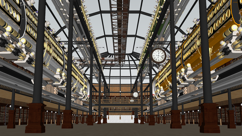
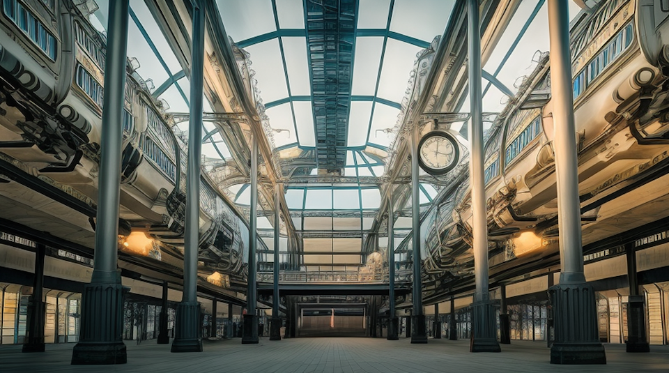
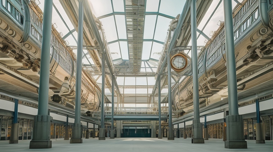
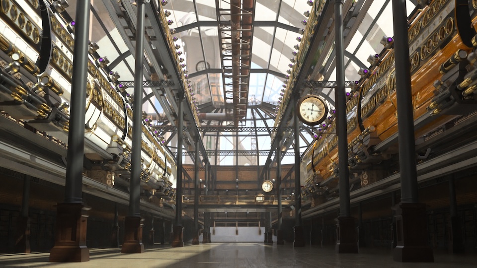
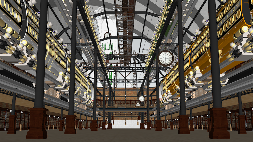
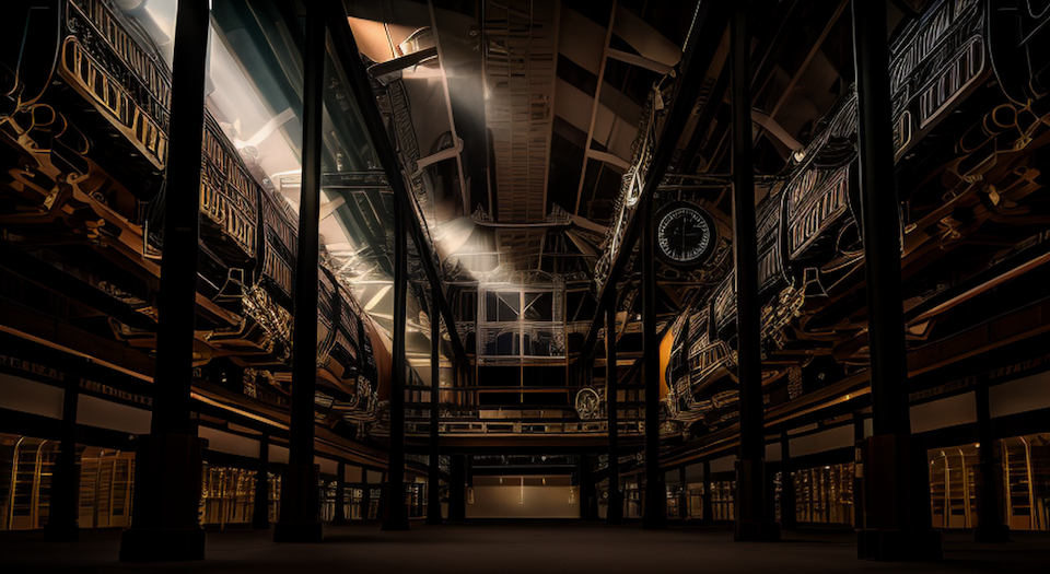
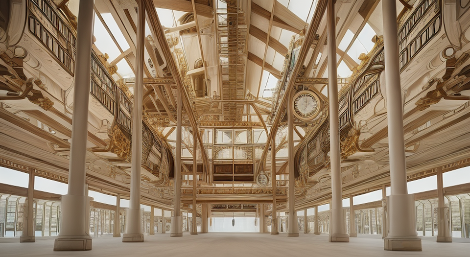
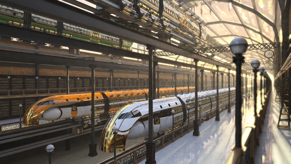
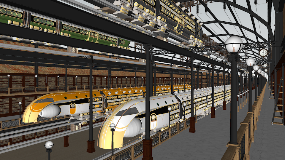
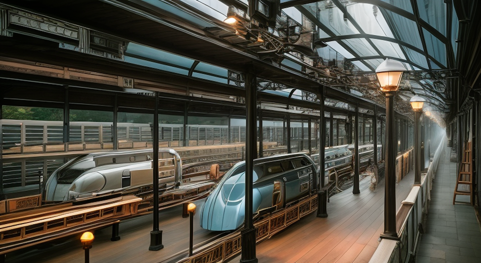
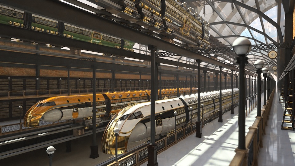
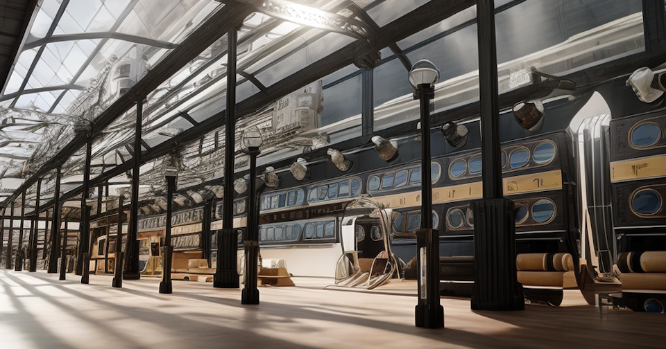
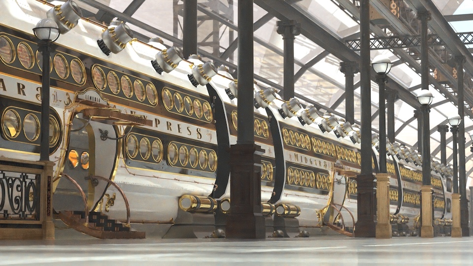
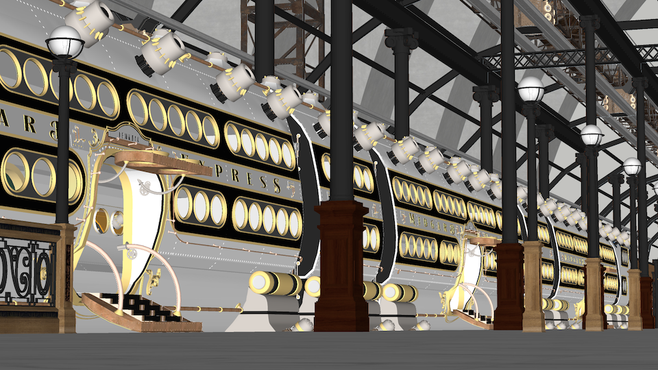
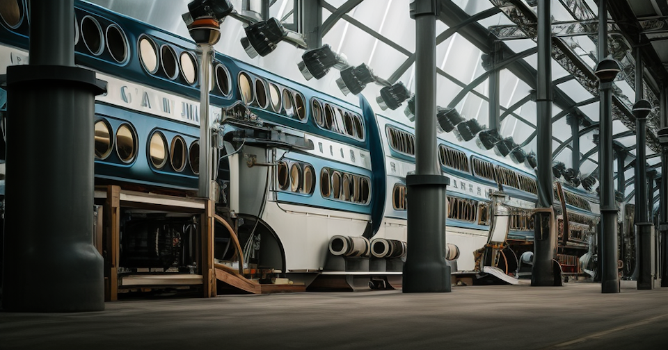
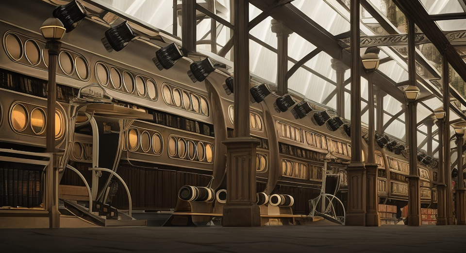
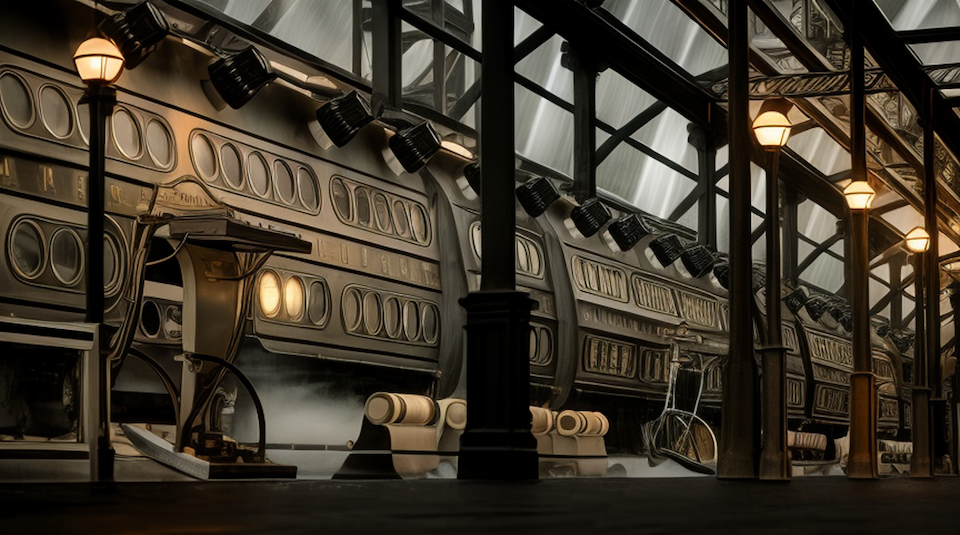
As seen from the comparison images from SketchUp and Thea Renders, there’s much detail that gets lost. When the scene’s center has geometry further off, Diffusion seems to get a bit confused as if it’s nearsightedness works great for what is directly in front of it but that distance seems to confuse the AI. So, simple objects, centered and close produce rather (or more so) reliable representations while distant objects produce scattered or blurry results. But, even with something as simple as a round, circle port window, Diffusion translates the geometry into something seen in a Salvador Dalì painting.Even though the simple geometry is right in front and center… this is where I wish the maximum 100% value of “Respect Model Geometry” was reworked so that 100% actually is 100% and not a 50% “close your eyes, fill in the gap, hit and miss, prancing pony” thing. In this case, I really want to rely more on the horse power this beast has but, isn’t applied to the extend I think it should bed in this aspect.
Blinders:
As mentioned before about focusing on near/far objects, I find that it seems to be accentuated even more with stuff on the sides. It seems (perhaps my perspective anyway) that the AI gets even more funky, creative at filling in the gaps with the stuff that is not right in front and more to the sides. I haven’t quite figured out to what extent or if it’s just a continuation of the same issue mentioned above. But, again, this might be confirmed or solved if selecting 100% on “Respect Model Geometry” will be reworked to do just that.One obvious discovery, when tried, is that Diffusion currently rejects 2pt perspective. After preparing scenes with 2 pt perspective to keep verticals in certain scenes, the launch of Diffusion kicks that perspective right out. So, the plugin cannot take advantage of SketchUp’s different camera features. As long as one knows this, the scenes can be set up appropriately to accommodate this current weakness.
However, I conclude that Diffusion is an excellent tool and amazing resource for concept work. To be able to produce, in shorthand and scribbles, an image that conveys “ideas” of what something “could” look like or be in the end, is simply fantastic. Not only for the simple objective of communicating ideas but, as a great inspirational tool to generate variations that one would not natively create if left alone.
Basically, Diffusion is a fun, useful and creative extension to have in the tool box. And if a quick deadline or fast turn over of work is required, this thoroughbred will run the race well.
Scene 01
Diffusion Interior Photorealistic
Reference: Thea Render and SketchUp Screenshot
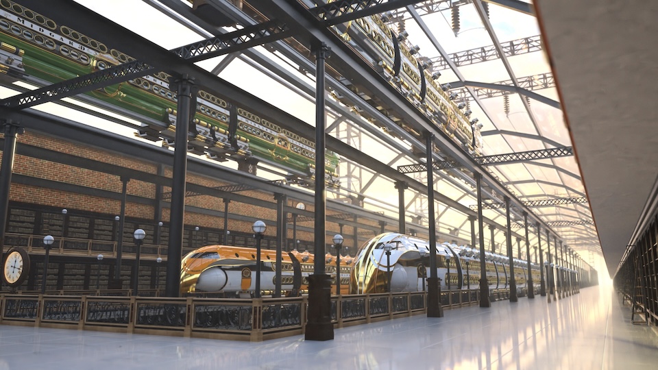
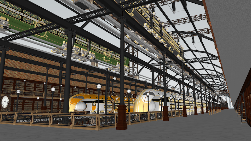
Diffusion:
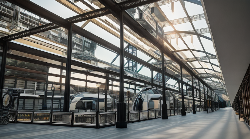
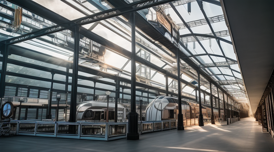
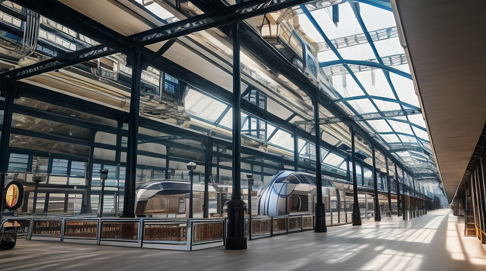
Diffusion Interior Photorealistic
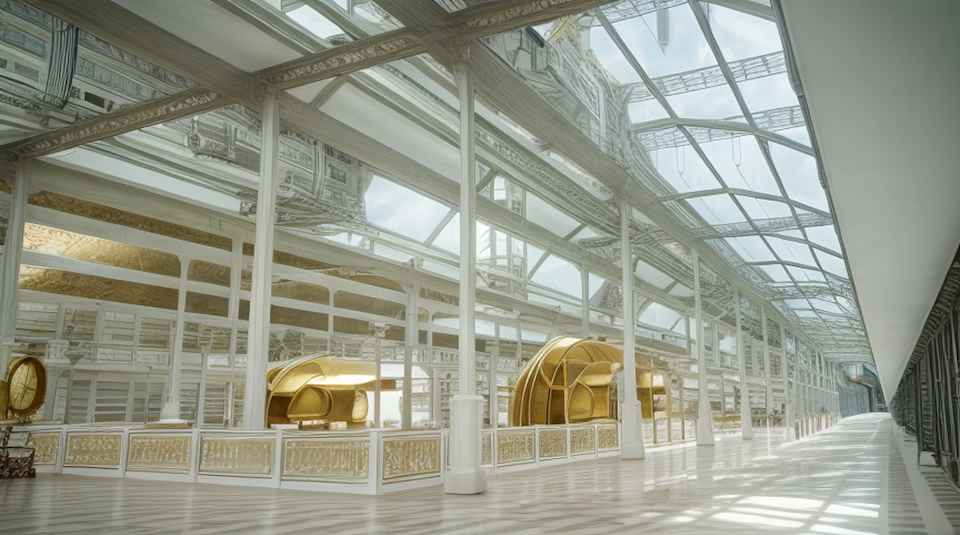
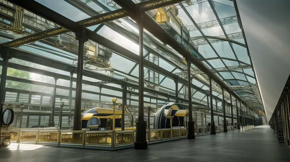
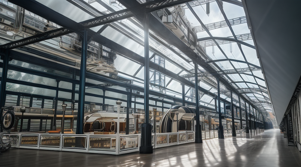
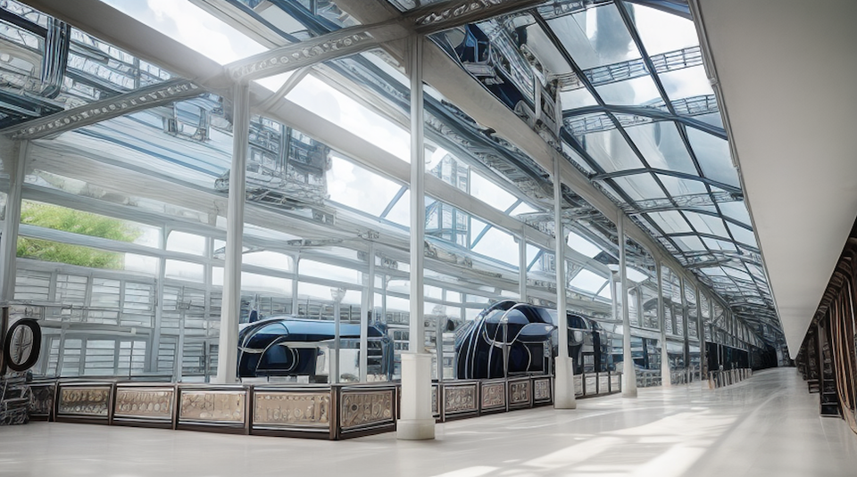
Scene with arches in background
Reference: Thea Render and SketchUp Screenshot
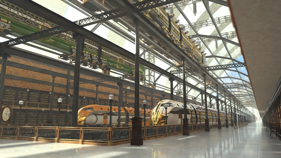
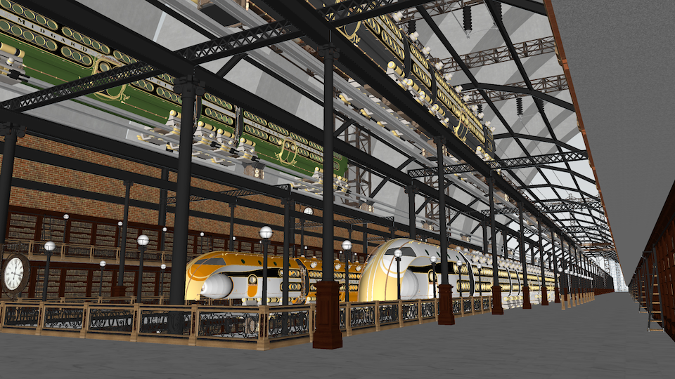
-
Steampunk Station scene 2 & 5
Reference: Thea Render and SketchUp Screenshot
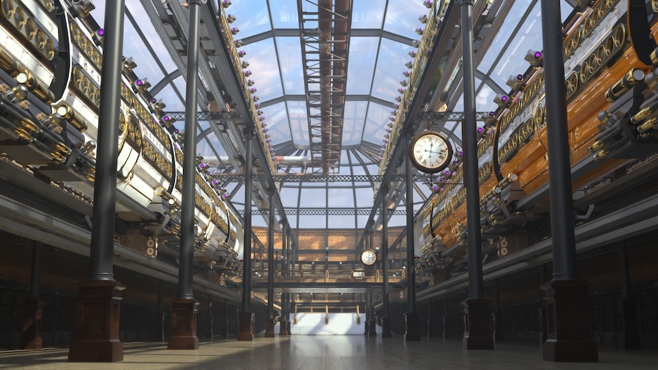
Diffusion:
[attachment=5:3kbxrykh]<!-- ia5 -->14 Steampunk Station scene 2 & 5 20240206 11h06m28s.png<!-- ia5 -->[/attachment:3kbxrykh]
[attachment=4:3kbxrykh]<!-- ia4 -->15 Steampunk Station scene 2 & 5 20240206 16h44m37s.png<!-- ia4 -->[/attachment:3kbxrykh]
Reference: Thea Render and SketchUp Screenshot
[attachment=3:3kbxrykh]<!-- ia3 -->16 Steampunk Station-Scene 2 1920x1080 1h13m0139s.jpg<!-- ia3 -->[/attachment:3kbxrykh]
[attachment=2:3kbxrykh]<!-- ia2 -->17 Steampunk Station-Scene 2 SU.png<!-- ia2 -->[/attachment:3kbxrykh]
Diffusion:
[attachment=1:3kbxrykh]<!-- ia1 -->18 Steampunk Station scene 2 & 5 20240131 09h31m19s.png<!-- ia1 -->[/attachment:3kbxrykh]
[attachment=0:3kbxrykh]<!-- ia0 -->19 Steampunk Station scene 2 & 5 20240131 09h30m50s.png<!-- ia0 -->[/attachment:3kbxrykh]
-
Very cool.
-
beautiful! I love it.
-
-
Prima !!!!!
-
@unknownuser said:
As seen from the comparison images from SketchUp and Thea Renders, there’s much detail that gets lost. When the scene’s center has geometry further off, Diffusion seems to get a bit confused as if it’s near sightedness works great for what is directly in front of it but that distance seems to confuse the AI. So, simple objects, centered and close produce rather (or more so) reliable representations while distant objects produce scattered or blurry results. But, even with something as simple as a round, circle port window, Diffusion translates the geometry into something seen in a Salvador Dalì painting.
A very accurate description of the diffusion model currently. A bad dream type of detail in my opinion.
I think its good to concept but not suitable to be used as final output. It can only get better to the detriment of those that spent years perfecting their skills.
-
Steampunk Station Scene 4
Reference: Thea Render and SketchUp Screenshot
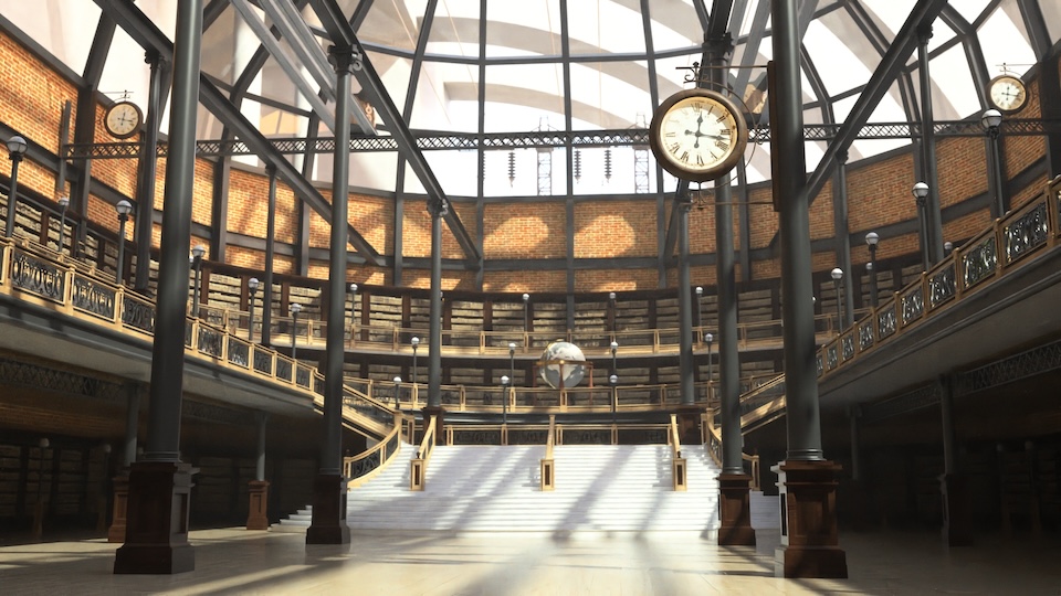
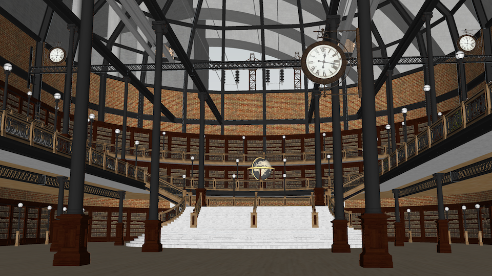
Diffusion:
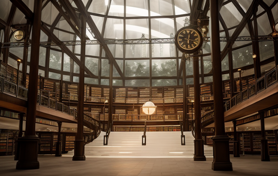
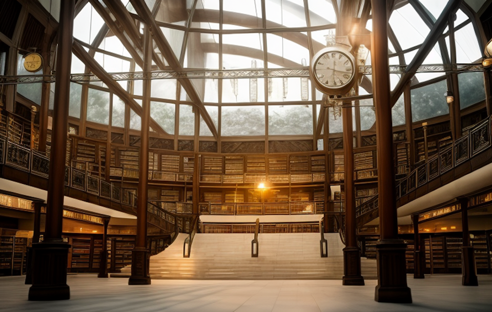
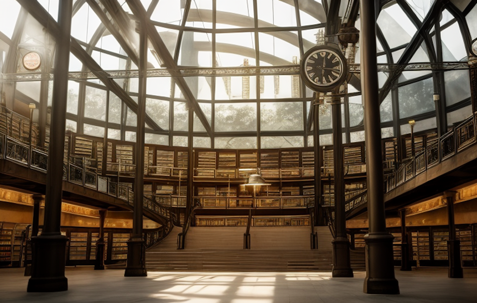
-
Steampunk Station Scene 8
Reference: Thea Render and SketchUp Screenshot
Diffusion:
SCENE 08 B
Reference: Thea Render and SketchUp Screenshot
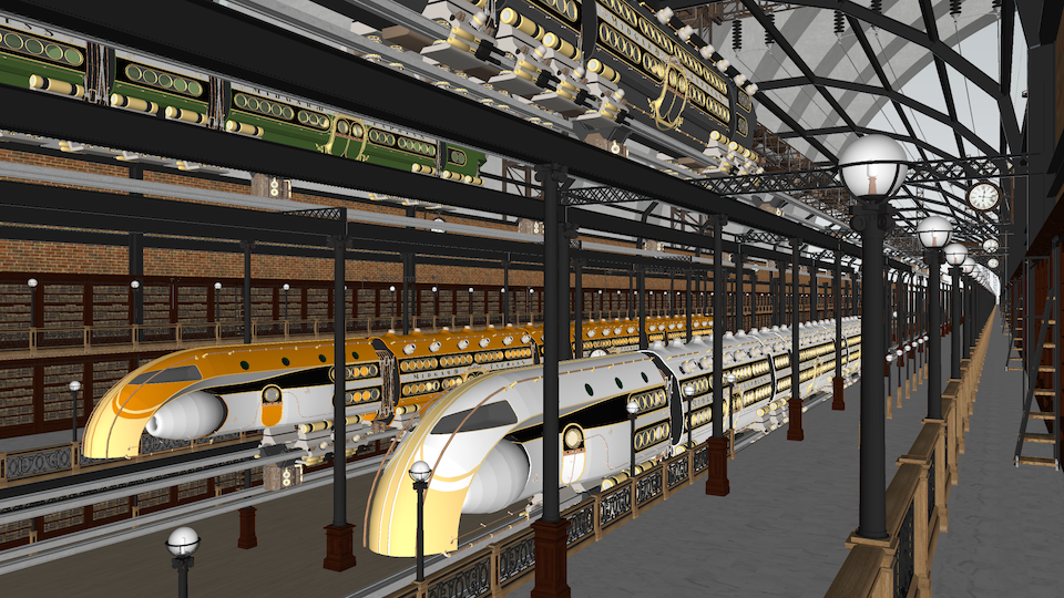
Diffusion:
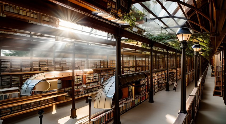
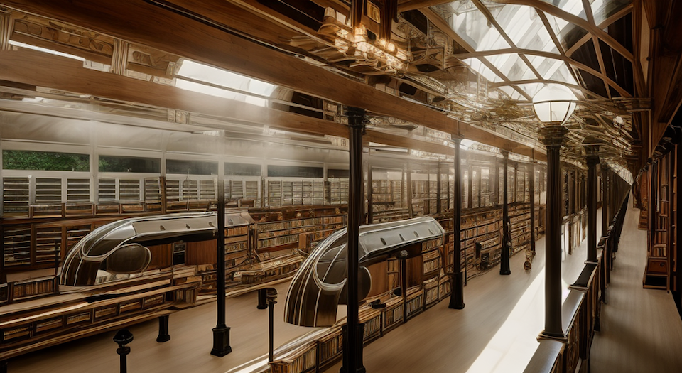
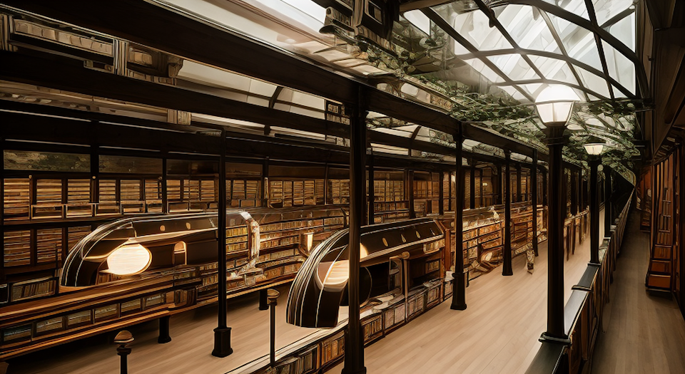
-
Steampunk Station Scene 14
Scene 14 A
Reference: Thea Render and SketchUp Screenshot
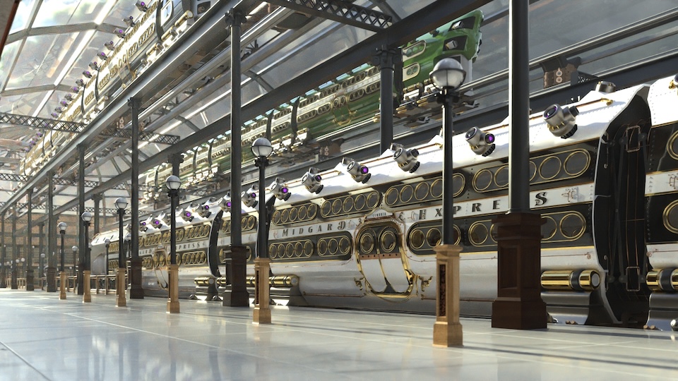
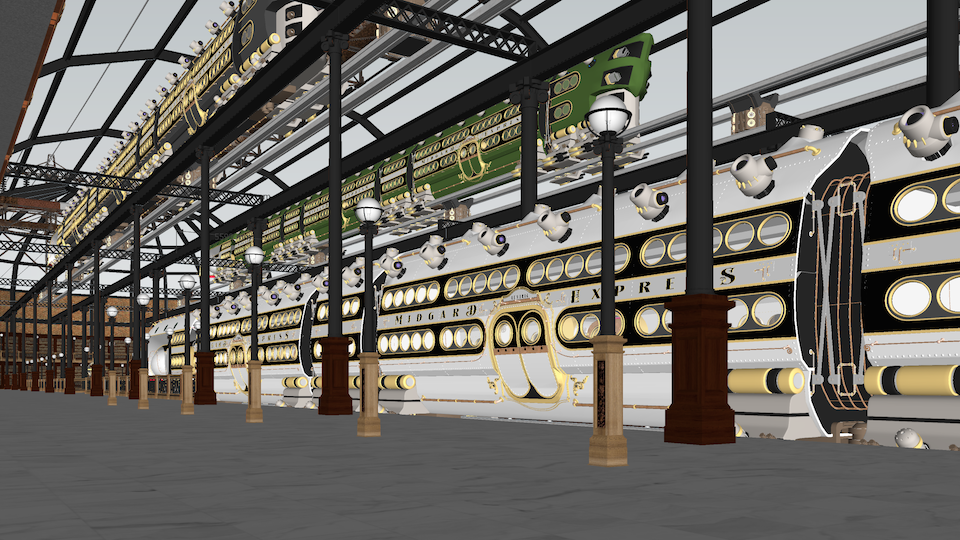
Diffusion:
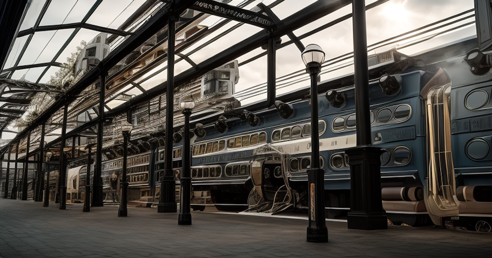
SCENE 14 B
Reference: Thea Render and SketchUp Screenshot
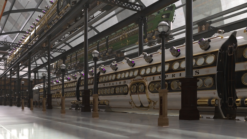
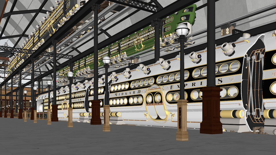
Diffusion:
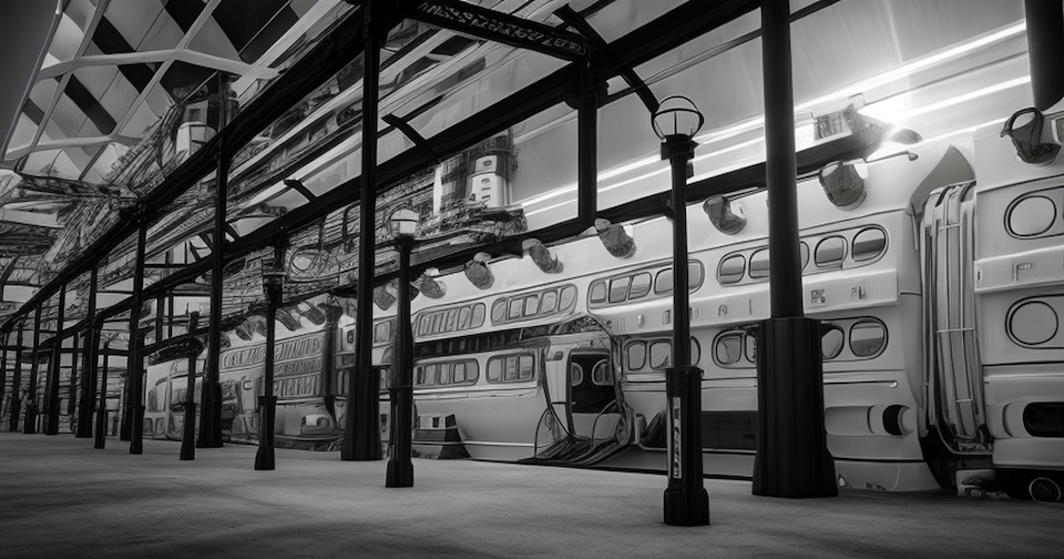
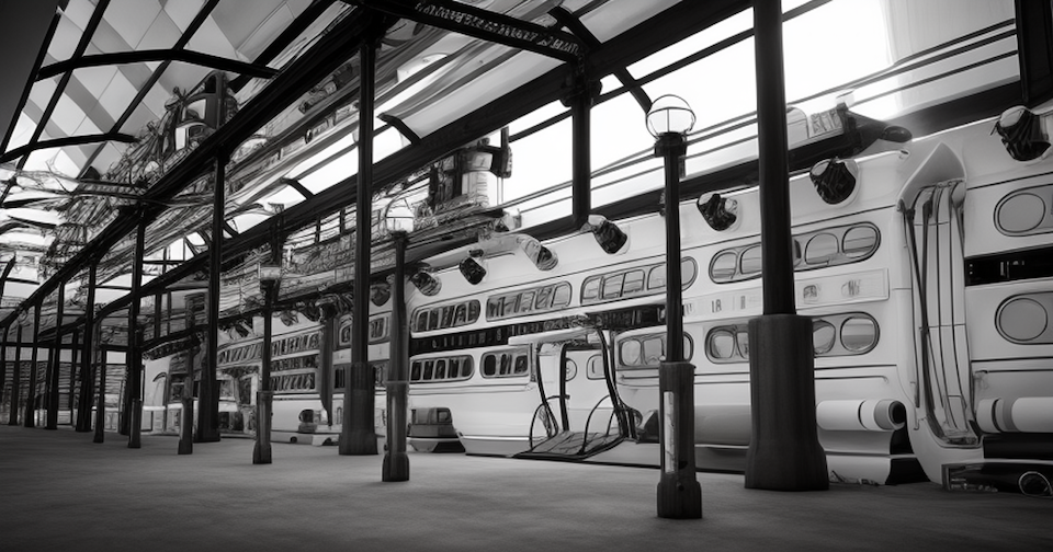
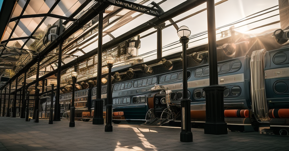
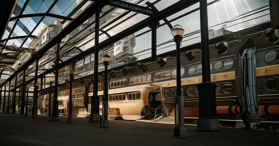
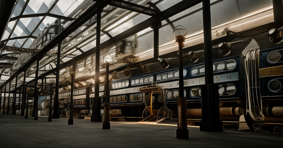
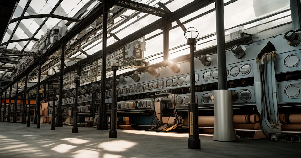
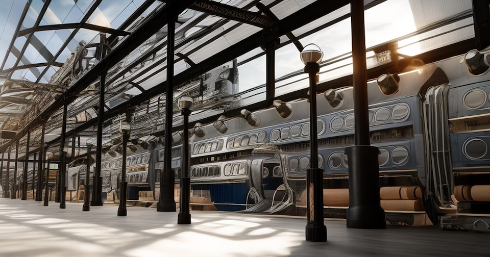
-
Steampunk Station Scene 18
Scene 18 B
Reference: Thea Render and SketchUp Screenshot
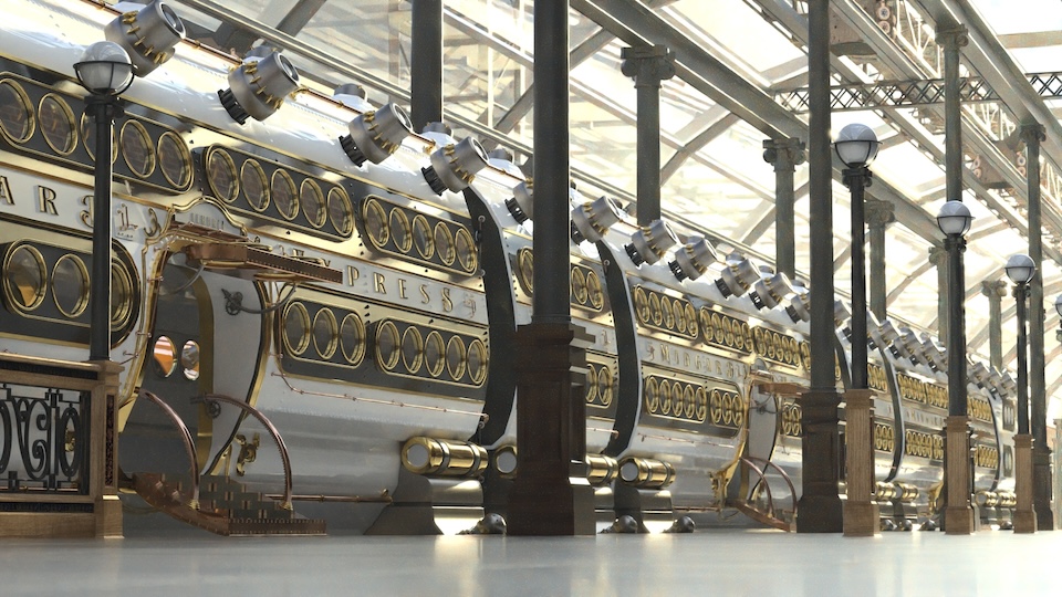
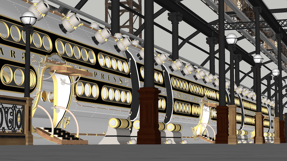
Diffusion:
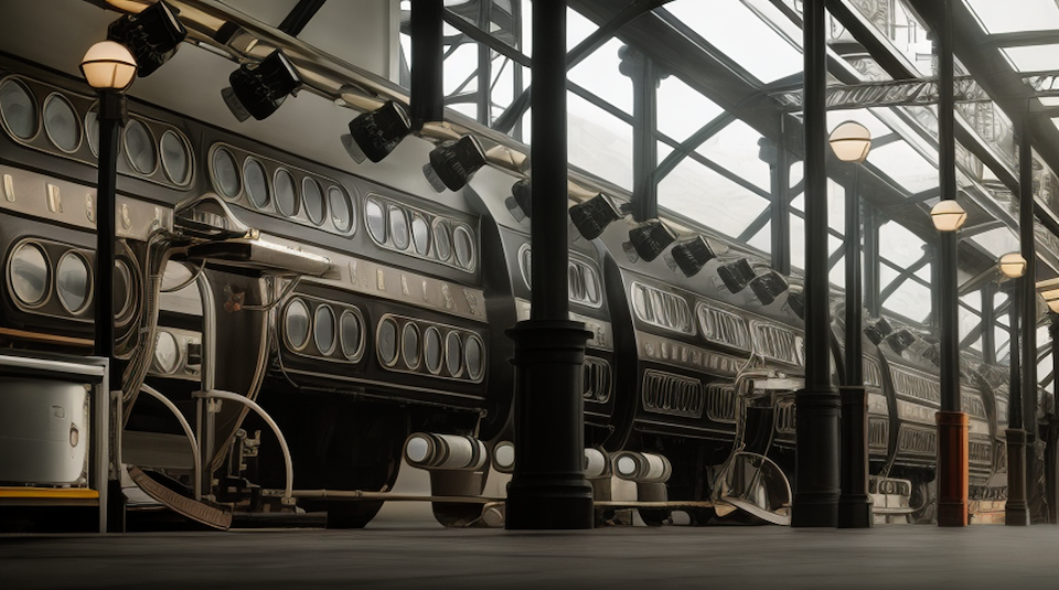
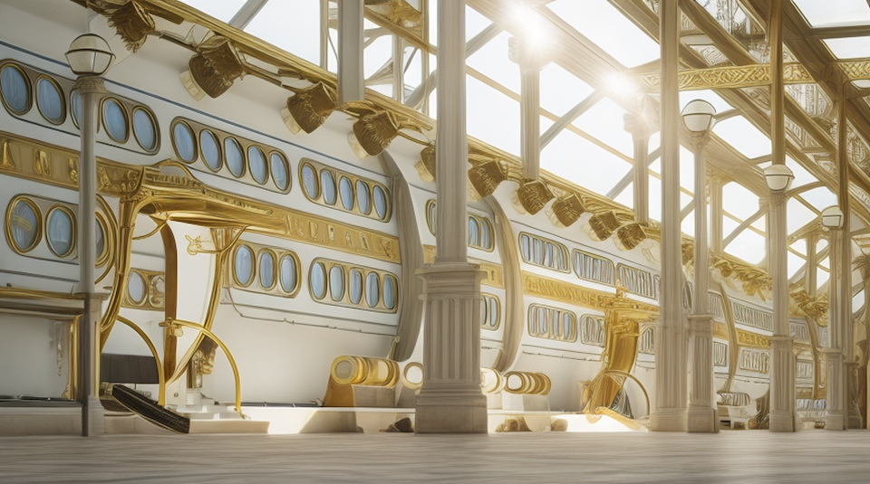
Scene 18 A
Reference: Thea Render and SketchUp Screenshot
Diffusion:
-
Thank you for kudos. Much appreciated.
-
Now, that's a massive model

-
@rich o brien said:
@unknownuser said:
But, even with something as simple as a round, circle port window, Diffusion translates the geometry into something seen in a Salvador Dalì painting.
A very accurate description of the diffusion model currently. A bad dream type of detail in my opinion.
I think its good to concept but not suitable to be used as final output. It can only get better to the detriment of those that spent years perfecting their skills.
@Rich, I agree!
I spent three days looking at over 1000s of variations, selected a hundred+ of those I thought were reasonable as the others were just NUTS! Then, from those, my family helped in a day selecting their favorites which I weeded down to those the family mutually agreed on and a few of my own favs.
But, even though this is not my best Thea Rendering effort, which wasn't the point of this exercise, preparing the materials alone for render took three days with edits and test with two days Just to make 10 quick renders? Part of me is screaming, "not fair" while the other part is crying that the world don't care one way or the other and this is the future as this tech improves. For myself, I see this as the DJ that took bands out of bars, concerts, weddings and parties by owners that could have a night of music at 1/8th the price or more!
However, before I ranted too much in public on the issue, I knew as well I needed to immerse myself in some practical tests to wrap my head around the subject enough to have an opinion, thus these tests. Alas, the future looks bleak, exciting fun and cheap. I guess those who are celebrating are those who can work faster and cheaper for those who discern less for quality, talent and experience... with the exception, as you mention, for concept work. If I can vomit out an idea to get an agreement for work to be done, than I have no moral issue with using this tool, as it does that very well. But, with this tech in the hands of newbies who have no understanding of the challenges with getting realistic results, expectation of clients will change as well, accepting the one click solution as equal to the sweat, experience and passion of rendering they had to "pay" for. I may be a bit slanted or prejudiced but, I think I'm being rather realistic in my assessment as well.
As we saw digital music replace musicians, the more this tech advances, I believe we will (or are) seeing the mortality of the technical expertise of the artistry and profession we've known. The day that AI produces "controlled" work in perfection under direction (or automated), is the day that the masters' and gurus' end has come in this game.
LOL! And all that after all this "fun" becoming familiar with the tool. I believe you and others who share this perspective, are spot on.
-
I think that no matter how good it gets it will always lack imagination.
People still draw and paint despite disruption with digital media.
I'm optimistic about it. Rock'n'roll is here to stay

-
I sure hope you're right!!!!
Please be right.
-
There are several areas in which AI is much better than normal render engines: these are textiles! I've decided to render architecture classically and render textiles in Skechup diffusion and then mix the two together in Photoshop.
In your case it's about architecture. rendering is better than diffusion
-
Thanks for doing these comparisons.. very cool to see.
-
@jo-ke said:
The light is often better in diffusion.
Yeah, in those few cases in which the sun isn't casting shadows in 4 different directions, maybe..

Hello! It looks like you're interested in this conversation, but you don't have an account yet.
Getting fed up of having to scroll through the same posts each visit? When you register for an account, you'll always come back to exactly where you were before, and choose to be notified of new replies (either via email, or push notification). You'll also be able to save bookmarks and upvote posts to show your appreciation to other community members.
With your input, this post could be even better 💗
Register LoginAdvertisement


