Oval house
-
Thanks nlipovac.
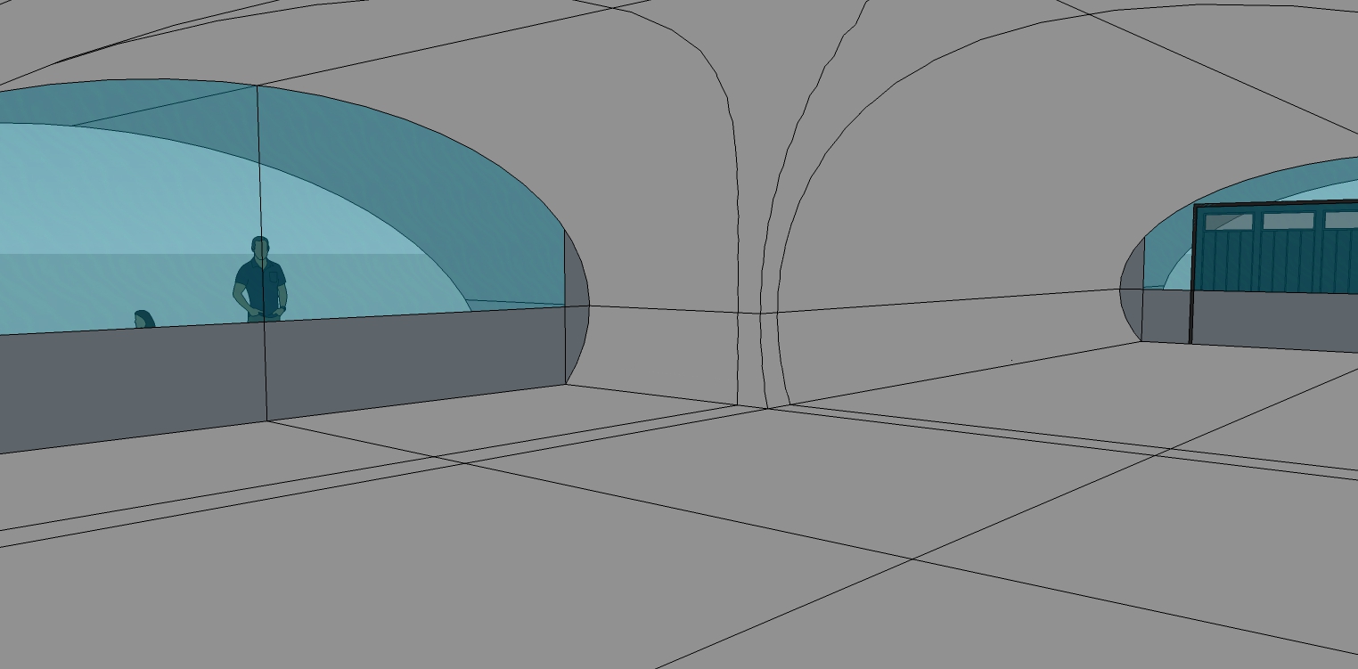
Some more updates. Intersected models and then cleaned out all the interior lines and faces.
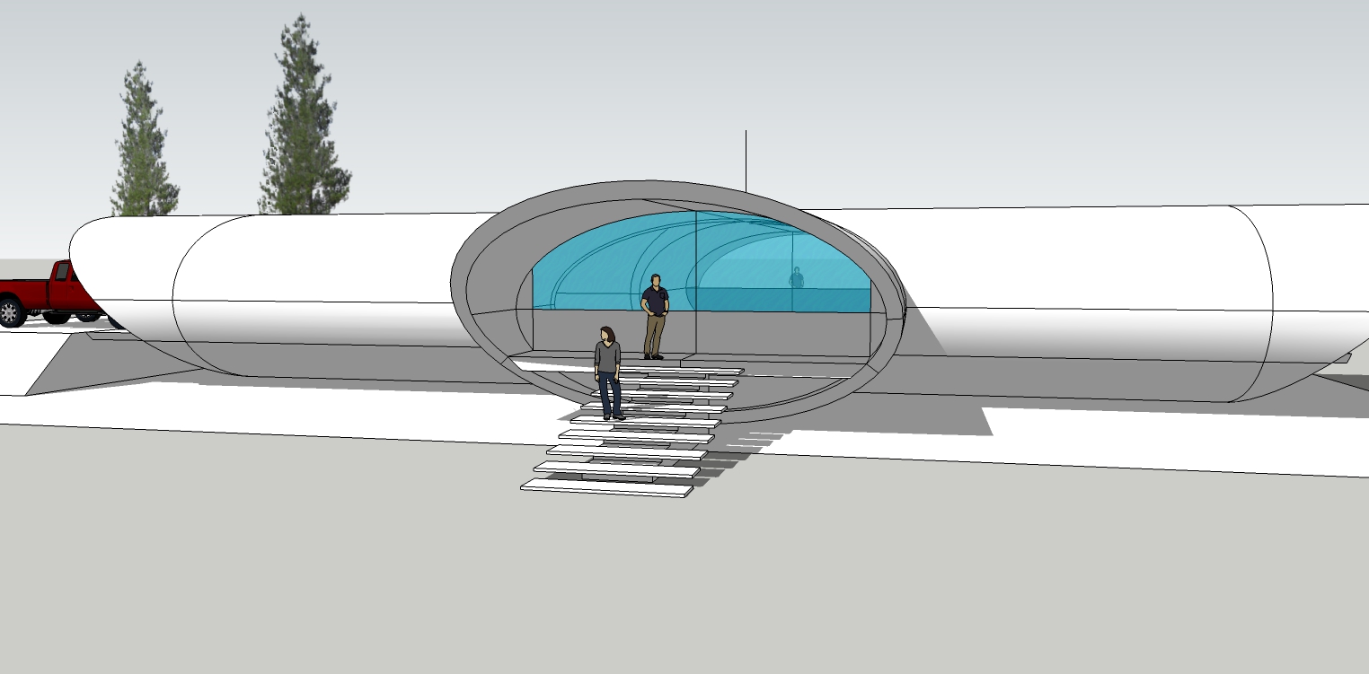
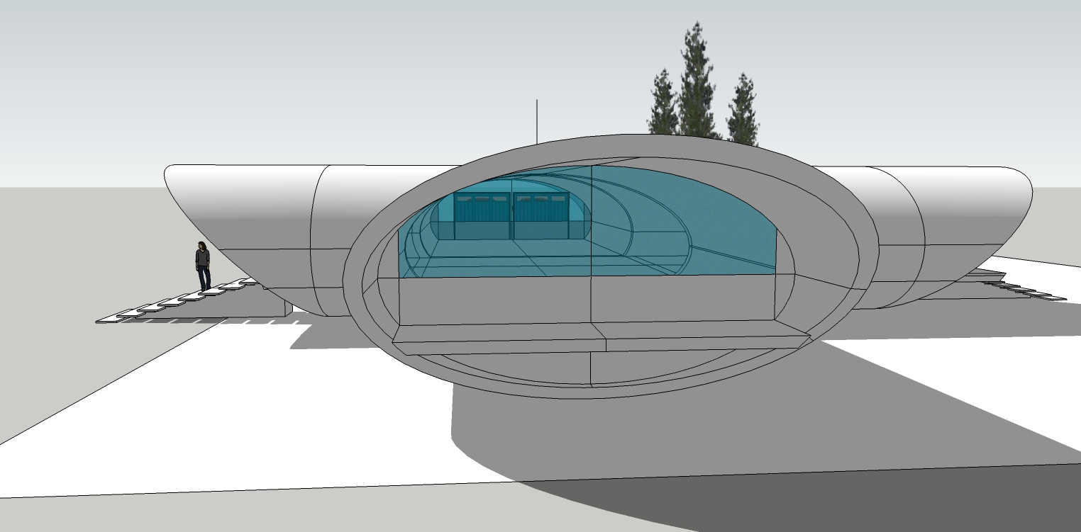
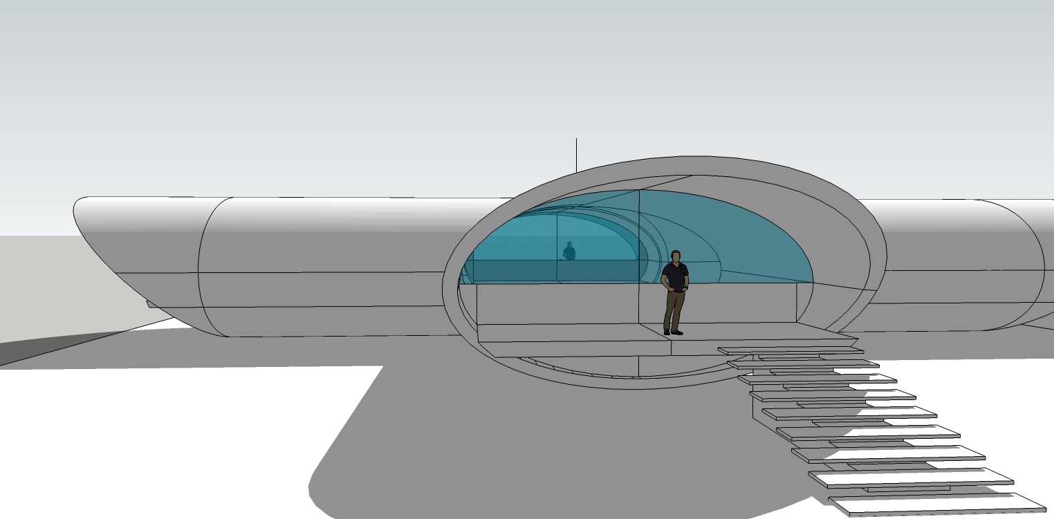
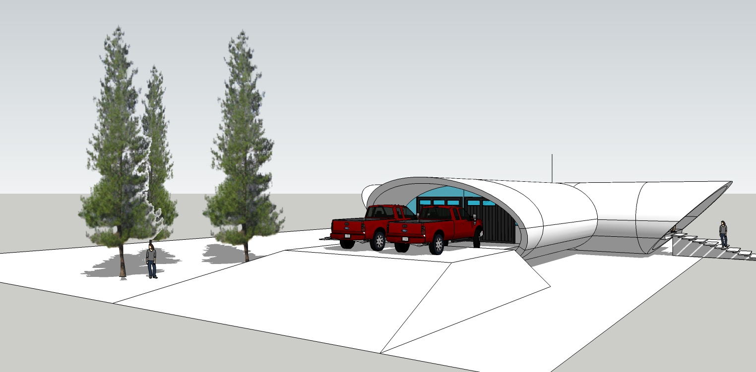
-
Looking good mate, when can I move in?

-
@mike amos said:
Looking good mate, when can I move in?

Thanks.
When? Right after I start all over again.

The model is made wrong. Overall too small for the floorplan and also the hidden geometry doesn't line up. This created intersection issues. Wrong number of segments in the ovals.
Oops.

So I will start again and post the updates in this thread. No problem. The rework will go faster. Same design. Just fixed.
-
@bryan k said:
the hidden geometry doesn't line up. This created intersection issues. Wrong number of segments in the ovals.
Perhaps this might help?
Create the first leg as circular. Copy rotate. Intersect. Remove internal faces. Select all and scale about centre to flatten to oval.
Although this could also be done with Solid tools (Pro or plugin) it seemed to be just as quick with Intersect.
-
Thanks shawb. I've already figured out the issue and will have the rebuild done tonight. That's how I knew it was wrong.

Cheers.

BTW, the correct number of segments to make a perfect lineup of centerlines is 180 segments in a circle. 45 segments per 1/4 arc. (90 / 2 = 45)
I overlooked this.
-
Will look forward to seeing the progress.
-
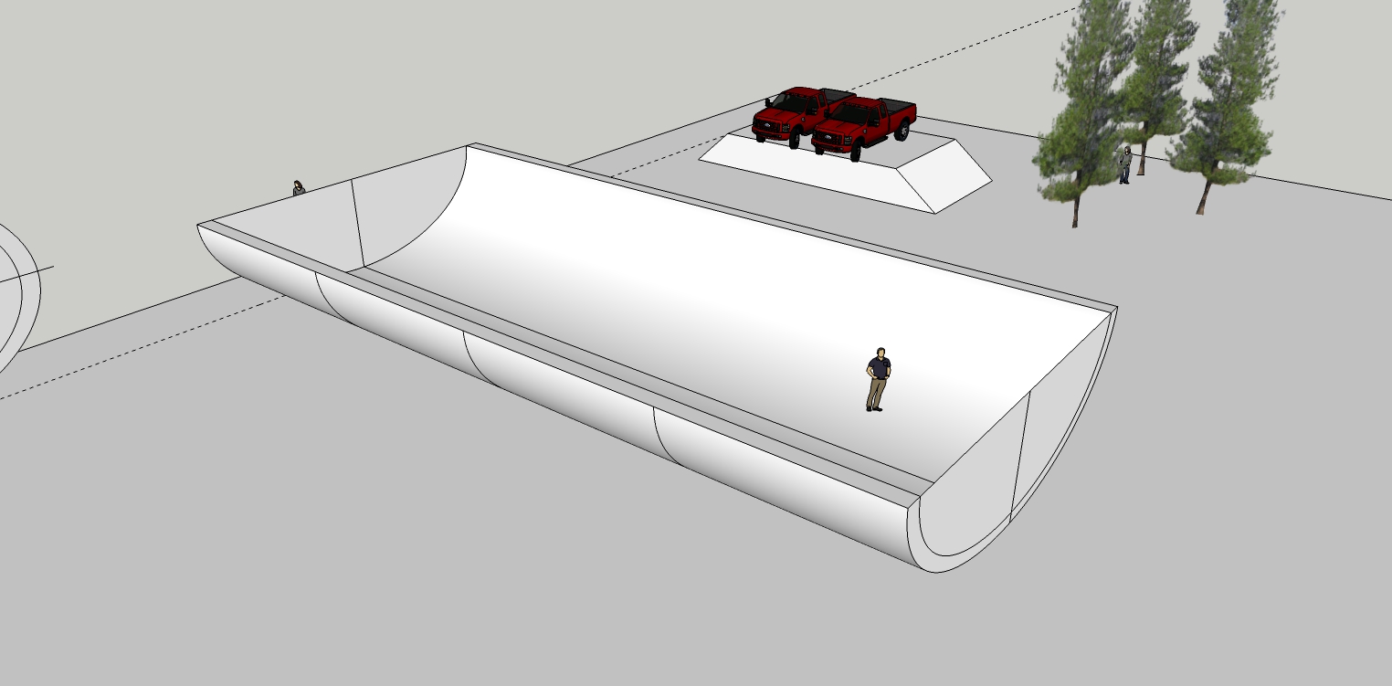
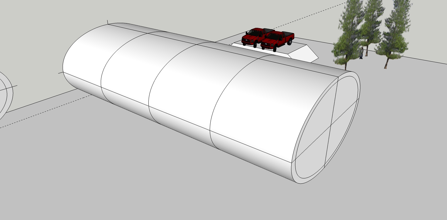
Got it right this time.
-
... completely detached from your design content topic Bryan - I always love these "simple" native SkUp graphics! There never is a single reason to press any render button!

-
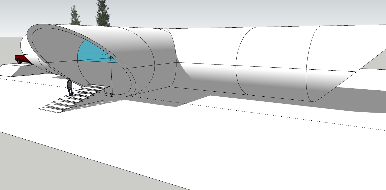
Main rework finished. It is now a two story house and far bigger on the inside.
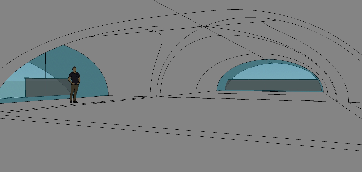
3rd pic is showing hidden lines.
On to the details!
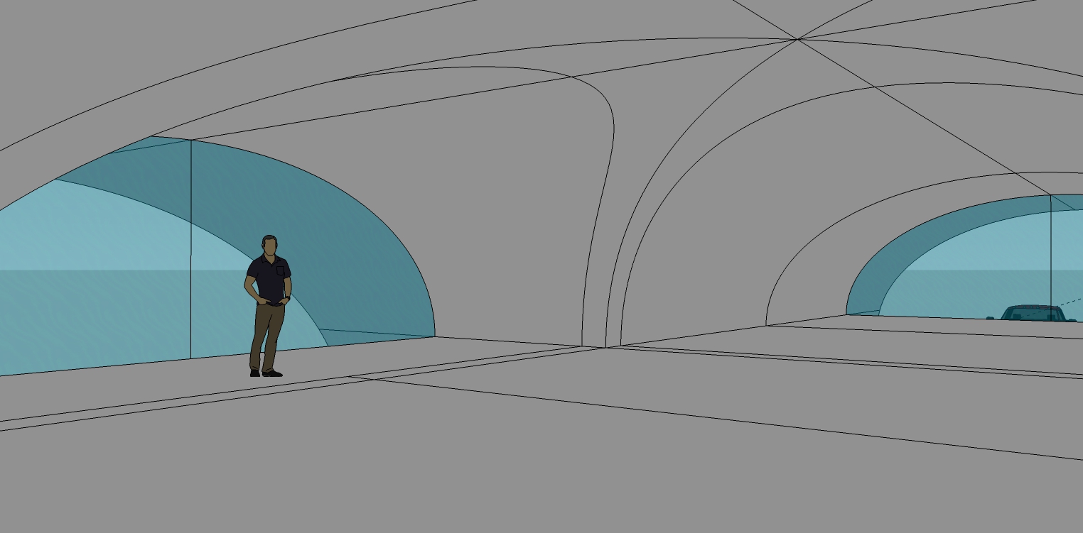
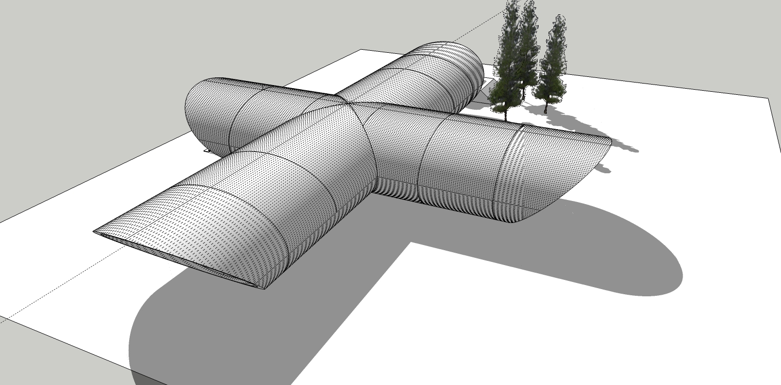
-
@hornoxx said:
... completely detached from your design content topic Bryan - I always love these "simple" native SkUp graphics! There never is a single reason to press any render button!

Yeah, the original programming team absolutely picked the right palette for everything. It is definitely one of the things I like best about SketchUp.
-
Almost finished with the rework.
It was not easy separating the two halves. Not hard, just tedious with straggling lines grouped with the wrong halves.
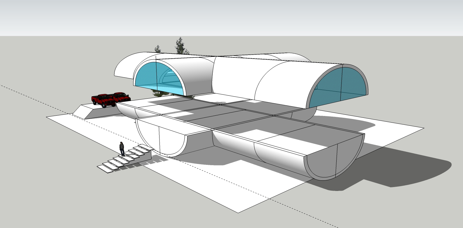
-
@bryan k said:
...the original programming team absolutely picked the right palette for everything. It is definitely one of the things I like best about SketchUp.
better it cannot be formulated - at least in this aspect SkUp is unbeatable
-
Working on the stair detail.
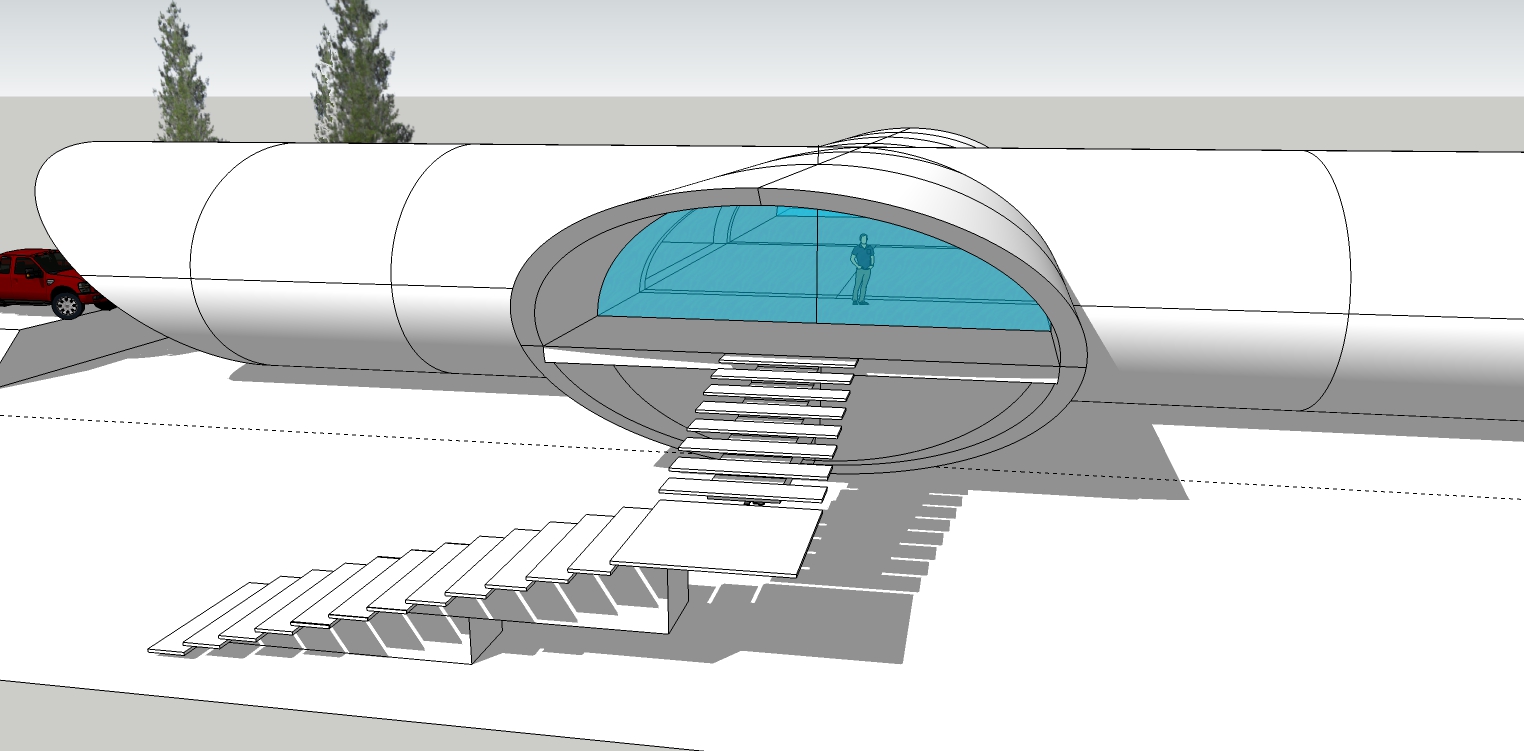
-
Working on garage detail.
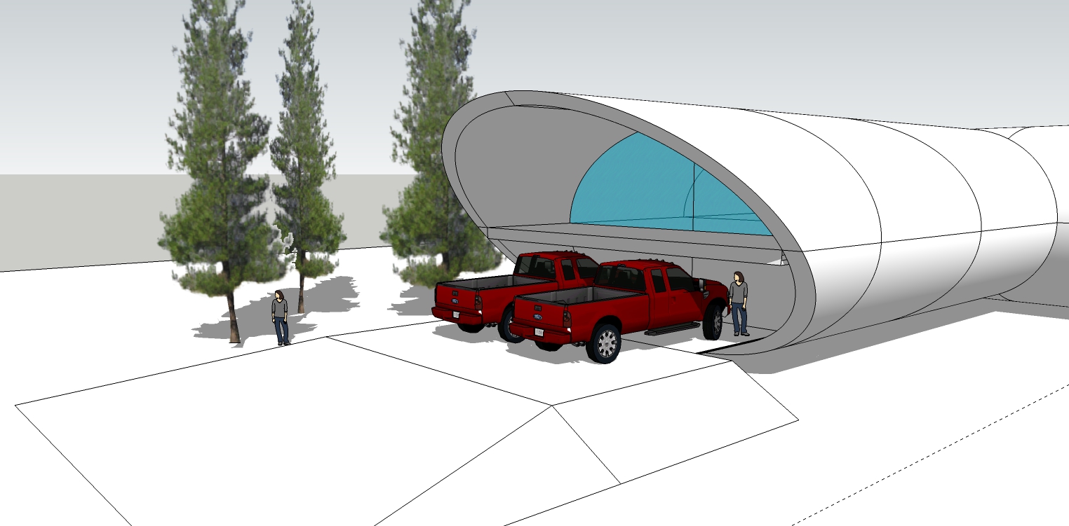
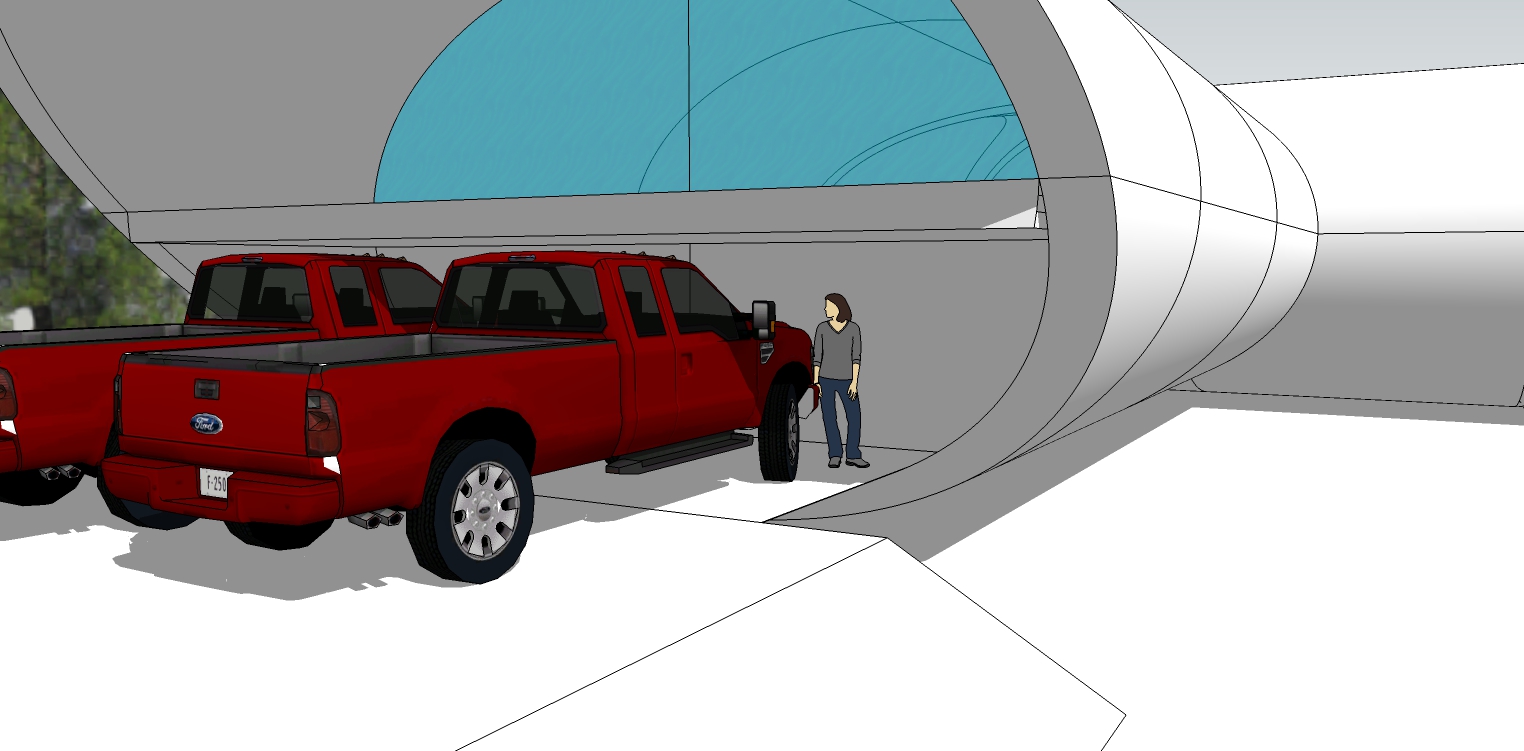
-
More stair detail.
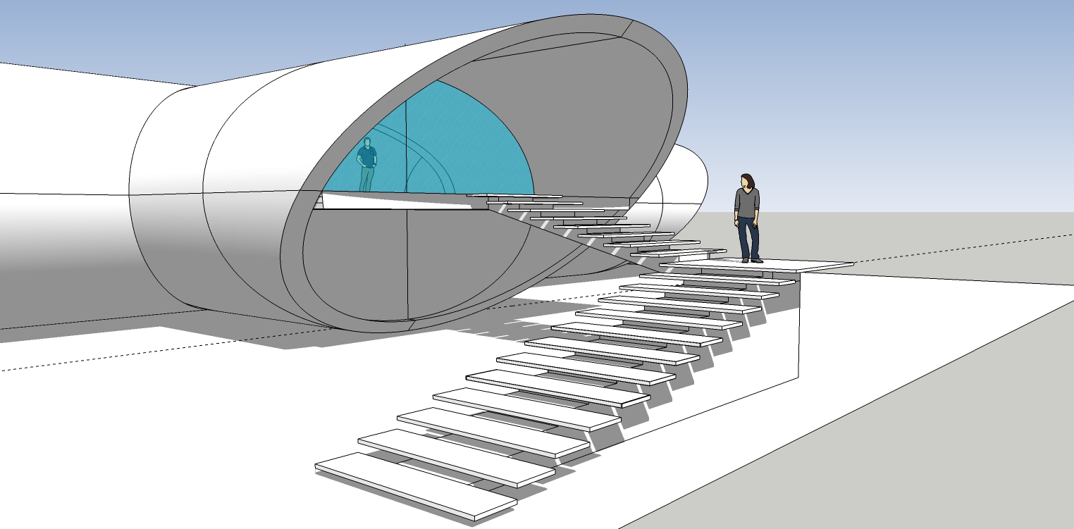
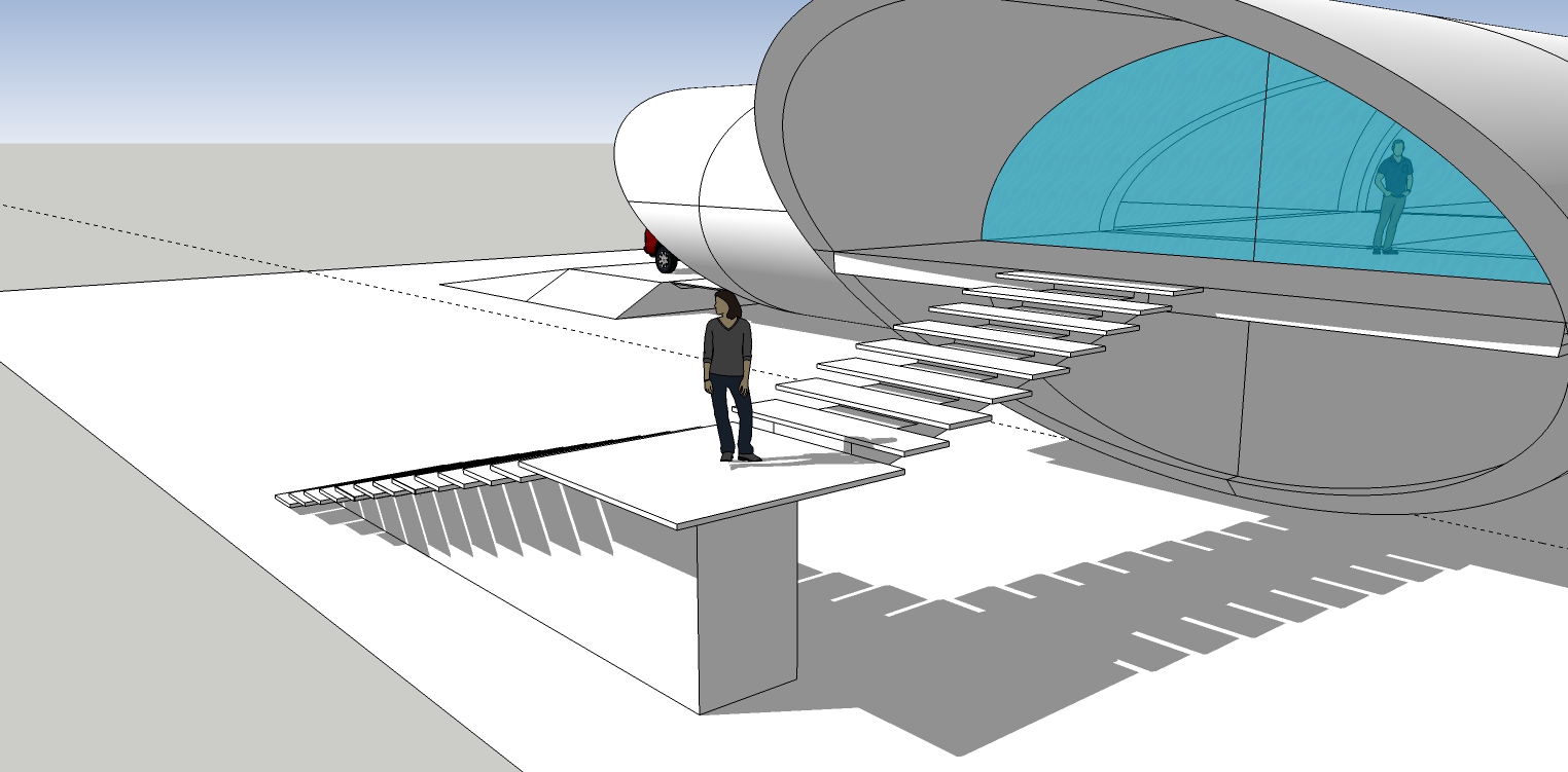
-
@hornoxx said:
completely detached from your design content topic Bryan - I always love these "simple" native SkUp graphics! There never is a single reason to press any render button!
Always tempting to hit the Render button - just because you have one! Agree there is a lot of SU to be explored and utilised 'just out of the box'.
Project looking good, especially with the bigger size and two levels.
-
Thanks shawb.
-
Seems very Stanley Tigerman-ish. Make sure that the pick-ups dont have campers on the back. Low clearance doors.

-
@david_h said:
Seems very Stanley Tigerman-ish. Make sure that the pick-ups dont have campers on the back. Low clearance doors.


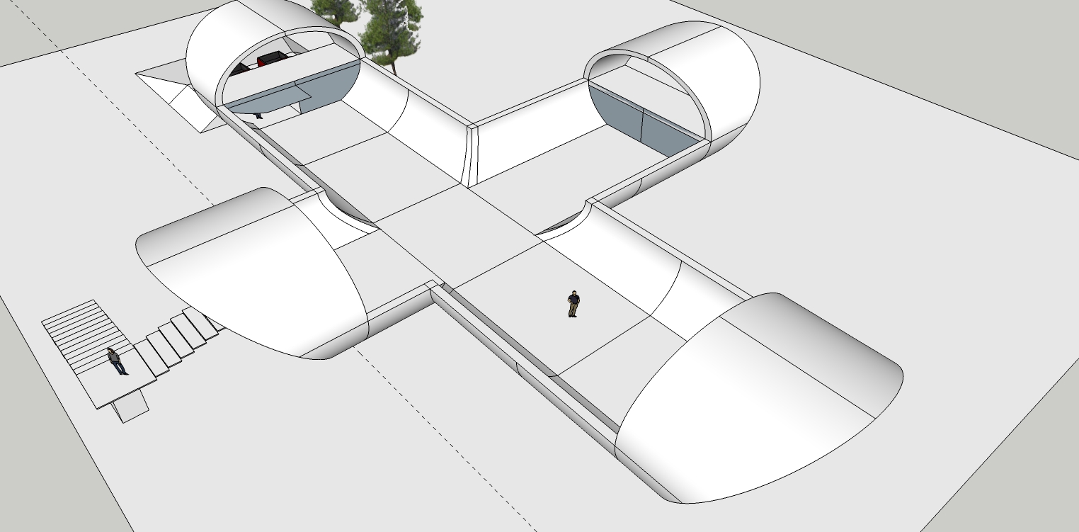
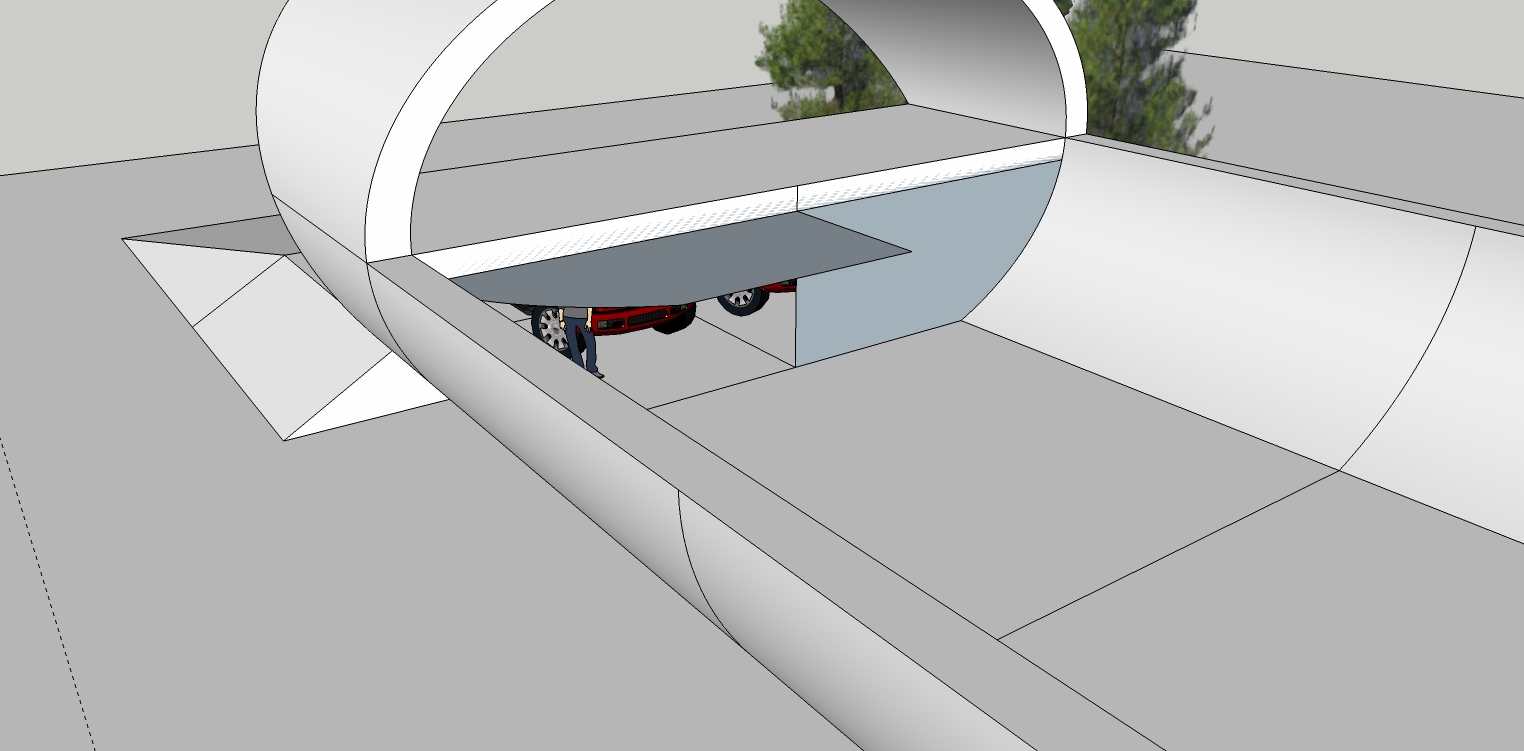
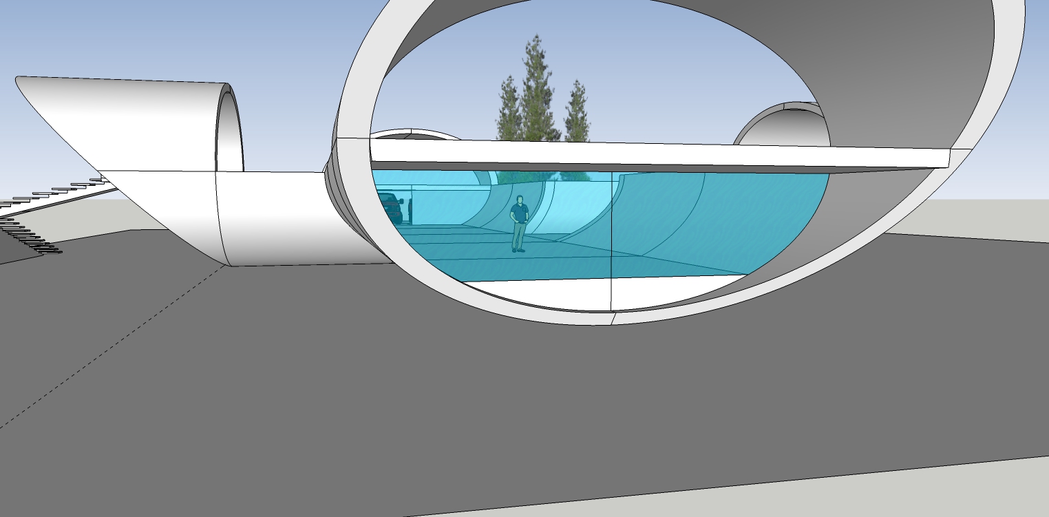
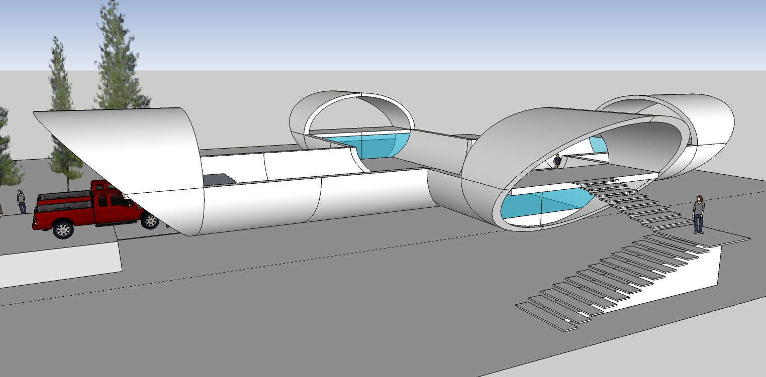
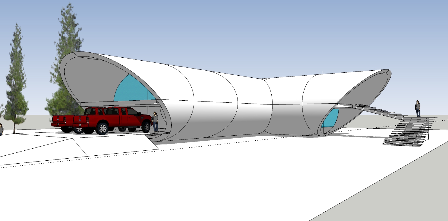
Updates.
-
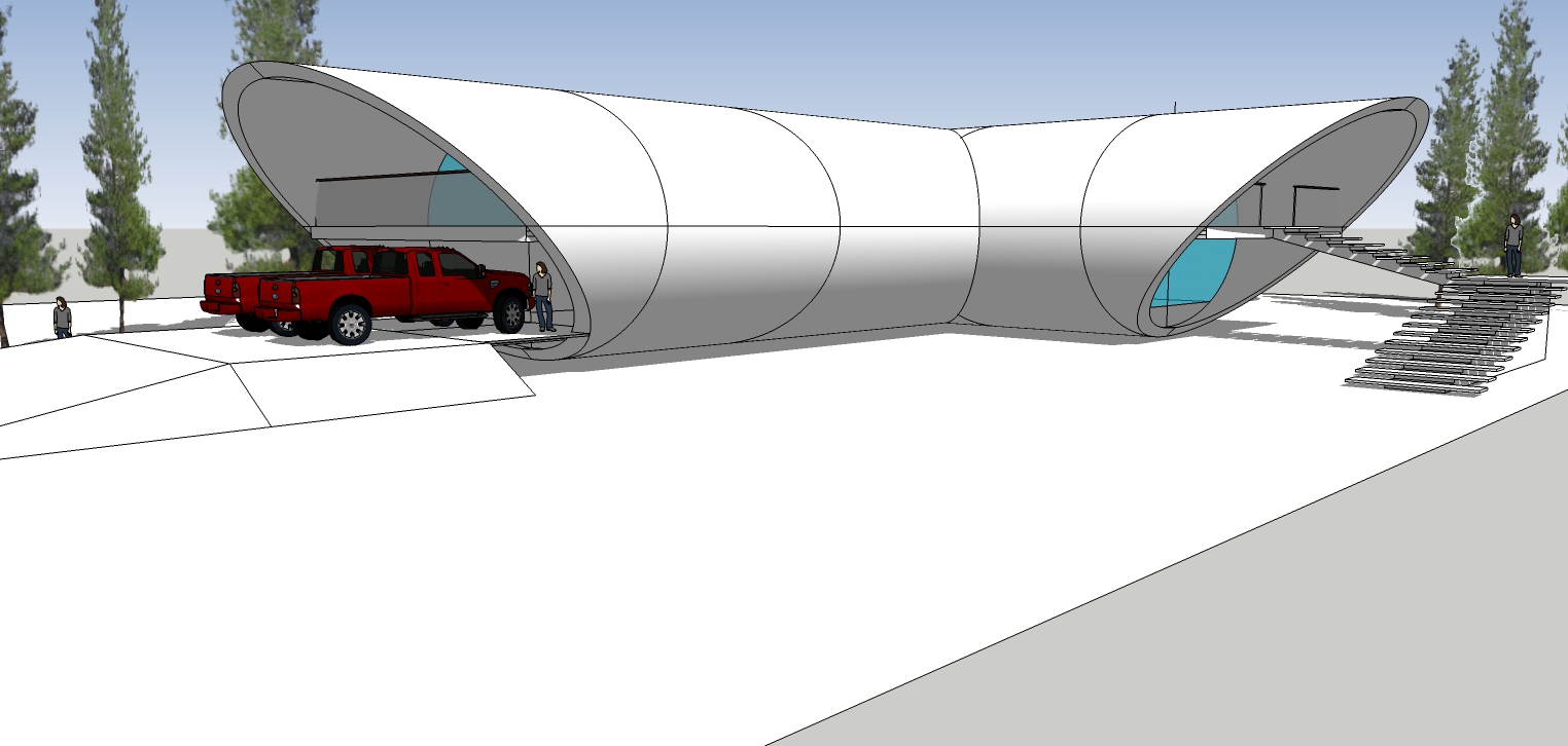
Last update for now.
Hello! It looks like you're interested in this conversation, but you don't have an account yet.
Getting fed up of having to scroll through the same posts each visit? When you register for an account, you'll always come back to exactly where you were before, and choose to be notified of new replies (either via email, or push notification). You'll also be able to save bookmarks and upvote posts to show your appreciation to other community members.
With your input, this post could be even better 💗
Register LoginAdvertisement


