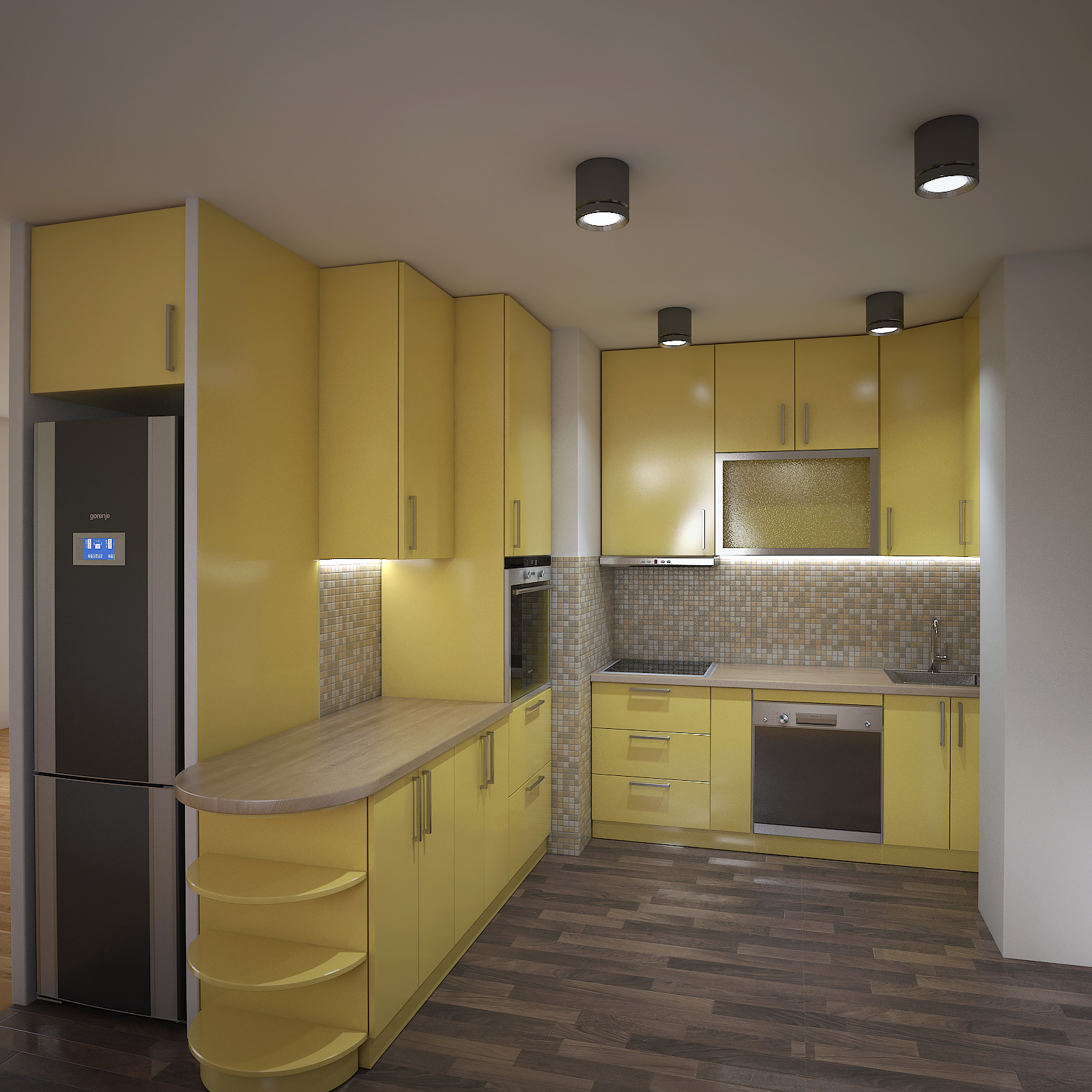
My first Kitchen rendering
-
Hello good people,
This is my first post on this forum, although I visit it regularly.
Browsing this forum I learned a lot of useful things related to SketchUp, there are many experts here!
So, I would ask you to evaluate my work and give advice on how to improve my renders.
I did renders of a kitchen, modeled in SketchUp and rendered with Vray. There are no accessories, so it looks empty, but the important thing here is lighting and materials.
And yes, the design of the kitchen is not my idea, it was done strictly by the idea of the client.Thanks

-
That frosted glass looks great and the render is nice too.
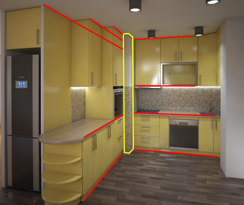
Only thing I could critique is the camera position...

The 2pt perspective and the camera direction makes you look at the corner.
This is a great video about composition....
-
Thanks for the review, your critique is very useful, I can learn a lot from this video.
Jovan K.
-
Overall a good first render. Better than my first attempts!
Excellent video Rich! I need to use those techniques as well.
-
There seems to be an unwritten rule that everyone does at least one kitchen.
I think your rendering looks great, my one critique would be that it needs some life; add some stuff to the counters, make it look like someone lives there. Also, it looks like the upper cabinets on the back wall will hit the ceiling lights when they are opened (particularly the one over the cook top).
-
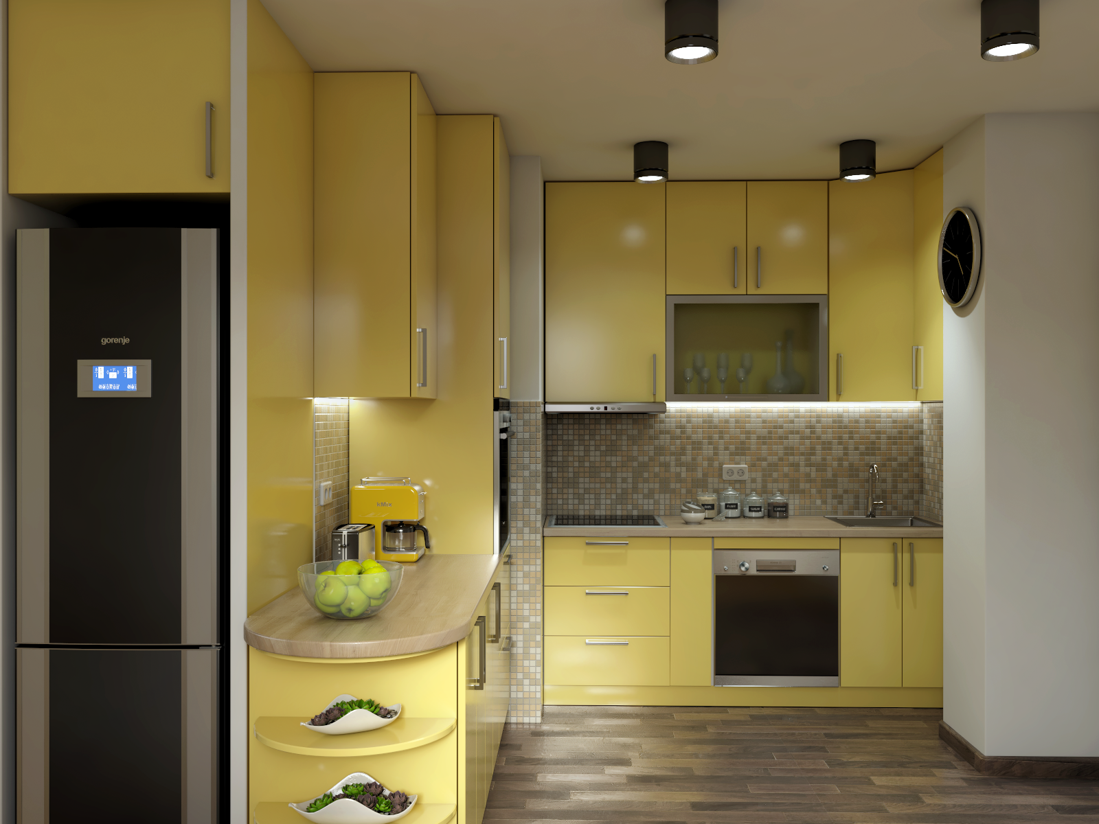
I have finally found some time to work on this project, and this is the result. Thank you all for useful suggestion. Hope you like the new one...


-
Wow! That looks great!
-
Looks great, Jova the King. Those granny smith apples look good enough to throw at my nephew!
-
@bryan k said:
Overall a good first render. Better than my first attempts!...

 and twice much better than mine Bryan

@jova_the_king said:
...Hope you like the new one...
 ...
...Yes! and welcome and good job
 - go on and keep posting!
 -
Very nice job. Light looks great!
Hello! It looks like you're interested in this conversation, but you don't have an account yet.
Getting fed up of having to scroll through the same posts each visit? When you register for an account, you'll always come back to exactly where you were before, and choose to be notified of new replies (either via email, or push notification). You'll also be able to save bookmarks and upvote posts to show your appreciation to other community members.
With your input, this post could be even better 💗
Register LoginAdvertisement


