SketchUp 2017 Wishlist
-
@kaas said:
@baz said:
I am really not getting on with the new trays in 16, I would like the option to revert to the 15 version.
- 100
Thank Kaas, from us here in the wilderness. I thought that the simple dialog box interface in SU15 was so easy, Especially liked that I could stick em all together and click on the ones I needed at the time.
Software designers have to justify their bucks I s'pose.
My bottom line advice is; If it ain't broke, don't fix it, please. (Or,another way of saying it: Don't add 'features' for the sake of it, please.
Me personally, I would prefer if SU stayed just as it is. My workflow can handle 'clipping' and 'UV' mapping and all the other 'things'.
My main ask would be more integration with LO. With similar, if not exact, commands.
-
I'm sorry, but I personally am VERY fond of the new trays and really didn't like the old ones at all.
I agree though that the old ones should be an option instead of being discarded altogether.
For people who don't like having the trays on top of drawings all time, wich is most of us the only chance the new trays give us are:
- stick them to the viewport borders, wich is what I love about them, but that spends a part of total screen real estate;
- autohide, wich isn't practical as the info keeps vanishing;
- or to keep closing them with mouse and openning them with menu/shortcuts wich is really not that practical.
So even if I personally love them, I must agree with criticism...
-
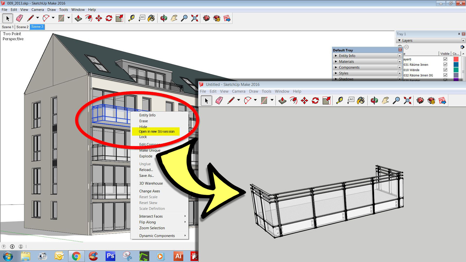
Context Menu Option: Open Selection in new SU-Session
Hi All
the larger and more complex a model will be, the more I prefer to edit details in a new separate SU-Session.
This option I would like to have as a right click Context Menu Option.just dreaming

imagine - if there even would be a provy-intelligence between that edited file-detail and the origin selection, that would be fantastic...

-
You mean like this:

-
Well, nice many/most people like the new trays. I prefer the old one that was sticky, auto-sizing etc.
Maybe I could have liked the new trays IF:
- you could customize/disable the auto-hide for the docked trays AND/OR
- a toggle was an actual toggle: close the rest and open the corresponding tray - and keep it open!
- if these options were available in Ruby that would be fine as well. That way, people could code the trays to their needs.
-
I already mentioned this, but SketchUp is ideal for VR modeling. Something like this: http://www.dezeen.com/2016/05/25/virtual-reality-designing-architects-vrtisan-unreal-engine-htc-vive/?utm_medium=email%26amp;utm_campaign=Dezeen%20Mail%20307%26amp;utm_content=Dezeen%20Mail%20307+Version+A+CID_c0ee56bd7293591ff8b237110ded3ae4%26amp;utm_source=Dezeen%20Mail%26amp;utm_term=Read%20the%20story%20and%20comments
-
I really would like to see full 64bit support so that model can be viewed in SketchUp the same way they can in some external programs like Lumion and LumentRt (among many others). A lot of my models lag (go into wireframe mode) when orbiting. This does not happen in those other programs.
-
@hornoxx said:
Context Menu Option: Open Selection in new SU-Session
Hi All
the larger and more complex a model will be, the more I prefer to edit details in a new separate SU-Session.
This option I would like to have as a right click Context Menu Option.just dreaming

imagine - if there even would be a provy-intelligence between that edited file-detail and the origin selection, that would be fantastic...along with this. . .and I have been asking for something along these lines since version 3>> as one edits a nested component you could "hide rest of model" but still be able to control the visibility of the group in the nest above and be able to do this all the way to the root of the tree, but still hide rest of model. Is this even possible? Plugin???
That would just make my day.
-
@tuna1957 said:
One more thing for us mac users, how about a real functional material editor on par with what the windows guys get ? not going to hold my breath.......
This would be a huge help. For rendering we really need a more sophisticated materials window. Something that can be organized and always shows the names (not with a slooooow hover), sorting Alphanumerical at least (though it seems the SketchUp developers hate alphanumerical). Key + hover on a face and highlight the material in the window (yes I know a bout the eyedropper). Pick a material and highlight the faces that have it. Also the highlight is so dim on the Mac as it is, one has to search for the selected material. Materials are a big deal. Help us out here, folks.
-
@ntxdave said:
I really would like to see full 64bit support so that model can be viewed in SketchUp the same way they can in some external programs like Lumion and LumentRt (among many others). A lot of my models lag (go into wireframe mode) when orbiting. This does not happen in those other programs.
Which part isn't 64bit? Anyway that's a long-standing discussion with one side claiming it would do nothing to speed up SketchUp. I would say: since the change to 64 bit there was an improvement, whatever the cause, but nothing of that magnitude.
-
@jql said:
You mean like this
Hi JQL - thanks for your GIF and yes, exactly like this!
I am ashamed a little - I still do not understand what you are doing and how you do this
does my desired feature already exist ? -
Someone needs to improve 3D warehouse. Add some rating to the models or something. Endless scrolling in search for a good model isn't how I like to spend my day. Also, I would like to see a section on it where we could sell our good stuff.
-
@hornoxx said:
@jql said:
You mean like this
Hi JQL - thanks for your GIF and yes, exactly like this!
I am ashamed a little - I still do not understand what you are doing and how you do this
does my desired feature already exist ?It not only exists:

SketchUp Plugins | PluginStore | SketchUcation
SketchUp Plugin and Extension Store by SketchUcation provides free downloads of hundreds of SketchUp extensions and plugins
(sketchucation.com)
As I've seen you posting in the thread where it was initially posted:
http://sketchucation.com/forums/viewtopic.php?f=323%26amp;t=63488#p581479
So it's a bit strange you missed it!

-
@kimi kimi said:
Someone needs to improve 3D warehouse. Add some rating to the models or something. Endless scrolling in search for a good model isn't how I like to spend my day. Also, I would like to see a section on it where we could sell our good stuff.
Sell it here!

Shop | SketchUcation
3D SketchUp Community for Design and Engineering Professionals.
(sketchucation.com)
-
@david_h said:
as one edits a nested component you could "hide rest of model" but still be able to control the visibility of the group in the nest above and be able to do this all the way to the root of the tree, but still hide rest of model. Is this even possible? Plugin???
That would just make my day.
That would be killer!
I would love to hide/show components hierarchy above and below. I believe something like a breadcrumb toolbar for visibility was talked about before.
-
@jql said:
So it's a bit strange you missed it!

thanks JQL for bringing order in my huddle - both, in my brain and in my plugins!!

Your amazement is entitled - this particular plugin was completely gone from my memory...
-
Well it's one of those plugins that is crucial when you need it but you don't need it in every project.
-
Hi,
It would be convenient if you could hit the "esc" key to close a dialog menus rather than needing to click "ok".
Thanks,
John
-
hey guys - any rumors out there what su 17 is bringing to us?
-
I would love to not have to deal with trays. I avoid using 2016 altogether because I hate dealing with the wack-a-mole trays. It seems like an a third appendix - why did we need this?! How has it improved the program?! I don't get it at all...I can't get used to using this feature - it's a PITA. I hate the Trays. It should be an added optional feature - not a fundamental change to the program.
Advertisement


