Suggestions for higher quality and more realistic render
-
Hi to everybody!
I would like to do a sort of work in progress to get my render more realistic.
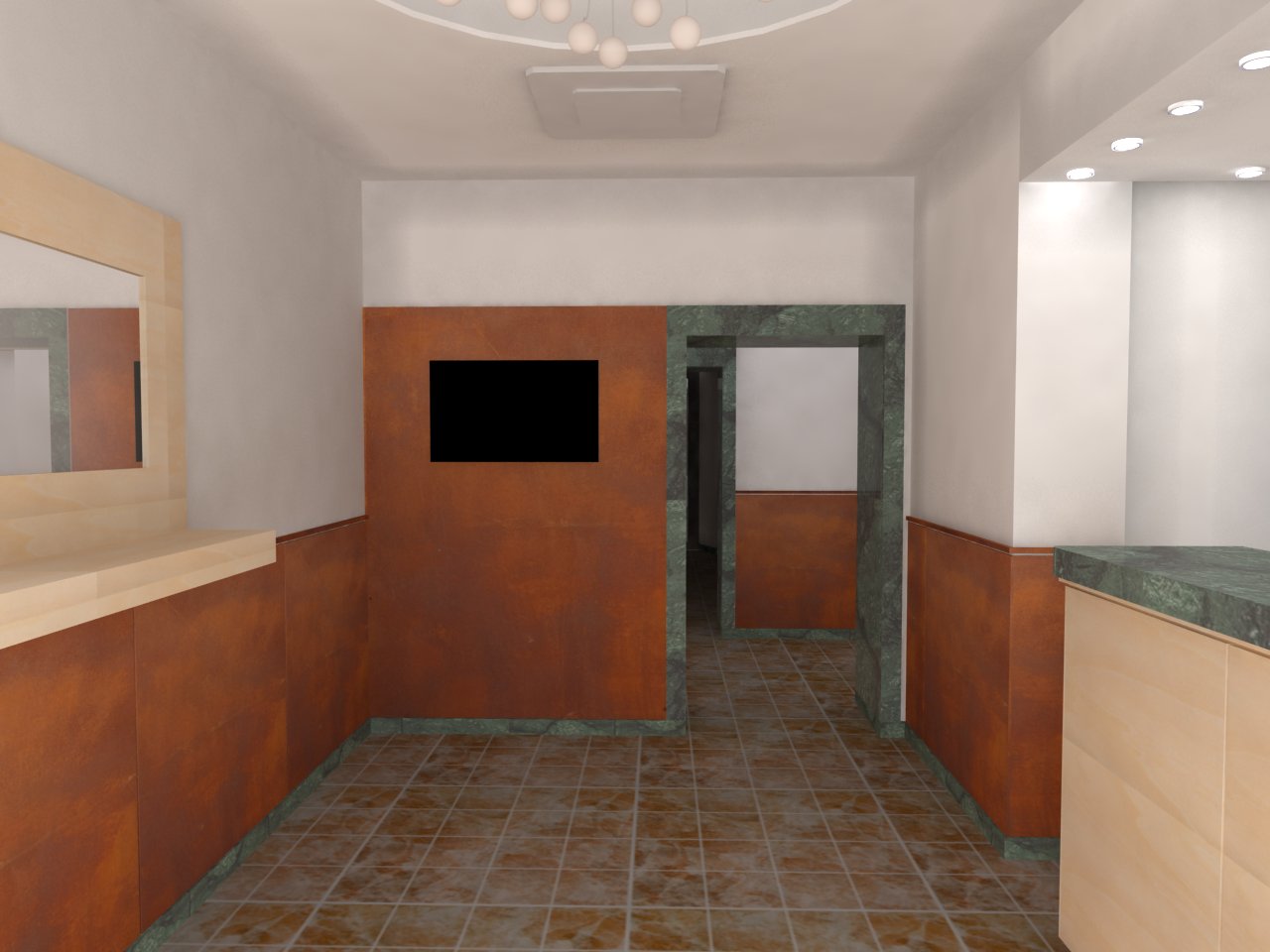
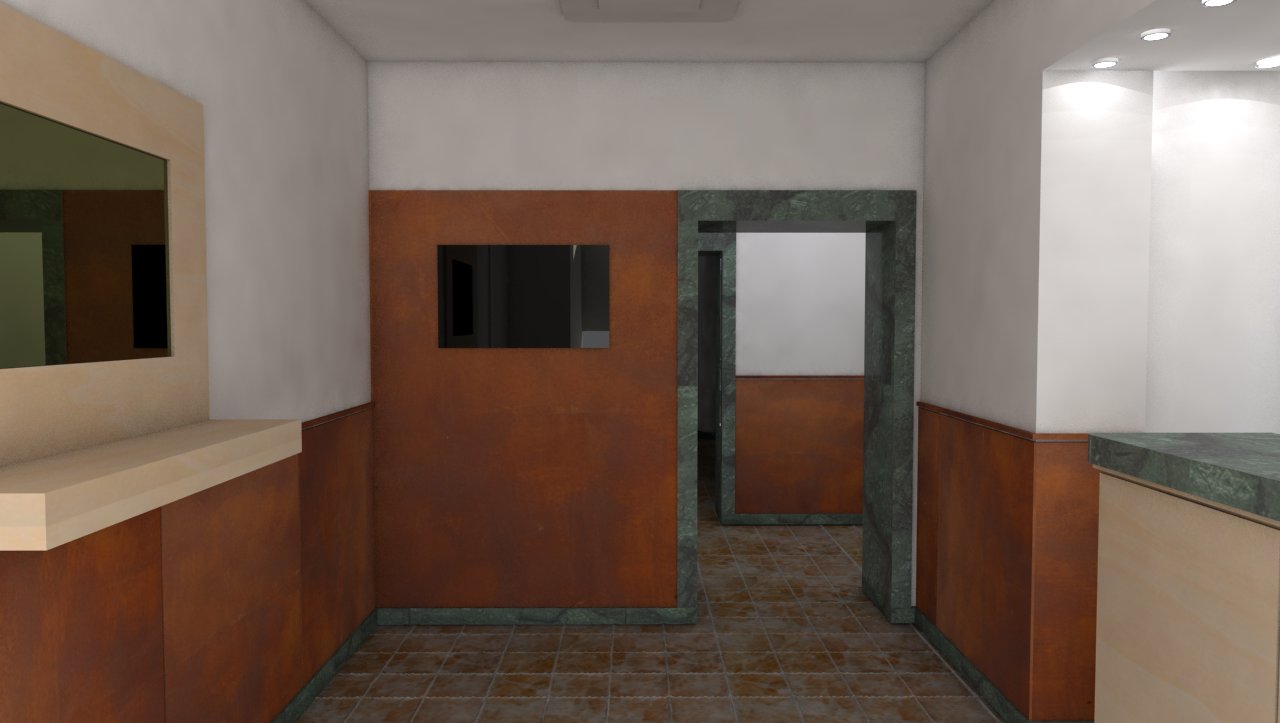
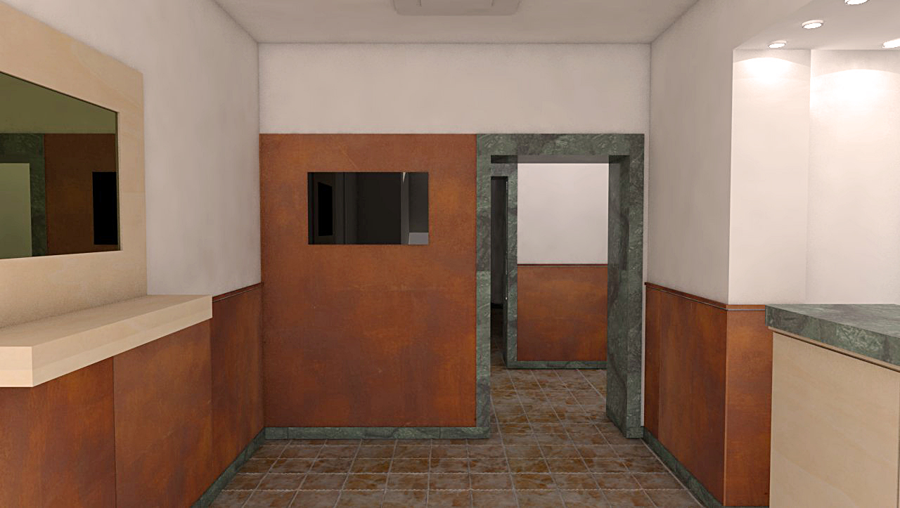
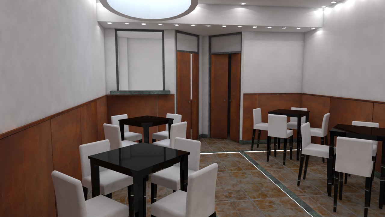
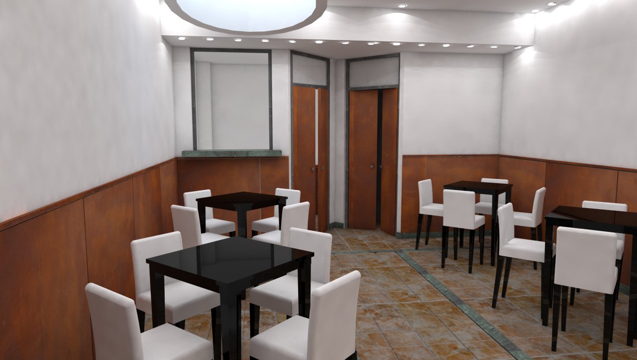
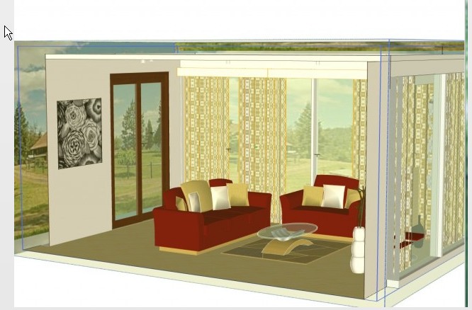
Those are 3 images of the breakfast room and the reception of a little hotel; made with Vray engine on SU. Materials were chosen by the owner, the floor is terrible but they don't want to change it.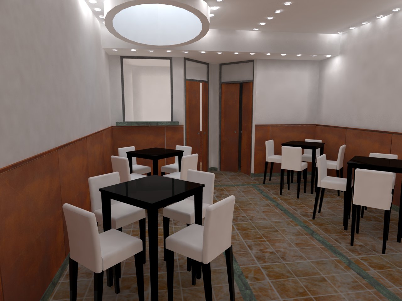
breakfast room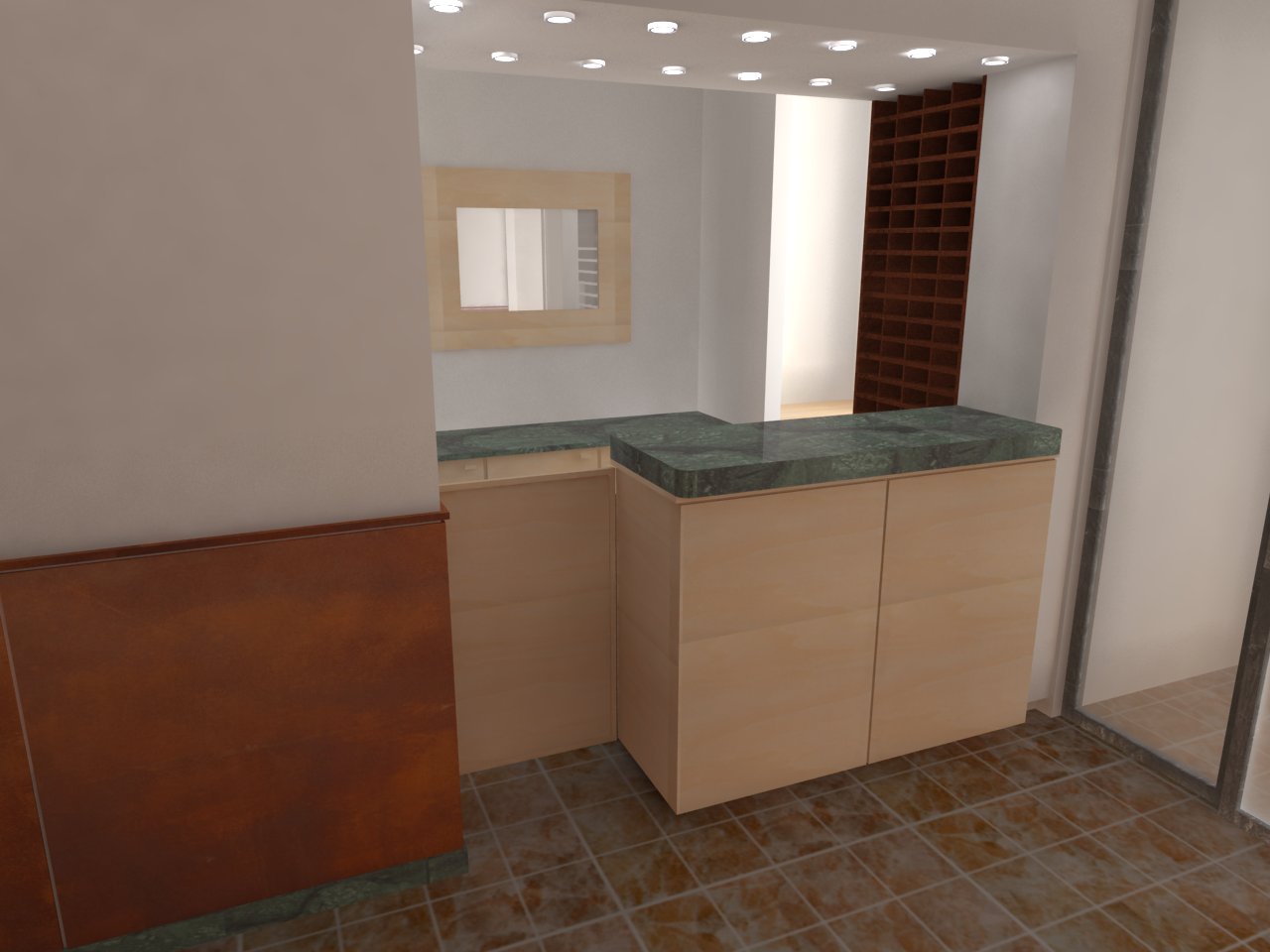
reception 1
reception 2suggestions gor higher quality and more relism?
Thanks to all
-
Try some filters on it, by exporting render to photoshop
bring material back and use a transpantcy to existing model material
and render again. -
suggestions for higher quality when you print
-
use a picture for texture
-
use a enlarger to get more pic
http://graphicssoft.about.com/cs/resolution/a/increasingres.htm
-
-
some example
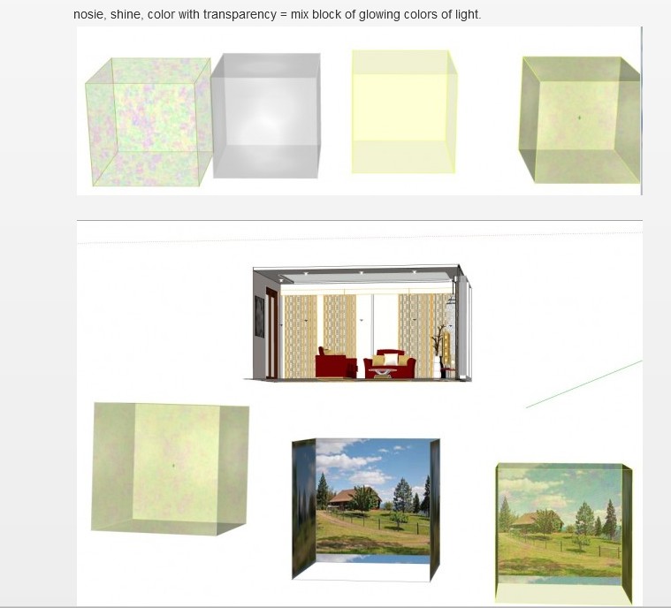
bring back air space material and Then using a transpantcy to overlay existing model materialby dukejazz » July 31st, 2012, 11:56 pm
No rendering, everything is done in sketchup.
Quick work adding color to objects in your modelThis here is low res but the process can be done in high res too.
then render. -
Hi,
First of all good job! You have asked for CC so few things that I noticed:- Geometry - some things should be more round, and in general most of your edges are sharp, in nature it is very uncommon
- textures - Your textures are flat, ude bump maps where necesarry, and sometimes reflection, it don't have to be 100% reflexive and very sharp. Also notice how tiling and seams are apparent in Your render ( esspecially wood and sandstone (?) near mirror. The rusty tiles (?) on the lower part of wall are repeating - try to make them uniqe.
- Lighting - well it is a mater of taste, but it also looks quite flat, You have almost no shadows.
- Render settings - I don't know if it is ambient occlussion that makes a strange pattern near the edges , or something else.
See attached pictures and keep them coming!


Matt
-
thanks to both of you!
to dukejazz: the result of your example is great, but probably my english is not so good to understand how you did or probably my know how about SUP Vray is not so good..
Yes, when I can I use picture for texture, wood-panel and iron-corten panel are taken from picture.
About photoshop, you suggest to apply a transparency filter to the material before rendering?
thank you!to Mattc: wow! It seems to have a personal tutor!Thanks for compliments, but everything you wrote is right
please, maybe I misunderstood some of your words on the pictures, be patient.-geometry- I will try to correct with photoshop beacause in SU the chair seems round-curved
-make it more round(about the cirle on theroof)-you're right, but in SU it's a circle extruded, i don't know how to get it better. I will try
-textures_ are flat, it's true (and should try to use bump and displacement, i'm going to study) but all those are panels and they should be flat, or not? Tiling..yes, ok i'm changing it. The lowe part of the wall are corten-iron panels, they must repeat, but it's true, they sounds bad.
-lighting.. yes, no shadows,why? Maybe because there are too much lights?
-No, it's not ambient occlusion, is TEXTDIRT. I tried to use it to give more power to corners, but matbe is better to remove it.
-color for the mirror ok.
Thank you guys. After dinner I will try to get some changes and i'll post the new picture
See you -
@decumano said:
maybe I misunderstood some of your words on the pictures, be patient.
Well english is also not mine native language, and handwriting didn't help, but it was the fastest way to express my thoughts.
@decumano said:
-geometry- I will try to correct with photoshop beacause in SU the chair seems round-curved
It is not exactly what I ment - chair can be round, but at the back of the chair you have one sharp edge, and also where the seat meets wyth the backrest, You can see the shape of t he chair and there it is like cut with the nife.
@decumano said:
-make it more round(about the cirle on theroof)-you're right, but in SU it's a circle extruded, i don't know how to get it better. I will try
I am afraid that the best option is to re-do it .You can try smothing it.
@decumano said:
-textures_ are flat, it's true (and should try to use bump and displacement, i'm going to study) but all those are panels and they should be flat, or not? Tiling..yes, ok i'm changing it. The lowe part of the wall are corten-iron panels, they must repeat, but it's true, they sounds bad.
They can be flat , but usually you will se a crese where they join. The same goes for the floor tiles, usualy the part between them is a bit lower, and sometimes ther is a big difference in refelctions, (tiles reflects preety good , the concrete between not) Corten-Iron, it seems that every panel looks the smae, maybe try to rotate one panel 90 degrees clockwise, it will break repetition.
@decumano said:
-lighting.. yes, no shadows,why? Maybe because there are too much lights?
here I cannot help, but maybe You can post a screen from Your sketchup file ?to see how the ligths are placed?
@decumano said:
-No, it's not ambient occlusion, is TEXTDIRT. I tried to use it to give more power to corners, but matbe is better to remove it.
I haven't tried textdirt, only used AO , but You dont want to overdrive the settings as it will looks unnatural.
Good luck
Matt -
First, I would recommend the investment of buying the 2 part series on VRay for SketchUp from Evermotion. In these vids, you will learn 3 keys to better renderings.
-
Modeling details. Example - practically nothing in real life has a 90 degree sharp edge on it, the way SU models. Get the round corner plugin!
-
Materials - Great renders need great materials. Learning the material editor is a core component to having great images.
-
Light - Its truly the light in the render that creates the mood. Think about what you want the render to say. Create a moment in time (to be cheesy about it).
Other notes-
Photoshop - not an option, must use it and use render channels. This is where the magic happens!
Aspect Ratio - think outside the constraints of the SU window. Use ThomThoms Vray Toys and try different proportions. 16:9 or 2.39:1 http://en.wikipedia.org/wiki/Aspect_ratio_(image)
You are creating a photography. Compose it as such. This is a great video to get your wheels turning. Watch it! Watch it now!
http://fstoppers.com/new-photography-rules-of-composition-by-scott-kelby -
-
ThomThom actually released an updated version of his V-Ray Tools Plugin this week. I highly recommend installing it. http://sketchucation.com/forums/viewtopic.php?t=15491
-
MATT: yes, of course handwriting is fast, and infact I really appreciate your help!
This is what i did:
1_chair component modified, cut effect removed.
2_Ambient Occlusion. I used and I like it! Even if I saw a tutorial where the result is a black/white image to use after in postproduction, I did not get it.
3_The glass has a brown color. I like it, without any doubt is more realistic (the TV too)
4_tiling of wood settled
5_displacement for the flat floor
6_iron-corten panels rotated!
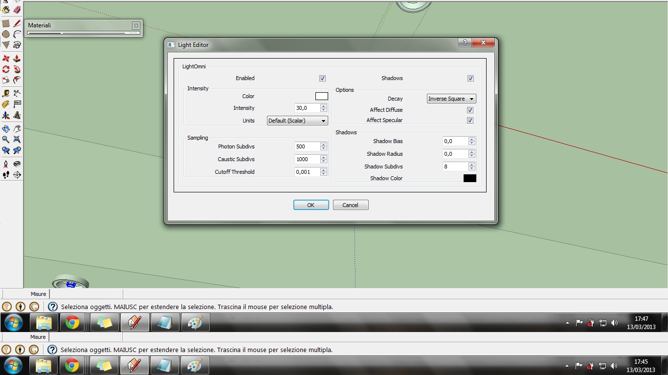
7_lighting. In this render I used only omni light, the shadows are enabled, maybe i should change the BIAS and RADIUS value? (even if, I don't know why) now there is a little shadow near the chairs (last picture in this post)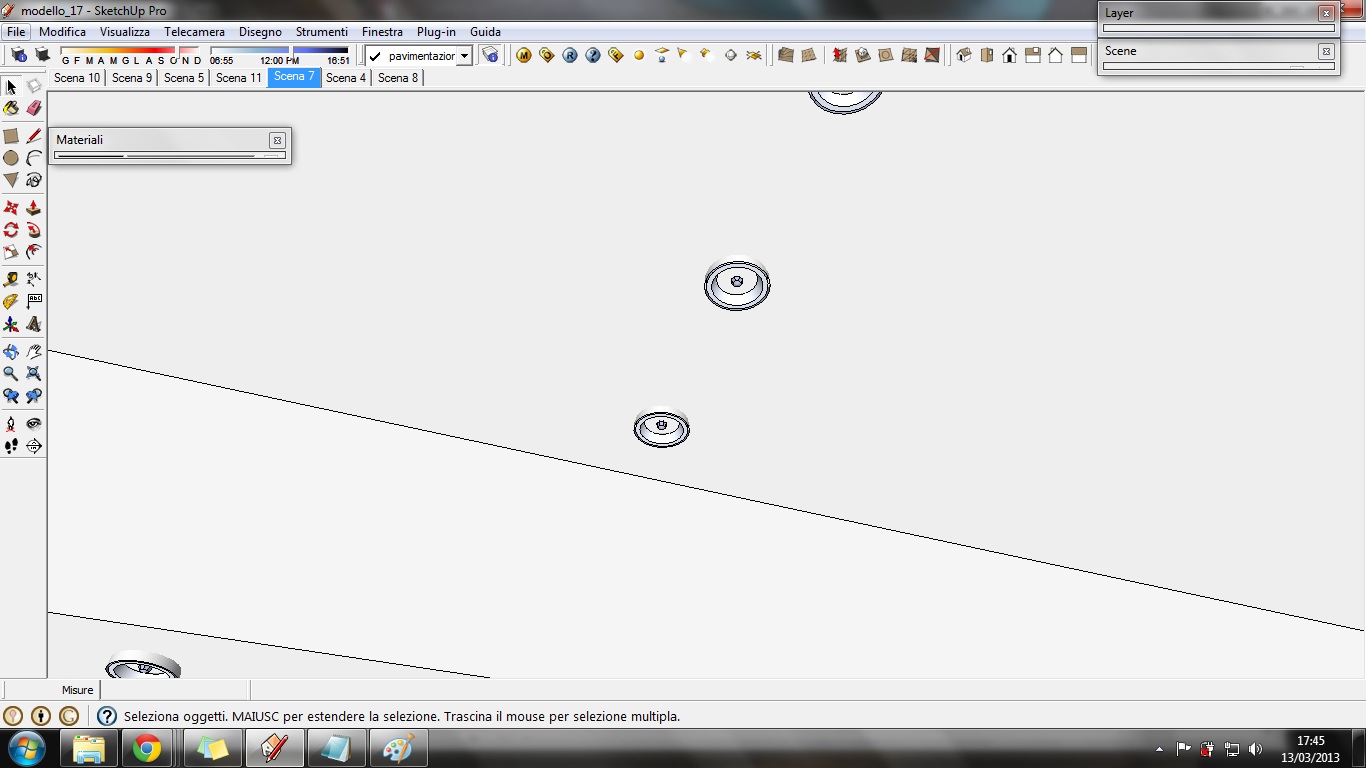
Valerostudio thanks for your suggestions
Yes, i should spend more time learning about materials and lighting
Photoshop, I agree. I used only for external render. Now I try for this interior one.
Thanks for the suggestion about proportion,now I try; and for the video, interesting.So, this is the result: after and before the cure.
The changes are good but it seems darker (i will change camera settings) and a little bit blurred/out of focus (I could resolve this problem with photoshop)
This is with 1 minute photoshop changes
This is the other one render
The cut on the floor, between the displacement(ed) texture and the other texture, how can I resolve?
What else do you suggest to me for the render and then for the post-production?
Really thanks
(trying, trying, trying, what a long work for little changes!) -
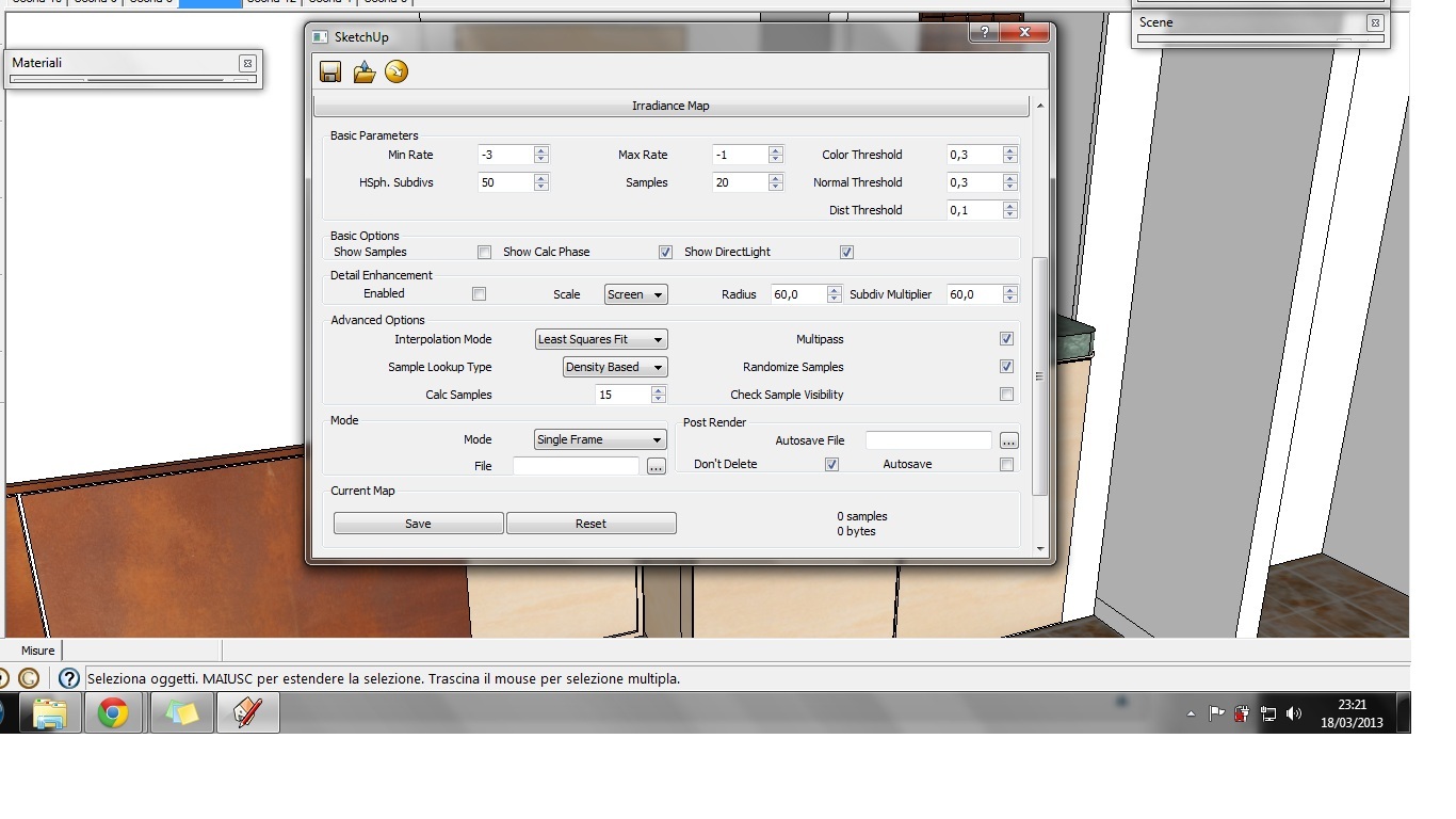
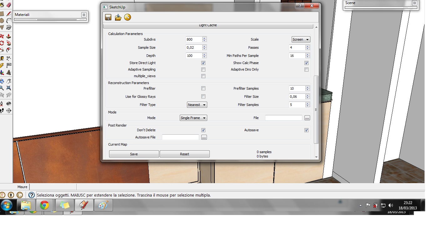
can you share some of your settings in particular those about irradiance map/light cache and also for the displaced material?
anyway i would rather avoid displacement at all, because in this case it will only cost many many memory and render time for a job that you can achieve with a simpler and faster bump..
ps. are you italian? -
Yes, of course. I never played with irradiance map and light cache values... so I don't know how I should change settings
Yes, I had problems with displacement, now i resolved:
But your suggestion about using bump map is the same suggestion I received in a post on this forum about displacement!! So, now, I'm going to use a bump map!
However, those are the last render I did (I accept all your suggestions! Even about irradiance map and light cache!)


ps. yes, italian, did you understand it by reading italian words on the images, or by reading my macaronic english??
-
obviousely the second one, i didn't even see the italian menu-text haahah..
ok quando sto un pò più libero magari ti spiego qualcosa in italiano che mi costa meno stress hahah.. comunque il muro con le "macchie" di luce dipende quasi sicuramente dai samples in irradiance map.. considera che quelle impostazioni di default vanno bene per i test ma poi ti consiglierei di alzarle per le immagini fibnali, ci mette molto di più a renderizzare, ma ne vale la pena come qualità.. occhio pure ai materiali emissivi che tendono a pisciare macchie di luce un pò ovunque.. -
Looking better! I think you have a lot of splotches in your lighting though. Are you using an emissive material somewhere? If so, do not use it for lighting! This works in other render engines but not vray (currently). There is an issue with emissive materials being used as light. Stick to Planar, omni, spot, and IES light sources. Emissive is only meant to give materials the effect of being lit. It will cause a ton of noise in your scene. As for IR and LC settings, these too will affect the splotches. Look at how these settings work here - http://www.spot3d.com/vray/help/150SP1/render_params_gi.htm
-
THANK YOU PANIXIA for making me feel a macaronic-english-speaker!...thank you so much! eheh
A parte tutto, magari mi dessi dei consigli in italiano! Quando vuoi, ogni consiglio è ben accetto!
Quindi mi dici di cambiare i samples, lo farò, a quanto?30-40?. Cos'altro da cambiare?For VALEROSTUDIO
Yes, a lot of splotches, but I never used emissive material! Panixia suggessts it's a "simples value" problem. I'll try to change.
Thank you for the link, really useful!
-
maybe also more than 30-40 as far as i can see the proper value changes at each renders depending of the lighting conditions.. i suspect that in your case you should raise it a lot because you have a lot of splotches.. keep testing and read soemething about the vray engine.. the link posted by valero is a very good start, look further in that site, it refers to vray for 3dsmax but it works quite the same in vray for sketchup..
Hello! It looks like you're interested in this conversation, but you don't have an account yet.
Getting fed up of having to scroll through the same posts each visit? When you register for an account, you'll always come back to exactly where you were before, and choose to be notified of new replies (either via email, or push notification). You'll also be able to save bookmarks and upvote posts to show your appreciation to other community members.
With your input, this post could be even better 💗
Register Login


Advertisement