Constructive Rendering Criticism
-
why not, you do have vray after all. a very good renderer, albeit the learning curve is a bit steep. but once u got the basics, it's easier and less "messy" than post pro IMO.
-
Here are some thoughts:
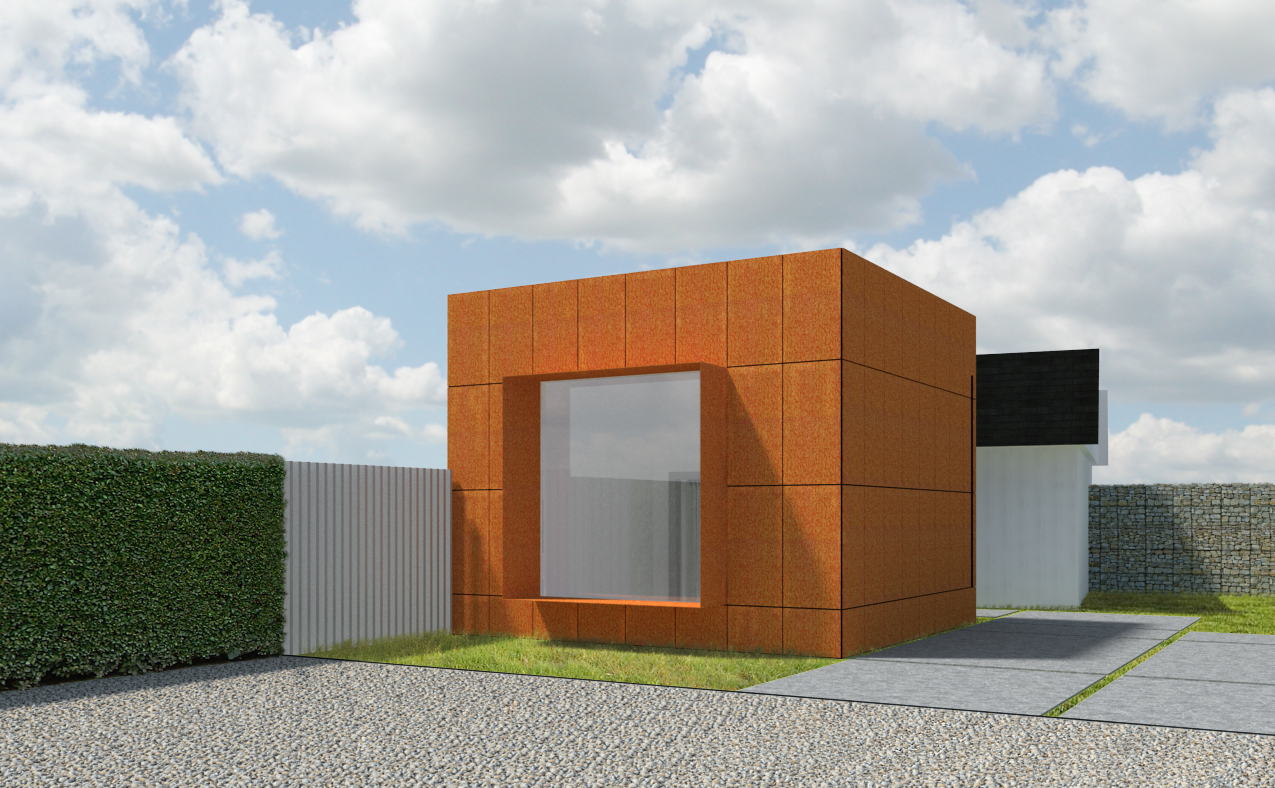
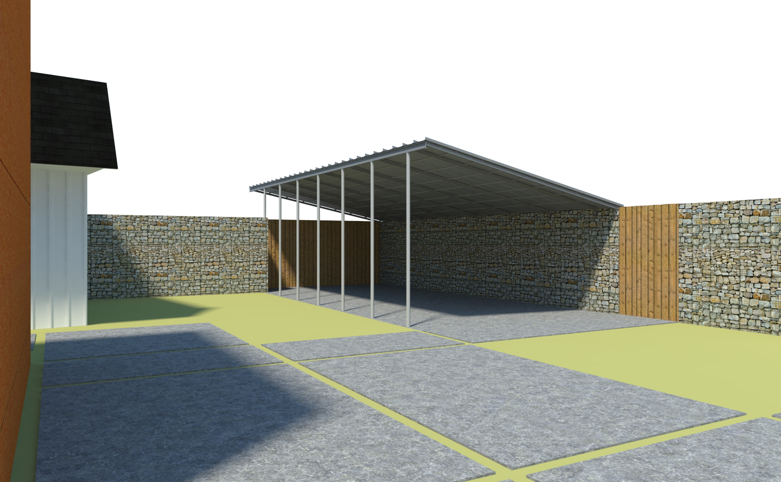
- The grass looks very flat. If you are adding detail in post-pro, try painting in some grass in ey places to make it stand out in front of objects. In other words, grass is not flat on top, but anywhere there is an object behind the grass, the top of the grass is flat, but it should be spikey.
- I can't tell what the white face is. I'm guessing its a wall. You might consider using a less-white white, and put a bump texture on it of some sort. Unless you really were going for a very flat bright white.
- I don't love the 80% transparent trees. They feel flat as well, and not very vibrant. I'm a landscape guy though, so I like to see the trees happy. But I also fade mine back form time to time when necessary.
- The tree shadow on the ground is very hard. I'm guessing you added it in post-pro. Try applying a gaussian blur filter to it. If you want to get fancy, make it more blurry the further away from the trunk it gets.
- Is that corrugated metal on the left? If so, it feels like it could be more reflective. I would guess the bright rust color maybe should influence the color of that wall.
- Back to grass - little tufts of grass coming up through the pavers might be nice.
- The grass in front of the rust building looks like it has a grey edge in front of it. Not sure if that is a metal header/divider, or something. But I'd rather see it be a dark green I think.
- The foreground is very bright. Consider darkening a bit, and there should be a gradient across it. Make it lightly darker near other objects, like the grass and pavers.
- The reflection on the window does not feel realistic. Seems to be too black and white. I would imaging it should have more color to it, especially in the sky.
- The model might need more detail in it. That box is very boxy.
- I think the sky is nice and pleasant, and the general ambient color of the model rendering works well with the sky image you used. Thats good.
 well, there you go. Hopefully that is helpful. good luck!
Chris
-
Thanks for all your comments! I'm still pretty new to the world of rendering so every bit of advice is appreciated.
-
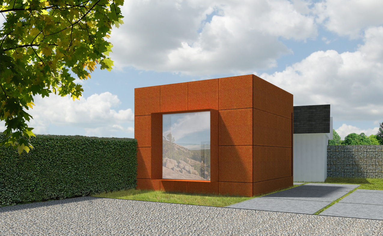
The tree shadow is moving in a different direction than the cube shadow. The sun is 93 million miles away so rays from teh sun should be virtually parallel. This leads me that you have inserted a light in the scene rather than using "set sun as light source."
-
The gray window is very confusing. Is it a window? If I am looking through it, I should see some hint of what is in teh building, not what seems to be a Southwestern scene. If it is a reflection from the outside, It should show elements of the courtyard. And, in any case, the scene would have some color in it, it would never be neutral gray.
Also, the top of the white fence is spikey, but its shadow is not spikey.
The white building in the background does not read properly. The end of the building is shown side on as a straight line. That should not happen if the white building is parallel to the red one. And even if that was a true perspective, you should move the camera as the result of that angle is visually ambiguous.
-
@roger said:
The tree shadow is moving in a different direction than the cube shadow. The sun is 93 million miles away so rays from teh sun should be virtually parallel. This leads me that you have inserted a light in the scene rather than using "set sun as light source."
The tree shadow was actually added in post pro in Photoshop. I didn't even catch that I hadn't matched shadow angles correctly

-
@roger said:
The gray window is very confusing. Is it a window? If I am looking through it, I should see some hint of what is in teh building, not what seems to be a Southwestern scene. If it is a reflection from the outside, It should show elements of the courtyard. And, in any case, the scene would have some color in it, it would never be neutral gray.
Also, the top of the white fence is spikey, but its shadow is not spikey.
The white building in the background does not read properly. The end of the building is shown side on as a straight line. That should not happen if the white building is parallel to the red one. And even if that was a true perspective, you should move the camera as the result of that angle is visually ambiguous.
The purpose of the image on the window was to reflect the projector that will be installed inside the steel box which will show images on the window.
Copy that on the white building. It actually isn't parallel to the rust building which is why it looks awkward. I will have to address that problem I guess.
Thanks for your crits.
-
I will keep my comments to the image itself and not the technical and texture stuff because that seems to have been covered already. In creating a successful image you must think about your composition. Firstly, the proportion of your image. It seems that you are just using whatever size comes out of SU. Take advantage of the crop tool. Use a proportion that works for the image, something more horizontal like 1:1.618 (golden mean) and think about how that image lays out using the rule of thirds. Place foreground trees in a way that they peek out from the corners of the image and cast a shadow in front of you and not back towards you. Unless a client wants to specifically see the exact shadows I almost always cheat them so I can get the best looking lighting and not neccessarily the correct condition. Your shadows are part of our composition, think about them carefully. Here are some great articles on compositioning http://photoinf.com/Golden_Mean/. This is the absolute #1 thing to learn before texturing and lighting when it comes to rendering. You are afterall taking a virtual photograph.
-
@jm2 said:
@roger said:
The gray window is very confusing. Is it a window? If I am looking through it, I should see some hint of what is in teh building, not what seems to be a Southwestern scene. If it is a reflection from the outside, It should show elements of the courtyard. And, in any case, the scene would have some color in it, it would never be neutral gray.
Also, the top of the white fence is spikey, but its shadow is not spikey.
The white building in the background does not read properly. The end of the building is shown side on as a straight line. That should not happen if the white building is parallel to the red one. And even if that was a true perspective, you should move the camera as the result of that angle is visually ambiguous.
The purpose of the image on the window was to reflect the projector that will be installed inside the steel box which will show images on the window.
Copy that on the white building. It actually isn't parallel to the rust building which is why it looks awkward. I will have to address that problem I guess.
Thanks for your crits.
If the image is being projected outward you would see a shadow on the screen from the protruding shade. The part of the image in the shade would would show at close to full value and the projected image in the sun struck part of the screen would be faded or even impossible to see. The person on the screen is a visually ambiguous. Maybe he is part of the protected image, maybe he is standing in the cube in front of the projector or perhaps he is a shadow on the outside cast by a person we don't see.
Don't be afraid to search the net for visual references or take the time to create crude models as a way of making a reality check before rendering via post processing.
Some render artists you conventions for things like glass when they don't really understand a setting or are to lazy to build a complete model. However, a couple of angled parallel lines across a glass surface are usually the sign of a lesser artist. The key is a lifetime of accurate observation.
-
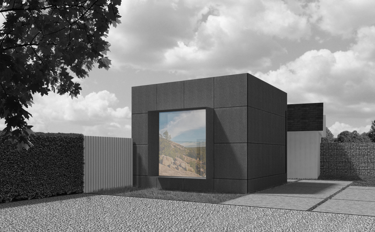
Thought I would post an updated rendering of the original image I posted. Still adding the finishing touches in PS, but overall I'm really happy with the results. Thanks to everyone for their advice
-
nice work!
-
much better

Are you adding trees back in post-pro? -
@andybot said:
much better
Are you adding trees back in post-pro?Here are the two final renderings I did for the architect. We are actually going to show the client the black and white one but I thought the color looked good as well. I'm working on a second daytime rendering as well as a night rendering. I will post those within the next week. Thanks again for the tips!
-
Looks nice, but I must say I'm a little confused by the Reflection or Image, it doesn't seem to reflect the correct subject if it is a reflection and it has colour in the black and white.
-
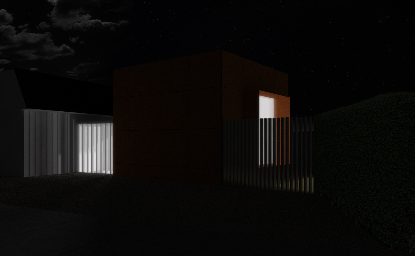
I was farther along than I thought I was, so here's the night rendering. I'm not as happy with this one, but for being my first one, I was still pleased.
-
I haven't done any post-pro work on it yet, but here's the other view of the project.
-
@box said:
Looks nice, but I must say I'm a little confused by the Reflection or Image, it doesn't seem to reflect the correct subject if it is a reflection and it has colour in the black and white.
I know it is a little confusing...the window will serve both for viewing and light, as well as a projection screen for art.
-
@jm2 said:
@andybot said:
much better
Are you adding trees back in post-pro?Here are the two final renderings I did for the architect. We are actually going to show the client the black and white one but I thought the color looked good as well. I'm working on a second daytime rendering as well as a night rendering. I will post those within the next week. Thanks again for the tips!
JM2, there is still a problem, but you are getting much closer to a good result. Let me see if I can explain properly. The area of the projection screen shaded by the window frame projection should have saturated or at least more saturated color.
-
@roger said:
@jm2 said:
@andybot said:
much better
Are you adding trees back in post-pro?Here are the two final renderings I did for the architect. We are actually going to show the client the black and white one but I thought the color looked good as well. I'm working on a second daytime rendering as well as a night rendering. I will post those within the next week. Thanks again for the tips!
JM2, there is still a problem, but you are getting much closer to a good result. Let me see if I can explain properly. The area of the projection screen shaded by the window frame projection should have saturated or at least more saturated color.
Ahh...I understand now. The image would be saturated in that area due to the image being shaded by the window frame projection. I would assume it would be a combination of more saturation and a darker tone?Thanks.
-
Not necessarily darker as the projection light source is independent of the exterior sunlight.
When in doubt, I will google for an example and if that produces nothing I will do a small quick-and-dirty mockup to study the effect I am trying to reproduce.
Of course, you can also build the projection effect right into your model and not have to do anything in post. However if you understand what the result will be it can be quicker to fake it.
Hello! It looks like you're interested in this conversation, but you don't have an account yet.
Getting fed up of having to scroll through the same posts each visit? When you register for an account, you'll always come back to exactly where you were before, and choose to be notified of new replies (either via email, or push notification). You'll also be able to save bookmarks and upvote posts to show your appreciation to other community members.
With your input, this post could be even better 💗
Register Login


Advertisement