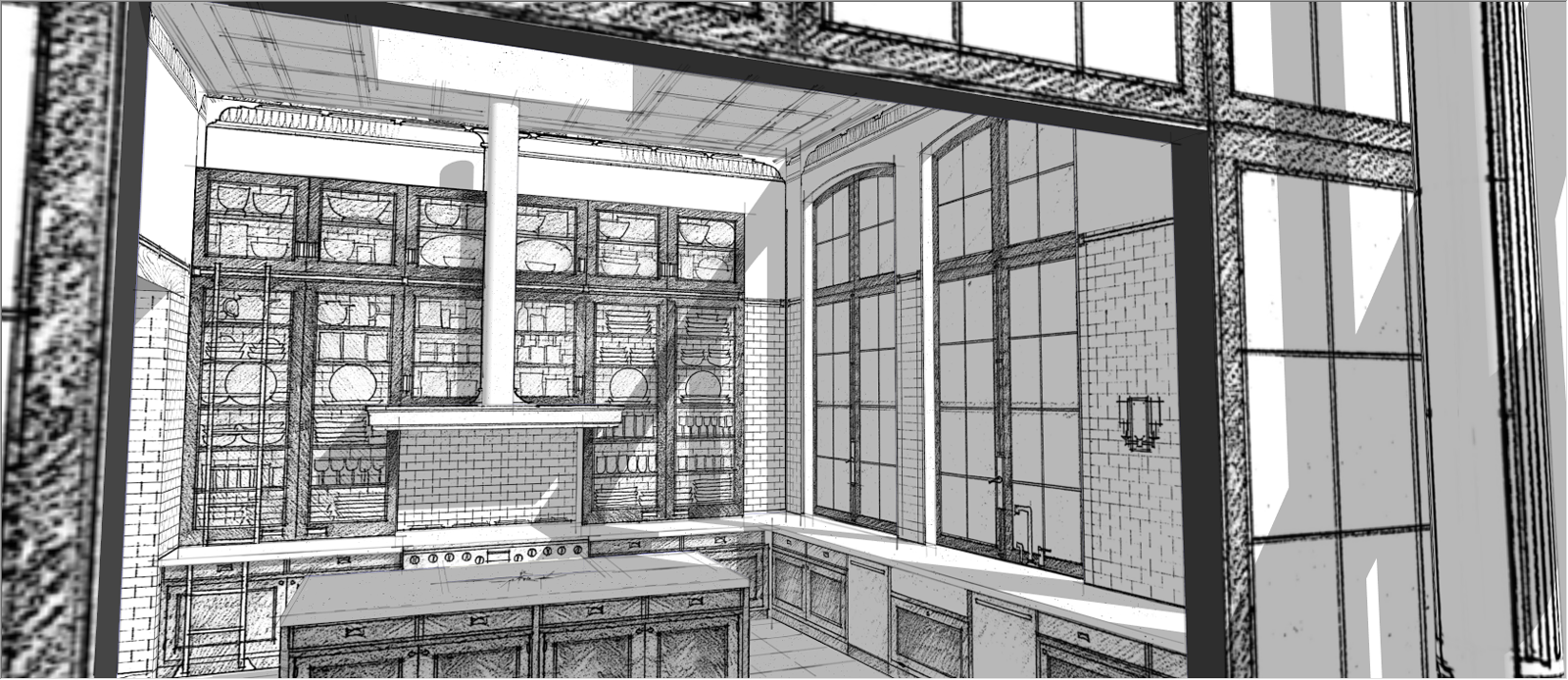
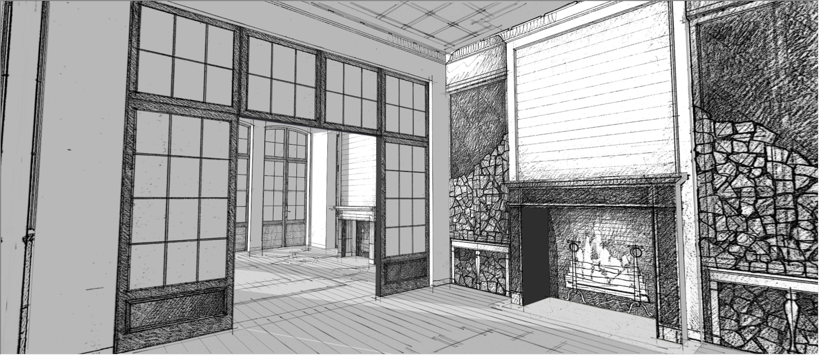
Sketchup with handmade sketches
-
Hi,
these are handmade sketches, mapped onto 'foam core' modeling and combined with cad drawing imports.
Back to basics.
More images on my blog.
I hope someone likes this. -
Wow, impressive!
I'd love to see what would happen if you manage to slap some color in there!
Again, very nice way to represent and ideia. Keep up the good work!
Cheers -
Hi, toponypy:
I like these a lot, and I applaud your use of alternative methods involving a real world marking device. Keep it up.
-
I like this very much. Good work.
-
Nice and interesting idea.

What I don't like:
-the fallen verticals;
-some of the "handmade" textures look low resolution;
-the mix between "handmade" strokes and SU's "hard edged" shadows is a bit odd. Maybe you can give a watercolor effect (mainly in order to have some "shaky" edges) to those shadows as it was a watercolor finished with pen strokes. -
Very interesting

-
Tony. Hand drawn plans and elevs pasted on like this really work for me. Its a very efficient way of creating 3D concept sketches and to keep the whole design process moving. Its also an easy step to get hand rendering in there say with coloured pencil. Just use the SU edit in an outside program thing. I'd cut out the glass areas though.
-
very good idea !
your handmade textures work well with Sketchup wiewport style

-
I find out this study very interesting too.
Here is a first attempt (not very careful: just to visit the technique )
1)I have printed my window to draw on it. I had carefully fixed the light and shadows (without shadows on the ground) and have chosen the Isometric view with front face view before to print it. I have also fixed the size of the printed window in order to use my pens accordingly.
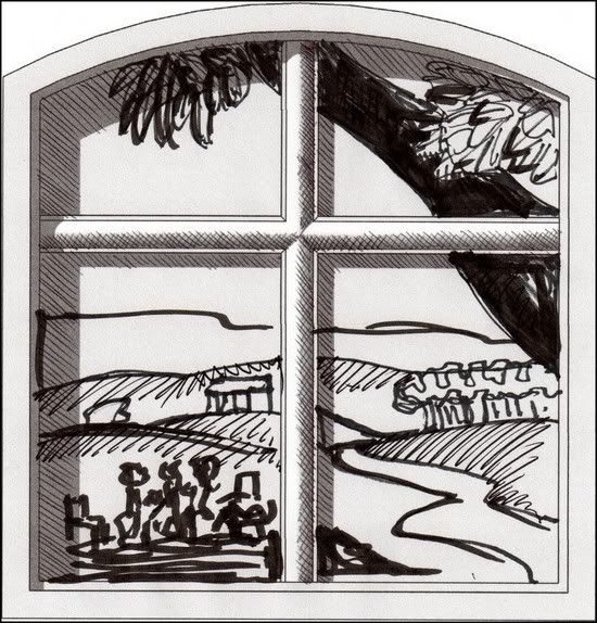
2)I have made my cooking with Photo Match (rather than projected picture)(I am searching)
Re: before to use PhotoMatch (using it after, photmatch seems to be lost), I have used a style pen from DAVE R or at SketchUp Artists
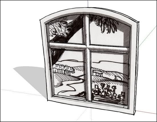
2bis) As you see I have used a simplified model, which keeps some depth geometry.
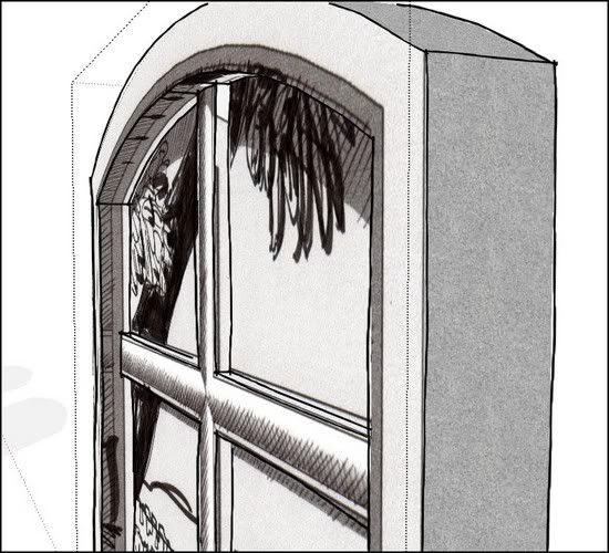
I'm going to make other tries.
*simon
-
Simon, that's very nice. I like the way that looks. It reminds me of a TA I had when I was in fine art school a hundred years ago. He did 3D constructions out of paper on which he drew in ink. The first pieces of his that I saw were some microscopes. They were made life size and from a bit of a distance looked real. He brought them into our drawing class to show and I thought we were going to spend the class time looking in microscopes and drawing what we saw. It wasn't until I got closer that I realized they weren't real.
-
to the OP, i think softening up the shadows would make these things.
really nice as is, though.
Hello! It looks like you're interested in this conversation, but you don't have an account yet.
Getting fed up of having to scroll through the same posts each visit? When you register for an account, you'll always come back to exactly where you were before, and choose to be notified of new replies (either via email, or push notification). You'll also be able to save bookmarks and upvote posts to show your appreciation to other community members.
With your input, this post could be even better 💗
Register LoginAdvertisement


