My First Ever Sketchup Project
-
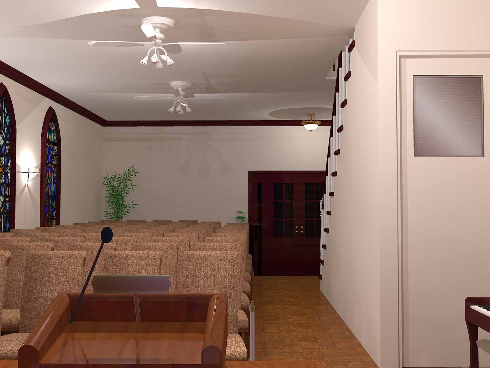
I am an artist and was asked to make an artistic visual of a small building they are talking about turning into a church. They want to extend the first floor out more towards the street. My only regret was not taking enough pictures when I went to see the house. I now know to take LOTS of pictures and bring a tape measure. This is my first Sketchup project I'm seeing to the end. I also have another in the works but I'll show that one later. I need help with lighting. I'm using Kerkythea as the rendering program. I basically put omni lights where they would go in real life but don't know how to manage the shadows. I am a total noob at camera tweaking also. So any critique in these areas are greatly appreciated.
This is what I have so far. These are test renders.
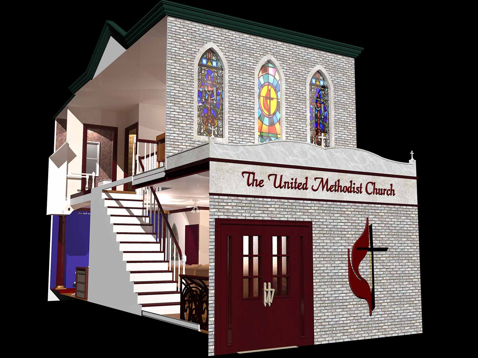
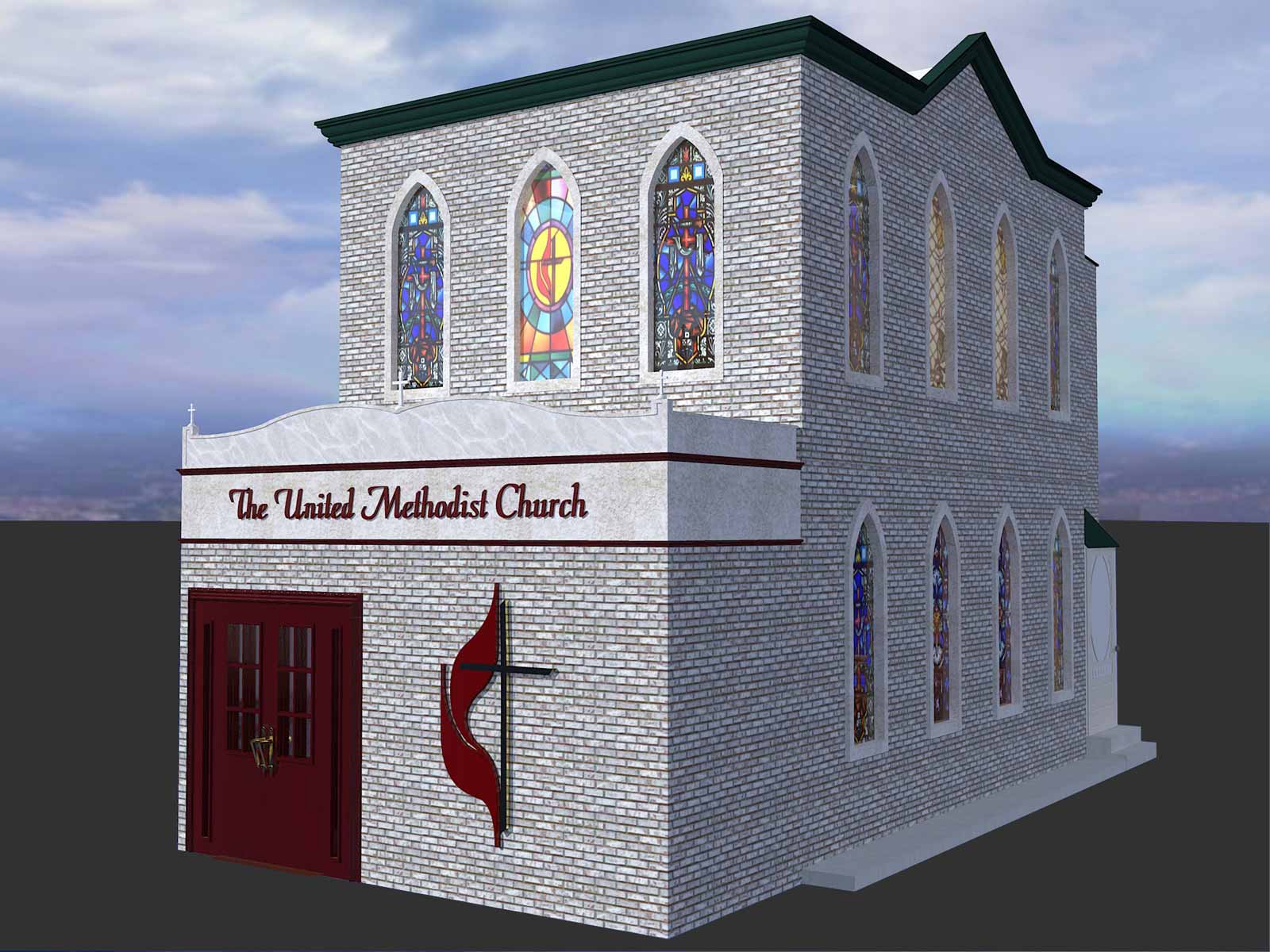
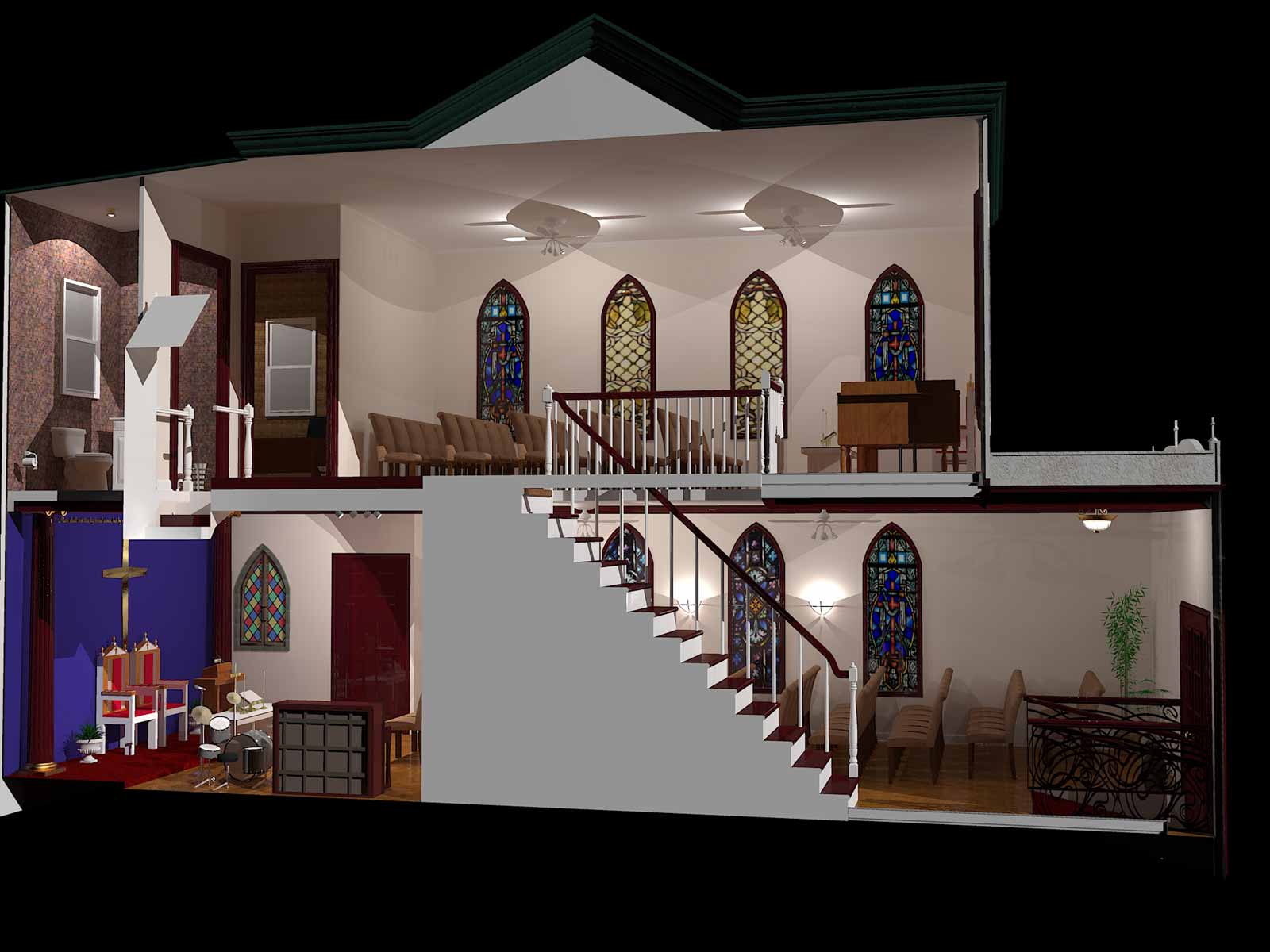
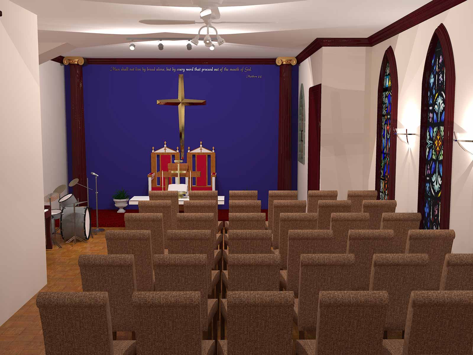
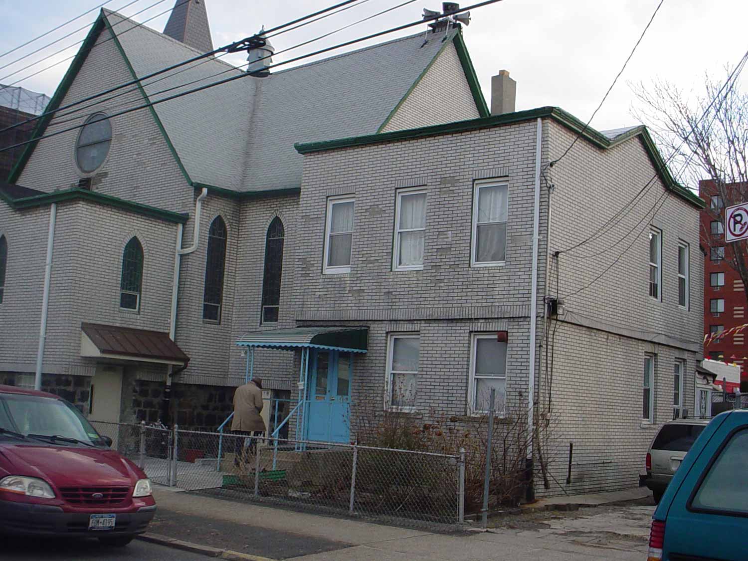
The actual building
-
Mistro,
I have had a bit or experience with both Sketchup and Kerkythea. Do you have a specific question? If so than it has eluded me.Cheers,
-
Don't know how I missed your first WIP?
Well done! Your certainly taking to SketchUp pretty quickly. Whilst I can't comment on the KT side of things I will say your off to a flyer. Those long hours paid off.
Always nice to see new users sticking with it and sharing their work.
Have you tried the TwiLight demo? You might find it a bit easier to get to grips with?
-
Mistro, were you given a design to work with or are you designing it? The reason I ask is that these renderings look like renderings, they don't convey a new feeling or a spiritual and inviting ambience. As an artistic interpretation, I think it could have softer light and less realism. What do I mean? For example, the fixtures, ceiling fan, drumset, microphone, etc. all jump out as mundane. Why not take artistic license and edit some of this out? I don't know Kerkythea well enough to advise on how to soften shadows, but I'm sure somebody else can help with that. As for the exterior shots, I like the one with the black background, but now with the infinite expanse and sky. Why not try a photo collage and put it in context? Then you can do some Photoshopping and add some beautiful light streaming down or something. I'd like to see where you take this. Keep going.
-
Thanks for your replies.
@Crankston: I have a lot to learn about lighting as I am new to doing serious renders. Fletch and another person over at the Kerkythea forums gave me some pointers. I know my shadows were too harsh so for the most part aside from sharing I am exposing myself to critiques I can consider as I move forward.@Rich: Thank you. I will look into that demo. I have a passion for visual art and 3D rendering got me excited on a whole new level. I been hired to do many artistic designs that were in people's imagination mostly through illustration and painting so this just feels right and natural.
@ledisnomad: The house in the last pic is what I'm working from. All they told me was to extend the front out to where the fence would be and give a visual of the inside with the walls of the rooms torn out to make open spaces for the sanctuaries. I used my imagination for the rest. Yes you are right about the lighting and I just learned how to get softer shadows. I been playing with the furniture and accessories; experimenting with different materials. I only downloaded the instruments to save time but I do like to model my own elements from scratch. I'm not crazy about the pillars or the ceiling fans either as they are modified downloads. And yes, the end product is supposed to be a rendering within the photograph.
After I get more understanding about lighting, I am also looking into camera settings and angles. My next render of this church is going to take long (see myself building a render rig with multiple cores). I will post it when it's done.
-
Hey Mistro. Your Render's look amazing. I would say that the only tip I can give you is to be careful with your textures before exporting into Kerkythea. Basically, if your mesh is painted different on the inside than on the outside, Kerkythea will randomly choose one of the textures/colors to render. This can wreak havoc on models, believe me. Anyway, keep up the great work, and let me know if you have any questions.
Cheers,
-
Nice modeling and rendering. By looking at the photo, I can see the second floor extends beyond the first floor and is finished with thin brick adhered to the sheathing, whereas the first floor has true brick veneer. This will affect how your windows are finished out. Typically, the entrance door should be set back into the brick (like the windows are); otherwise, rain will flow down that wall and make it's way in behind the door's wood trim along the top. You might also want ot look at moving the door around the side where you can then include an overhead canopy to protect the door and people from inclement weather (there is a cheap aluminum job over the existing door, so this must have been a concern int he past). Or, if the city will allow a canopy to extend over the public right-of-way, do so ont he front. Can become an interesting design element.
-
Daniel, thanks for that observation. It makes a lot of sense about the front door being set into the brick. When I think about it, that is how exterior doors are I guess unless the framing is made of stone or brick. There is room enough to make the entrance on the side between the buildings and canopies are very common with small churches. I will consider this as I further play with the design.
-
First ever SU project?
Looking good for a first time effort. Keep at it!
Hello! It looks like you're interested in this conversation, but you don't have an account yet.
Getting fed up of having to scroll through the same posts each visit? When you register for an account, you'll always come back to exactly where you were before, and choose to be notified of new replies (either via email, or push notification). You'll also be able to save bookmarks and upvote posts to show your appreciation to other community members.
With your input, this post could be even better 💗
Register LoginAdvertisement


