Turning on Ambient Occlusion will help also! (in the indirect illumination settings)
I typically use .8 amount, 16 subdivs, and 8 radius.
Turning on Ambient Occlusion will help also! (in the indirect illumination settings)
I typically use .8 amount, 16 subdivs, and 8 radius.
Try making a diffuse map that's just the solid color with the same dimensions as your bump map. Or make a version of that bump that is colored and use it as your diffuse.
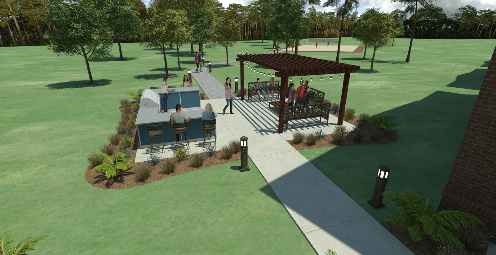
I recently did an outdoor scene with several 2d people and plants and due to the sun angle (doesn't seem to matter which) they all come out somewhat dim.
The only time I can get them illuminate properly is if they are laying flat.
Has anyone ever dealt with this? Not sure what to do. I like to render them in the scene since it saves a lot of time placing them manually in photoshop.

@jonfar said:
i will leave the comments on the lighting and materials to the rendering gurus on this forum, cause there are guys here with far more knowledge than me
but as an architect i cant help to comment 4 things:
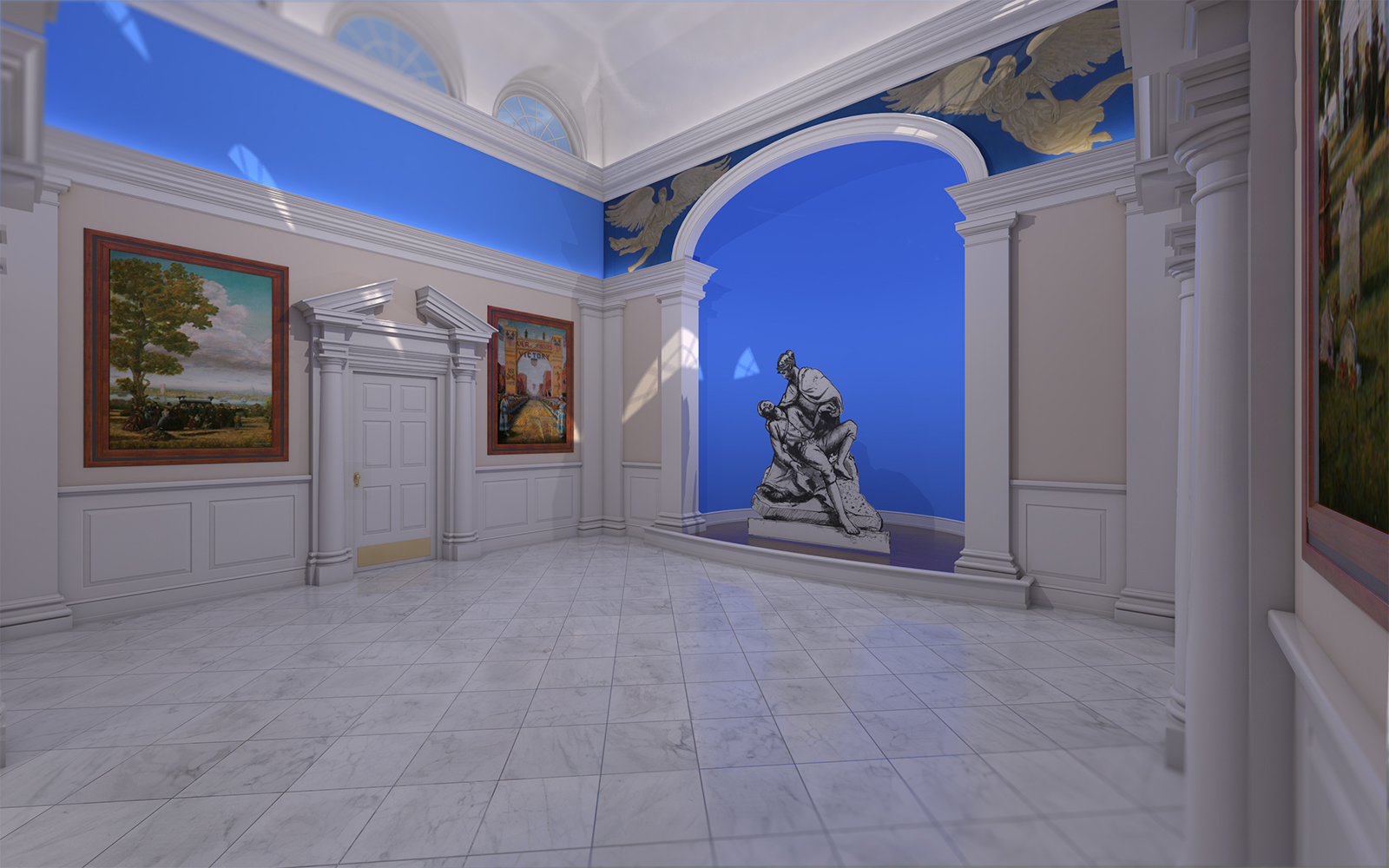
- the perspective seems overstretched (i dont know if that's the right word, english is not my native language) or maybe its just an illusion caused by the floor tiles, IDK...
- i cant understand the camera blur... it seems to happen only in the top-left and right-bottom of the image... its strange
- are you sure the floor tiles are in the right angle? seems odd for an orthogonal room
- the paintings frames lack a sense of depth... again, i dont know if that's the right word, but they seem flat (i wont mention the sculpture, cause im guessing it will be replaced by a 3 dimensional one)
but i love the detail on the door frame and columns, with some tweaks i think it has potential to be a great render image
It's probably the field of view. At 35, the room looks claustrophobic. I agree though, I should probably dial it back down a bit.
It's tilt shift blur, just a personal preference.
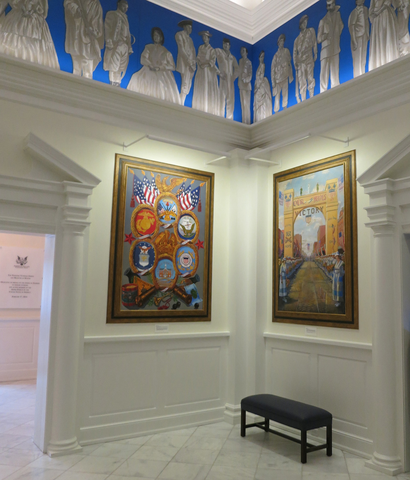
3&4... i'll attach an image of the actual project.

I did this awhile back for work and the project was finished so I was able to pull in some materials and have been trying to finish it out.
I haven't finished pulling in all the artwork that is there but I'm about 90% there.
My main concern is just the overall look. I was trying to go for an ultra-realistic look but I feel like it just doesn't look right. I think it's mostly the walls. Do any of you use a bump map or lightly textured material for painted walls? I think there are probably too many sharp edges on the moulding and trim... Just babbling, but critique away.

I think I fixed it... I turned the subdivs down to 1. Weird.
I tend to have this issue pretty frequently, and it is quite bothersome when using some textures.
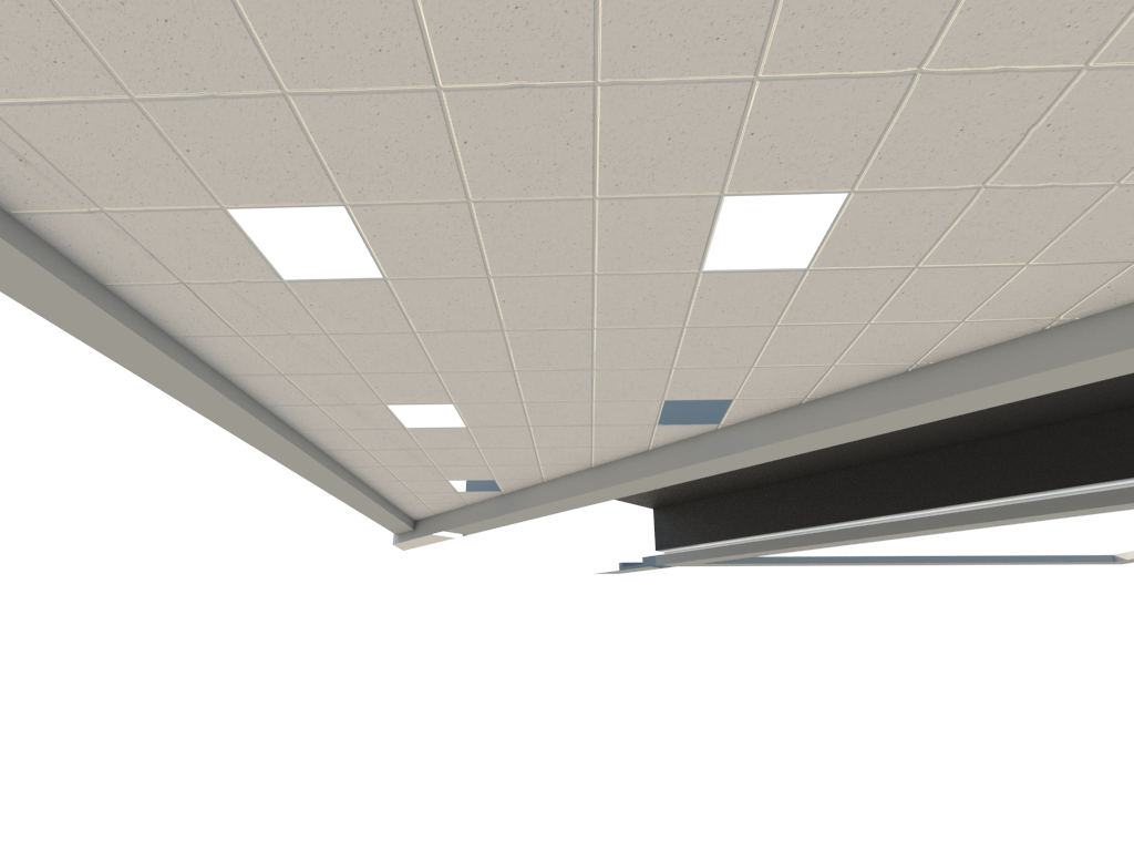
Basically I have a ceiling grid texture and displacement map that I made. The displacement map is just the grid, no aliasing on the lines or anything.
However, when I render it. I get weird wavy or squiggly artifacts. This happens to me with a lot of my brick & tile textures, too.
What setting do I need to adjust?
See image for example.
