Hi All,
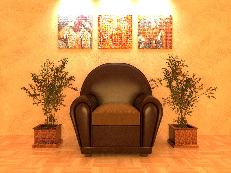
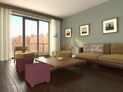
Here is the latest render i have been working on it was rendered in Kerkythea 2008, he scene still has quite lot of 'noise' in it but this is just a WIP.
I have tried to create a waiting area type feel to the scene.
Kind regards
Hi All,
Here is the latest render i have been working on it was rendered in Kerkythea 2008, he scene still has quite lot of 'noise' in it but this is just a WIP.
I have tried to create a waiting area type feel to the scene.
Kind regards

Hi All,
tomsdesk glad you like them 
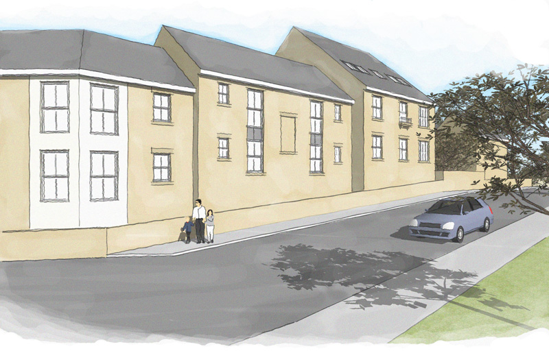
Here are the latest versions of this project, i have added some sketchy lines to the face of the properties and also to the roof.
Kind regards
Darren
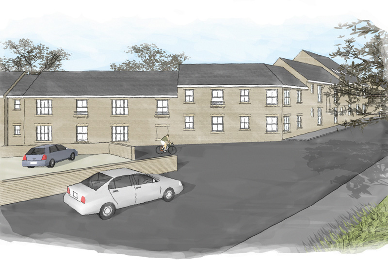
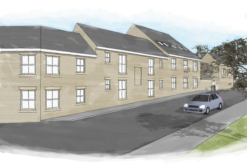
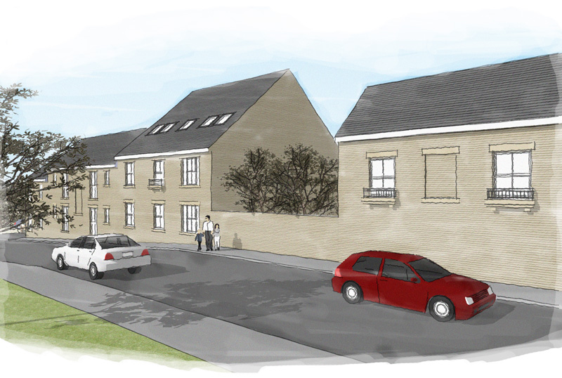
Some more scenes from the above same project.
Darren
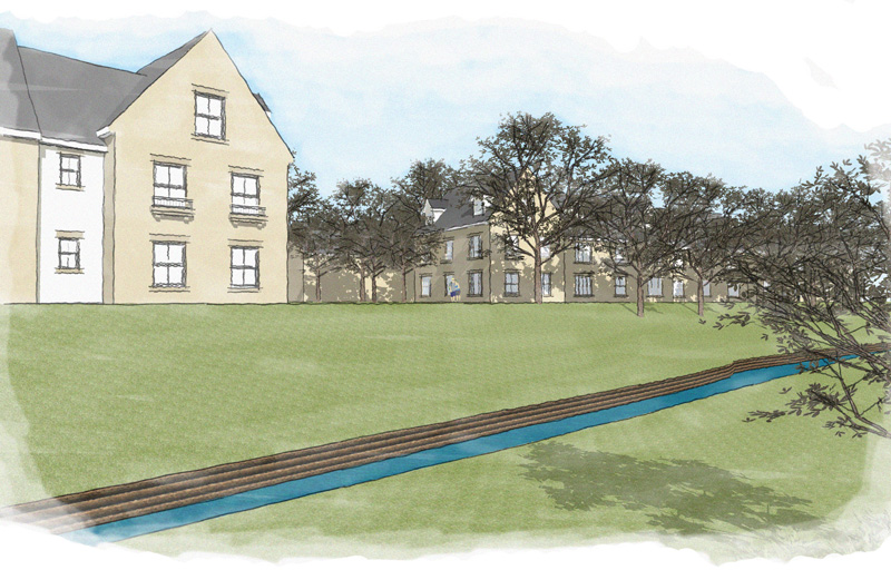
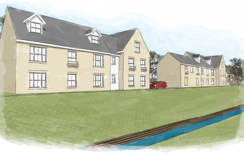
Hi All,
Here are my latest watercolours, there are four different views of the same street scene just from different angles.
Kind regards
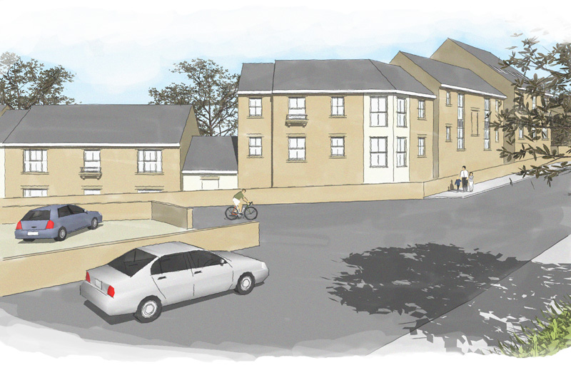
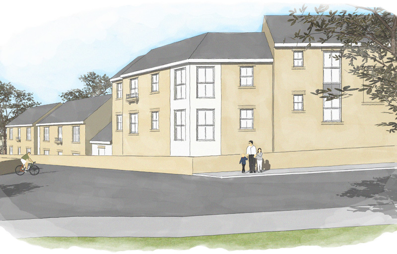
I have another coule of projets i am working on at minute i will post them when finished.
Darren
Hi PKast,
Nice to see a different interpretation of the the image, i have actually done some tweaking on them myself lightened the sky and decreased the coverage of the sky.
I am really starting to love these type of images i normally do alot of renders in kerkythea and always will do but these are great to do quick to show clients. The clients for the project really liked the images and thought they were hand drawn  i took it as complment.
Kind regards
Darren
@pkast said:
I like the angles of your views. I think your Sketchup models are very good. I like the style of the post processing, it's very pleasing. I think you could use some more white around the perimeter, especially on the first image to draw you in on the middle.
@unknownuser said:
Here's a quote from Grant Marshall's "Digital Watercolour Effects on Sketchup Images": "Watercolour artists often don't cover all the paper with paint. White paper can be an important part of the composition and help give life to the image. If your SketchUp images are edge-to-edge colour you'll have missed out on one of the easier 'tricks' and you can run the risk of the end result looking overworked and muddy. Generally speaking, larger areas of white will give the image a quick, sketchy, suggestive feel, while less white might be appropriate if you are simulating a more detailed, more 'finished' painting."
Best,
Thanks for positive feedback all, ver grateful
Where can i find Grant Marshall's "Digital Watercolour Effects on Sketchup Images" ?
Kind regards
Hi,
Maybe this is me being a little dumb, but i dont have much experience with photoshop. 
Could someone please tell me exactly where i need to extract the file to and exactly how it works, maybe a quick step by step.
Kind regards
Darren
Number 3 is my favourite to, i know what you mean about the shadows its trick getting them looking spot on for these type of images
Darren
I used photoshop and 'the dennis technique' glad ou like
Darren
Hi All,
Here are my first attempts at digital watercolours, it would be great to here your comments and crits on them.
Kind regards
Darren


@fletch said:
guess Sintra didn't want you to see the big image for some reason...
dont you roll your eyes at me mr fletcher 

no real reason i didnt post the large version, well other than i posted the image whilst at work and did a quick copy and paste job with a small example i had 
kind regards
darren
yes moddleing done withsketchup.
thanks for the comments guys 
HI All,
Thought i would post my latest render with the brilliant Kerkythea Rendering programme.
Kind regards
Darren
Hey friendly fred, fancy seeing you around here 
looking good this one buddy especially with the timescale you had to work with. how come you didnt post it in the kt forum 
also the trees look great where are they from 
Speak soon
Darren
fellow kt addict