Wohoo, well done Jeff!
While we are taking off on this so passionately (wich in fact I enjoy a lot!) we still do not know if it is of any help to our friend Jhearcht...
...Please give us a sign Sir, animation or stills?
Wohoo, well done Jeff!
While we are taking off on this so passionately (wich in fact I enjoy a lot!) we still do not know if it is of any help to our friend Jhearcht...
...Please give us a sign Sir, animation or stills?
Either with "film and stage" plugin, "note camera location" plugin, or with "BMVB" by Thomasz
Oh yes, just realized it's the same traffic light you meant. You put a lot of thoughts in between, I didn't get it 
Beautyful idea still.
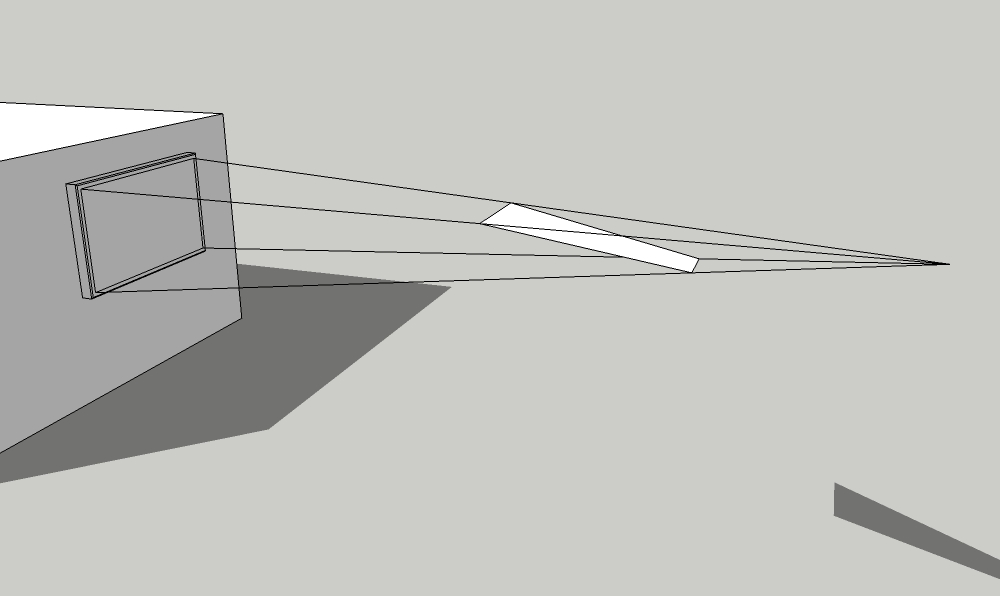
Tadaa! here is the key: just drawing lines to the camera and adding a face that recieves sunlight. Wonder how to get the keystoning for the TV material right...
glad you like it jo-ke!
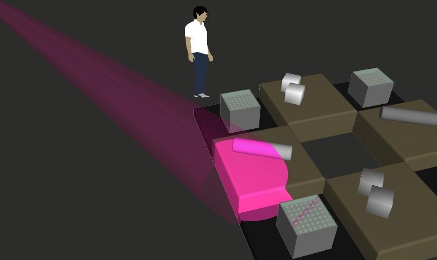
Actually I find it not that difficult to achieve an impressive look with lights in saturated colors - although it helps to know what the spots are doing in real life. For me the tricky part is keeping it realistic and not to put more lights in the visualisation than what will be payed for in the end. It can easyly happen that you are promising too much because you wanted your renders look pretty, but there really is no fun in disappointed customers.
I remember that I enjoyed following your Palladium project, would like to see more of that.
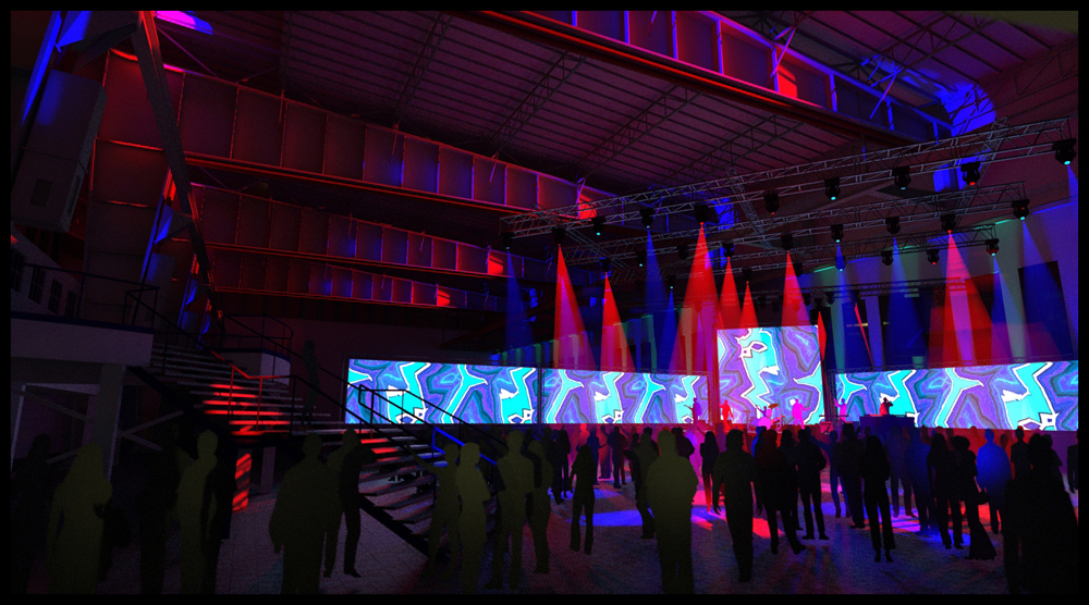
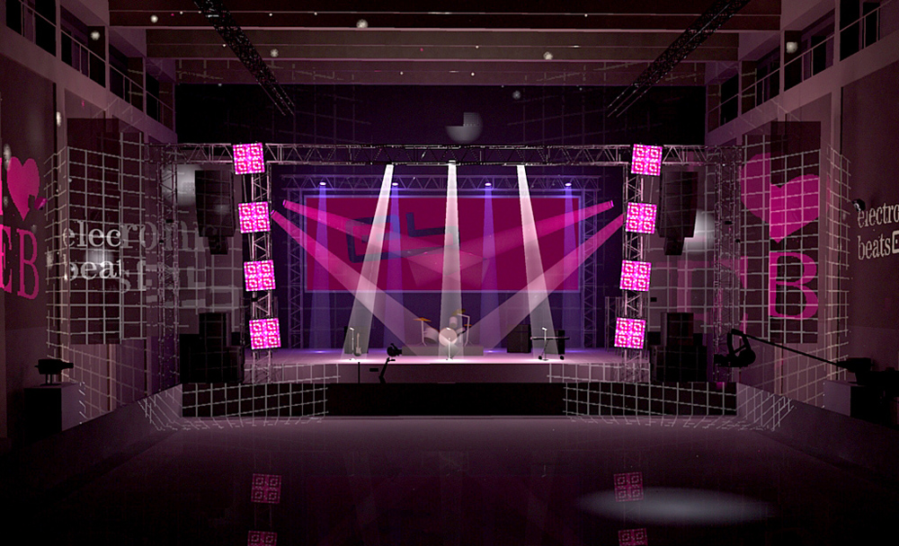
The stage is one of my older renders where I created the beams with geometry. Since Podium 1.x has neither spot lights nor volumetrics, I lined up quite a few omni lights inside of a transparent cone. But since you are using TWL you have other possibilities at hand. Maybe you could try to separately render one volumetric light pass with only the beams showing, then overlay in Photoshop with layer mode lighten. This gives you more control and might save some testing.
cheers
Jeff, that is pretty smart! Reminds me of when I was trying to paint a spotlight into furniture by excessive intersecting 
Richard, Where can I find that Aidan blog post? Your texture trick is amazing!
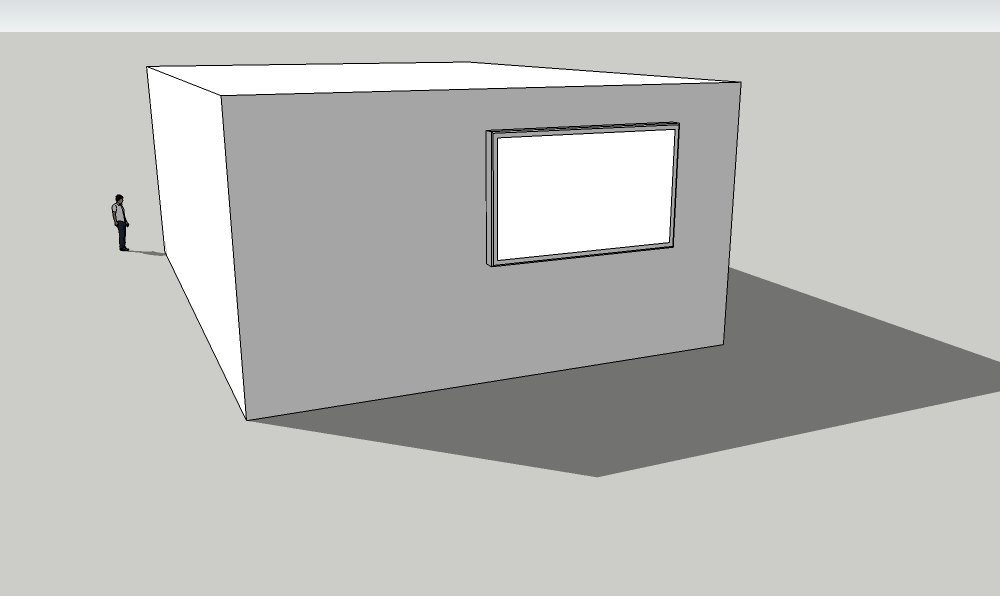
This getting really interesting, so here is mine for you to guess - with shadows not drawn and default material only...
Thank you Dermot, Nicolas and Oli, you are very kind.
Yes, Blogger is very easy to use, I have a portfolio standing there already.
The struggle is more on the decision what kind of services I am going to offer and how to structure the communication...
...but as I am writing this here I am getting another good idea. So it's obvious that I have to give it more time to maturate before I tell you.
btw, how could I be bothered by answering questions? I am learning every day myself, and isn't this exactly what SCF is all about? Please give me the chance to contribute something to your thread in return! 
thanks again
alex
Looking at it again, I have already learned one thing - these are way too many different pictures in one place. In a portfolio this could only be presented as a slideshow.
...
Yup, this streetlight tutorial is very smart, I especially like the trick to tint the surface that recieves diffuse light...
But what is schown there can not work for jhearcht's situation, just tested it. The recieve shadows option controls the reception of other geometries shadows, but the entities own shadow remains.
I like this one a lot Kevin!
 (cant find the applause smiley)
+1 screenshot
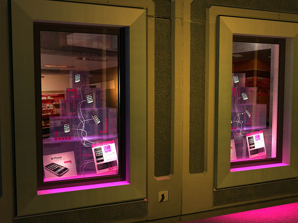
Hi, thats a difficult one if you need the shadows or want to export an animation.
If not, I'd suggest to "light" your screen in an image editing program.
In SU you could also darken all other materials so that the screen stands out more, but this does not work with shadows switched on...
cheers
Hi all,
Many of you may have possibly asked themselves "who is that Shura or Alex guy anyway?".
If so, I guess the reason was because I never really posted any serious projects here.
Now I feel it is time for me step out of the shadow and show my face (notice change of avatar).
Of course, like many others I am sometimes too chicken to show off, but that is not the reason.
It is rather that my work basis and also my private life has changed a lot recently and I didn't have any projects in a while.
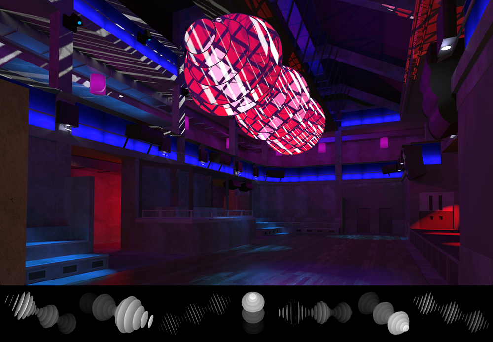
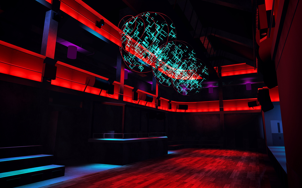
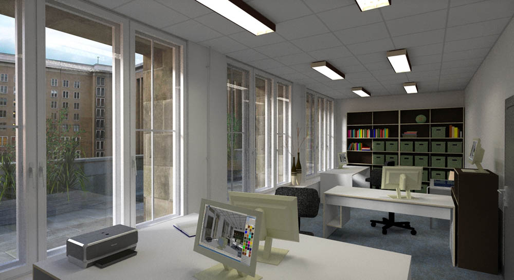
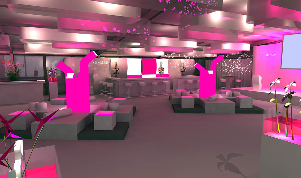
For almost 18 years I've been working on some sort of artistic approach to lighting and media installations.
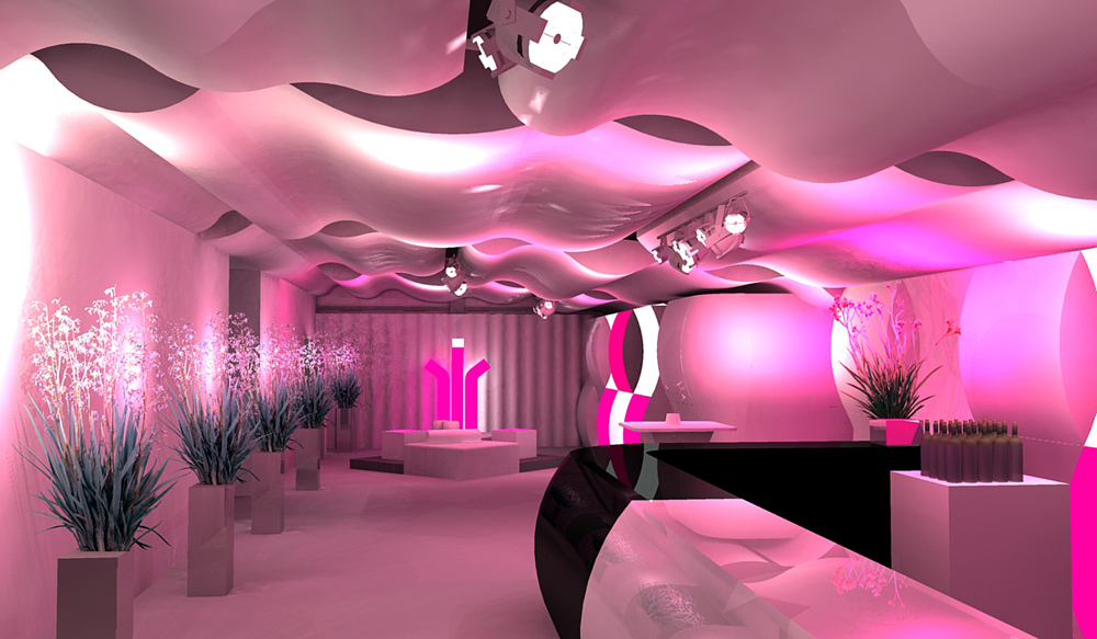
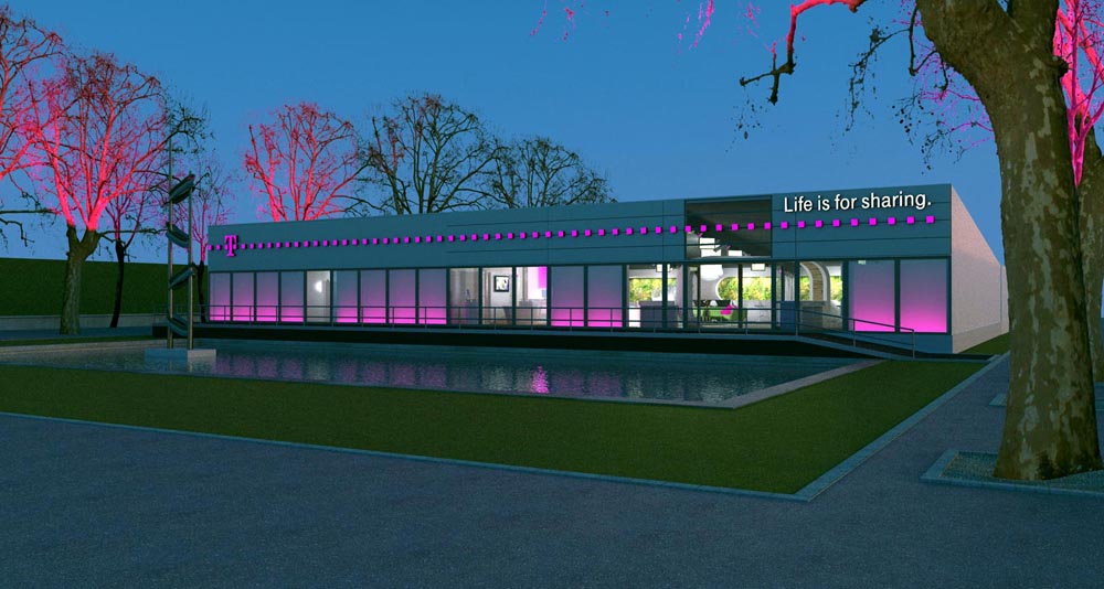
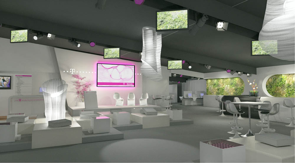
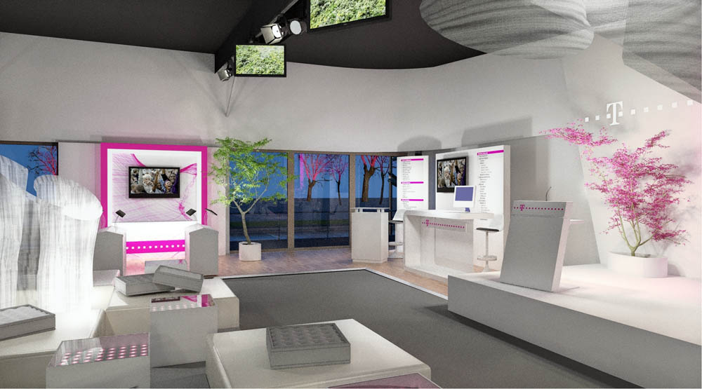
The projects I designed were mainly in the fields of architectural projection, nightlife environments and corporate architecture.
I must say that I got tired of all that at some point, but to explain the reasons would take too long now.
At the moment I am having an extended break and take the chance to do some learning and reorientation to find a new focal point.
One thing I already know for sure is that I have become a complete SketchUp enthusiast during the past years,
and I really love what am finding here at SCF.
Probably I have mentioned before that I have a strong sense of thankfulness to all of you guys. I really start feeling at home here.
Still struggling on how to put my portfolio together and hoping that posting pictures may help me to see them from a different
angle, I picked some of my renders to show you.
Please take a look, I would like to know what you're thinking.
best wishes
alex
PS:
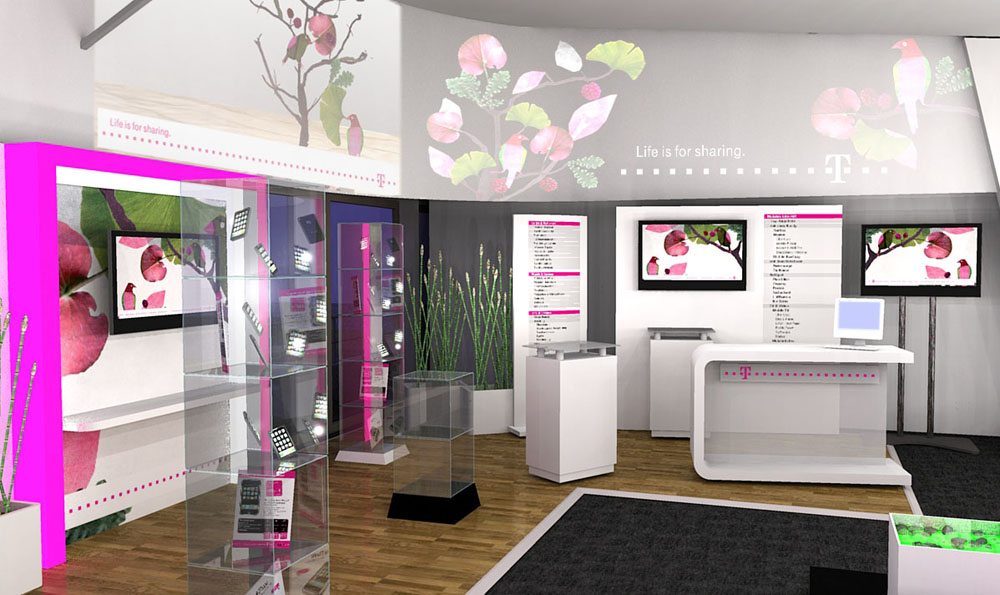
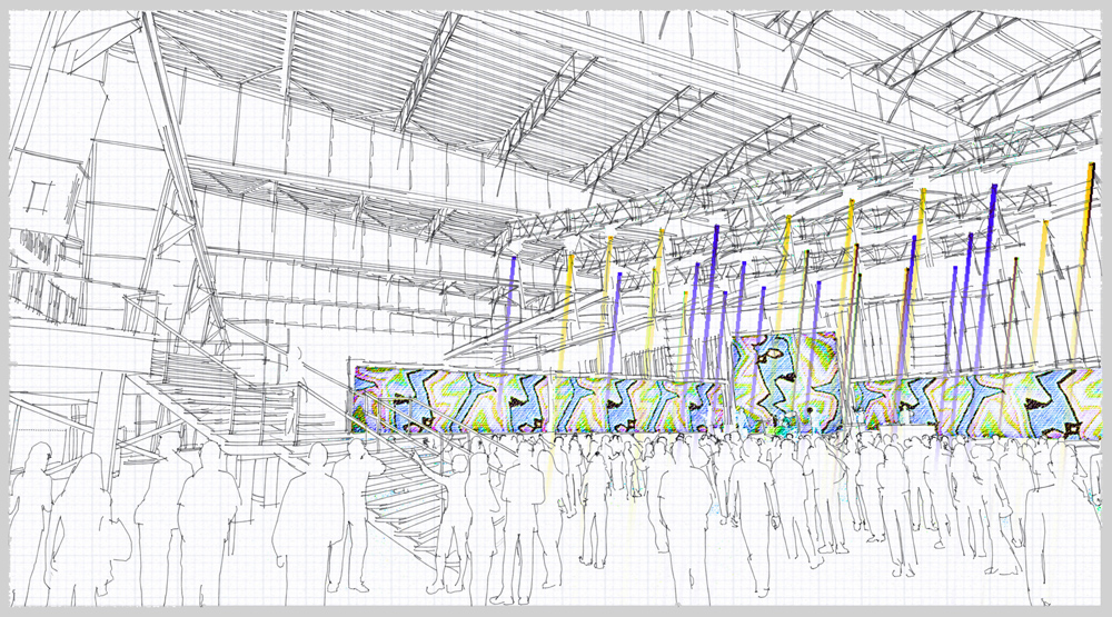
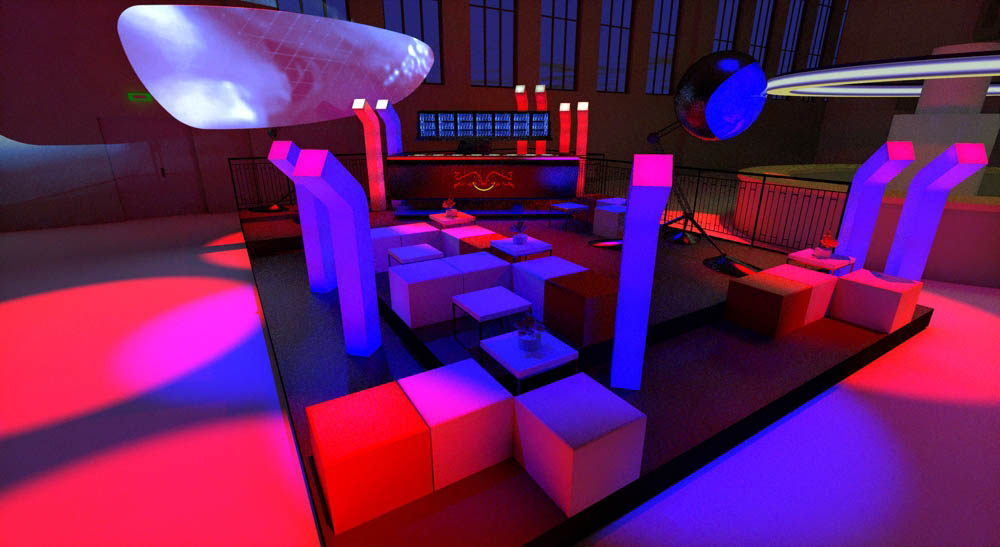
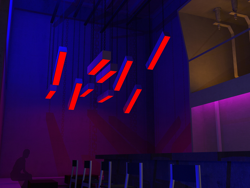
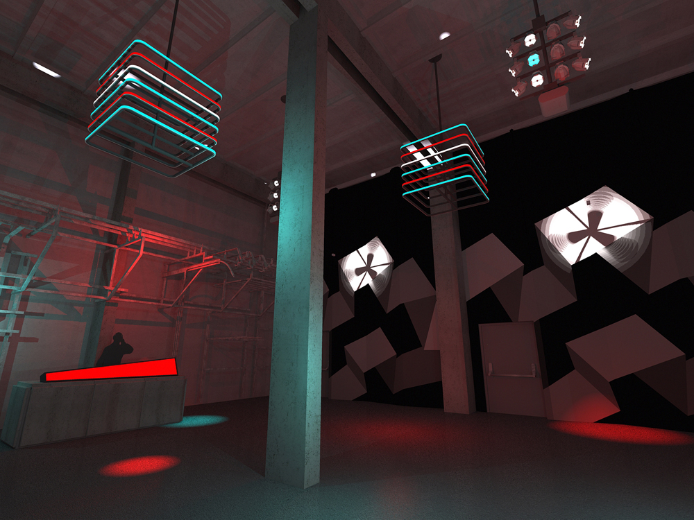
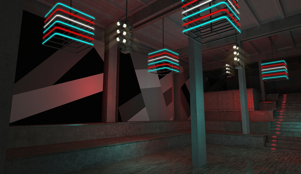
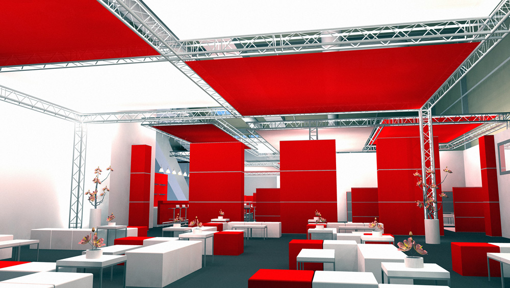
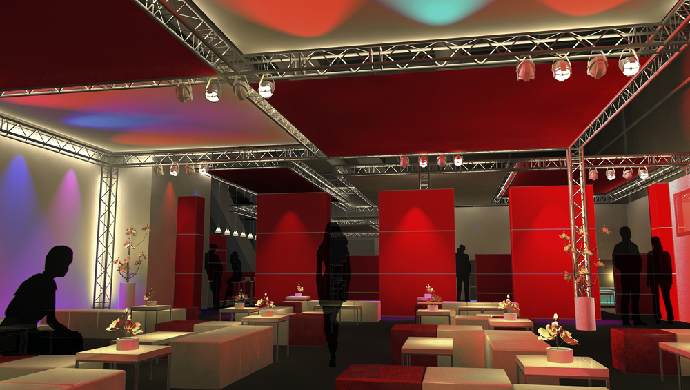
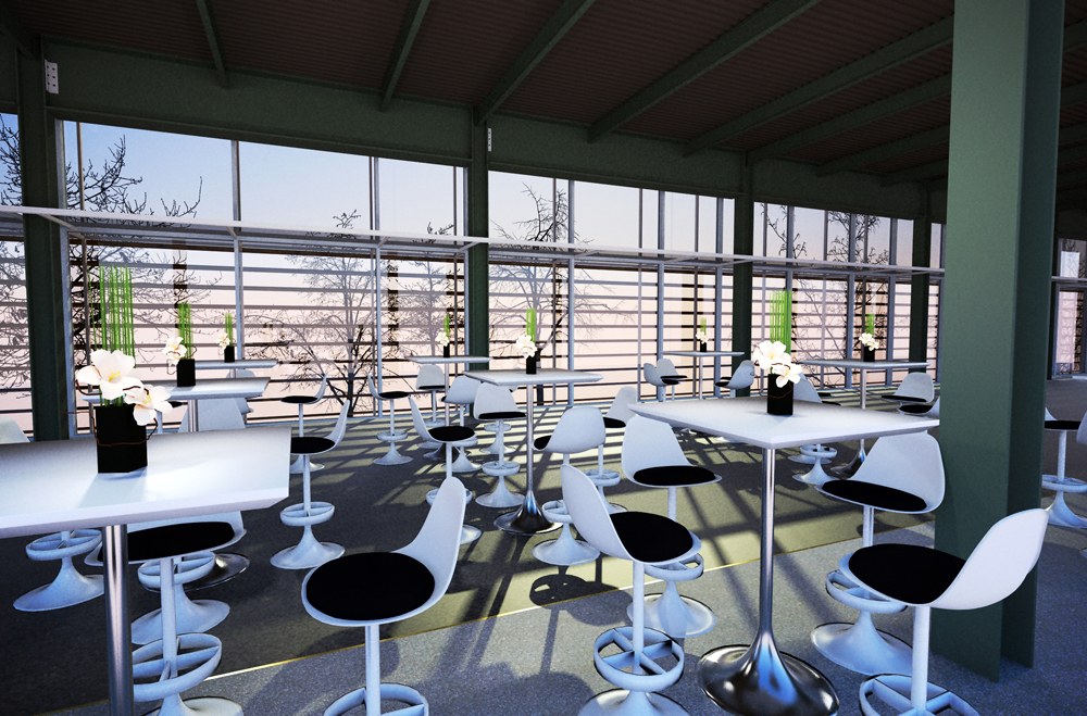
Most of the following visualisations are rendered in either Podium or Twilight with rarely any postpro.
Only one render is LightUp output, and another one obviously sketchy lines directly from SU.
Exept one, all of the concepts went into production.
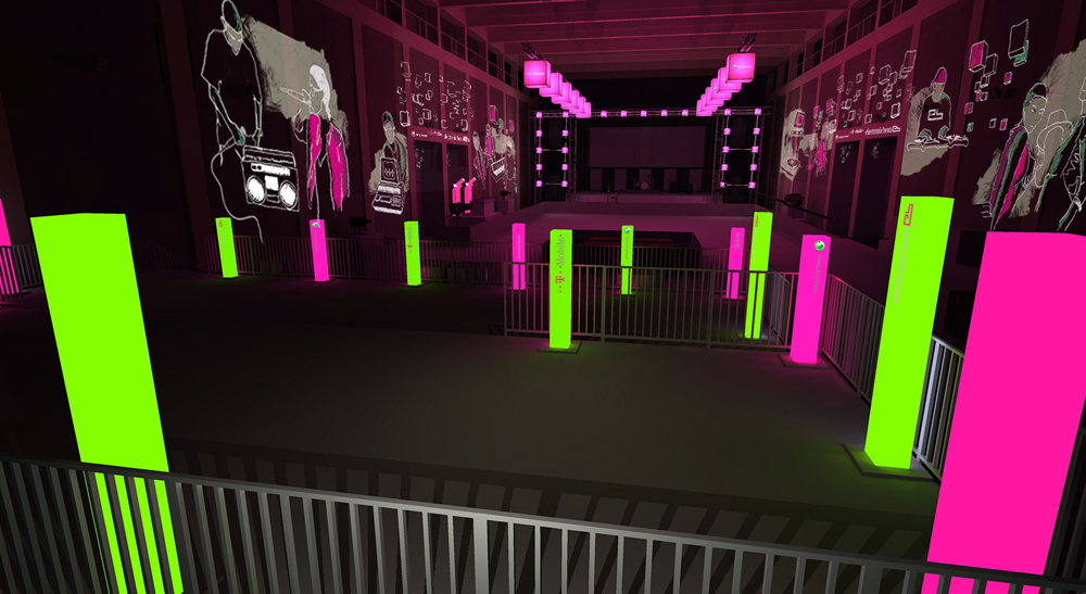
Don't worry Ross, of course the upper walkway is meant to be the VIP-gallery and especially reserved for a few lightweight models and fragrance designers. Ask Jason, maybe he can get you up there too.
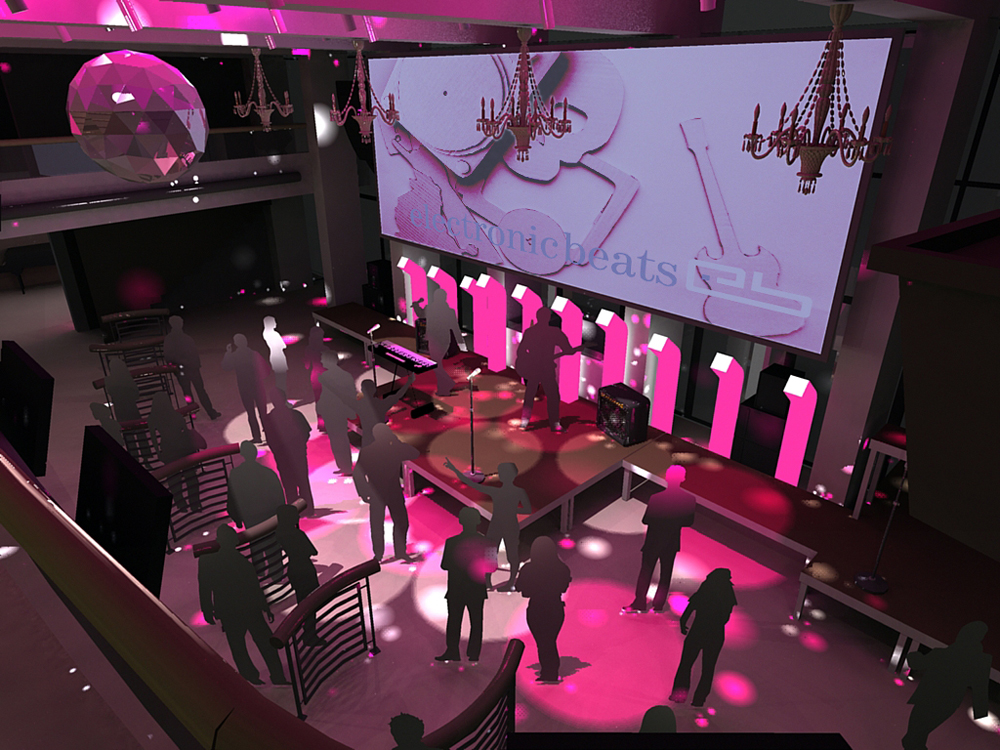
Well done Jason! Good to see there are other professionals here who are visualizing event projects. Bet your customer is very happy. 
Very accurate modelling, only maybe the roof tiles could be a little smaller.
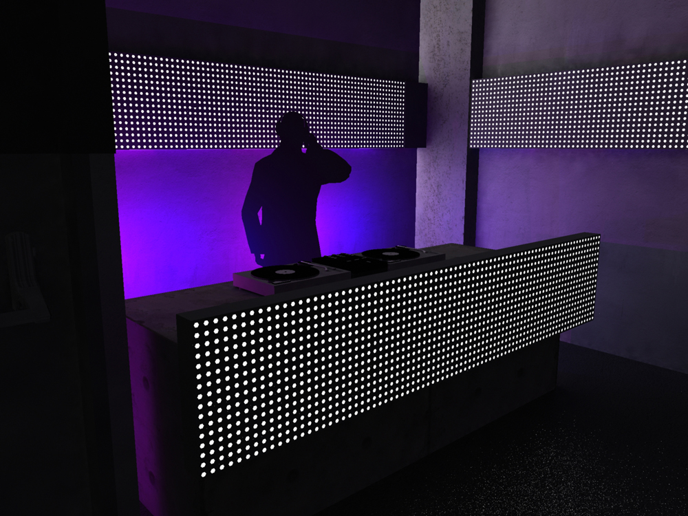
Good idea to have a view from the operator stand with mixer and lighting desk in the foreground.
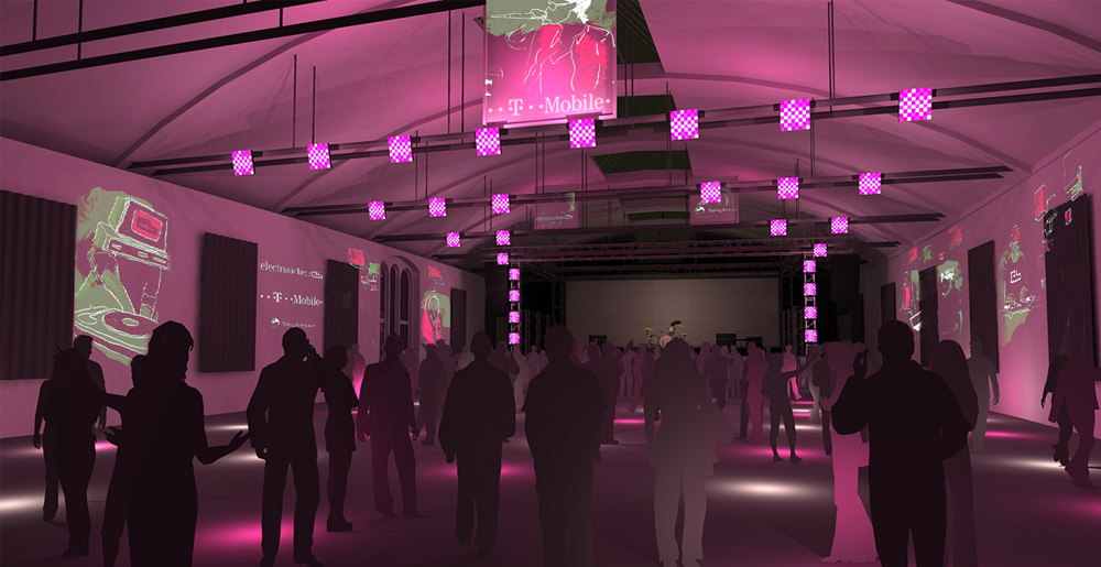
In the first and the last picture the silhouette people take away realism imo. In the other two they work well though. Sometimes a good solution for that is to darken the silhouettes from back to foreground or vice versa. When you take the effort to manually gradate your crowd you'll be surprized how that can add to "realism".
To comment on design is tricky because I don't know the concept and can't say if this is useful for you - so just two ideas here:
Maybe it is wanted to have all the lighting in white, but if you would present at least the stage in strong colours, the scene would look much more like a musical event. Maybe just some color on the building behind the stage to make a nice backdrop? Also the band logo would get better contrasted by that.
Can't say if this the case here, but many times I have run into problems by forgetting to draw the speaker system. Especially when there was graphic content like screens or logos on stage I later ran into complicated problem solving during setup because the big black boxes blocked the lines of sight and air-clamps are still not invented yet.
greetings
alex
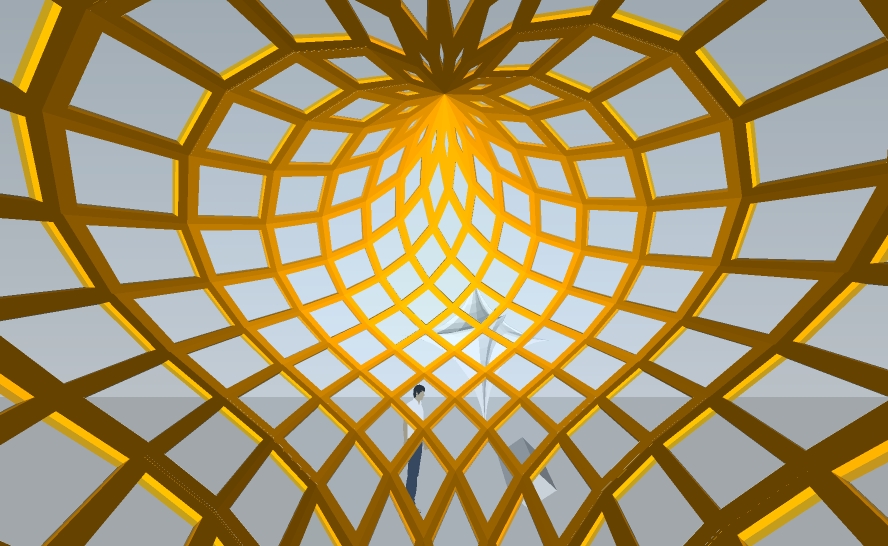
-confused- there is always your genius inside when someone uses Lattice Maker, true or not? ...
...but what's that finger_print.rb? 
serious, I get loads of inspiration from LM, cant thank you enough!
would be little tricky to really build that Zono Lattice, but wasn't there a 3d-printing contest going on?
Thanks James, actually not a big thing - just used two plugins (you guys made me do it .
cheers
Yeah, very good-looking, congratulations Fred!
So see you over at Thea guys - Oli, be prepared for adrenalin rush
Hello Dave,
you are right - and this is kind of a disadvantage...
...although in rendering you will not see the edges, and of course you can switch off all edges and profiles in styles - but then the whole model would be without them.
afaik there is no easy way to hide all profiles and edges, but I might be just unknowing (hopefully, please someone point to the right method or plugin)
cheers
alex