jim...yes thats exactly what I mean, its really annoying and difficult to set up the scene like that. I'll try the camera tool.
Posts
-
RE: Flip Camera Ruby?
-
Flip Camera Ruby?
Hi people,
Does anybody know if there is a ruby out there that can flip the sketchup camera 90 degrees from horizontal vertical?
I would rotate the whole model 90 degrees to fit it in the screen better (its a tall skinny building) but I need to maintain the correct sun shadows.
any thoughts on this?
-
RE: The Future of Plastic Surgery
you are sick man (in a good way) nice work although I think the face is a little too heavily textured..almost like sandstone. interesting work!!

-
RE: Proposed Tower....Podium Renders
I didn't export shadows in these images, they are just the podium shadows. I only exported the SU shadows to add a blurry effect for another project.
If you read the whole of this tut I've explained how to do it.
-
RE: Sketchup+photomatch+podium+photoshop
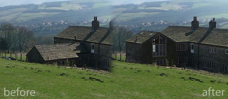
Here is a comparison image, bit easier to understand I think. Cheers TBD
-
RE: Sketchup+photomatch+podium+photoshop
Thanks guys, I suprised myself with this one!
Yes I cloned textures from the original building onto the podium render. They multiply the occlusion produced by podium to make it a bit more convincing. ie they are on a seperate layer above the podium render which I tweaked with curves etc to get the right tone. The sly baked reflections and internal ambient light are too produced by the podium render.
Usually I'd render a textured model but I only have a couple of days to do everything and the materials have to be reclaimed vernacular, so it just made sense to do the visual in this fashion. It is possible to do all this purely in podium but again time is an issue.
Cheers for all the comments its much appreciated
-
RE: LightUp WIP
looks really nice....hdr lighting looks convincing [edit]got my trial downloaded....its freaky moving round a rendered model, kinda like playing xbox lol
-
RE: Sketchup+photomatch+podium+photoshop
its a lot more powerful than people think!
-
RE: Sketchup+photomatch+podium+photoshop
They've sorted the the 2d viewport thing. I've rendered plans/elevations/sections oh yes
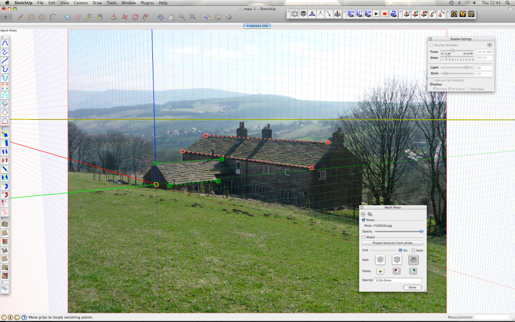
Yes podium renders photomatch beautifully, it will render exactly what the viewport shows in SU. Just set up your 'Match Photo' scene and away you go.
I use this all the time now, but usually with fully textured models not white like this.
-
Sketchup+photomatch+podium+photoshop
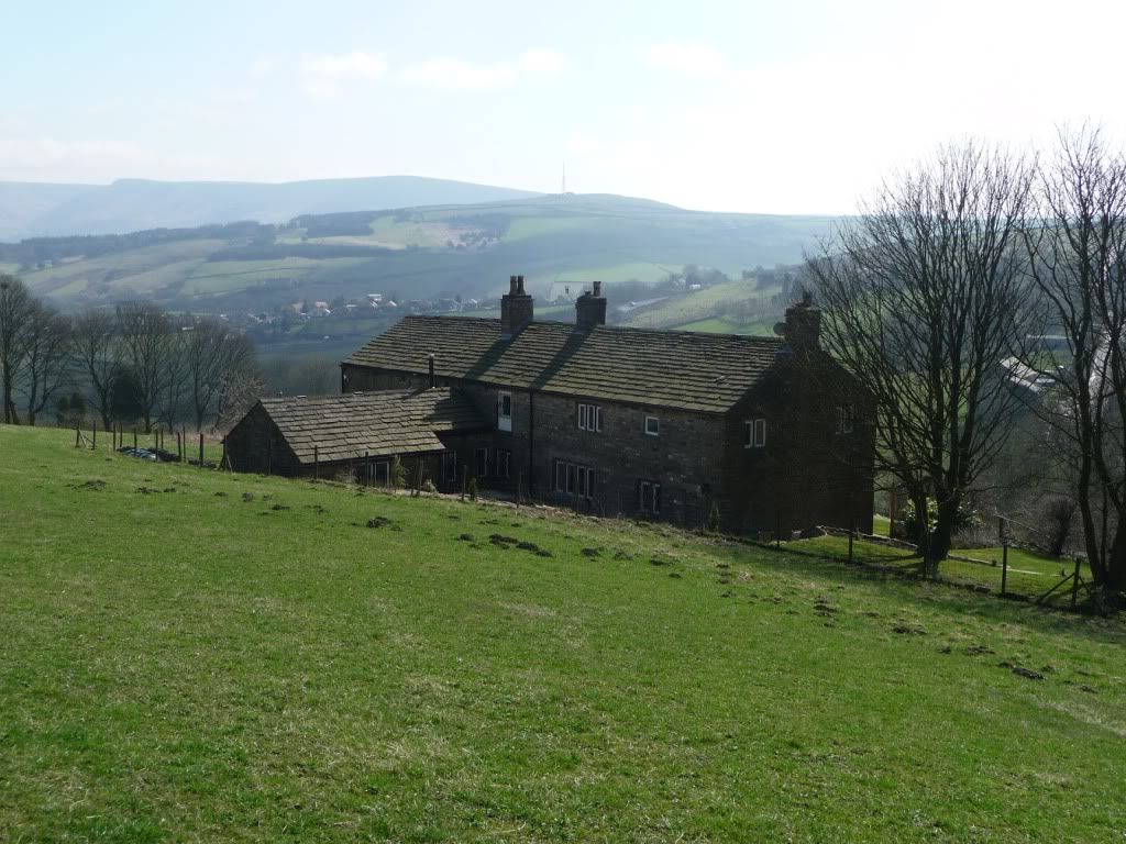
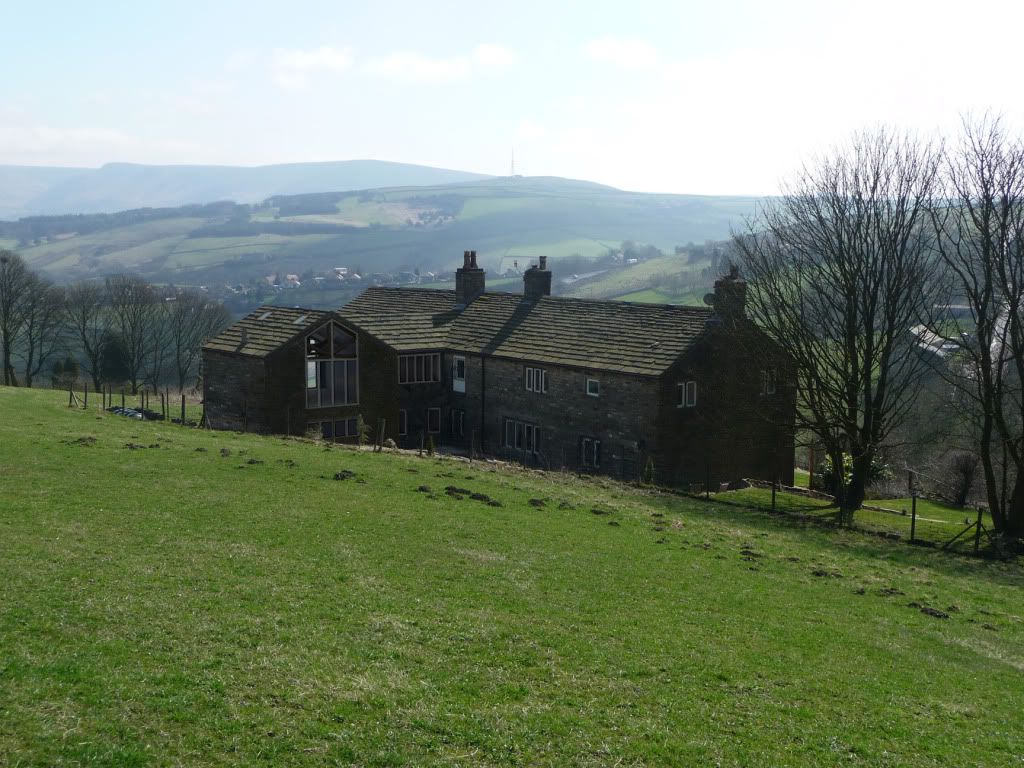
An extension to an old listed house in Saddleworth, UK
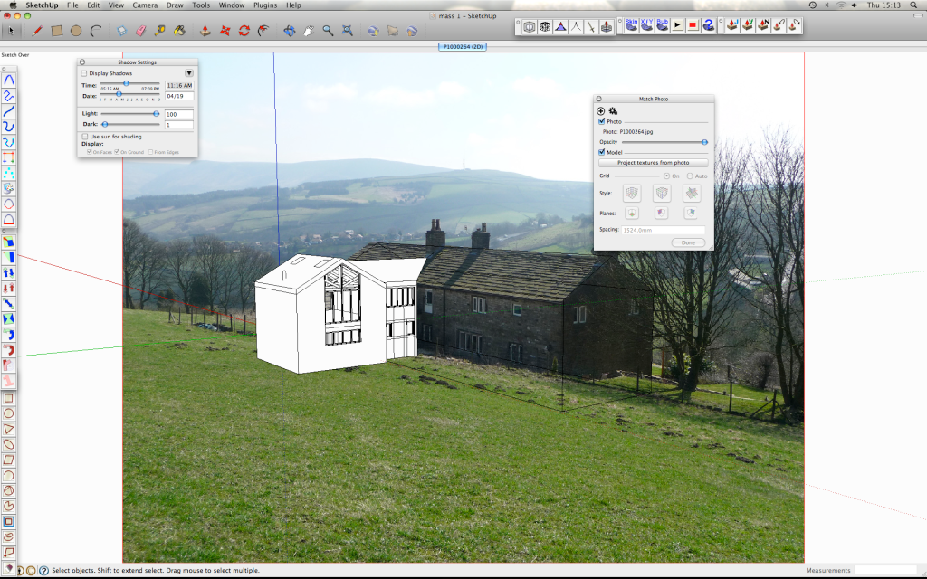
Photomatch in SU, rendered in podium, cloned textures in PS.
I am not the architect for this....I just did this massing study as the relative heights are very important (the extension cant be visible from the valley side)
This is my process.
Good fun!!

-
RE: WIP -- 'Protrude' ruby from Jim Foltz
hi jim,
the protrude window pops up now with no warning messages.....but.....it doesn't work.
I take it you have to select a face then divide then protrude....but when I click divide nothings happens, I have tried entering different values too (and reversing faces)
-
RE: Proposed Tower....Podium Renders
Legendary!! Thanks Edson....I'll let you know when I need it!! It's a very realistic effect. Thanks again
-
RE: Proposed Tower....Podium Renders
edson: i get you now, for some views it is appropriate while with others it looks plain wrong!! I know you like treating your renders almost like elevations, as evidenced in the institute of architects that you did......which worked very nicely indeed. I may be asking you for a favour in the near future.....the mesh PNG you made lol its fantastic.
-
RE: Proposed Tower....Podium Renders
lol thanks, nice fix....but the building looks really deep now!!!
nice web site, I see what you mean.
you can get fantastic results using the lines as a mask too, check this out that smooge did, I haven't got round to doing one yet but any excuse and I'll do it!
-
RE: Proposed Tower....Podium Renders
Here is a quick tut I did on a similar more abstract style, again, Zem pioneered this technique.
Principles are the same except I used SU wireframe and shadows export too, no particular reason, I was just playing with different overlays.
http://supodiumforum.websitetoolbox.com/post?id=3446402 [scroll down for the tut]
-
RE: Proposed Tower....Podium Renders
cheers for all the comments guys.....edson: yes I'm normally not keen on the verticals like this but it reduces the impact of the tower next to the listed building adjacent, I tried several FOVs and 45 degrees [edit: I mean 65 degrees] seemed to come out best.
thanks, oli
-
RE: Proposed Tower....Podium Renders
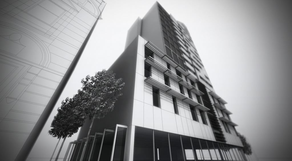
I draped the CAD drawings over all the faces, quite time consuming, but quicker than modeling the whole building...it would take weeks. I exported the lines in SU as a jpeg then placed over the raw renders in PS using 'multiply' blending mode with 30-40% opacity. gives a bit more depth/sharpness too I think. I tend to do A LOT of studies like this under really tight deadlines, you can get away with doing less. The modeling, rendering and post process only took 2 days, thats the beauty of podium, no exporting/importing etc etc!
-
RE: Proposed Tower....Podium Renders
I understand the verticals issue, again, I was trying to fake the impact of the tower. But if that many people have commented on the convergence then I must be wrong!! maybe I'll tone it down a bit next time round. It really is HUGE compared to the landmark building adjacent, but the client requires 90 apartments so it has to be this big. This is purely a massing study by the way....not for marketing etc. I don't normally post my work here, just on the podium web site for critiques, the people there taught me everything! My process is similar to Zem's mixed media/watercolour techniques just tweaked here and there. thanks for your interest
-
RE: Proposed Tower....Podium Renders
cheers for all the comments guys.....edson: yes I'm normally not keen on the verticals like this but it reduces the impact of the tower next to the listed building adjacent, I tried several FOVs and 45 degrees seemed to come out best.
thanks, oli
oh....heres another close up with depth blur and vignette (yes I know its over the top lol)
