brilliant! love the color, love the detail.
ps - susan, great critique. I learned a lot from that. 
brilliant! love the color, love the detail.
ps - susan, great critique. I learned a lot from that.
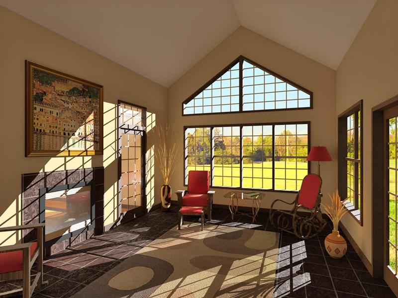
very nice presentation. I may take some cues from this for a project in progress. I wouldn't have thought I'd like the yellowy sky, but it makes for a nice atmosphere.
Cool project, Bruce I like the third image. Evokes a little Zep, imho.
modeled in SU, rendered in KT, MLT 78h 171pass, tonemapping, PS post processing: noise removal, color balance adjustment, a couple other small touches.
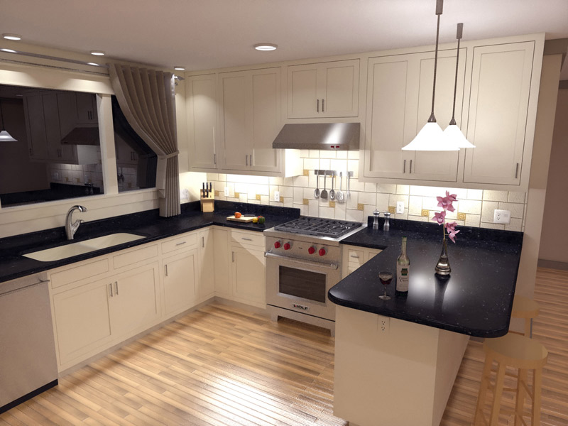
where it's at right now...
still holding off on post-processing - waiting on info to finish up details, revisions, etc.
larger version here: KitchenNWpspsm
larger version here: KitchenSWpspsm
![KitchenNWpspsm[1].jpg](/uploads/imported_attachments/PCOY_KitchenNWpspsm1.jpg)
![KitchenSWpspsm[1].jpg](/uploads/imported_attachments/6ogP_KitchenSWpspsm1.jpg)
Thanks for the comments and suggestions. Here's another go at the wc-ish style.
Marc,
You could use different Materials for each respective color entity (trim, sofit, etc.). So for example, let's say you start with the Material "Color_000" (that's just a standard white). Create a new material from it (see attached) and name it descriptively (i.e. trim). Create a new material like this for each item and name them descriptively. Now when you've completed your model and applied materials to the appropriate faces, you can just go back to your materials palette and make changes to the desired parts.
As far as using groups and components, I would recommend putting all of your trim into a group so it's easy to select just the trim if you want to (open the group and "select all"). That way, applying materials will be easy too.

Welcome, Titmas.
I'm sure that you will find, as I did, the friendly folks at this forum to be very helpful. A great place to learn.
Nick
Gully, this was my first method, but I need to duplicate these holes sometimes up to 25 times on one part. That's why I was seeking an easier method that would incorporate the hole into the duplication process.
Gaieus, thanks for the thread reference - I've read that before, but it obviously didn't stick before.
I just made a square hole component and will duplicate both components to achieve the desired effect.
Alan, I tried it out, but I still have the original face without holes (see pic). Am I missing something?
Thanks all

Gai, you are correct, the material was indeed applied to the group. I've replicated the original circumstances in the attached skp file.
It appears as though applying a texture to a group associates the texture with the larger entity, not with the individual face. Thus, to work around the issue, simply open the group and reapply the material to the specific face.

Nice work, Tina. The last kitchen render is great - the added depth and realism of the shadows in combination with your style are stunning. Keep posting your progress.
Thanks everyone. Here are the options I see at hand from this exchange:
Just delete all the little faces manually.
Utilize a pair of components in tandem to cut holes in more than one plane (viewtopic.php?f=20&t=744).
Do your duplication of holes in a single plane, then push-pull your thickness like it's your job (per James - emphasis added). To expound on this option, picking up where James left off I could then extrude the rest of my piece and graft it onto the "holy" face (see attached pic:)
I expect that any of these methods could be best in various situations. Thanks everyone for sharing.

I agree with remus, that's the right way to do it. Another way is to open both files and just copy from one (Ctrl+C) and paste in the other (Ctrl+V)
Thanks for the tips and encouraging words, everyone.
Here's the "final" version. Changed since last posting: some colors & textures, tweaked tile color/position/bump map, softened shadow, ceiling fan, light switches, outlets, tone mapping.
I experimented with HDR on this - output 5 Gamma tonemap exposure steps (1.00, 2.00, ...), merged them in PS, then Shadow/Highlight adjusted. I liked this version better than the product of my previous process (HSV or Linear tonemapping, PS Shadow/Highlight adjustment). It produced a more realistic image; though highlights are more overexposed than with just Shadow/Highlight adjustment, it appeared more like a real photograph for that very reason.

Here's what I cooked up over the weekend. Unfortunately, I forgot to enable the soft shadows before rendering... oops. Oh well, I can do better yet before I call it done. The reflectivity experiment with the fireplace glass doesn't look great and the tiles are much darker and flatter looking than I had hoped. Oh, and the adjustments I made to the tile mapping position got lost somewhere in the fray - I had lined it up to evenly frame the fireplace - I've lined that up once again.
With the color of the tiles it seems either something changed between my last test and this render, or Photon Map and MLT mode interpreted it differently.
I'm setting the glass back to straight-up TG and I'm not sure yet what I'll do to try getting the tile to look better. I guess some prelim test in MLT would be appropriate since my final render will be in that mode.
Looks great! I've been thinking about giving that DOF thang a whirl when I think of a use for it. Any hot tips for a fellow first-timer?
welcome to the forum!
happy little tip/shortcut for you as you begin (if you haven't already learned this...) I noticed the angled edges of the plate in the kitchen. Not sure if you modeled this yourself, but ffr if you want a smoother edge on a circle, you can just type the number of segments you want followed by 's' immediately after drawing a circle - then hit enter and voila!
i.e. draw circle, type "48s" (you'll see it come up in the little field at the lower right hand corner), then hit enter.
