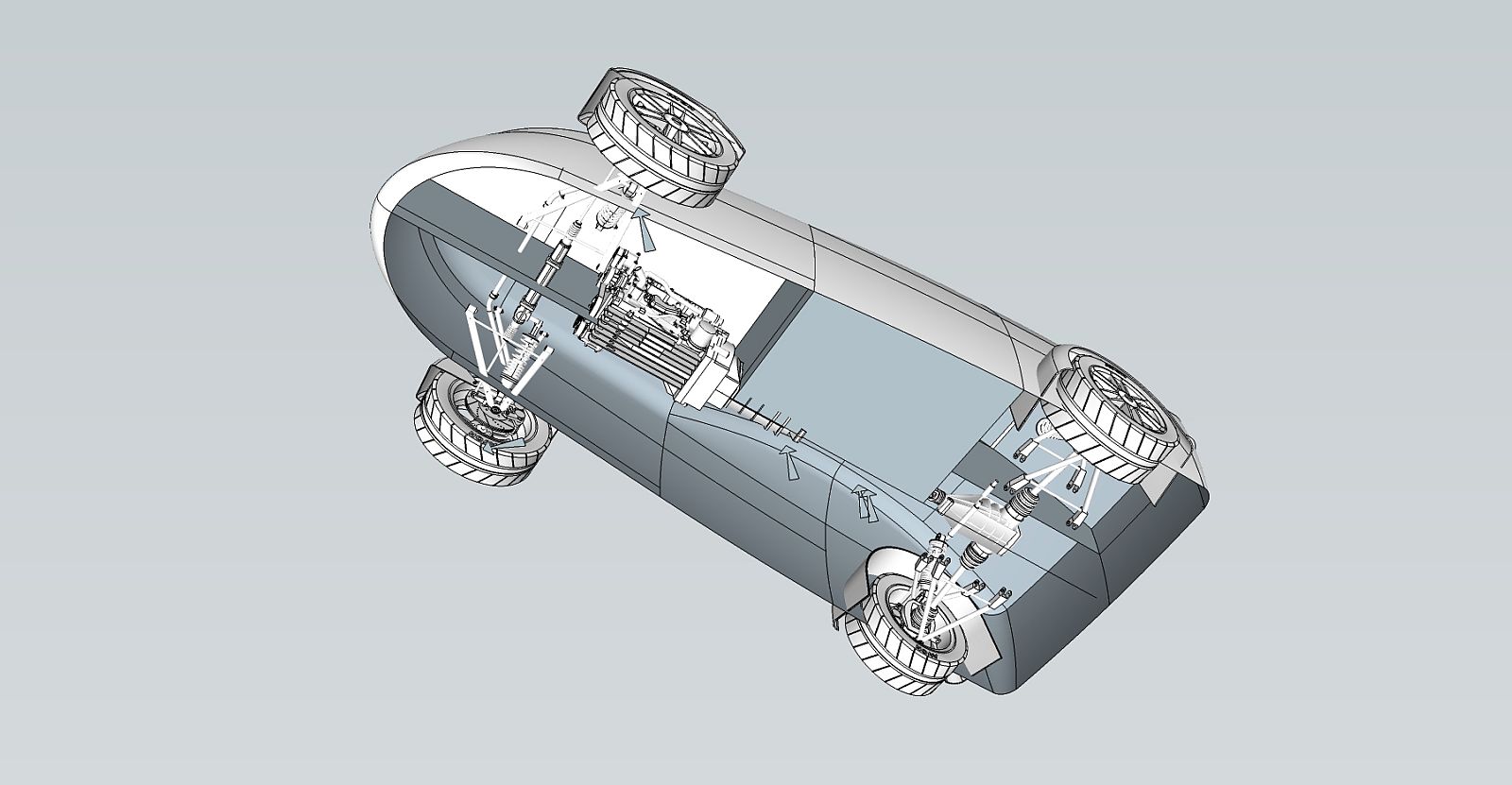
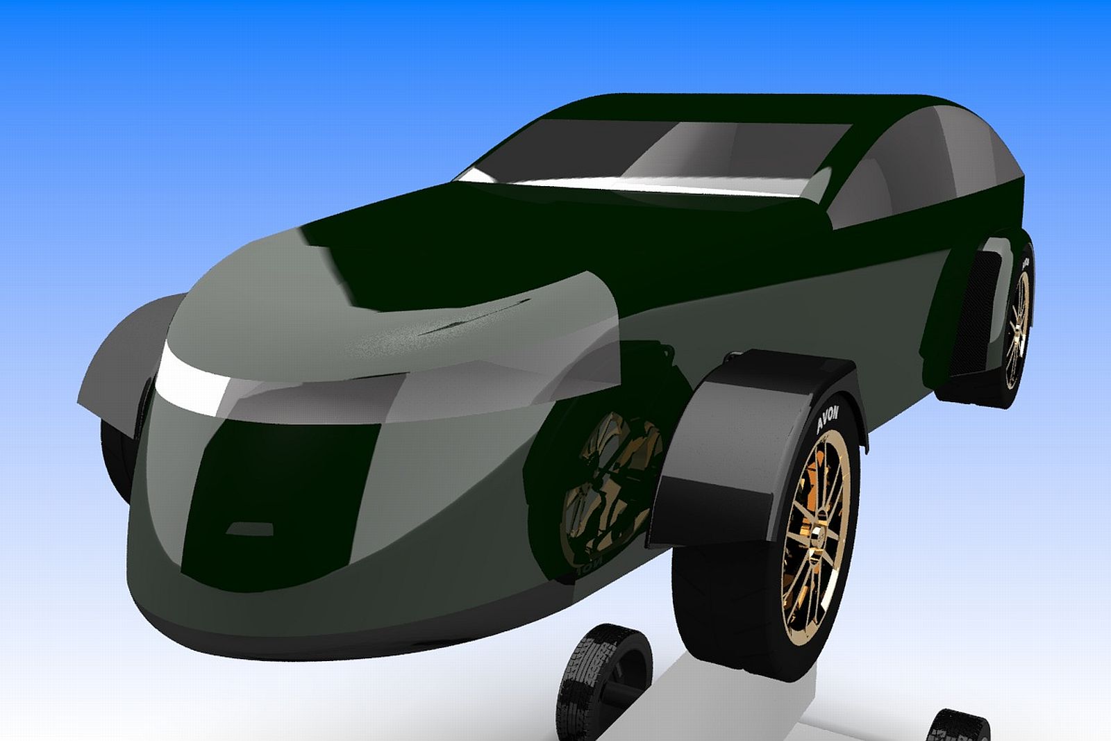
Really neat, thanks for showing rendered and sketchup output.
Posts
-
RE: Clockwork Tinkerbellposted in WIP
-
RE: Mascara House WIPposted in WIP
Having had a look at the room allocation, there appears to be a problem. They have a 'kids room' but only one bedroom I can see, are the 'kids' put on a coathanger every night and tidied away into a wardrobe? THAT could catch on........
-
RE: Another car ish, a bit........posted in WIP
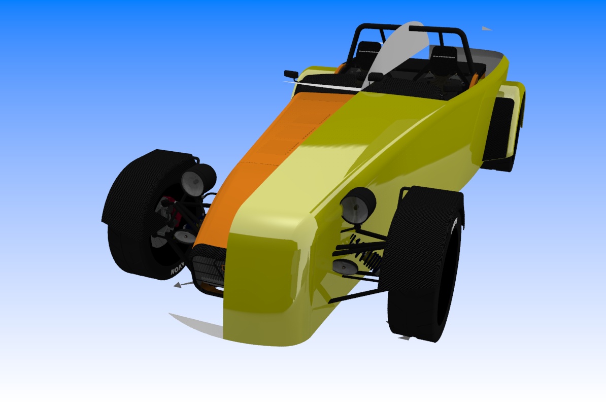
Alternate Style placing the current caterham se7en as a template. There will probably be changes but the body is nearer in size so weight gain will be much less.
-
RE: Windmillsposted in Gallery
David, brilliant as usual. One day etc etc. I sencerely hope your images earn you good money, giving them away like this must cost you a small fortune and I would rather look at YOUR work than the guff in the national gallery. At least your product has integrity.
As a side issue, these would make fantastic hdri images if there were a way to do so.
-
RE: Fragmenting(?) issue...posted in SketchUp Discussions
Have a look into the saucer section, it looks to me as though there are segment walls heading into the centre, like orange segments. I know it happens sometimes and only cure I found was to make sure the 'lines' or segments on the outer profile are contiuous or welded seeing as sketchup loves breaking up circles and arcs.
-
RE: Another car ish, a bit........posted in WIP
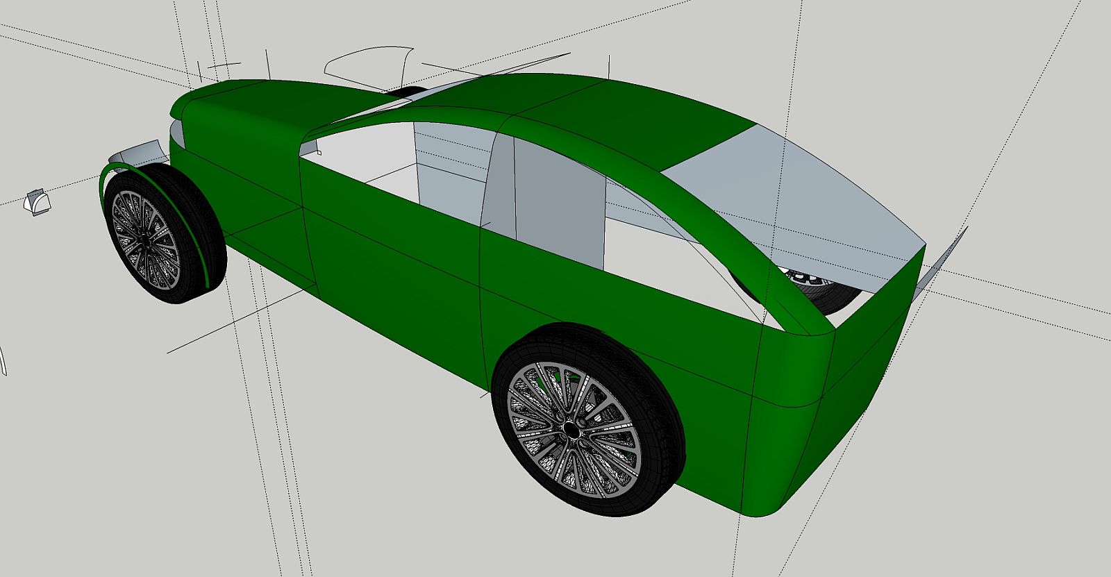
Change for better resolution of regions, rear end in particular.
-
RE: Another car ish, a bit........posted in WIP
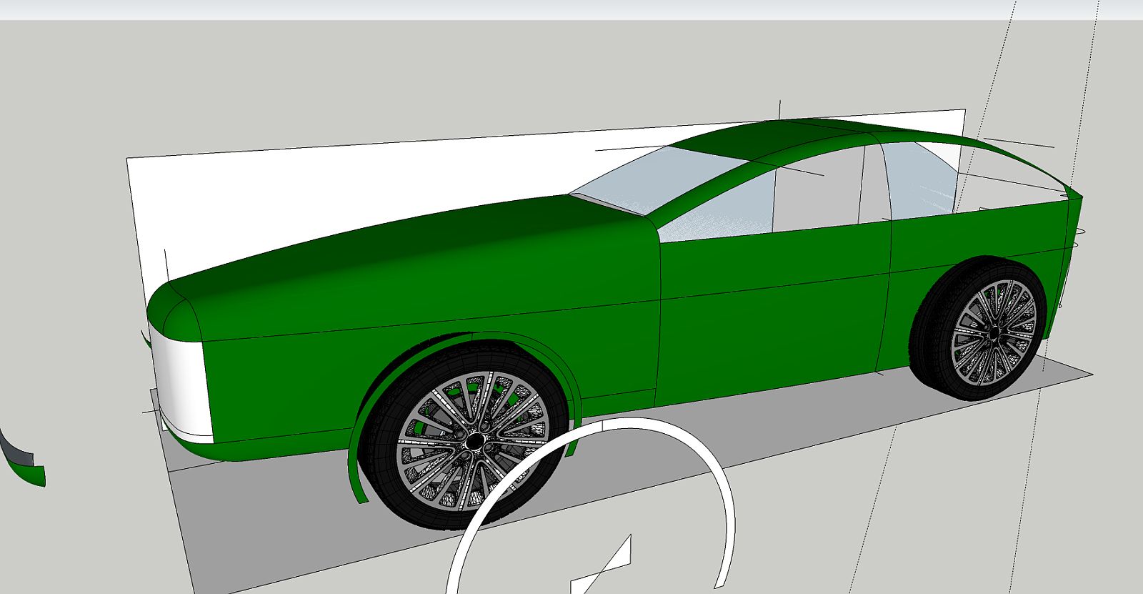
Not finished with that body by any means but I am looking at ways to better integrate roof and body. My problem area with any of my models. Just trying another method here.
-
RE: Trappedposted in Gallery
Mate you keep on setting the standards. Roll on Sir, always a treat to see your renders.
-
RE: Nurseryposted in Gallery
Very nice does not seem to do justice but the feel of the scene is, very nice. A wonderful job of work Sir.
-
RE: NPR Barn Renderingposted in Gallery
@cotty said:
A masterpice!

I would like to see the raw SU output in comparison...Seconded, 'a wonderful thing to behold' That's a quote but cannot recall where from.
-
RE: Another car ish, a bit........posted in WIP
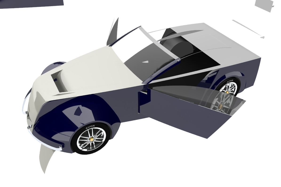
Getting quite frustrated making panels and lines fit, the roof and glazing are particularly difficult, hence the drop top version, I know it is not as sophisticated as some here but I am honing a method that works for me rather than follow the herd.
-
RE: Click speed and Escapeposted in SketchUp Discussions
I selected 'use maximum texture size' ignored the warning and for some strange reason changing tools is no longer a problem. No idea why that should be but everything else was as has been suggested here so I wnet for broke and tada.
Just been using sketchup 2013 for a few minutes and normal service has resumed. Clicking about half a dozen times to get a tool change. What is going on?????????
-
RE: The future of warposted in WIP
Have a look around there are some really experienced robot designers on the board and they are the guys to ask about texturing robots. As an aside, did you see how the x-box conroller, (the 3d movement thing) has been used to make disaster scene robots sheaper and more effective? I reckon the cost to be something like one hundredth of the cost of purpose designed kit. Robots with human form have been considered as more frightening for an enemy but have a thought to how the tripods in war of the worlds worked with sound. Shock tactics achieve as much or more than weapons in a conflict sitaution, the enemy cannot do too much if they are searching for some nice soft paper and a whole. The appearance and noise of the first tanks in ww1 was enough to send whole trenches of troops running. Back to war of the worlds, can you imagine the sound or would you have to watch the film again, I can conjure it from memory and that would work for security purposes like riots too.
-
RE: The future of warposted in WIP
Are you trying for a robo cop alike soldier robot? From a practical point of view 'bots are likely to come in two varieties, flying and tracked/wheeled. For a humanoid type yours has more credibility than many around but the non textured image seems to suit more render types. Urban and many rural scenarios are better covered by a single drab colour as far as military practise goes. To be really up to date your 'bot would not hold a weapon system like a human, the hydraulic system would be easily capable stability wise and binocular vision over a wider field would enable range data to be more accurate anyway. Likely to be radar or ladar based rather than optical.
-
RE: Bookcase Velieroposted in Gallery
A stunning piece, great render too. I am in awe of the mind that thinks these things up but to my mind it is over engineered. Fantastic to look at though.
-
RE: Another car ish, a bit........posted in WIP
Thanks Oli, I had the luxury of a caterham day at donnington, prior to the circuit being butchered for the failed F1 entry, What looks like a very simple car works well on a circuit with combination fast and slow corners with cambered kinks adding the the fright, err experience. What I HATED was the soaking I got even from spray and the lack of adjustment for seating and pedals. Apparently Chapman had a short body and Looooong legs which makes for interesting times when you cannot find the brake pedal coming up for the short circuit final bend/chicane and the instructor is saying 'OK, brake .....now, now,NOOOOOOOOOOOOOOOW'...............
