Wow that's exactly what I'm trying to accomplish. I don't understand what you mean by draw a triangle profile but I will look into the "Follow Me" feature now. Thanks!
Latest posts made by matthira
-
RE: Place an identical (complex) smaller shape in a larger shape
-
RE: Place an identical (complex) smaller shape in a larger shape
Yes a V-shaped groove is all I'm looking for. I'm sorry I'm complicating it so much!
-
RE: Place an identical (complex) smaller shape in a larger shape
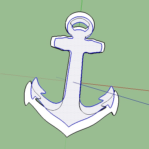
You have all really helped me a lot. I've made a lot of progress for someone who just started this yesterday. I made it to here:
I assume there is a way to create a bevel from those faces I've made? Would it be best to make the large anchor one face, and to use the smaller lines to intersect it and make a bevel from that?
Many thanks again!

-
RE: Place an identical (complex) smaller shape in a larger shape
Hello all yes sorry for the confusing question but I did mean a triangular bevel tracing the interior of the shape.
-
RE: Place an identical (complex) smaller shape in a larger shape
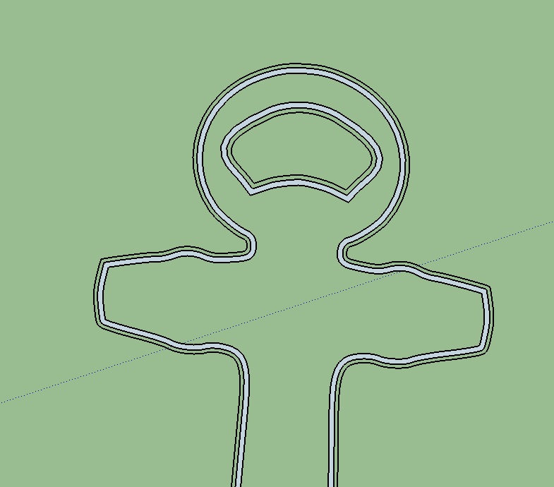
Thanks for the reply! Wow, okay I will try that I wasn't aware that was an option. Do you have any suggestions on how to turn that smaller face now into a triangle I could use to engrave the larger anchor? Thanks again!
I'm not seeing how you used the offset tool on the hole towards the top. It appears it only works on outside edges?
-
Place an identical (complex) smaller shape in a larger shape
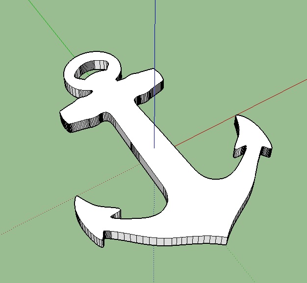
I'm very new to this so I apologize if this is a stupid question. I'm working on this custom lapel pin 3D print based on my monogram logo (an anchor. I have advanced knowledge of 2D vector work but I've never experimented with 3D.
Anyway, I got this far:But I wanted to spruce it up a little. I was going to add a triangular shaped engraving pattern inside the border, so I thought the best way to go about that would be to scale down the outline of the shape and manipulate it into a triangle to intersect the main body. The problem is when I scale it down, this happens:
It doesn't line up properly.
Is there a better way I should go about doing this? I'm trying to make it a little more elegant and less plain so I think this would be a step in the right direction.
Thanks in advance.
File:
http://sketchucation.com/forums/download/file.php?mode=view%26amp;id=131341

