You got all you need....a desire to improve and to keep trying for an image you have in mind. Keep on like that and you'll beat the machine into doing what you want.
Posts
-
RE: Improving my renderings
-
RE: Reflection Pond
Like the composition very much Gareth. Feels right, looks right. I find Pre sets only get you half way there. What you do after that makes the difference.
-
RE: Conceptual visualization
Like the clarity of the images and they work well as concept, but a couple of things may help get your idea across better. 1- Control the camera settings to be at correct eye level and without converging verticals. You'll get a lot more punch out of it and it will FEEL better. 2- Can you think of anything to add that may explain more about the concept other than form. eg. what is the building to be used for ?, where is it ? What type of people use it ? There's a lot more of the concept story you can tell if you think about it....and that will all help sell your ideas.
Cheers -
RE: NPR Style Method [Tutorial]
Hi. Just to say that all the NPR entourage at add life is now only £2.00 GBP for 20 and totally royalty free.
-
RE: Sketchy presentation visuals
As SU face me's these figures are only £2.00 for 20
-
RE: Jumping dwg lines
Just wondering if there are any further fixes to this problem. Just got some DWG's giving me hell.
-
RE: NPR with Painter
@michaliszissiou said:
Landie


I really love these. I also tested painter, its a great app. You dont really need a renderer for this, you know.
A workflow using SU raw export and corelpainter is almost an industry standard in matte painting.Thanks...I've never been talented enough to raw paint over a guide. I've always been amazed by matte artists. With this workflow the render from Kerkythea makes things a lot easier when using painter in clone mode.
-
RE: NPR with Painter
Huge thanks everyone..

This technique has developed out of trying, and failing many times. I needed a workflow that was efficient, with an end result I felt was truely hand painted. Painter just does it for me.@unknownuser said:
you are using 5 different types of software to achieve this nice artistic result, how long did it take you?
Hi james. I can afford to be simpler with the modelling and quicker rendering, as the finished piece is loose on detail. Overall it took 2 long days.
@shura said:
Are you working with version 11? Is the watercolor renderer really that powerful
Hi Shura. I'm still on Painter 10 and to be honest nearly all of the watercolor brushes are very hard work and I never touch them. The brushes I use are a mix of pastels / oil pastels / airbrushes / blenders / and pencil. The big secrets are, clone painting, texturing and coloring your paper, using a lot of layers and working the underpainting. I'll post a tutorial on my site when I get a chance. If you need any tips in the meantime just drop me a line....happy to help out.
-
NPR with Painter
Hi
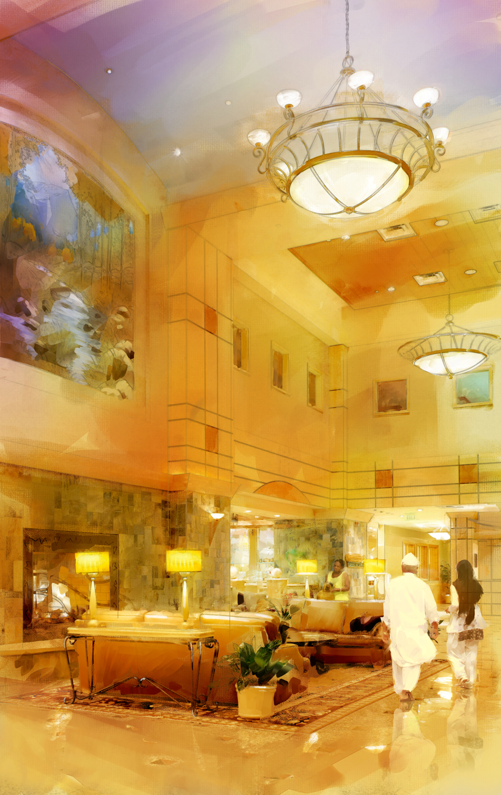
Here is a test painting I've done with Corel Painter. As before, I model in SU, render in Kerkythea, composite in Photopaint add the Add Life entourage and finish in Painter.
This time I;ve used a coloured canvas and worked with an underpainting to add color shift and light emphasis accross the image.
Does anyone else work with Painter ?


-
Free 2.5D face me's
Hi. Some of these are free in 3D Warehouse. Just search for hand drawn entourage.

-
RE: Skp+ps
Very energetic, full of life and colour. The abstract context is a great touch. A very good concept style... and unique to you.

-
RE: Ski lodge (WIP)
Hi Rick
Apologies...I should have scrolled across to see the full extent of your image before commenting above.
Composition: Good frame proportion although I would still stick to 2 point perspective and get a bit more foreground in if possible.
Render: I hear what you say about client requests...you just gotta go with it. If they are happy then it's a job well done.
Entourage: Still think it would be great to add life here and there.
All the best -
RE: Ski lodge (WIP)
Hi Rick. Please take these as helpful tips rather than criticism.
Composition: I'd pull back a bit to see the full gable and the full extent of the first floor balcony, and stick to 2 point perspective as far as possible so verticals are vertical. Eyeline / horizon at about one third split and try the frame crop at 16:9
Render: Try a really crisp daytime render, deep blue sky etc. You seem to have struggled with trying to achieve an evening impression. It is difficult. Lets see through the windows.
Entourage: Maybe log piles, more skis / snowboards. People on the balcony. Footprints in the snow. Mountains in the background.
Otherwise, very good effort.
-
RE: Buy Me
Hi Jonathan. Was this the only render you did for the realty people ? If it was IMHO I'd take a higher viewpoint to see the full deck area. This is great amenity space and implies a much bigger property. All positives for selling. Just a little too much undercroft for me. But a realy good render

-
RE: Design Proposal
Great composition on each Eric and I like the sketch effect very much
 . It's difficult to know how far to take visuals for pitch work, and maybe time is an issue, but I think colour and a bit of life of some sort is always a good call when trying to sell a proposal.
 -
RE: Sketchy presentation visuals
@michaelayne said:
landie
Good to know you use the sketchup forum too!! Keep up the good work buddy.
Sorry Mike, missed this one...thanks for chipping in. Hope things are OK.
-
RE: NPR to photoreal
@unknownuser said:
Cheers...you're right. It could do with filling ou
Cheers...you're right. It could do with filling out a bit.
-
RE: NPR to photoreal
Thanks Rob. Had a look on your web site and I really like the way you cover all types, i.e. sketchy, watercolour and photoreal. I've always believed that dependent on the project, design stage or the audience, you need different approaches to the visual material.