ok, i didnt mean p4wn as is replace, but rather run along sid the other ones.
exept with a better GUI 
ok, i didnt mean p4wn as is replace, but rather run along sid the other ones.
exept with a better GUI 
thanks for the advice remus. say, do you have a brother named romulus?...
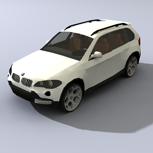
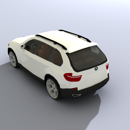
here are some more renderings. credit to whoever make the highly accurate BMW!


nope. edges are colored by axis, unfortunatly.
wow, its going to be a big change from the before photo. especialy if the brick turns out like in the SU pics.
you want it rendered? PM me with the file. (if you do, it will be the first PM to me in my history of posting on various forums. im usualy realativly un-loved on forums, this place seems to like me).
to answer your question, david, its still pronounced "eegor", like DR. frankenstien's assistant. i thought id make a sort of play on words... exept with spelling...
from what ive heard on this forum and the podium forum, 2.0 is going to p4wn indigo and the rest of the rendering softwares.
stop it! you're making my moderatly good modeling skills seem feeble! i want to see that ISS...
my plight with indigo continues. the buttons dont show up on the tool bar. when ever i try to use one of the options, it opens windows exporer and then an eror mesage that wont go away no matter how many times you click the "continue" button. the only way to get rid of it is to close SU, wich generates a bug slpat. the renders look great when i get the image into indigo, but getting it there is definatly not worth it. podium 2.0, where are you?
hey, looks great! ad some color and lets see how it looks!
i especialy like the lettering above the door. looks like an old movie theater! (i cant think how else to describe it, but it looks like the real thing!)
my advice for ganeral use of mouse and key board is: keep one hand on the mouse to use for orbiting and tool use, and the other hand on the key board for short cuts and modifyer keys (ie ctrl, alt, shift, ect). i personaly think that having to take your hand off the mouse to press a bunch of keys is slower than just pressing the button on the screen. i dont think the same for often-used tools like the orbit tool. thanks for the idea though!
my class today went very soothly! we learned how to make a sphere, advanced select tool uses, and the wonders that are groups and components.
some other mantra i have for my students is this: always keep a high vantage point. you shouldnt even be able to see the "sky". this makes modeling much easier.
you guys like it?
want it rendered?
i also agree with the addition of a "before" picture.
yes, i was just thinking of that. but then the o-so handy zoom extents tool would be gone. my class starts in about 5 minutes! (yse im posting at school). this class: realizing that things are not solid in SU, revised Folow Me tool lesson, and intro to groups/components. and all this is in 45 minutes! wish me luck!
thanks for clearing the light/reflection misconception, guys.
oh ya, podium 2.0 is going to be awsome
thanks for the advice plot-paris and solo. ive tried to incorperate the "playing" that solo spoke of into my lessons. so far ive seen some pretty interesting results. and plot paris, i have tried to force them to use the mouse for navigation, but some of them are button die-hards. ill try to correct them today.
thanks again for the advice! more sugestions are welcome!
i agree with remus for the most part. i think that the solar panels would kind of balance themselves out, but only to a certain extent. it wouold take of energy, and let us remember that solar panels are not that efficient yet, but it would reduce the cost or running the place for sure.
there is a flaw w/the design though: the axle thats holding the panels seems to thin and flimsy. my sugestion would be to ad a sort of support post coming out of the roof to support the axle. ill do some quick drawings and get back to this
WOW! that thing is HUGE! i was expecting it to be a little smaller. great model, once again.
if you pm me w/the SKP file, ill render it w/podium.
thanks for the advice about indigo, er, stinkie.
you said that 2.0 will not have reflection and light assignments. WTF?!?!?! no more reflection/omnis?!?!?! this. is. madness!!! (or sparta, take your pick). no way thay're going to get rid of that! how can they? the level of realism would go way down! maybe i just misunderstood... i hope i did...
and stinkie, how am i able to "stick with" SKindigo when the buttons dont show up, and and all the options just freeze/crash SU when i click them? pretty much all i can do is export and thats it. im pretty pissed right now. i knew indigo was too good to be true...
hey, cool design. but what kind of scale are we talking here? stick bryce in there and lets have a look.
about your question of wether the solar panels could folow the sun or not: i think that with the rate that technology is advancing; if not now, probably in the next couple of years.
btw, if you are wondering who "bryce" is, he's the 2-D guy thats snading near the origin point whenever you open SU. if you want him back in your model, just go to:
window>components. and when the box opens go to the drop down menu and select "people". you should find him just fine.
wait a second! if you're this good at SU, you probably know who bryce is! oh well, someone new to SU will probly find this helpful.
good model!
not that i know of. my sugestion is to learn to love it. its EXTREMLY helpful. trust me, i use it all the time. oh, and btw, welcome to the forums!!
WOW! now that i see it with reflection and a background, it kinda reminds me of playing need for speed most wanted. (the golf GTI was my first career car, panited just like that one). i might sugest adding more light to the scene. the reflection on the paint and windows is absolutly AWSOME. try to define the tail lights a little bit more, they are barely visible amongst all that gleaming red paint. oh, and the body color matched rims are a little too over the top. try some matte black ones.
great job!!
i second the multi-core movement! just imagine: when i get my Alienware desktop with the dual quad-core processors (overkill, i know), i could just crank out full quality renders like a factory!
and i would also like to see more render sizes. i have only the free eval 1.5 (i like free stuff), and the biggest i can output is 500x500. its ok for small projects, but i would like some more render sizes (not just limited to you moniter size like the full version).
and hope, like remus, that they will keep the integration w/SU. i hate having to export to another program. this might be from my bad experience w/indigo. the renders looked great when they were done, but getting them there was a PAIN. podium rules. end of story.
anyone else?