Thanks for sharing
Posts
-
RE: Pigeons
Hi I have not used this plug in, but I seem to think you have Maxwell so you could use the proxies thing. Though I have had the odd quirky result using it.
-
RE: House in a forest render
Found this tutorial. might help. http://sketchupvrayresources.blogspot.com/2011/07/making-modern-minimalist-house-by.html
-
RE: Maxwell Villa part 2
Is that from the Maxwell resourses site? Or another/ I can`t find it

-
RE: House in a forest render
Nice scene. The glass is a bit reflective for my tastes, almost mirror like. It would have more depth if you had a sense of the rooms behind.David H Hieru`s Villa looks good that way as a recent post.What renderer did you use?
-
RE: Maxwell Villa part 2
I like the grainy effect. What kind of glass did you use in Maxwell?
-
RE: BoxPod
Hi came across these, they are getting away from your idea but is a little food for thought.
http://microcompacthome.com/company/[/url] http://www.archilab.org/public/2000/catalog/gregoi/gregoien.htm[/url]
-
RE: BoxPod
Like it. My wife recently went to help train staff at a hotel. I noticed all the bathrooms were of this kind of design, and were craned in plugged and plumbed in. The rest of the hotel was of more traditional construction. I seem to think Kengo Kuma designed a plastic house but not a micro one. How about a Kalwall panel to make the door with a moulded edge.
-
RE: Matched Photo
@matt.gordon320 said:
While I don't have any real criticism (It looks good!), I do have a better method of cutting around trees...use the ones I have instead. I can create a dropbox link if you want. I have a couple hundred photoshop alpha channel trees for use with renderings that friend of mine made a while ago, as well as people and brush presets (for black/white people silhouettes) They're absolutely awesome for PS renderings.
Let me know.
Matt
Yes please. You will have to point me towards a good tutorial on how to use them as I have no idea.
-
RE: [Interior] Classic Living Room (2options)
Fantastic. Makes me feel a little lame. I like the first one best. Would be very proud of either though.
-
RE: Matched Photo
@honoluludesktop said:
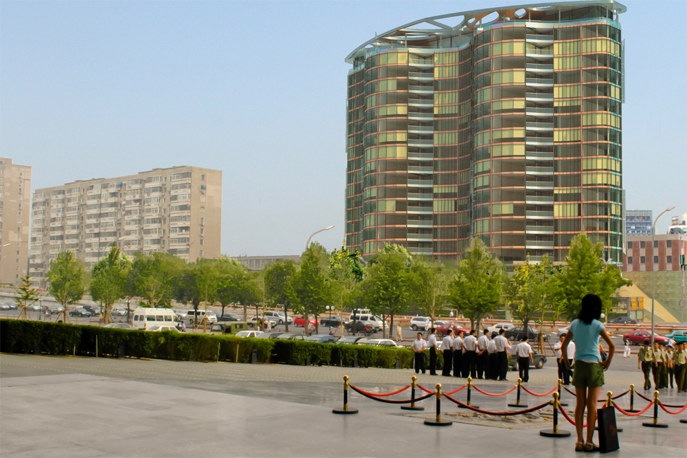
Guy, I find the lady in the foreground out of scale. Is the object of the render the biggest building on the right? If so I would opp. for a more symmetrical view, may be a tall image with more sky above. I also find the empty left lower portion of the image to be a distraction. The empty sky on the upper left could also use a foreground tree.
Nice building, will do much to upgrade the neighborhood.
quote="honoluludesktop"]Guy, I find the lady in the foreground out of scale. Is the object of the render the biggest building on the right? If so I would opp. for a more symmetrical view, may be a tall image with more sky above. I also find the empty left lower portion of the image to be a distraction. The empty sky on the upper left could also use a foreground tree.Nice building, will do much to upgrade the neighborhood.
@honoluludesktop said:Guy, I find the lady in the foreground out of scale. Is the object of the render the biggest building on the right? If so I would opp. for a more symmetrical view, may be a tall image with more sky above. I also find the empty left lower portion of the image to be a distraction. The empty sky on the upper left could also use a foreground tree.
Nice building, will do much to upgrade the neighborhood.
/quoteThanks for the help and the comments. The lady is part of the original photo, but she can come out,with a fight! I was going to do add more sky though. Alas dont have a good photo from a flatter angle.
Regards
-
Matched Photo
Hi,
I could do with some help and criticism please. I have rendered a matched photo in Maxwell Render and put it together in Photoshop. Does anyone have a good method of citting around trees? Have tried to use the background layer and use the airbrush behind to limited effect. I have only a little experince in Maxwell though have enjoyed using it so far.
Any help will be greatly appreciated.

-
RE: Big mirror problem
Hi
That seems a lot of textures for a simple scene. Are you using any very big texture
s or pngs. Can you simplify it a little? It will not just be the mirror but cumulative effect of textures. Would this normally work on your machine? I found if I have too many glossy surfaces I did not get a render! Can you use layers to hide something? Looks like not. Have you tried using ThomThoms clean up? I do not have the technical knowledge of others here but sounds very heavy for a single interior scene.Someone with real knowledge will answer I am sure.
Guy
-
RE: Decoration : Water Is Life
Interesting idea nice render. What method did you use to make the cones? Why the chess board background?
-
RE: Show Me Your SketchUp
Before I had more stuff on but now just simple and render apps/tool.
-
RE: Render this: Rusted, busted old beaten up car
Quick test render. Can`t nail the glass though.

![AutoSave_Austin[1].png](/uploads/imported_attachments/oR6D_AutoSave_Austin1.png)
-
RE: Curviloft (Beta) Plugin Tutorial
Amazing stuff. I have a laughable question. Can you please tell me where I find the sub division options you have used at the start of your tutorial? I can`t seem to find it!
Guy
-
RE: Silvershadows eye candy 2 : BLACK HAWK
Absolutely amazing job! Now you need flying lessons.
