There you go, made the shadows softer, some more specularity on the roof and the tree has been finished.
Cheers,
FoXar ^^
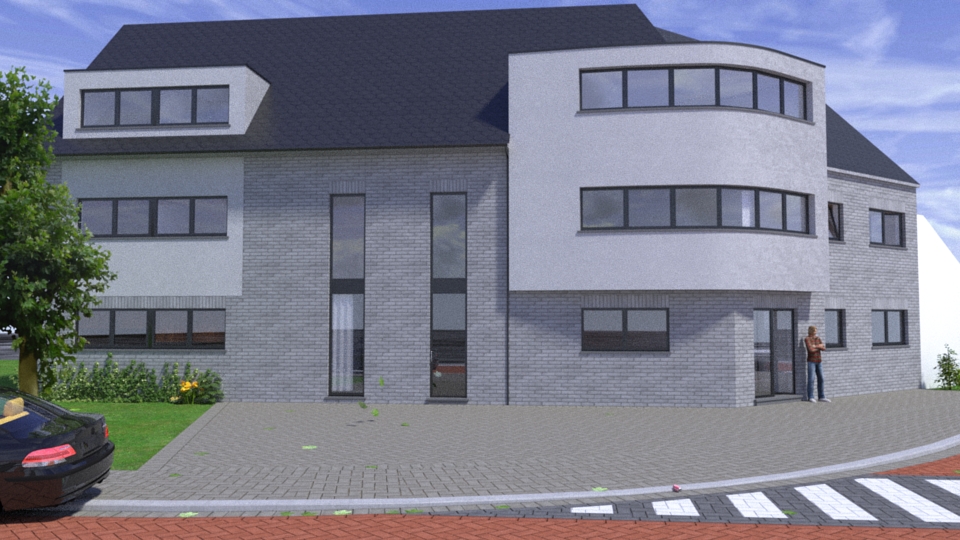
There you go, made the shadows softer, some more specularity on the roof and the tree has been finished.
Cheers,
FoXar ^^

@solo said:
Sure thing, I had that request from guys using Mac's as for some reason .skp's do not show thumb nails.
Yep you're right, I'm on mac too, and it's a pain, but now the collection is just in my components folder, which is very usefull!
Cheers,
FoXar ^^
Haha, I thought so, and yes, awesome collection, bought it somewhere in the first week when it
came out, still had no regret, Pete (if I may call you like that) you've done a great job, and owyeah,
your pack is way to cheap..! 
If I may for the interested:
http://solosplace.com/3Dgarden.aspx
(My bad if this has been a bit too off, just see it as 'topic filling')
Cheers,
FoXar ^^
Well I suppose the best way to kick off is start making mods,
that's how I started modeling anyways. So this is what modding's
about (I'm giving this example as it's what I've been working on).
You can take GTA San Andreas as your 'game engine', with the available
tools of the 'modding comunity' you will be able to take out the whole map,
cars, peds,... And you will be able to creat your own map/world in it, you can
also code new scripts for new game modes or missions. I could talk hours about
it, but if you're interested in more about this just send me a pm or something, as
I'll be forgetting to check out this topic so..
Btw, I also know more things about other 'real' game engines (IrrLicht f.e.)
Cheers,
FoXar ^^
@unknownuser said:
Hi FoXy,
Looks good so far, i don't have much experience with renders yet but i'm learning. Do you think your roof tile should have a little dull reflection?
Other than that well done. Although i'd hate to be a window cleaner in Olen
Hehe thanks "rclub24", you're right it could use some more specularity (if that is what you mean?).
Yeah I understand, well the architecture of this block really isn't my style, and all these windows
being the same (and in a weird curved position) might be a pain the clean them, as long as we get
'enough' work for these 3D jobs I suppose we won't need to clean them, at least I hope so.
Cheers,
FoXar ^^
Hmm I'm liking the second one the most, and the first less.
I like the second one more due to the details I still see in the cladding while the background tree is still
subtle and not too strong pronounced. But that's just my thinking, it might also depend on color profile's
as others told before. I hope you're having something usefully on my comment.
Btw, great style, I like it how your style evolves trough the topics, and the man at the roof 
Grats,
FoXy ^^
Hmmm, after reading trough this topic I'm getting the feeling to start learning
Vue too, when I get some time on my hands I'll sure boot up this nice piece of software
to give it a shot!
Grats,
FoXy ^^
Hehe, great Master Turf both, Olishea and Solo, you have some great imagination!
The grass chopper is looking great too, but am I spotting some flowers of solo's gardenpack?
Grats,
FoXy ^^
Hello,
It's been a while I've been back on the boards (posting something),
so I suppose it's the best to introduce myself shortly. I'm a young
student (16 to be precise) which shares the same passion as most
people do here. The SU microbe has bitten me about 3 years ago
when I started creating game modifications, and later it drove me
to some small jobs in the viz. On school I'll be starting in the 5th
grade of 'Architecture & Interior Design' on high school located
in.. Belgium (how could you ever guess..  ) where I'll be using
SU for the first time on school (hehe looking forward to that!)
Oh well, that's about it, a bit longer than I've expected, but I'm a big
talker.. 
I'm currently working on an appartment block that will be located in Belgium (Olen),
but I'm still not that happy with the image I'm getting, so if you guys have any
constructive critism or way to make this better, please let me know, it will be
greatly appreciated.
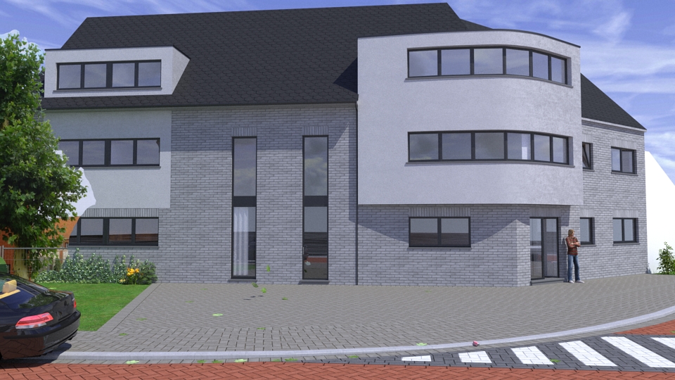
N.B. Project should be finished at wednesday / tree clipmap was not finished yet.
Sorry if my English is a bit slugish,
FoXy ^^
Hi there stinkie, looks very nice, especially all the detail you've put in the model,
also I might be able to help you bit sometimes, as I'm quite familiar to game modding
in spare time, and the assets are quite close o your ones, ohyeah, and I'm Flemish to,
so I might take you some pictures if you want, ain't a real problem for me ;]
Grats..
FoXy..
Okay, now I see it, looks very good, nice use of solo's garden pack.
But maybe you could try to brighten up the sky a bit, but still looks good ;]
Grats..
FoXy..
Looking very good Sharwe, especially the length and focusing on nice
spots of the building are a great plus. What immediately took my attention
were the walking people and driving cars, I was wondering myself how you've did that, do you mind sharing?
I'm really looking forward to see your animation, unfortunately it doesn't load..
It's just a white rectangle, is it me or do others experience the same problem?
Grats..
FoXy..
Looks awesome, the architecture and design is totally my style :]
May I give it a try at rendering, or do you prefer not to, just to
be sure that the project keeps "yours" (dunno how to explain it right.. sorry for my english)
Grats..
FoXy..
Looking very good,
you're inspiring me a lot lately!
Btw, I'm also learing Vray right now, I'm also fascinated by the speed
and quality of the renders.
Oh yeah, and to elt you notice, I was planning to buy your garden pack one of these days ;]
Grats,
FoXy..
Very good work pibuz, I really like the lightning, nice scene ;]
And about the fireflies, you could easely post-pro them in Photoshop or Lightroom.
Grats..
FoXy..
@hebrides said:
Well Foxar its hard to get attention in here sometimes, no worry. I think you are on your way. Just brighten the last one up a bit so we can see it.
Hehe kay, thanks for the tip to!
Here's the brightened up version done in Lightroom 2.2
Grats..
FoXy..
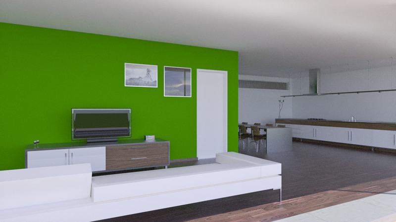
Hmm seems like this topic is getting lost quite fast..
But meh, here's a new render I took in KT + MLT overnight (and half day)..
Also, is there anyone who has some requests or any ways to improve as it's still not
that 100% right IMO.
Grats..
FoXy..
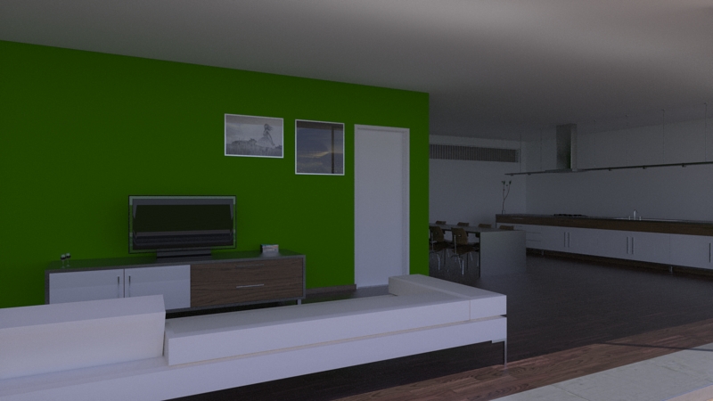
First I want to say your renders are looking very good, better than the previous project did ;]
Second,
First I should know if you're on a nVidia or ATi card, if you're on a nVidia
you could adjust your monitor within nView (install the newest driver to have this program).
If you're running on a ATi I'll have to look further.
But I'll give you a more detailed explenation after I know wich crad you're running on ;]
Grats..
FoXy..
Hello folks,
I'm currently working on a self designed vacation park, this is fictional
project that should be located in Spain near 'Sant Fost de Campsentelles'.
The key (style) features of this project should be fresh, modern and sort of minimalistic,
I've tried to implement these key features in the building and in the furniture.
I've still got a lot to do, here's a list:
-Terrain (in progress)
-Entrance
-2P Home
-4P Home (in progress)
-8p Home
-Big swimming pool
-Cafetaria/restaurant/recreative-build
I would kindly apreciate to give me some constructive critism and requests are welcome to ;]
Further I can show you all a 2 (not final) renders, one interior and one exterior ;]
Hope you enjoy(ed)!
Grats..
FoXy..
![An exterior view [KT + MLT] An exterior view [KT + MLT]](/uploads/imported_attachments/tTW9_K8-2.jpg)
![A quick interior, just 43 passes [KT + MLT] A quick interior, just 43 passes [KT + MLT]](/uploads/imported_attachments/Ss1u_K11.jpg)