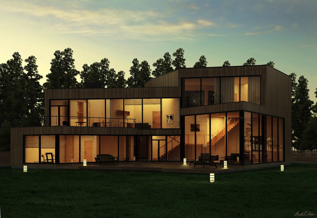
And some exteriors. This is my own project, multifamily housing in Lithuania, Vilnius. Only two days for modeling, texturing, rendering and post production 
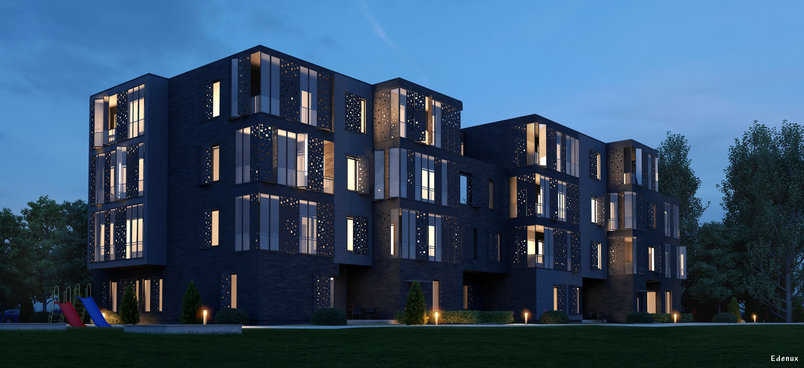
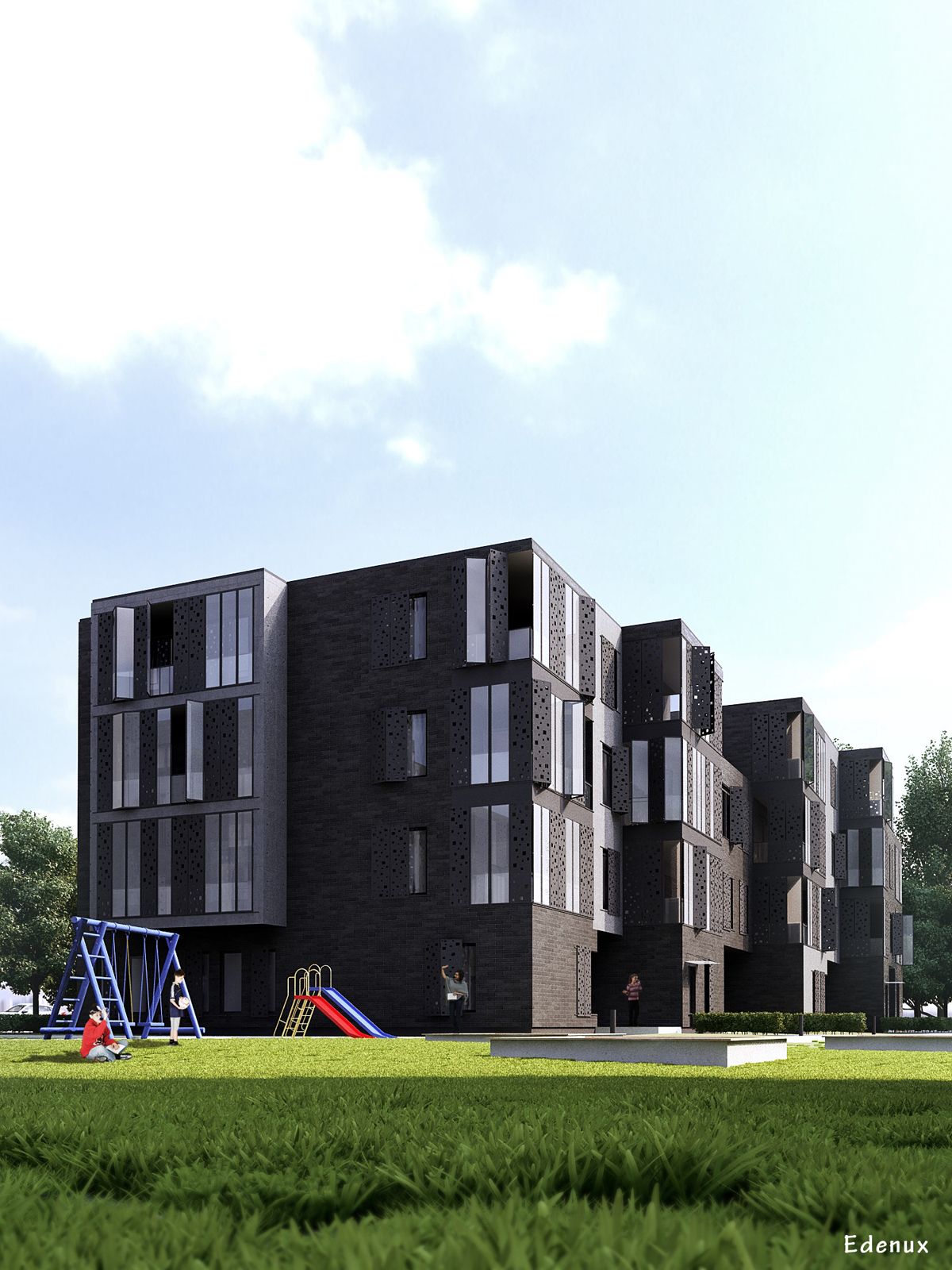
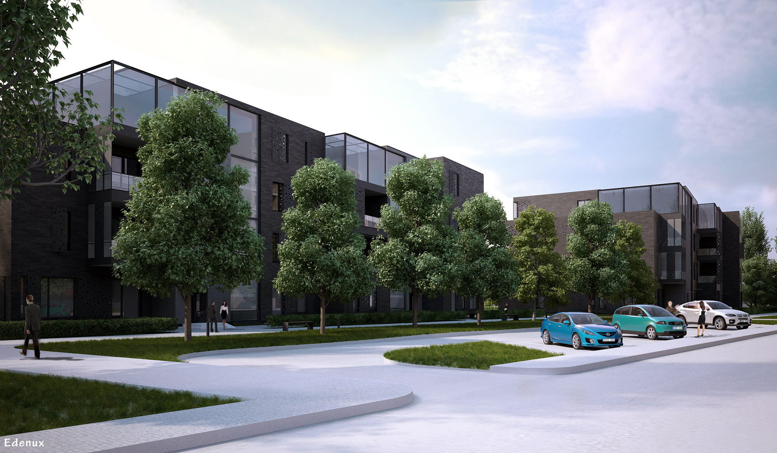
And some exteriors. This is my own project, multifamily housing in Lithuania, Vilnius. Only two days for modeling, texturing, rendering and post production 


Overal view is very good. But you should use different materials on walls, ceilings and cabinets. I mean white color. Now it looks, that you only placed a white color, and everything looks like made from colored plaster. And one more thing: in reality it is impossible to make perfect wall, it allways has some scratches and etc. So I recommend using plaster textures on walls, ceiling, and diffrent textures on furniture 
Hi. Renders are pretty good, but there are still many things which can improve quality. First of all, in interior there are so many dark zones, which are not giving any information. And of course that dark corners makes image less cosy 
What about exterior. I like that it is well illuminated. But composition is not that good: if I were you, I would zoom out the camera to see overall building view, how it looks in environment. And cuting top af the building is not good desicion in my opinion 
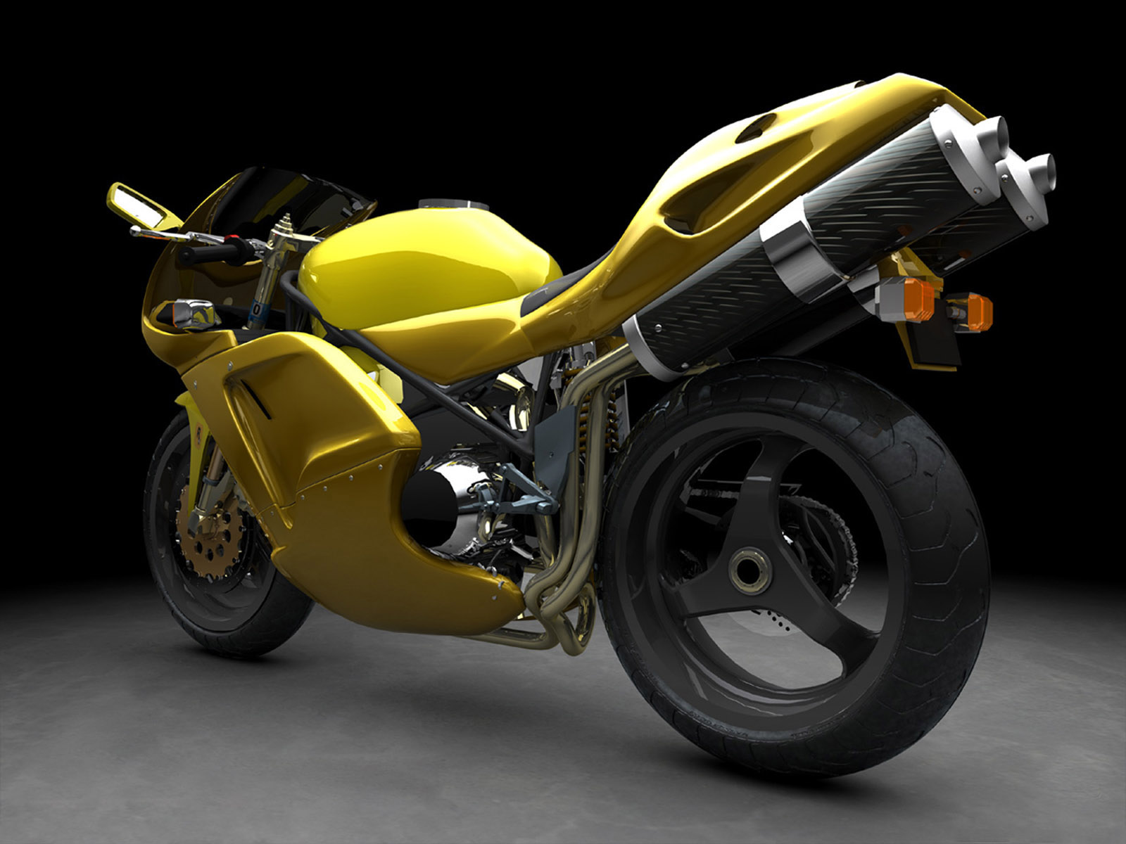
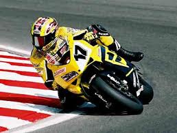
Hello, I like your modeling skills and design. But your are not revealing it with renders. Pay more attention for materials, reflections, esspecially on metal. Maybe white backround can help you to get contrast, because now almost everything are grey colored. And of course composition. You should try lowering the camera. You can rotate your bike a little bit to show "power" and "speed". Some attachments can help you:

Hi. Have not posted anything for a while here, so here are some not commercial interiors:
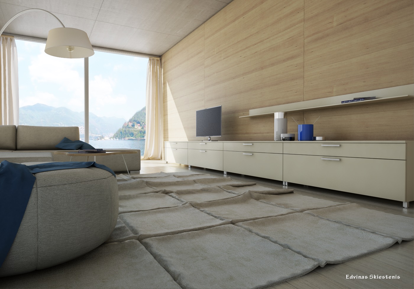
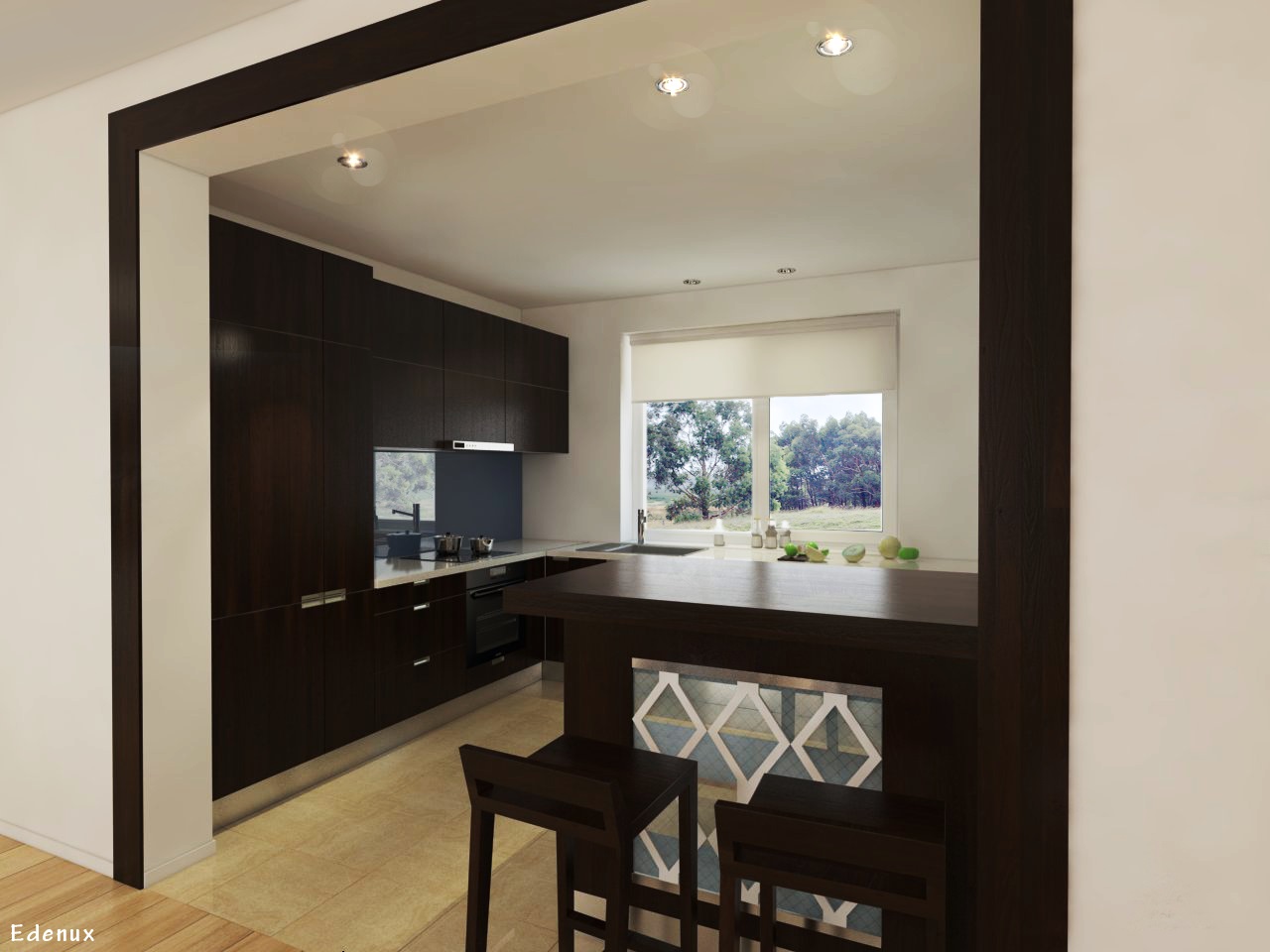
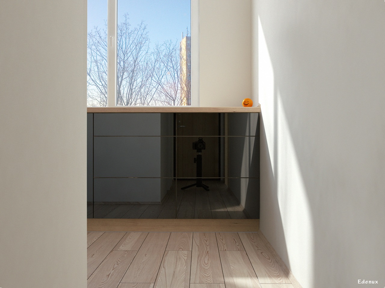
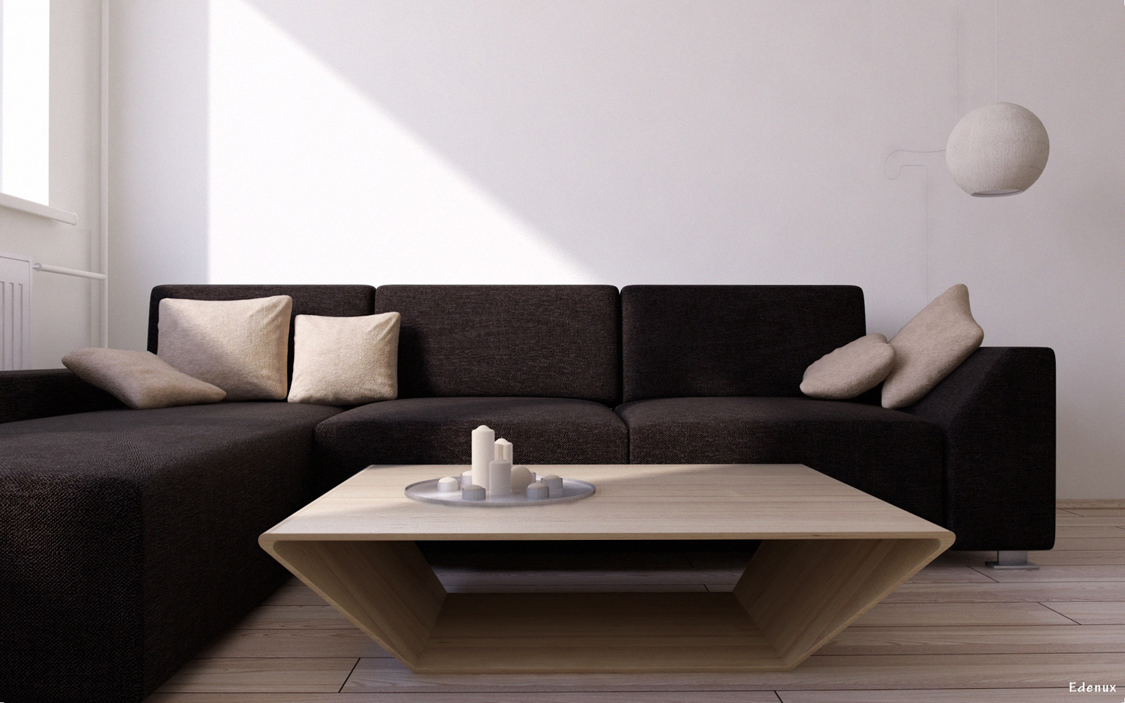
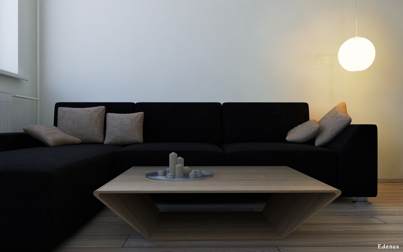
Hello. This is my last project. Sketchup + vray + a lot of photoshop 


Thanks for watching,
C&C are welcome 
Hieru. Well, actually there is a bump map(displace is not goog choise in this situation), but in real life, you are not able to see it from this view. It is too far. It might be when you are several metres from the object.
I agree with you about dirt map
Thanks
Altab. Well, actually I am not allowed to tell you settings. But you can purchase video tutorial from evermotion. You will find everything there aout this project
Update of the house 

Hi friends. I am posting my last render. Planing to update it, because the result is not like I expected. Any comments and critics? 
Sketchup + v-ray + ps.
I have a problem which is close to this topic. My background is too close to the object. How can I minimize or zoom it out? 
markrd001 was right. But i wanted to tell you this: http://maggiefieldsdesign.blogspot.com/2011/03/illusion-of-space-by-atmospheric.html
maybe not so much, but a little atmosphere feeling 
Very nice and realistic. But in my opinion you should make the second "plan" not such a visible. I mean that some atmosphere feeling and bluriness are missing 
Thanks again, so many people I know is there! Lucky to be here 
jarynzlesa, hello, I saw a comment of yours in alvis post when you called him with my name. The true is revealed
Roger, the design of clock is not mine, I just googled and modeled. To be honest, the building is only in my mind
but I was thinking it to be in Italy, near one of the largest lakes
irwanwr, I am in progress of making a complete tutorial for creating these renders. But I am only creator, not distributor. You will be able to buy it I think
Thank you all!
ArchEden(edenux)
Really nice style, I like them. Maybe 3rd render has little to much of sterility(is too clean)? Nothing in addition, great renders!
Thanks everyone for kind words!
fabiorossi, firstly, big thank you. About rendering times. Each one scene took about 3hours of rendering(size about 3000x1600), except the bedroom one, which is about 2hours. I am using a laptop(i7, 8Gb ram, 2gb video).
Shaders. Well, I don't actually know what it means 
 But if I am right, it's a texture which is reflected. I was using them only on wood materials. Also on wood I have been using desatured reflection maps. Some images to make it more clear:


Daniel, I don't know why, maybe bacause wide images or big resolusion give you a feeling of oversized boards, but they are really in good size, just checked
Anyway, thank you!
Edenux
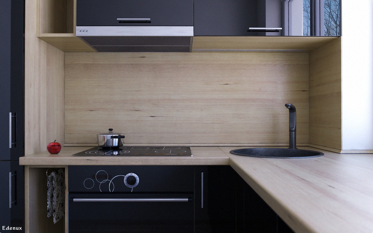
Hello, I am new to this forum. I would like to share some renders which was created with sketchup 8 and vray and get some comments and critics. P.S. everything was modeled by me 

Thankfully,
Edenux