Perspective, FOV and other interesting stuff (I hope)
-
OK, thank you.
Maybe I'll post something about my techniques to save file size... -
@gaieus said:
Maybe I'll post something about my techniques to save file size...
That would be GREATLY appreciated!

-
-
Bruce, yes I did know that but still a great tip.

-
Maybe others can share some of their favorite "funky" angles?
-
Tina,
Don't know if this will be helpful, but I often find that you can use more extreme perspectives for aerial and worms-eye views. Once you move away from 'realistic' eye levels I think the mind accepts that the view is no longer 'real' and will tolerate more exaggerated perspectives.
In the case of your project, I'd go for a more radical perspective (60 - 70 degree FOV) on the aerial view. I'd also be tempted to try a view from low down on the approaching driveway (which looks to slope up towards the building), putting the foundations almost at eye-level. This won't show the whole building (which I know your client wants) but could be a nice 'persuasive' illustration.
Hope that's of some help. Don't really feel qualified to comment too much, as my industry is traditionally a lot more tolerant of extreme perspectives (style over substance!! )
AndyC.
-
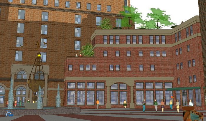
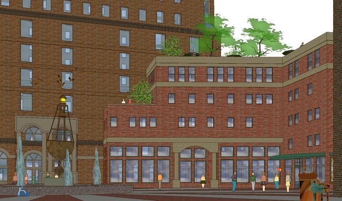
Been following this thread with great interest...just starting to play around with such myself (totally in the dark until now...but my eyes haven't yet adjusted to the light :`) Here's a couple of images for discussion if you will, both look a bit strange to me when I look at them this way...
FOV at default 30 (outer edges and peeps look distorted):

Same FOV in 2 point perspective (inner verticals look distorted):

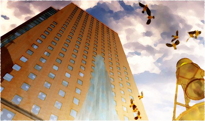
Just for fun:

-
Tom, your "just for fun" is fantastic. The ceiling lights inside the windows caught my eye... brilliant

This would make a great wallpaper. -
tom,
for what it is worth, for normal views i prefer the 2-point, but the ones looking up need the converging lines for effect. your "just for fun"pic is really good.
-
Eric...gotta admit: just a happy accident. You're looking at the upper windows on the other side of the building...though you give me an idea about how to create the effect intentionally.
Edson...yeh, starting to prefer 2-point too, especially for distance views. And better for this view as well, I think...because of the near building frame, but I still think it looks distorted in the middle at this stage. Will experiment next filling in with lots of foreground "eye-busy" to see if the intensity of it goes away...?
-
I often use exaggerated views for site signage, one of my main investors actually insists in them for when he approaches his bankers for funds, he calls it 'dynamic angles'
I agree about the 'just for fun' one...it will sell the concept quicker than the corrected ones. -
A couple days ago there was no paying work in house, only business development projects. Now I have a couple of jobs the clients want yesterday. I have been working until I fall asleep at the key board. I came over here to see what you guys and gals are doing as a form of taking a break.
I am really starting to enjoys Tom's style. I also like his hat.
Regarding perspective. The strong up shot works with out question. The other two I am probably OK with both, but maybe I favor the corrected perspective. I am only bother when the three point looks like a mistake. However at some point you say wow that is powerful and must be done on purpose. It when some thing is a little off that I don't feel confident in the artists intention.
Well, that was a hell of a break, now back to work.
-
@tinanne said:
@gaieus said:
Tina, I was actually going to ask what roof tiles you are using and how you solve the high-poly problem if they are modelled. And what do you mean by "boosted"?
Boosted is when they use more mortar under a portion of the tile to make it look raised. It's really pretty when done right. You'll find it alot in Mission Architecture. I'm sure someone out there has the whole history and origin behind it
 I am a woman of few words (which my husband appreciates
  )
)[attachment=0:cef5irog]<!-- ia0 -->Boosted-Barcelona-2.jpg<!-- ia0 -->[/attachment:cef5irog]
[attachment=1:cef5irog]<!-- ia1 -->2377.jpg<!-- ia1 -->[/attachment:cef5irog]The component is from FF and it is very taxing. I usually wait until the last minute (if I can) to put them on and of course have to turn those layers off if I actually want to continue working in the file.
 But the effect on the finished rendering is very nice. Not so flat and when you start playing around with the sketchy styles the roof really starts to "pop".
If the render engine supported displacementmaps, would that produce a sufficient result?
-
yes thomas... it cam be produced with displacement maps... rite now i only know of maxwell 1.6, vray and fry render to support displacement maps.
-
Woah! I'm away for a couple of days and...... TOM! that upshot is gorgeous!
@thomthom said:
If the render engine supported displacementmaps, would that produce a sufficient result?
Forgive my thomthom, but I don't know what that is?
Andy, I love you work, you are more the qualified to answer! I tried ground view but the client would go for it. He has been very firm with what he wanted soooo.... Here it is finished
Roger I feel your pain, I have been working till I fall asleep at my desk for 3 weeks and trying to pack inbetween. (but that not a bad thing, right!)
This is a great discussion. Anyone else have some fun angles. I'm going to play with some as soon as I clear my drawing board a little and move some couches!
Hello! It looks like you're interested in this conversation, but you don't have an account yet.
Getting fed up of having to scroll through the same posts each visit? When you register for an account, you'll always come back to exactly where you were before, and choose to be notified of new replies (either via email, or push notification). You'll also be able to save bookmarks and upvote posts to show your appreciation to other community members.
With your input, this post could be even better 💗
Register LoginAdvertisement


