Green Toaster's Car Sketches
-
I'm not getting much better with these cars - I'd really like to start creating some more realistic, cool looking vehicles like I've seen others have done.
Are there any tutorials for some nice cars?
Thanks,
Brad
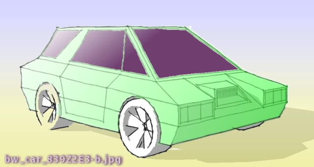
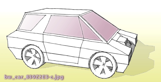
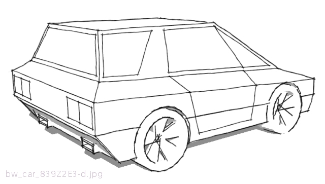
-
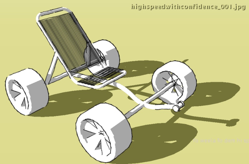
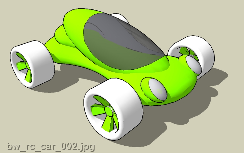
Here's an idea for a four wheel pedal car sans bodywork, drivetrain, steering, et cetera.
-
Something different . . .
-
Hey Green, I think these are really refreshing, well done. SU is not the ideal program for this type of work however.
Mike
-
Thanks Mike - I've seen people using Blender to model cars really, really well.
I have begun learning Blender but have had several struggles - I've found it to be much more time consuming and difficult to learn compared to SketchUp. I'll try to find more time to do stuff with Blender or 3D Wings or something similar. Blender has some gallery images showing how someone used it to model a car that was really amazing - the detail, the quality of parts, how they all fit together - mind boggling good stuff. I doubt I'll ever make it to that point. I enjoy quick, simple projects like these models I've posted here - at least, maybe my models will lead to more complex, more refined designs & more complex modeling, perhaps with other software. That's the process I want for my students - start with this, then when you're ready for more complex geometry & functionality, use Blender, or whatever.
I love SketchUp - seems like I'm learning something new & helpful each time I use it.
-
MGT,
Jack bird bring that action.
I've been on that kind of "go to it" jag in the past, and it always got me "flowing," you know?
So many cars have been "piped out," they have been wheeling around with little notion of "cool" other then to provide scale reference.
If your going to go through the trouble of working that action, might as well get a big bit of a whale shank off on it.
Either way, I'm into it, and want it.
Durant "cameras once used film" Hapke
-
GreenToaster,
Your cars have a lot of character but obviously you're looking for a way to make them better. From what I can tell, you have the modeling skills. When I was trying to improve my modeling skills I'd just start out trying to build cars that I love. Since I'm into "hot rods" I usually start out with a car and modify it. My personal example would be this post http://www.giantmonster.tv/giant/?p=20.That's how I approach the modeling side.
The other skill set to develop is bringing the images in your head to life (in drawings or in 3D). For some that's easy, because they can "recall" those images very clearly and project those images into their "canvas". So modeling or drawing becomes like tracing. I sometimes have that vision and I can work from that.
In addition when I start building or designing anything I do research on the cars that I want my project to be "inspired by". Now with the web this type of research is so easy. Just do a search online and find some inspiration.
This reference work helps solidify the idea in my head. I'll draw sketches and even build up something in SketchUp. All this effort is working towards this vision in my head, refining and building up the concept.
The suddenly. Viola! It's done.
Here's a book that a friend of mine (who graduated from Art Center in automotive design) gave me a while back.
There's some great things in it. Not saying that you should get this specific book, but there are plenty of vehicle design books out there. Any one of them could help you.
Have fun!
-
@unknownuser said:
The other skill set to develop is bringing the images in your head to life (in drawings or in 3D). For some that's easy, because they can "recall" those images very clearly and project those images into their "canvas". So modeling or drawing becomes like tracing. I sometimes have that vision and I can work from that.
Yes, so true. My favorite illustration instructor when I was in college used to say "If you can't see it in your head you won't see it on paper" - this was before personal computers did CAD, early-mid 80's.MZ, I really appreciate your comments, links, and models. I think another missing link is the lack of time I spend devoted to a single project. It's difficult as I have "many irons in the fire", so to speak. I would really love to either find and devote a large chunk of time to a single project - or - pick a project and keep "chipping away" until it's "done" - as another great Industrial Designer from Detroit said "Details are EVERYTHING".
-
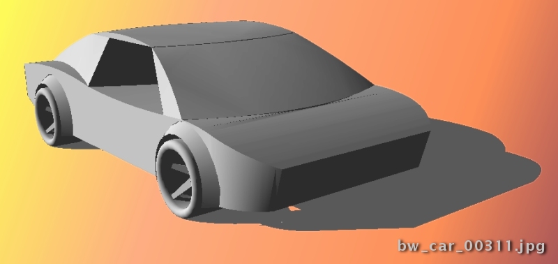
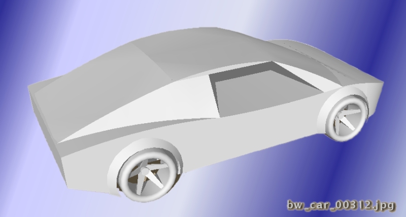
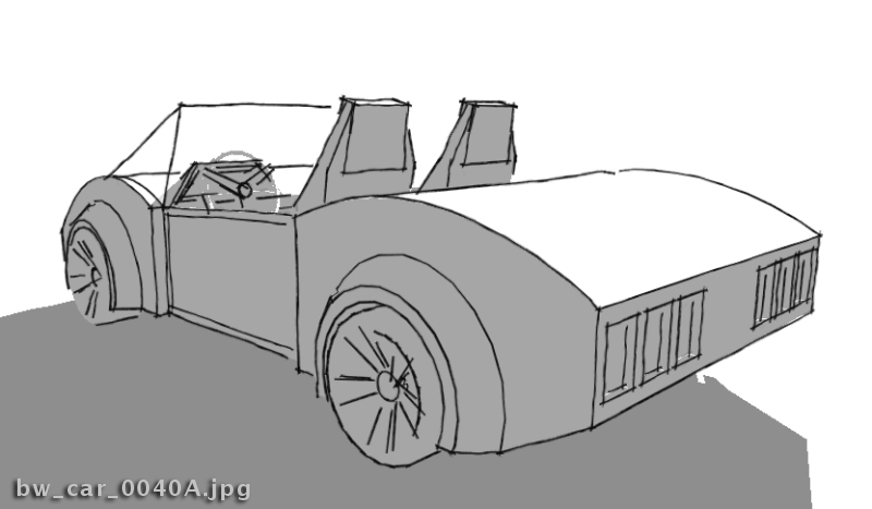
The proportions are way off - nose too short, back end too long - many areas are "wrong" but this is a departure for me - a good learning experience. The next one will be better.
Like my wife said, "Honey, you should remove the blindfold when you draw the next one."
-
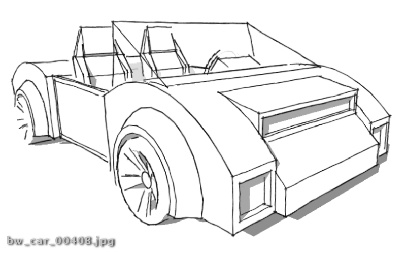
. . . another quickie - just trying something a little different . . . even though I'm not really getting "better" with this, at least I'm still working at it . . .
-
Hi, I'm new here, stumbled through looking for any more tips to easy smooth edges. I started out with modifying to the point it wasn't the same car as well. I've wanted to be a care designer. I've been modifying the component "Car_Sedan" on the 3D warehouse. I finally decided to stop procrastinating and Use what i knew to make the car more original.
It takes work to the the curves the way i want them, but I'm looking for new ideas on how to makes even cleaner lines...seems like people are modeling in other programs. I use sketchup from beginning to end.

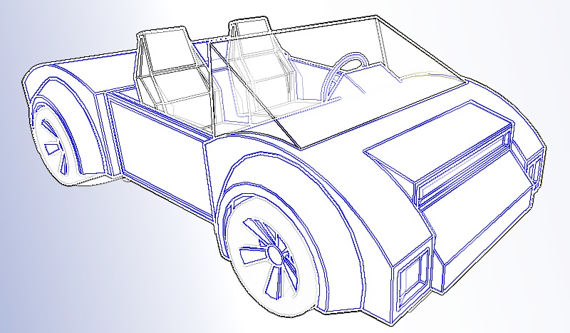
BTW GreenToaster i like your seats. Can you tell me how you made them?
-
The seats were just "eyeballed" - no dimensions just did a quick profile, extruded, chop, pull, done - very quick. Attached is the seat file - I have no idea what the dimensions are - might be "in the ball park"
-
cool.
For shapes other than blocks for cars i just use the sandbox, but Sketchup recognizes gravity and lays the material in only one direction so you have to make multiple parts of the cars.
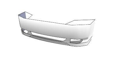
The curvature of this bumper is smooth, the light seats are what's kind of blocky, but i just made some Contour lines like on a topography plot, and layed them like i wanted to create the bumper. i then turned the bumper upwards, wheel well portion towards the ground, on the Z axis. and applied the material. it draped over fine. a bit of intersect to cut the holes out and that's all she wrote.
I do fenders pretty much the same way. always lay them down like the ground. so the curvature is similar to a hill or mountain. takes a good bit of practice to find out what works and what doesn't but it's worth it.
-
@unknownuser said:
I do fenders pretty much the same way. always lay them down like the ground. so the curvature is similar to a hill or mountain. takes a good bit of practice to find out what works and what doesn't but it's worth it.
. . . this opens up a whole new world - I guess it's obvious by my models, I don't use many of the tools & techniques that are available . . . something new to play with! I'm happy!
Thanks for the info!
-
@greentoaster said:
The proportions are way off - nose too short, back end too long..."
Not for a rear engine sports car!
 I think the proportions are pretty good! ....think Pantera, Ford GT 40, or some Lamborghini's and you'll see these same proportions.
Keep at it and enjoy the journey!
Cheers,
- CraigD -
Here's my first ultra-quick attempt using this technique (new to me). I love it - makes me wonder what else have I yet to discover about this stuff - lots, probably.

-
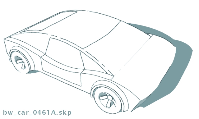
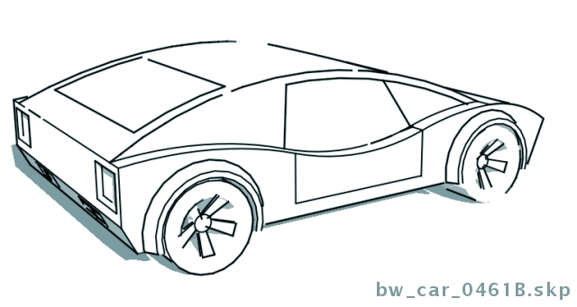
. . . pretty much more of the same . . . I'm doing these much, much quicker than I used to . . . fun!
-
GT! ur a natural when it comes to doin these!! its been a pleasure seeing ur models!!!
would u ever share them with us????

-
The last one is 712K - the size limit to upload is ~1/2 GB, so I don't know how to share the files. I've never put anything on the 3D warehouse - is that an option?
These files are "sloppy", meaning, I often eyeball stuff instead of using exact dimensions, so, I'm really embarrassed by their "unprofessional character".
Can I zip them up and post a zipped file?
-
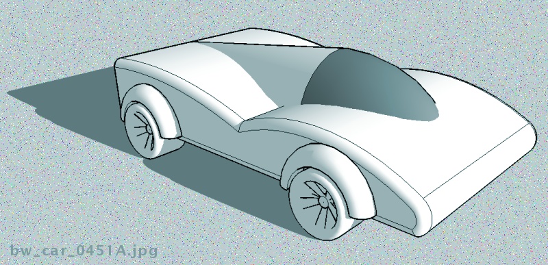
. . . is there a cure for this . . . could I be addicted to modeling cars . . . this is what I call an 8 minute quicky (imported wheels & tires) . . .
Hello! It looks like you're interested in this conversation, but you don't have an account yet.
Getting fed up of having to scroll through the same posts each visit? When you register for an account, you'll always come back to exactly where you were before, and choose to be notified of new replies (either via email, or push notification). You'll also be able to save bookmarks and upvote posts to show your appreciation to other community members.
With your input, this post could be even better 💗
Register LoginAdvertisement


