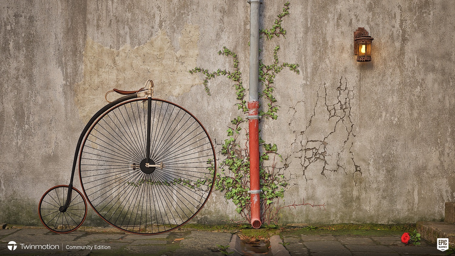
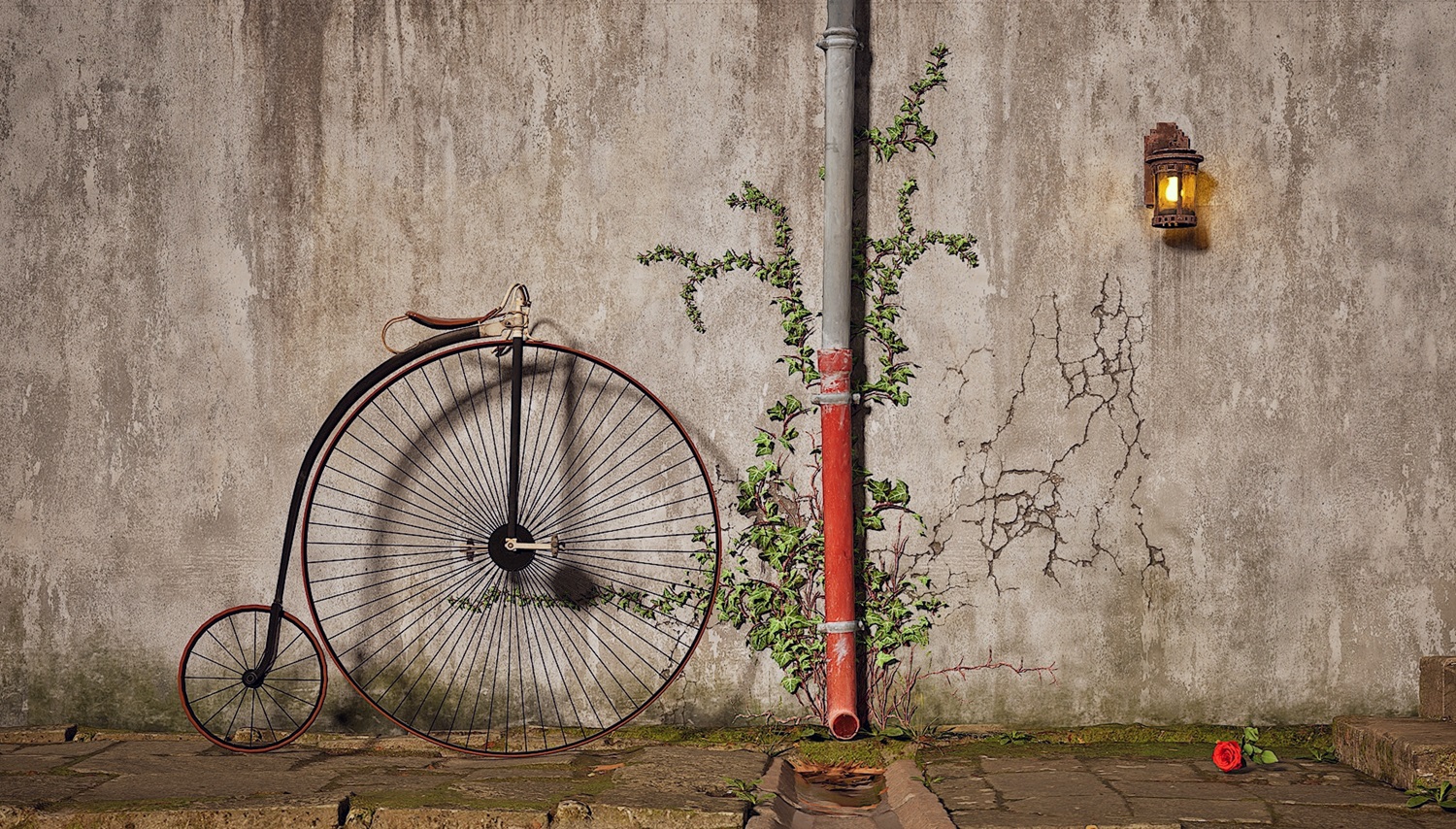
Bike against wall Mark 3
-
I started with the idea of a bike against wall, a very simple composition. It has evolved to this image which I am now happy with. I found tyhe Penny Farthing by accident and just love the geometry of it


-
That is leagues ahead of the previous. It tells more of a story and feels right.
The cracks make sense now as the ivy was a likely cause. This I love. Well done.
Did you try way to get the bike shadow on the wall stronger? Maybe move it closer? Or re-orientate the from wheel so it angle towards the camera to get it closer?
This is really great. From the texture to the colour palette it just all fits.
-
@rich o brien said:
That is leagues ahead of the previous. It tells more of a story and feels right.
The cracks make sense now as the ivy was a likely cause. This I love. Well done.
Did you try way to get the bike shadow on the wall stronger? Maybe move it closer? Or re-orientate the from wheel so it angle towards the camera to get it closer?
This is really great. From the texture to the colour palette it just all fits.
Thanks Rich, you got it.Even though this is a very simple composition it is very considered. I agonised over everything. This "simple' composition took a lot of work. As far as the shadow it is maxed out I know what you mean though. The only thing I could try is try more HDRI's I have tried about 7 so far.
-
I managed to increase the shadow.

-
@l i am said:
I managed to increase the shadow.
[attachment=0:2d2pjdb0]<!-- ia0 -->Cropped Sml jpeg.jpg<!-- ia0 -->[/attachment:2d2pjdb0]
Very nice, I like it a lot!
-
@l i am said:
I managed to increase the shadow.
[attachment=0:2oni1eah]<!-- ia0 -->Cropped Sml jpeg.jpg<!-- ia0 -->[/attachment:2oni1eah]
It looks yum. Lighting, I find, is the hardest part of rendering. It's easy to add but difficult to get it to a sweet spot.
Renders are never done. I often open up old archived personal projects to see what I created at the time and attempt to apply new approaches to it. To quickly realise I still fudge it up.
Unsplash is my goto to get lighting and camera positioning ideas.
-
Hey Rich, never heard of Unsplash, but I do now, thank you.
-
@l i am said:
Hey Rich, never heard of Unsplash, but I do now, thank you.
And thank you pixelcruncher, very kind

-
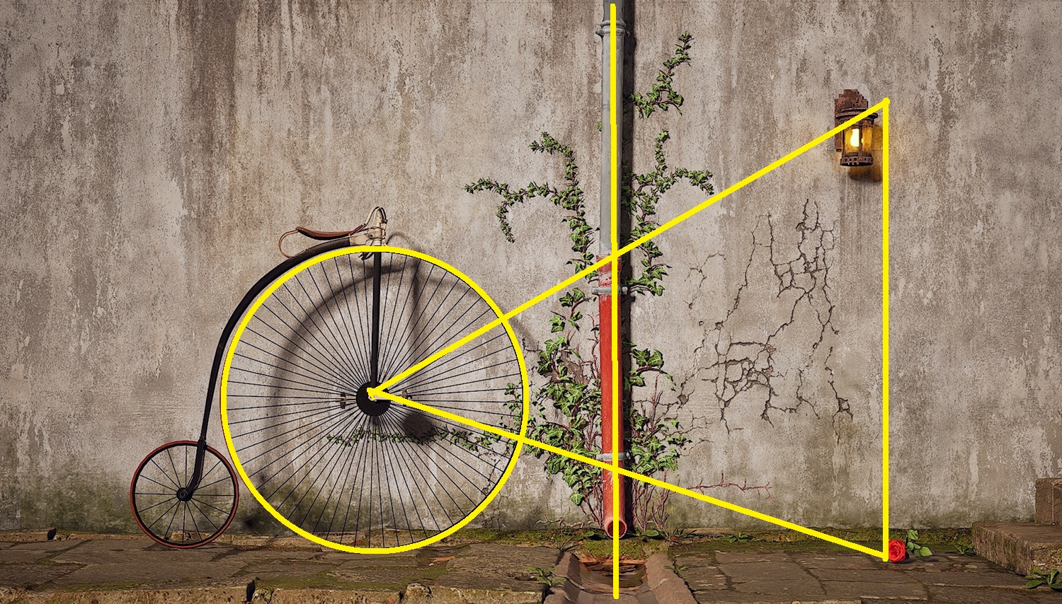
Just thought I would share the comosition of that image, it is "classic" It sits on my eyes so easily
 As soon as I put in the penny farthng someting I learnt in school came back to me.
Hello! It looks like you're interested in this conversation, but you don't have an account yet.
Getting fed up of having to scroll through the same posts each visit? When you register for an account, you'll always come back to exactly where you were before, and choose to be notified of new replies (either via email, or push notification). You'll also be able to save bookmarks and upvote posts to show your appreciation to other community members.
With your input, this post could be even better 💗
Register LoginAdvertisement


