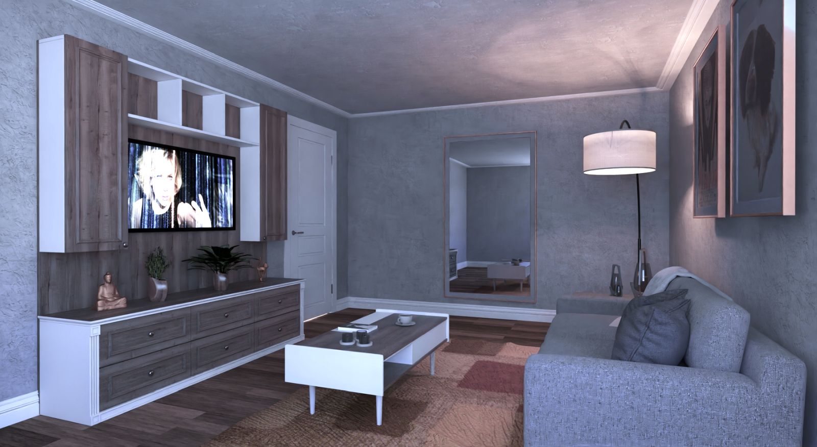
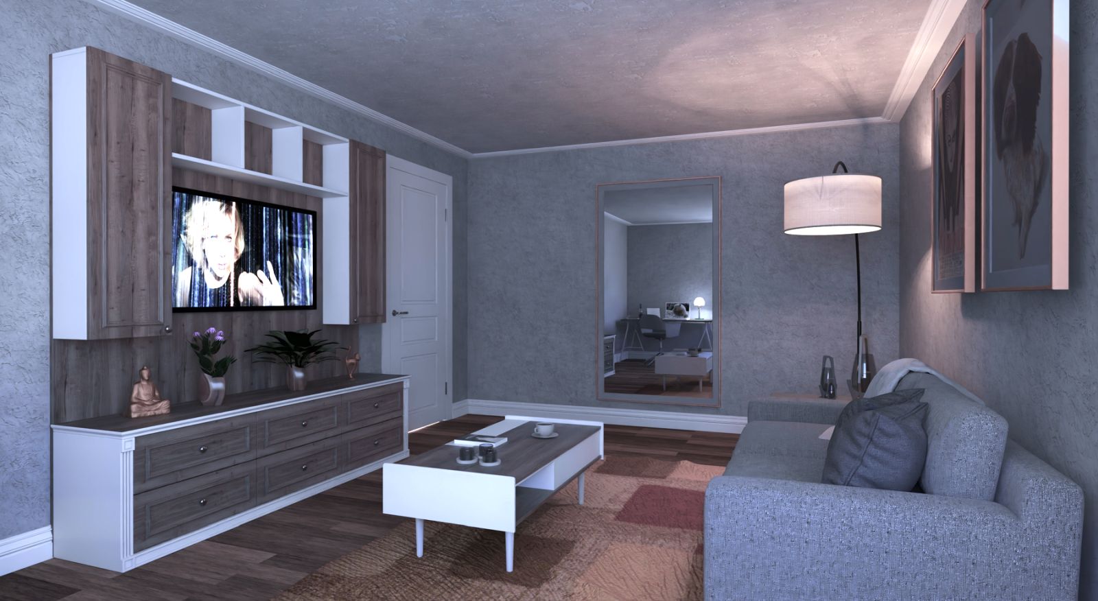
Living room
-
This is only six passes and thirty minutes. Getting the light and exposure right pays off.
Twilight V2 pro.
With a lot of help from the team at Twilight and all of you here, I think I am on the ball more often than not and while the road is not done yet, I am grateful to all of you.
Thank you.

-
This shows why sticking to an app will yield better and better results.

Its also a great advert for Twilight and their super knowledgeable support.
I know the SketchUp mantra is components, components, components. But there's a strong case to not have that for rendering. The drawers would take this to another level if their textures were not clones. Anything that breaks up pattern will look even more believable.
But I'm nitpicking at this point. Really clean result.
-
I need a face palm motif, Thanks, I thought I had done that during one of my checks.
Cheers Rich.
-
Wow! That turned out great!

-
Nice! Windows and some flashing at the bottom of the door will help.
-
Thanks folks, I left the flasshing off to allow light through, it hints at other rooms beyond the door and gives the model greater depth (IMHO) rather than the door being the end of it.
I have re rendered and will see if post pro is required before posting, thanks again to Rich for the reminder of the beginners error.
-
Nice work mate. Nice lighting and chair material is looking good too

-
Have made great progress with this one

-
I took a little more advice and frankly it is what makes a render tbh. Fletch made a suggestion for the unseen corner of the room (Apart from the mirror anyway) which lifts this view imho. I had thought of a woman walking into the scene but the somputer desk and liught works better than I thought it would.

-
Wow! This is looking great to me.


-
Thanks mates.

-
Damn! Even better. Like... perfect!

You nailed this one but good!
-
Cheers mate, if it gets off the floor this time, I'm using carriage bolts after.
-
Hello! It looks like you're interested in this conversation, but you don't have an account yet.
Getting fed up of having to scroll through the same posts each visit? When you register for an account, you'll always come back to exactly where you were before, and choose to be notified of new replies (either via email, or push notification). You'll also be able to save bookmarks and upvote posts to show your appreciation to other community members.
With your input, this post could be even better 💗
Register LoginAdvertisement


