Moving Day
-
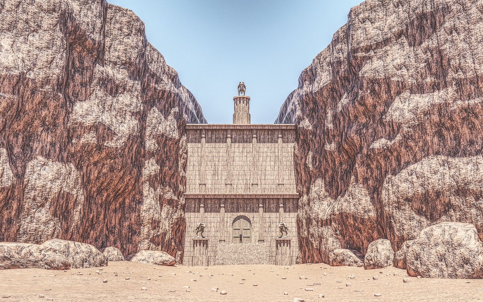
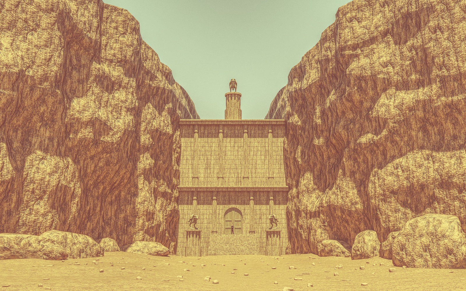
Just moved into my new digs ! Come on by but call first…. Dug out an older unfinished model. Added a few things and here you have it. First time making so much rock. Twilight render and had some fun post process in Affinity Photo. Two versions…
Cheers


-
Textures are a little overwhelming for me. I like the rocky atmosphere but textures make it difficult to for me to really see what the scene is all about. Again, just my opinion.
-
@ntxdave said:
Textures are a little overwhelming for me. I like the rocky atmosphere but textures make it difficult to for me to really see what the scene is all about. Again, just my opinion.
Thanks ntxdave, It’s meant to have an “over the top” illustrative look to it.
-
@tuna1957 said:
Thanks ntxdave, It’s meant to have an “over the top” illustrative look to it.
That it does!

-
Moving boundaries mate. Keep doing that.

-
Thanks Mike

-
Minas Morgul. Nice model.
-
I like the 1st image more than 2nd. 2nd is a bit too yellow.
But the style is a winner. I went OTT in AFPhoto with some color corrections, lens distortion, depth of field and a vignette...
![canyon watchers_B_PP1_small[rich].jpg](/uploads/imported_attachments/gfQI_canyonwatchers_B_PP1_smallrich.jpg)
Also grunge pattern overlays to break up the image a bit more and a little noise.
-
OK, the colors in Rich’s mage are better to me. The rocks and sky look more on the realistic side to me.
-
Looking good!

-
I like the first image alot.. 'maybe' slightly less texture.
-
Appreciate everyone’s replies. A little risky posting things out of the norm….


-
There is a photographer/artist these remind me of. Warhol I think. Images with different colour sets. My marbles are a bit rusty ATM, somewhat under the weather and memory issues so I will get back to you when the marbles run properly around the track.
-
Thanks Mike….hope you find your marbles…. I’ve searched for mine for years and still haven’t found them

Hello! It looks like you're interested in this conversation, but you don't have an account yet.
Getting fed up of having to scroll through the same posts each visit? When you register for an account, you'll always come back to exactly where you were before, and choose to be notified of new replies (either via email, or push notification). You'll also be able to save bookmarks and upvote posts to show your appreciation to other community members.
With your input, this post could be even better 💗
Register LoginAdvertisement


