Beach Sunset
-
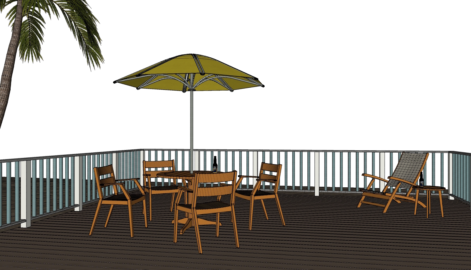
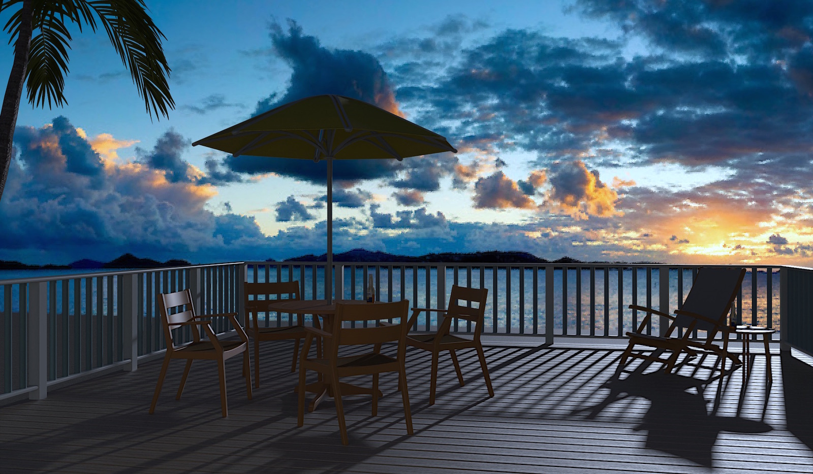
Time for a tasty adult beverage ? Been going back into old practice models and messing about for fun. Seeing if I can get a better result the second time around. Rendered in Twilight , post pro in Gimp. Shout out to Pixero for his nice palm trees available in the sketchUcation store.


-
Looks good!

I would like for the sun to be a little higher so that we could see the furniture just a little better (at least on my iPad).

BTW: I think the shadows look very good!


-
Let's go! Nice image!
-
Hi Tuna........nice work! I would suggest that you alter the sun colour in the renderer to a more yellow orange of the sunset, the sun position is perfect direction wise, but I think the colour temperature change would really make the image more cohesive.
Cheers
-
@l i am said:
Hi Tuna........nice work! I would suggest that you alter the sun colour in the renderer to a more yellow orange of the sunset, the sun position is perfect direction wise, but I think the colour temperature change would really make the image more cohesive.
Cheers
i wanted to say the same...
-
@ntxdave said:
Looks good!

I would like for the sun to be a little higher so that we could see the furniture just a little better (at least on my iPad).

BTW: I think the shadows look very good!


Agreed, but I think that could be done by assuming there is a lit venue behind the camera, say a resteraunt with lighting that would acheive the effect. So a number of light sources behind the camera, perhaps?
-
@ntxdave said:
Looks good!

I would like for the sun to be a little higher so that we could see the furniture just a little better (at least on my iPad).

BTW: I think the shadows look very good!


 and I I would like to sit there tasting the drink ("adult beverage" - this is a strange naming - is this a used naming?)
 -
It's a euphemism, probably originally used in polite references such as public announcements or advertising, now used in fun. Like "adult bookstore".
-
I have to comment on the picture though. Where's the light (shadows) coming from? Is it lit by the HDRI? Shadows look a little high. I would expect the vanishing point of the railing lines to go to the horizon. It seems to be above the horizon. I still like it though.
-
Thanks everyone for your comments and input. Guess I should have put this in "work in progress" as I'm sure I'll fool with it some more. Was curious about a few of the comments about how dark the image is viewed on some iPads'. Checked the post on an iPad and it is way darker than on my iMac that I used to do the work... go figure. pbacot I found your comments on the horizon interesting. The deck sits several feet above the origin , the "beach" plane is on the origin. Did some experimenting with the background image to get it lined up with the "beach". The edge of the water and land in the background image ended up a little lower than the railing. If this wasn't the right approach for figuring it out anyone is welcome to chime in with advice. This was defiantly more of a rendering and post pro exercise for me so all comments and advice is much appreciated. Just trying to get better I hope.

-
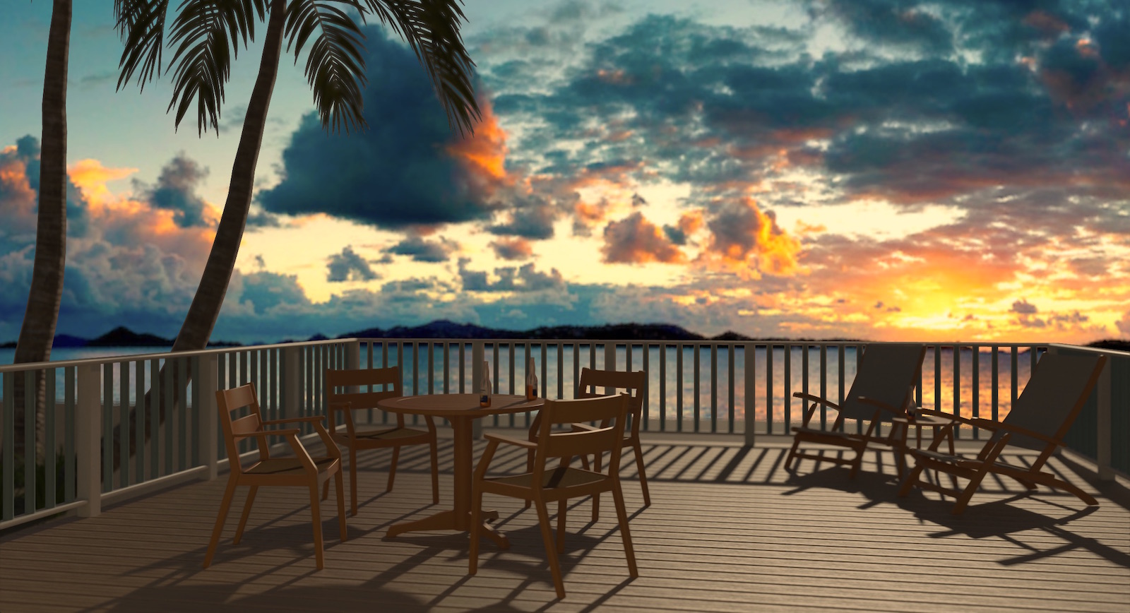
Made some minor changes to model and ran a new render. New render was with depth of field enabled . Better or worse you be the judge...


-
Yes! That's it!

Well done!
-
Thanks Bryan

-
I like the second one more.Nice work!
-
Thanks pbacot .
-
I do prefer the second but that's for accuracy sake, mood wise they both rock the clock. Very nice.

Hello! It looks like you're interested in this conversation, but you don't have an account yet.
Getting fed up of having to scroll through the same posts each visit? When you register for an account, you'll always come back to exactly where you were before, and choose to be notified of new replies (either via email, or push notification). You'll also be able to save bookmarks and upvote posts to show your appreciation to other community members.
With your input, this post could be even better 💗
Register LoginAdvertisement


