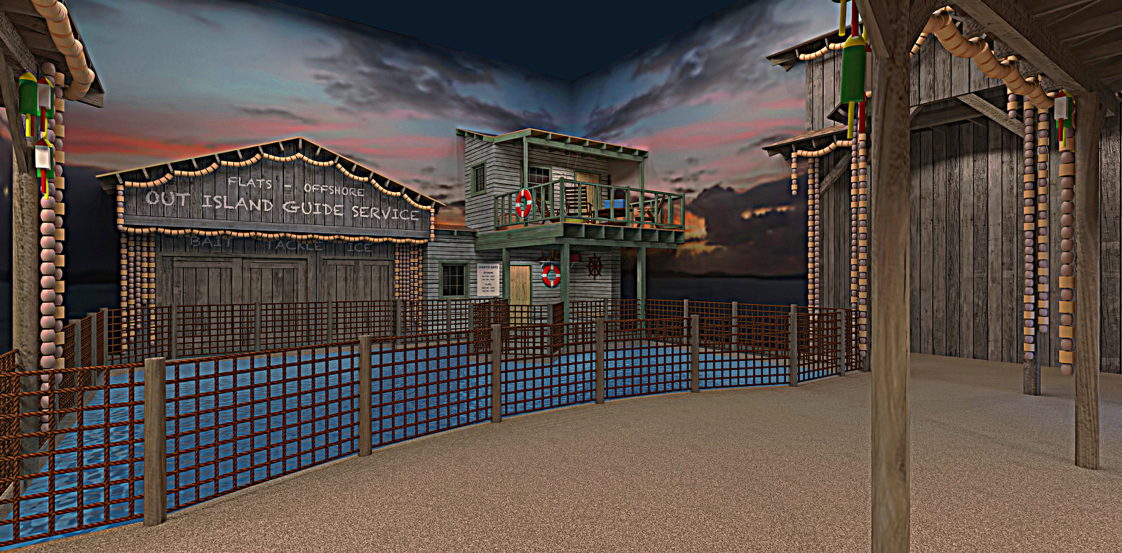
1st SU Model Revisited
-
First SU model done about four years ago. Wasn't rendering yet. All presentation boards were native SU output. Went back into the model switched out a bunch of textures and cooked a few renders.
The "pool" is a saltwater aquarium.... owner wanted space to have the feel of an "island fishing village". My job was to design the various faux structures. Space was huge pain to work with. Structure with porch hides a forest of pipes for the aquarium, Structure next to it incorporates "back of house" access doors.
Rendered in Twilight, minor post-pro in Gimp. Looks way better rendered......

-
Looking good

-
At first I thought the background didn't work for an outdoor scene because of the corner, but I quickly realized this was built indoors and the walls would have been painted with a
this background or similar. Nice work!
-
tadema, many thanks.
rangerrick, thanks for the thumb. the image on the walls are probably the weakest part. It was the best I could find at the time that had an approximate look of what we were going to shoot for. walls got handprinted murals by artists on the crew.
-
TwiLight is a great render tool.
You should make some time to apply new skills to this. Would be a great casestudy for you to grow from.
-
Great modeling job, Charles. Do people view the aquarium through windows on a lower level? Unless it houses something like otters, which inhabit the surface a lot, I don't see how anyone could really enjoy it if one only looks at it from above.
-
 great work Tuna! - and it obviously was a real project ?! I wonder what fish are going to swim in such a big aquarium, sharks?
Twilight - it´s pity - for years I have Twilight but still I can not manage to grasp this tool - no idea why I am so obtuse with it


 what annoys me because I always see your great results here

-
Looks very depressig- GULAG-esque, painfully oversharped and lacking aerial perspective
-
Rich, Thanks for the encouragement. Kind of the point in going back into these earlier models, improve my skills and hopefully come up with some decent portfolio stuff.
rv1974, Your right on about the dark and depressing look.... it's just what the owner loves, the actual space is even darker than the render. Don't disagree with your comment on overdoing the "sharpen" tool. Trying to get better with the post pro stuff and it's not always spot on yet. Not sure exactly what you mean by "aerial perspective", will just say I try to set the shots at an actual average eye level and as wide a field of view I can get without distortion. It's what it takes to sell the concepts to the owner and keep the job rolling. The original presentation boards were four eye level views showing all the faux structures and a plan view of the entire space , even though they were raw SU output at the time it sold the "man with the money"on the overall plan.
Daniel, Thanks and your right this is the upper level. Lower level has a large viewing window.
HornOxx, Thanks. Yes it's a real project, part of this private museum project I've been working on. Sharks it is ! Also has a pretty good variety of other saltwater fish also.l
-
Nice!
-
Nice image with plenty of atmosphere.
-
Bryan, Mike, thanks gentlemen.l
Hello! It looks like you're interested in this conversation, but you don't have an account yet.
Getting fed up of having to scroll through the same posts each visit? When you register for an account, you'll always come back to exactly where you were before, and choose to be notified of new replies (either via email, or push notification). You'll also be able to save bookmarks and upvote posts to show your appreciation to other community members.
With your input, this post could be even better 💗
Register LoginAdvertisement


