Suggestions
-
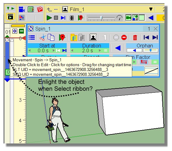
Enlighting the object ?
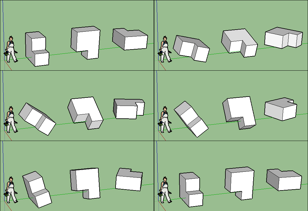
A selection multiple for a Rotation for each object by its Pivot? (same angle of rotation)
Idem + a random rotation(s) ?
Because it's easy when not numerous objects, but some painful when more than 5!
Of course objects can be different! (it's not the case here)
-
Pilou,
-
Preview of movement is planned. Same for camera (done but not enabled).
-
Spin for multiple objects should work as well if the local axes are properly defined. For instance, if you spin the first selected object by the X axis, other objects will spin by their own X axis too.
Fredo
-
-
@unknownuser said:
- Spin for multiple objects should work as well if the local axes are properly defined. For instance, if you spin the first selected object by the X axis, other objects will spin by their own X axis too.
A little video of this ? (not the result but the Clicks)
-
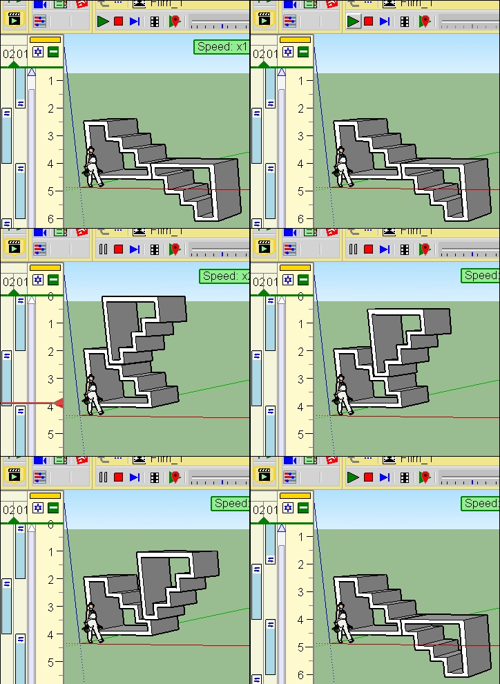
No possibility to follow a path ?
Make translation(s) one by one is not a pleasure's party!
-
@pilou said:
No possibility to follow a path ?
Make translation(s) one by one is not a pleasure's party!
I agree and I think he has this planned for a future release.
-
Can I ask that we can get render/animation screen resolution to lock aspect ratio when selecting size?
-
I havent had much time to try animator out yet but will surely do asap.
This is just a first impression suggestion.
I have some concerns about the overwhelming GUI like in this panel for example.
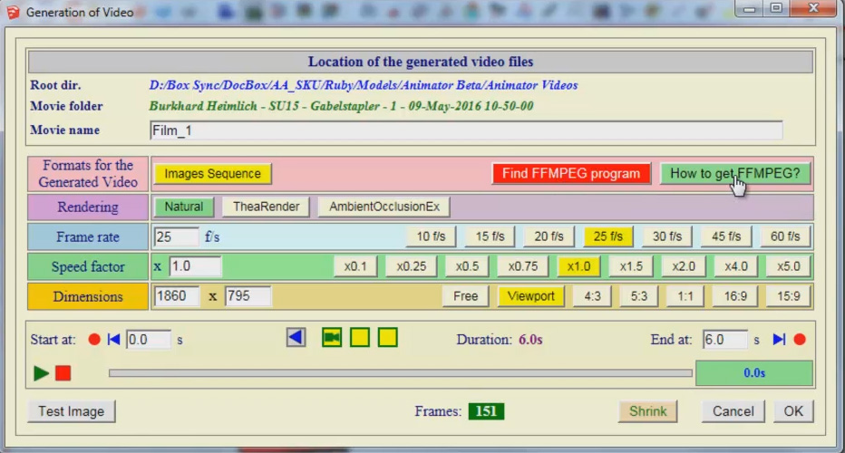
I don't believe showing all options at the same time is the best way of making it easy to use and understand.
Having the options as dropdown menus would make it easier on the eye and also save some screen space. -
About this animation final video render board.
For me it's a perfect comfortable one!
All in a wink!
Your animation is finished after a lot of hard work : you want just have the result for share and stock.
You don't want open a lot of more Menus and clicks! It's the last step!
What more simple than that?So Pixero I am totally disagree with you about this particular boad!

-
I believe that a GUI should be easy on the eye and easy to find what your looking for.
Having everything visible all at once is not the best way to achieve that IMHO.
You know it is there...somewhere but also for new users to not be overwhelmed by a GUI that looks complicated. Better to "guide" the user forward by showing a few categories and then let them "dive" into more information when needed.
Plus, that using dropdown menus will save space and make panels smaller and having more SU screen visible.
That must be a good thing what ever you think of my first arguments. -
For this particular above board who is like a "Preferences board"
Not any advantages to have parceled Dropdown Menus!
Debate is open!

-
I agree with both of you.
I happen to have had the same feeling Pixero is talking about, but after reading all the UI I understand it perfectly and it makes sense.
The UI is overwhelming, but if you take some time to understand it, all is there and makes sense.
Basically, it's functionally right though not intuitive.
@Fredo I think, overall this is true not only for this final board but for all the UI. I also think this is true for all your Plugins and I've shared that with you before... The thing is that your plugins are some of the most complex around and this one beats all the others so thinking about it is an incredible task by itself and the truth is that in the end the most important is that the UI works.
Overall I think information should be read better if it was better organized and hierarchized.
I'll try to be specific on my criticism as I think this helps on the discussion and it probably helps you decide the best course of action or if any is needed at all. So I'm sorry if this seems a negative critic as it's not intended like that.
For people to read this window well what I'd do is try to separate things in a clear way, imho this isn't happening as:
- There are a lot of font types with different colors and we don't clearly understand where are the headers that guide us or what is the logic behind that - I think text should be overall neutral black and bold or greyed out sometimes. Only in special cases should it be changing color, like red for warnings and also maybe uppercase when really important or extraordinary like the OK button or an important NOTE;
- Also, text that could be hidden most of the times should be hidden;
- This is specially true when we have to mix clickable text, read only text and also we need to input text. There must be a clear logic to distinguish those 3 actions without a doubt.
- There are also a lot of text boxes, wich sometimes relate to content that is exclusivelly inside the box and sometimes to content in other boxes and with different colors, so we loose sense of what should be guiding us. Is it layout by box or layout by color? It seems it's randomly either one or the other;
- There are also buttons wich also have colors and also look like boxes inside boxes. They have a subtle 3D effect and slightly more saturated colors but they are visually blended in all the box and background colors - and the logic behind button colors is also hard to grasp as there are colors for active buttons, colors for inactive buttons and colors for special buttons and buttons with the neutral grey color too. There are also smaller input boxes that have a white background wich is standard windows practice - However those two standard colors (grey buttons and white inputs) are still hard to relate to as the background color isn't standard grey that we're used to. I'm absolutelly sure there's a logic binding all these colors, but I haven't yet figured it out, so they just seem random and distracting at the moment.
- There is also another kind of buttons wich are flat and colored icons. They are floating around the timeline and we can't be sure if they are clickable or not. The first time I looked into them I was afraid of doing something stupid with them wich could ruin something or would start render on Thea for ages...
Finally there is info, that results from the options we choose or that relates to specific info on the whole board, that we don't exactly know what it means initially and probably could be located more closelly to where the action related to it is performed.
- Test Image - One imagines it is related with the rendering method? Natural, Thea, AOEx? Why isn't the test image in that box?
- Frames - This is the total frames being rendered and results from the Frame Rate+Speed Factor+Start End keyframes.
- Shrink - I haven't tried this one yet, but does it mean shrink the dimensions, shrink the frame rate, shrink the duration?
Imagine if this is Layout is possible or makes sense:
1 - First we define what we will be rendering - The first layout are would be Timeline+Framerate+Speed Factor - Here we could have the resulting Frames value.2 - Then we define how we will render it - Rendering+Dimensions+Format(Example: If Thea is choosen does it make sense to render with FFMPEG or should this be greyed out if Thea is clicked on? I haven't tried FFMPEG yet...) - Here we could have Test Image Button
NOTE: On dimensions and Frame Rate I would first insert standard buttons and then input box. This way people will be pushed to choose standard first instead of inputing values just to find later they could simply click a button.
3 - Finally the last area should be the final action we tak to start rendering. Like the save, save as or export button: Location Box+Shrink?+Cancel+OK buttons.
NOTE: I'd consider replacing the OK for a Render button. Or having an OK and a RENDER Button.
- OK saves settings and leaves dialog;
- Render saves settings and starts rendering.
Well I hope this helps and please feel free to ignore all of the above!
-
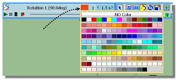
Does it possible to have a color's work for the ribbon's object (or the color of object if this one have it) ?
Because the info text is some painful

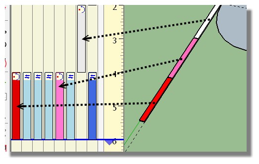
Edit: Found the color attribution!
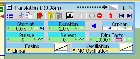
or also!

Hello! It looks like you're interested in this conversation, but you don't have an account yet.
Getting fed up of having to scroll through the same posts each visit? When you register for an account, you'll always come back to exactly where you were before, and choose to be notified of new replies (either via email, or push notification). You'll also be able to save bookmarks and upvote posts to show your appreciation to other community members.
With your input, this post could be even better 💗
Register LoginAdvertisement


