SketchUp 2016 Wishlist
-
- Allow SU to reference external objects in other files, skp skm etc. If you are building relatively small DC's that have lots of materials and textures file size goes up in a hurry. So say if the collection of DC's number 40 then the project size gets very large. I looked into 1 DC that almost brought my computer down to its knees. The basic geometry wasn't huge but when you added in all the hardware choices and textures the file size was over 150 MB.
I would rather wait a little longer for the the DC to change out materials / components, rather than try to load everything.
-
Fix the tool bars and buttons. When I run into parsing issues while creating / editing a plugin some of my tool bars get moved around.
-
store true radius's so dwg exports will work properly. This would also simplify other types of exports.
-
- Multicore support
- Recommendation: not only "minimal hardware" and "recommended hardware" but also "optimal hardware"
-
@eneroth3 said:
DesertRaven: What pushpull bug is this? I don't think I've ever seen it.
Hi eneroth3, I get this "bug" all the time when working on complex shapes.
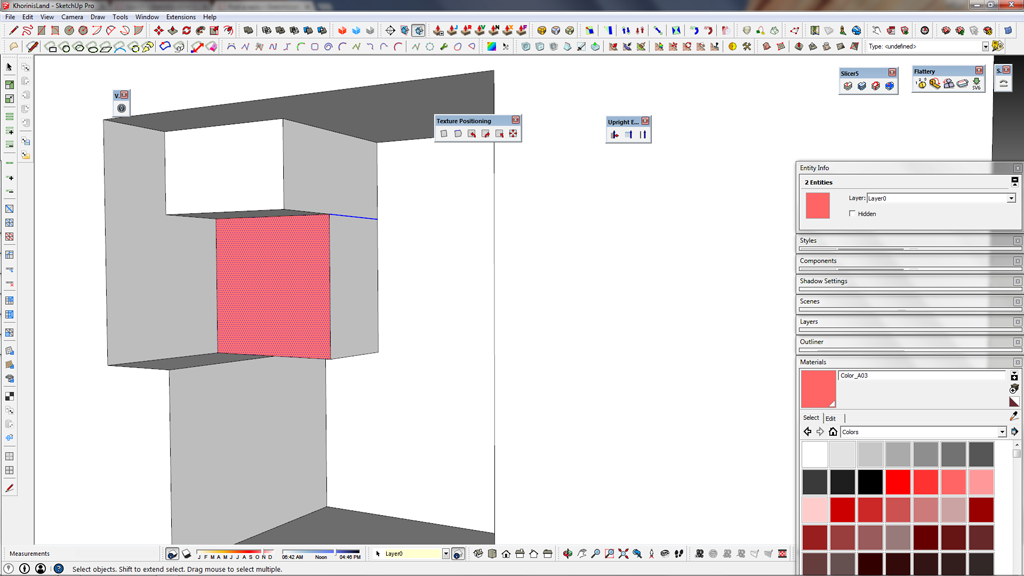
 The red face was push pulled, why is the blue line there?
I've seen the many nice plug-ins you created, my favorite one is the "erode" tool.
My question to you, how hard would it be to write a plug in that could just simply split up a solid in to quad faces? Maybe with some x/y/z parameters?
-
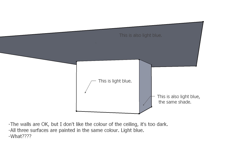
This might have been already discussed somewhere but I find a bit weird the way Sketchup displays colours of surfaces. It uses the different shades of the same colour for surfaces at different angles to your view and this is OK and normal as it gives you a clue about 3D aspect of your model. But I find that contrast between those shades is exaggerated. I got used to it (though never entirely) but not once happened that the client stared at the darker shade of a certain colour asking to change it - not realizing it's the same colour he/she likes/sees on the other surface!
See the image. (For those ones who want to check it: RGB - 222, 230, 255)
P.S. Actually, none of these shades are close enough to the original as the frontal surface is too bright. And don't try to apply shadows too this...

-
@aureus said:
... But I find that contrast between those shades is exaggerated. ...
you can adjust the contrast, what do you have it set at?
john -
Good to know, where's that option? (SU2014)
I know to adjust it for shadows (Shadow Settings - Light, Dark) .
-
I think you want "UseSunForAllShading" unchecked in the 'Shadow Settings' dialog...
toggle it and you can see the difference of your 'Light/Dark' choices better, set 'View' >> 'Shadows' off when you do it...john
-
@driven said:
I think you want "UseSunForAllShading" unchecked in the 'Shadow Settings' dialog...
toggle it and you can see the difference of your 'Light/Dark' choices better, set 'View' >> 'Shadows' off when you do it...john
John, the image was from the SU model which has all that what you say. "UseSunForAllShading" was unchecked and the shadows were off. If on - all the surfaces would be pretty dark thanks to that 'overhanging'.
-
Actually, you were right, there's a way to fix it. The "UseShadowForShading" should be CHECKED but "Shadows" should be OFF (View-Shadows-Off).
And DARK level should have much more value than LIGHT (in this case meaning less contrast). Upon installing SU it's usually vice versa /Light-80, Dark-45/ though it should be different: more like about Light-45 (or 30), Dark-80.
An interesting combination.
Thanks.
-
I normally set it in ruby code so I should of checked ...
I set it to gives me an unshaded 'green screen' view when exporting images...john
-
@aureus said:
Does having "UseSunDorAllShading" checked all the time slow down work in any way?
I don't think it's as bad as 'Shadows'...
btw.. I removed my code block because I'm still deciding on the final setting's, 100 100 is probably better for zero shadows...
would you mind deleting it from your reply?
john -
@driven said:
I normally set it in ruby code so I should of checked ...
           Sketchup.active_model.rendering_options["BackgroundColor"] = (Sketchup;;Color.new(0,255,0,255))
>                     Sketchup.active_model.shadow_info["UseSunForAllShading"] = true
>                     Sketchup.active_model.shadow_info["DisplayOnGroundPlane"] = false
>                     Sketchup.active_model.shadow_info["DisplayOnAllFaces"] = false
>                     Sketchup.active_model.shadow_info["DisplayShadows"] = false
>                     Sketchup.active_model.shadow_info["Dark"]  = 100
>                     Sketchup.active_model.shadow_info["Light"] = 0
>                     Sketchup.active_model.rendering_options["EdgeDisplayMode"] = 0
gives me an unshaded 'green screen' view when exporting images...
john
Anyway, you're obviously much more into this than me. Does having "UseSunDorAllShading" checked all the time slow down work in any way?
-
@driven said:
@aureus said:
Does having "UseSunDorAllShading" checked all the time slow down work in any way?
I don't think it's as bad as 'Shadows'...
btw.. I removed my code block because I'm still deciding on the final setting's, 100 100 is probably better for zero shadows...
would you mind deleting it from your reply?
johnSurely not that bad but if does slow down work, then better to be unchecked with large models prior final exporting images. As for large models and smooth work - I skipped SU2013 but when I installed 2014 I noticed a very nice difference compared to SU8: one big file which took SU 203 seconds to open was an easy task for 2014 - only 17 seconds! The same computer and system. I don't know what they did but they did it excellent!

But let's return to the wishlist.
It's not the biggest thing but right now moving from editing complex components and groups back to the whole model is making me pretty annoyed...
I wonder if one day this could be a bit easier... Right now you need to click somewhere out of the box of the group/component which can be hard if it's bigger than your window. -
Use the Outliner ?
-
@jiminy-billy-bob said:
Use the Outliner ?
Yes, so far that's the fastest way. Simply I forget to keep it open, when I have some other windows open.
One another wish: don't make it licenced for montly subscription. Just in case you (Trimble) considered that like some other software manufacturers (Adobe for example).

-
There's a plugin called "Backout" or something like that. I wanted this too but now haven't got it installed. Pulls you out of all components. I want the opposite to: Go all the way into context of clicked object. Boom in, edit, boom out without all the click/wait steps.
-
@pbacot said:
There's a plugin called "Backout" or something like that. I wanted this too but now haven't got it installed. Pulls you out of all components. I want the opposite to: Go all the way into context of clicked object. Boom in, edit, boom out without all the click/wait steps.
Isn't that built-in ? As the 'Outliner' ?? -
Someone just mentioned Outliner. I was pointing out the plugin as another answer to the question Actually I don't know how outliner would help when I am looking at a house full of nested components. I would first have to search for that component (if it isn't a group) in a list... bleah. Let me double click (plus modifier key) on a face and be able to work on it right then ...is what I mean. And why not use the Backout plugin method with a keystroke rather than go to a special window simply to enter the root context?
-
you can 'Backout' with the 'Esc' key, and 'in' with simple mouse clicks?
what am I missing?
john -
@driven said:
you can 'Backout' with the 'Esc' key, and 'in' with simple mouse clicks?
what am I missing?
johnNot missing anything.
You're right again. The ESC key does that work the with no need for any plugin (not you have to keep Outliner open).
All you need is to press it as many times as steps you've made when going into a certain group/component.
So for example, if you're editing a group which is inside a component which is inside another component which is...inside another group which is inside another component which is...inside another component (don't laugh - if you model a tree, you know what I mean)...then you need to press the ESC key five times in a row and voila - you've been pulled out. Luckily, it takes a 0.5 sec for those ones with quick fingers.
Hello! It looks like you're interested in this conversation, but you don't have an account yet.
Getting fed up of having to scroll through the same posts each visit? When you register for an account, you'll always come back to exactly where you were before, and choose to be notified of new replies (either via email, or push notification). You'll also be able to save bookmarks and upvote posts to show your appreciation to other community members.
With your input, this post could be even better 💗
Register LoginAdvertisement


