House-H, Hiroyuki-Shinozaki-architects
-
@ginchius said:
I only see the interior photos, I don't see the renders

I didn't read the text the first time and have only looked at the pictures. After reading this comment, I read the text, WOW, not photos?!

-
No way.. I was thinking of who would dare to dust out the place ..
Incredibly well done !
-
Too perfect...!

-
Thanks a lot guys.

@Kim, of course you know that is far from perfect...
-
I would like to see one post-pro image.
-
-
Yes, I don't know your mentioned post-pro tools and it would be helpful to see the influence of them...
-
Here is a raw render.
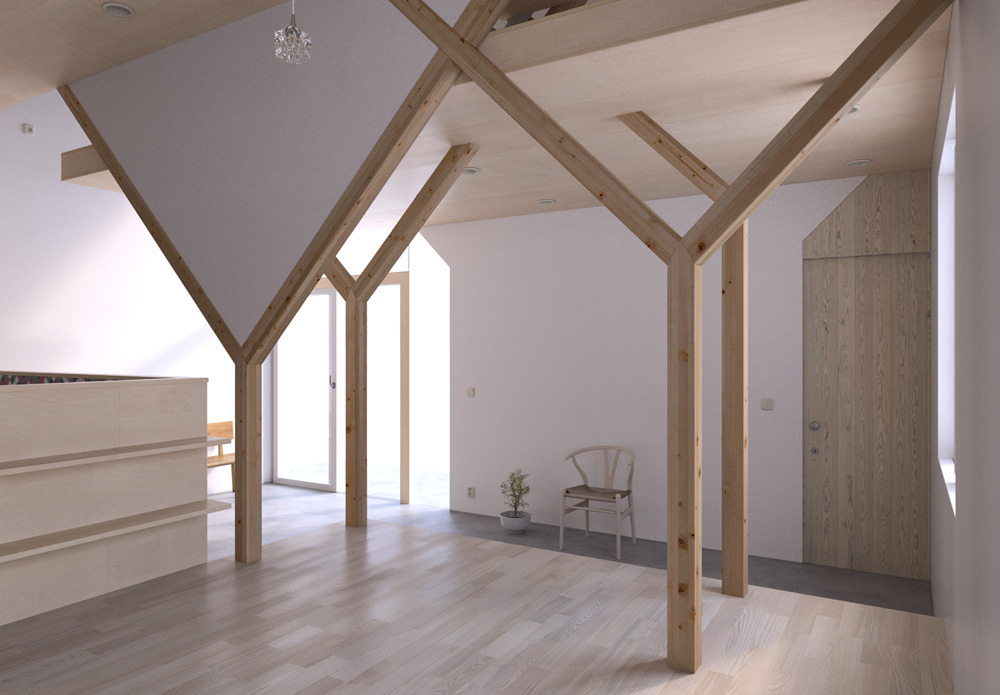
Even if Thea has a great toolset in the darkroom (you have control for example on ISO, shutter speed, exposure, contrast, camera response function, glare, vignetting etc. etc.) and you can obtain stunning image with no additional work, it also has the capacity to produce pretty "neutral" images that you can save also in high dynamic formats (for example in .EXR) for manipulation in post production with specialized softwares like the two mentioned in my first post.
For this work I had a bunch of nice photos as reference, in what the photographers called a "high key" mode, with a nice light spreading everywhere, so I tried to match them working mostly on lights and tone in post pro starting with a "neutral" output. -
Zen!

-
Subtile, but very powerful change! Thank you.
-
No sockets? fururistic....
-
Thanks for comments guys.

@Rich, it's full of sockets. I put them everywhere just for you. Can you see them? -


 As always
John -
Real Nice!
How are those Y beams joined at their intersections? -
Funny but I do tend to prefer the raw render. The others for me are a little over exposed. If the home was actually that overlight the architects stuffed up balancing light source directions!
Stunning work though mate!
-
Dunno, Richard, I feel the abundance of light makes these images look really inviting.
-
Thanks for comments.

@jpalm32 said:
How are those Y beams joined at their intersections?
If you mean the real thing, I don't have drawings of the details but I guess you can do that in many ways.
@richard said:
Funny but I do tend to prefer the raw render. The others for me are a little over exposed. If the home was actually that overlight the architects stuffed up balancing light source directions!
@unknownuser said:
Dunno, Richard, I feel the abundance of light makes these images look really inviting.
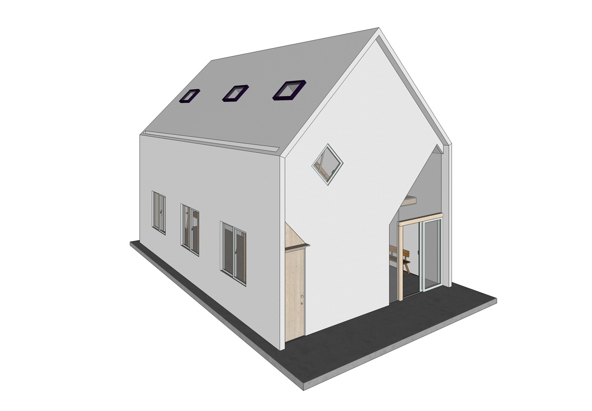
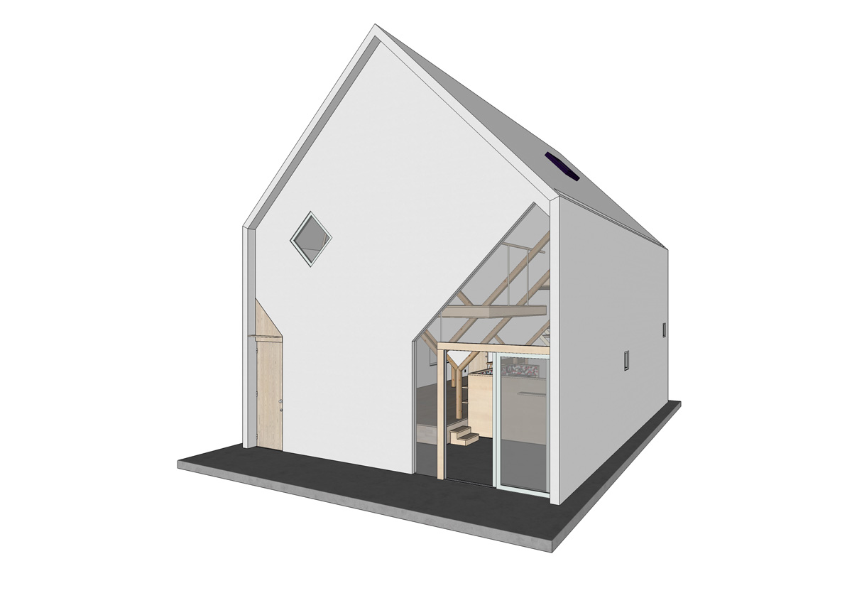
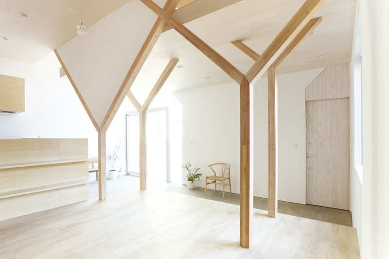
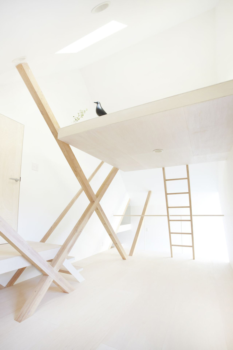
Maybe you are right Richard, but indeed I was after a "high key" mood for this set of images and an "abundance of light" as Tom said. Anyway I've attached a couple of views of the exterior of the model and a photo reference. The squared windows are pretty large (1,45 x 1,45 m) and the entrance is 2,50 x 2,30-4,50 m. Also the windowed side is exposed to south. Perhaps in the photos the exposure was a bit boosted in post pro, but I like that mood.
-
Take my question as a compliment: so these are real photos or other renders?
-
The two below the views of the model in the latest post are real photos.

Anyway, here is the link to the architect's site if someone is interested. -
Incredible as always!
Hello! It looks like you're interested in this conversation, but you don't have an account yet.
Getting fed up of having to scroll through the same posts each visit? When you register for an account, you'll always come back to exactly where you were before, and choose to be notified of new replies (either via email, or push notification). You'll also be able to save bookmarks and upvote posts to show your appreciation to other community members.
With your input, this post could be even better 💗
Register LoginAdvertisement


