Learning to Render (using Twilight)
-
I've not really done any rendering before but thought I would give it a try. I don't use SU for architectural stuff, I use it as the design process for making my sculptures and have never had much need for "finished artwork" in that sense. I usually design it then go downstairs and make it. But I can see it being useful for showing clients how something would look in their space, so I guess I should learn.
I thought I should put this up here so I have somewhere to come back to as a starting reference.

-
Nice start.
What app?
-
!


-
I know ther have been a few good posts about studio setups, plus example scenes. I would recommend taking a look at those and thinking about lighting. Outdoor clear sky render is not very good at showing sculptural volumes.
http://sketchucation.com/forums/viewtopic.php?f=81&t=45672&p=408110
Edit: Crap!@ I give up.. Either Roger or Richard, or maybe a figment of my imagination, posted a studio scene setup but I can't seem to find it now. Oh well, one of these days I'll pay more attention...
-
Will do Andy.
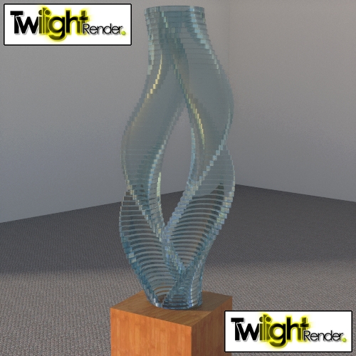
But first I just want to get my head around how the basics work.I eventually want to be able to get glass sculptures looking right.
I did this as a test and figured if I could manage that without having a clue then perhaps I could manage something reasonable with a bit o lernin..
-
@box said:
Will do Andy.
But first I just want to get my head around how the basics work.I eventually want to be able to get glass sculptures looking right.
I did this as a test and figured if I could manage that without having a clue then perhaps I could manage something reasonable with a bit o lernin..Well, sure. I just thought I'd point you down the right path...
Glass sculptures will be a bit more tricky - I'd recommend trying something that resolves caustics (light rays refracting and reflecting) You could try the unbiased settings in twilight for example.
-
here, try these.
great start, I also recommend NOT using sun but a combination of lights. Emitters on their own or emitters aided by a spherical HDRI setup.
A low-intensity HDRI can create a subtle fill-light when the emitters can add bright light to your scene.
This thread may help with glass materials:
And page 2 of this thread (A point light or spotlight can create interesting caustics coming from the glass
 )
)
-
Cheers for that Oli. I'll give em a go.
Andy, I found this thread, http://sketchucation.com/forums/viewtopic.php?f=15&t=48759 which links to some interesting stuff, so thanks both of you for pointing me up the pleasant garden path rather than the back passage.
-
-
@unknownuser said:
Try these too:
Speaking of studio lighting, if you don't already know, also these are interesting (scroll down the page, it's called "lightsmith collection"). You have an OBJ model and an EXR file for each one. You can't use them properly in Twilight, but for example in Thea you can assign an emitter material to the emitting surface and then load the EXR in the emittance color slot.
-
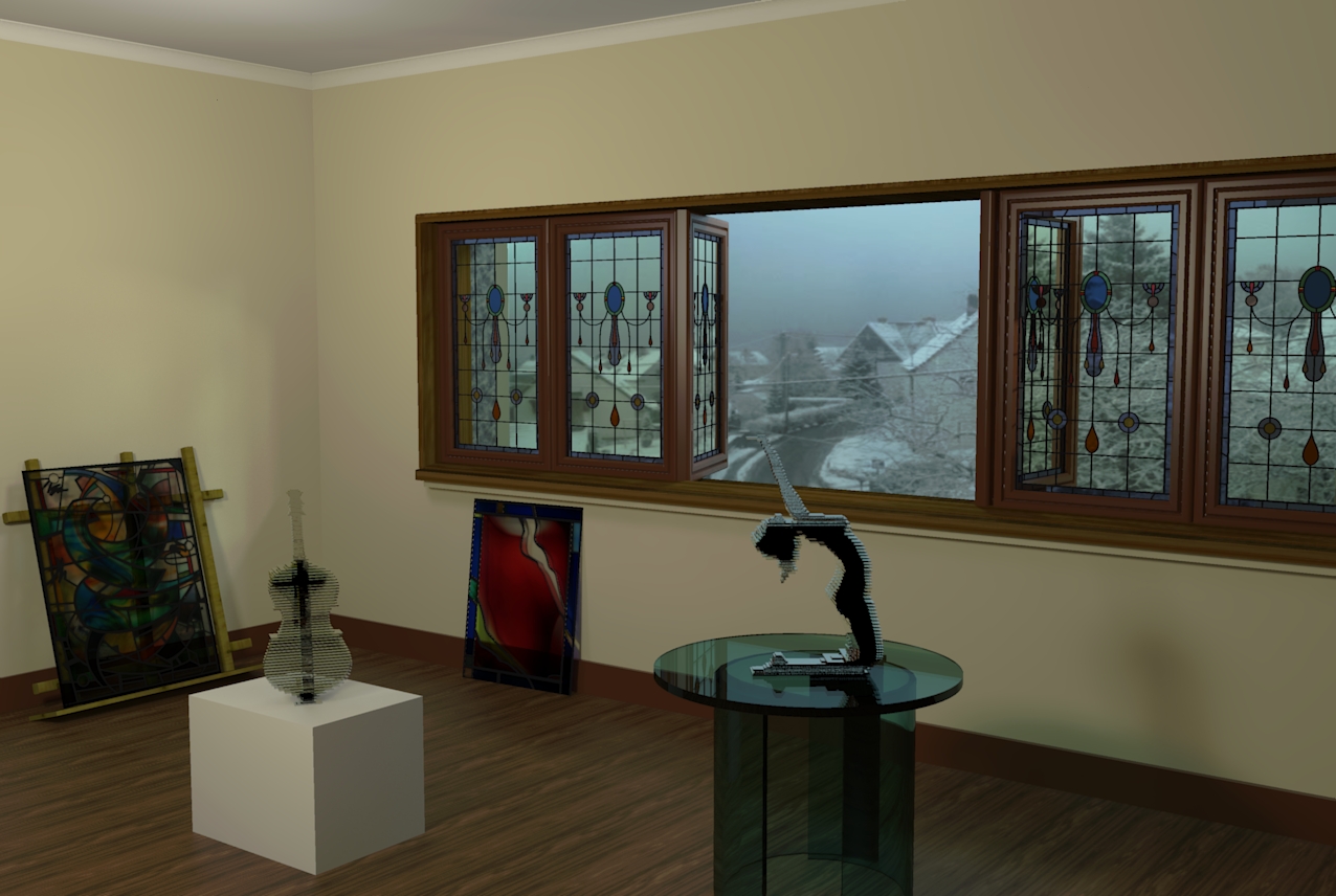
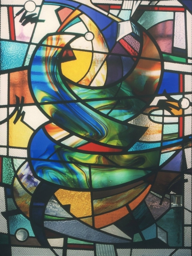
I'm starting to get a bit of an understanding of this rendering business. Still not great, and only using the simple presets in Twilight but I sort of like the unfinished nature of this. It reminds me of many days in my work life. An empty, usually sterile room in the process of being set up for an exhibition. There should be packing material and crap everywhere but just imagine the blast of icy wind from the window has blown it all to the other corner. It's purely an experiment, how the light falls and transmits the glass colours etc. The figure on the table and the Cello on the box are two views of the same sculpture, and the leadlites in the windows are anatomically correct.
-

Those windows are great.
It does give one a chill from that background. (HDR ?)
Prefer less DOF for forground., (IMO) -
Cheers for the thumbs.
The windows were a bit of fun, a simple throwing together of shapes in my head used in decades of windows. I make them for a living. But it was the first time I've actually modelled one precisely in SU. The lead profiles are exact and cut as you would in a real one.The chilling background is the view from the window next to this computer taken a few weeks ago with my phone.
Off now to work out what DOF really means and how it's used. I assume it's depth of field, but I've done nothing to the camera view, pure vanilla SU and Twi settings
-
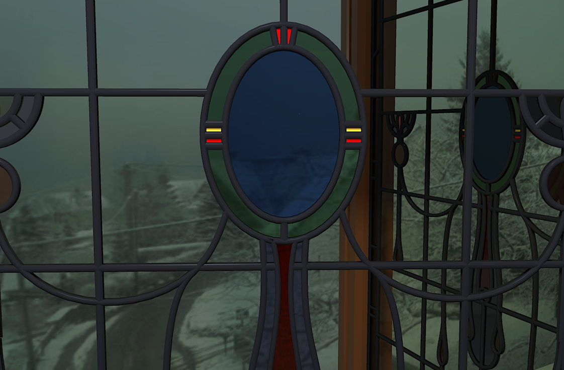
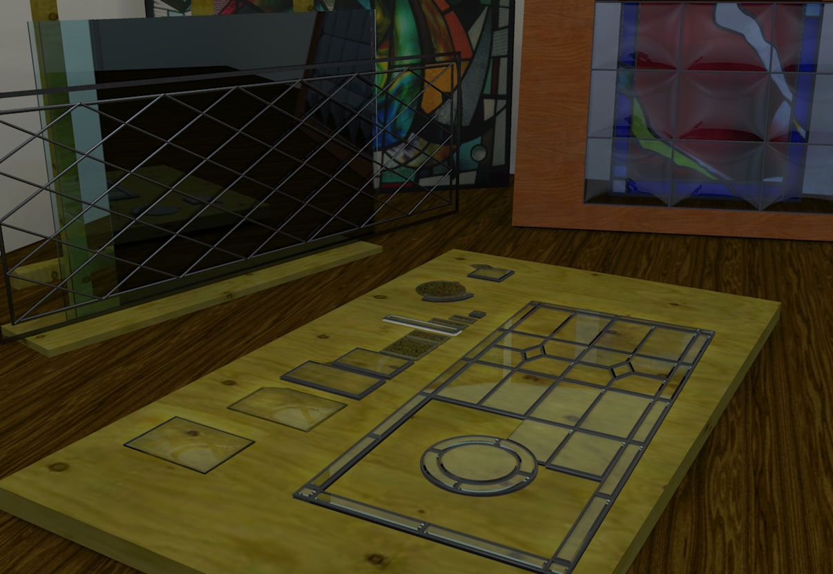
Just a close up showing that the windows are properly made. If you know your way around stained glass you will see that the lead work has correct profiles, only things missing are the solder joints, but that would be one more step into madness, and I think I've gone a bit too far along that road already. Next stage will be to make textures from my actual glass supplies so they are truly real windows.
-
Excellent work, Box. I like the glass composition in the frame on the floor. And of course the cello.
-
Thanks Tim, the one on the frame is an existing window. And it shows what I mean about making textures from my stock glass. I can then design and use "Real Sheets" of glass in the design, so the client gets what they see, not just an an ink or pencil representation of what the glass would look like.
-
Hell, they're all great. I am jealous.
-
Well while Rich is off there with his flights of fancy and the Borg Cylinder, I'm stuck here in reality. A broken bevelled leadlite stuck in the workshop corner awaiting repairs.
I really must sort out the colour balance, brightness etc of my monitors, I have three and these all look totally different on each. Who knows if even one of them is correct.
-
Regardless of monitors, can't you turn up the exposure or add a light? This whole thread if very interesting. Shows that rendering may come easier to someone who is already an artist. Good work! Is that some sort of beveled / quilted glass in the background. What is that piece?
-
That's sort of what I meant about getting my monitors balance properly. The one I mainly work on is much brighter than the others, so it sort of throws my lighting to crap.
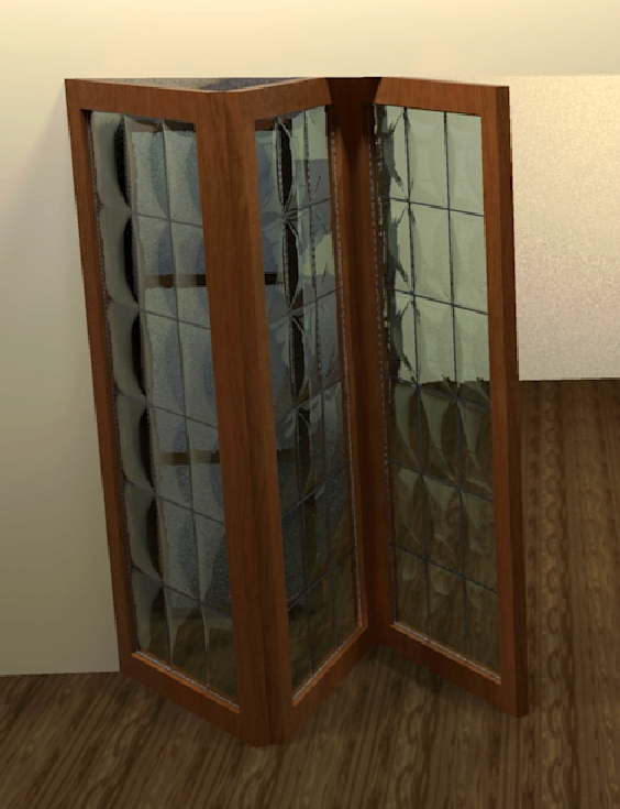
The "Quilted" one in the background is what is know in the trade as a Convexlite. Very popular in the 60s in Australia. I made that as a tester to see how the distortion works, and how well the shaping shows up. The glass panes are heated so they soften and sag through an opening, this makes a sort of flat bubble with straight edges.


Hello! It looks like you're interested in this conversation, but you don't have an account yet.
Getting fed up of having to scroll through the same posts each visit? When you register for an account, you'll always come back to exactly where you were before, and choose to be notified of new replies (either via email, or push notification). You'll also be able to save bookmarks and upvote posts to show your appreciation to other community members.
With your input, this post could be even better 💗
Register Login


Advertisement