Style Experiment
-
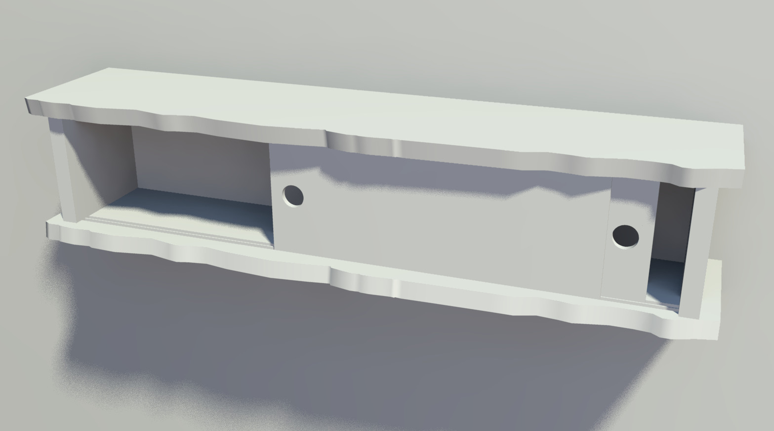
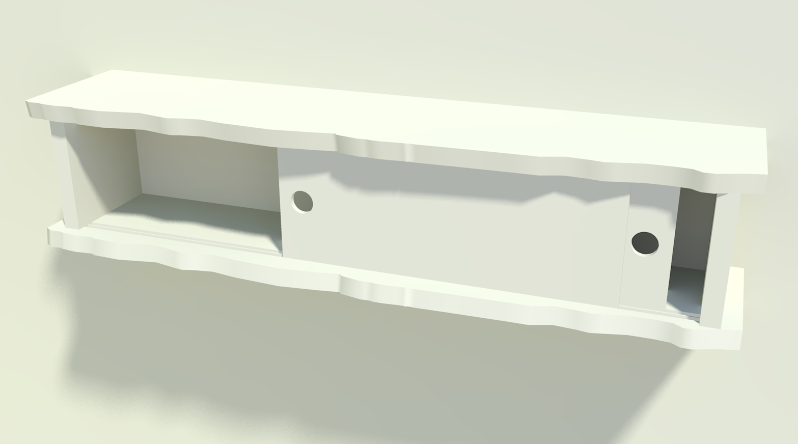
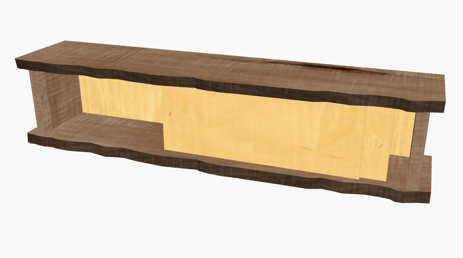
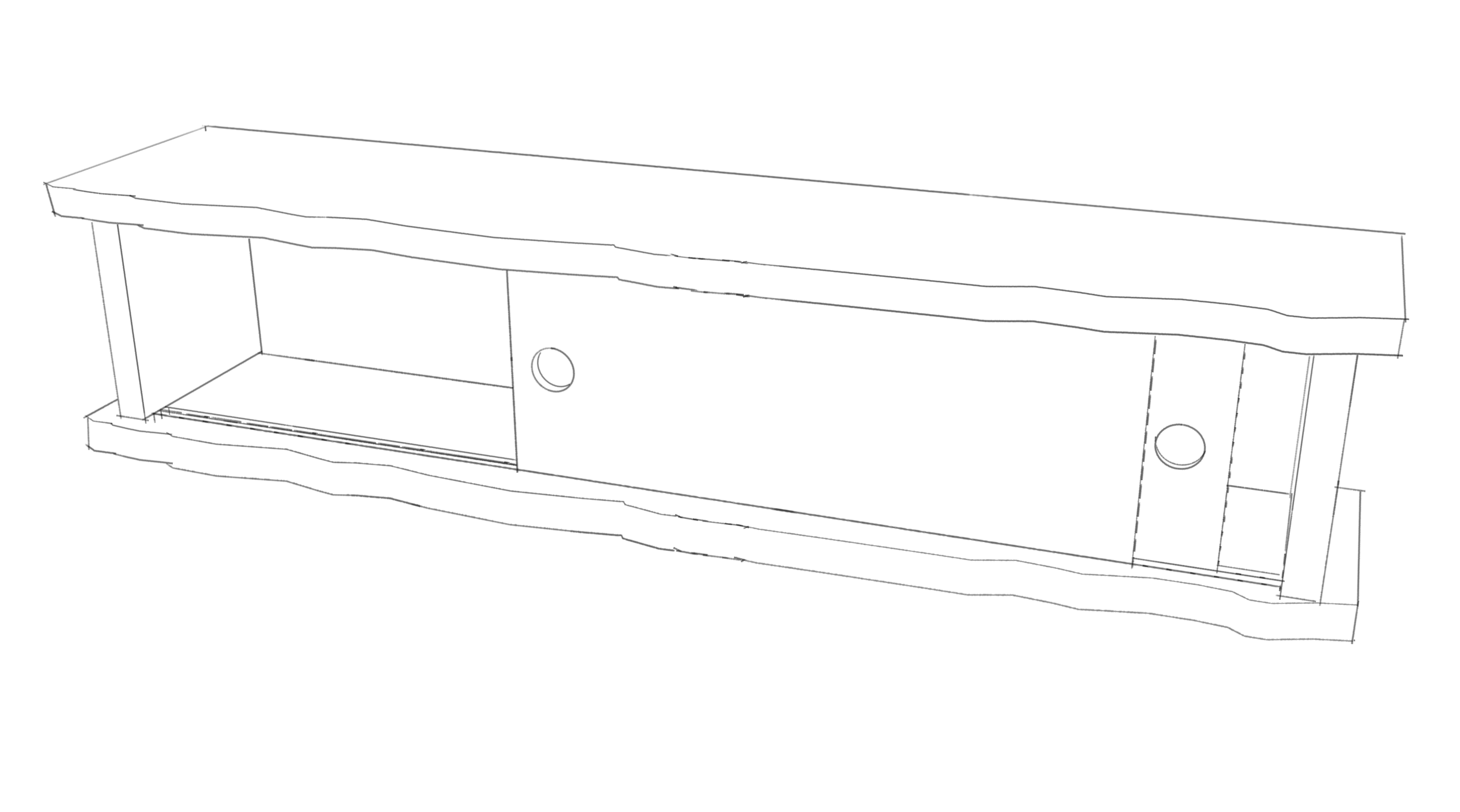
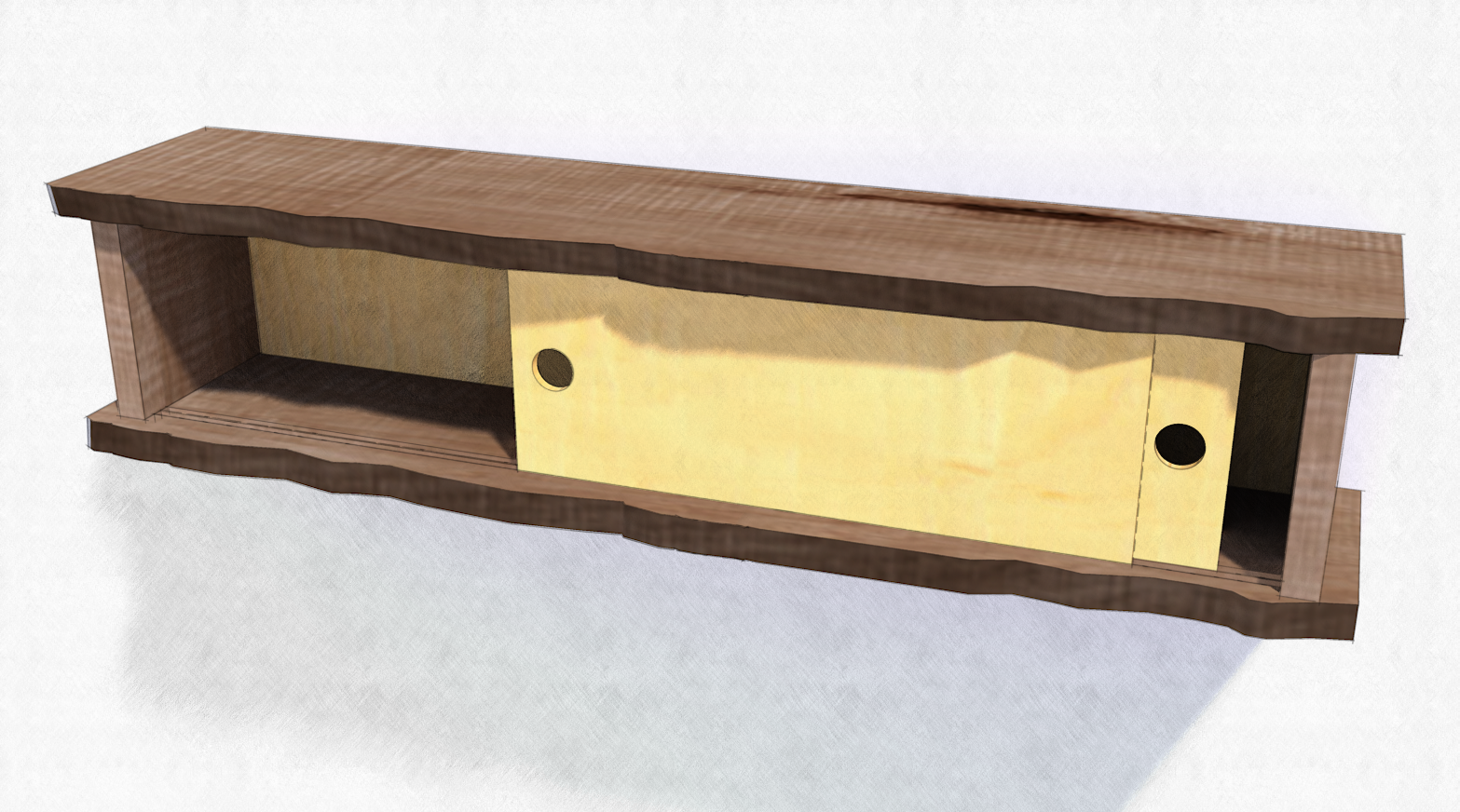
Peter, here's a comparison for you. These are straight out of KT. Same settings except for the render presets.
-
Thanks Dave,
That gives me more to work with. Also looking for nice way to quickly output things such as massing studies where I want it not to look like SU (sorry) and have a little life without taking up the afternoon. With my clay or AO outputs I've tried de-saturating and adjusting the contrast because the overlay tends to darken the whole model, if you know what I mean, so I was interested in how that might be better achieved. (Also for use in PP of regular renderings.)
Peter
-
Peter, I hope there is something useful there, anyway. Do you lay the clay render over another image or is it on the bottom? I usually put the render at the bottom of the pile.
-
@pbacot said:
Thanks Dave,
That gives me more to work with. Also looking for nice way to quickly output things such as massing studies where I want it not to look like SU (sorry) and have a little life without taking up the afternoon. With my clay or AO outputs I've tried de-saturating and adjusting the contrast because the overlay tends to darken the whole model, if you know what I mean, so I was interested in how that might be better achieved. (Also for use in PP of regular renderings.)
Peter
one possible way to achieve this pretty quick..
in sketchup, hide/delete any ground planes or walls etc that you don't need lines for then set to hidden line mode**.. export the SU model as .png/.tif with transparency turned on..
in photoshop, use 'multiply' as the layer blend mode as opposed to 'overlay' ..
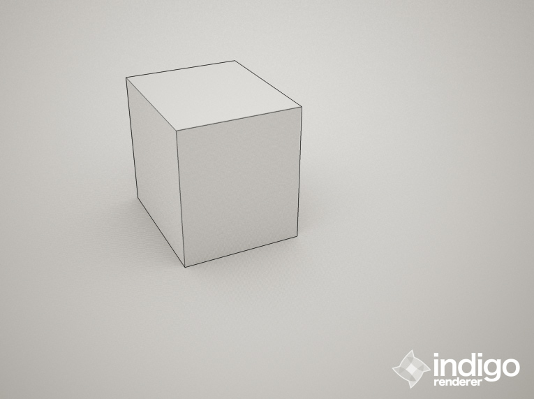
**realistically, what we need in sketchup is a combo of hidden line and wireframe mode.. then we'd be able to export a transparent image composed of only the lines we want with no faces to mess up the blending in post..
-
Jeff, that's essentially what I do now.
Export on PC doesn't allow for exporting PNGs with transparency. ThomThom has an export plugin that will export with the background transparent, though.
And I've made a feature request for that display style several times including in person at 3D BaseCamp last fall.
 Maybe it'll happen.
 -
@dave r said:
And I've made a feature request for that display style several times including in person at 3D BaseCamp last fall.
 Maybe it'll happen.

-
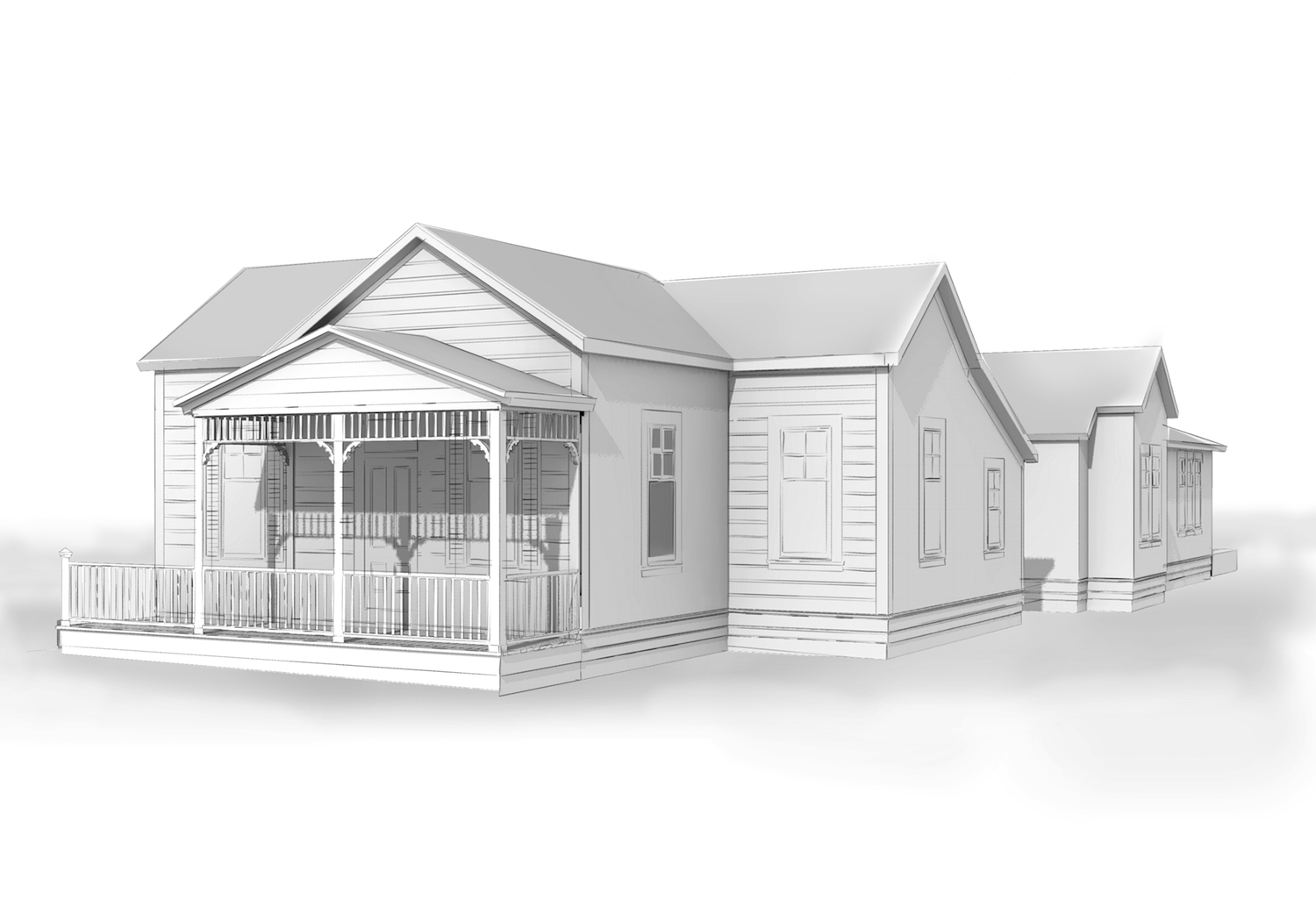
This is TEST.
 basically exporting linework from CAD elevations through SU and Daves' grainy pencil style.
In this case having the white fill in the model is useful to delineate the background. I use "color to Alpha"
I wish I could just export the shading from KT AO. Always have to remove background and color.
Here I can finish up a quick study if I were to punch out the windows, add a few lines in the roof and model that porch a little (heh, it is just a cutout). I hadn't put all the siding on yet either.
-
That looks nice Peter.
As for the background, you can put your model on a seamless background even if it is the size of a house. Make that background white in the render and you're all set.
-
How about something like this, Peter?
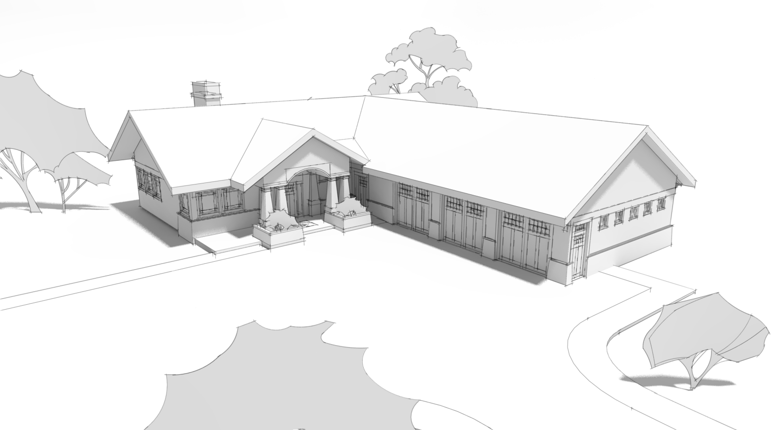
Here's a screen shot of the setup.
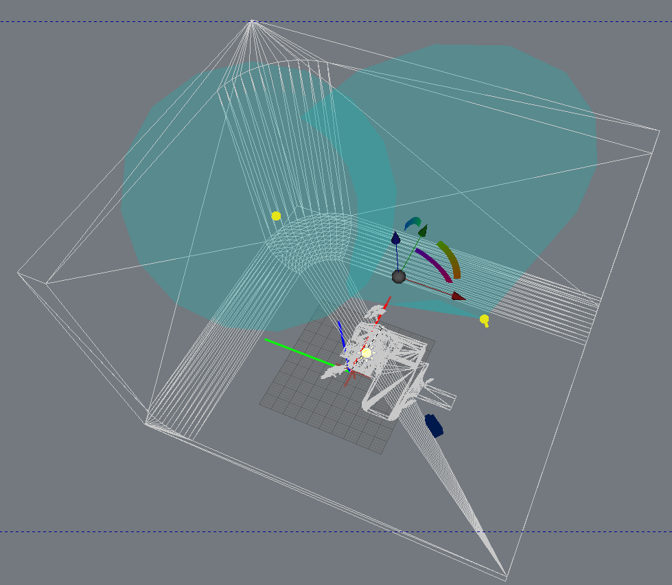
It's the same seamless background I've been using on many of the other images of this house. I added a couple of spotlights to illuminate the background only. No settings other than to turn on Soft Shadows for the sun.
The only other change I made was to set the image to black and white while editing. Otherwise it's just a simple matter of dropping the lines in over the render.
-
@dave r said:
Peter, I hope there is something useful there, anyway. Do you lay the clay render over another image or is it on the bottom? I usually put the render at the bottom of the pile.
I put it under. But it is yellow colored and the background (even white "sky color") is pinkish. In this one I removed the background, desaturated then also put the layer color to alpha. Set it above another white layer, (eventually one mask layer and layer for the ground wash)
Setting up a house "studio" not a bad idea.
 I took off the SU shadows and so forgot: no ground shadows! (if there were any in this shot)
 -
That looks good, Dave! Thanks for the demonstration too. Peter
-
Thank you. And you're welcome.
And here's a version of that image with pencil shading.
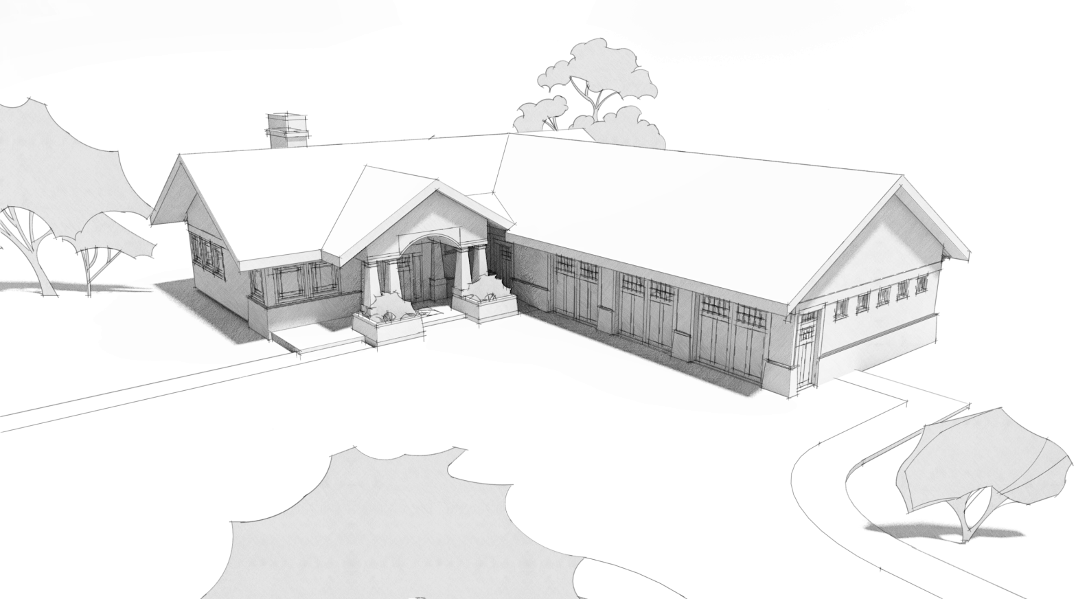
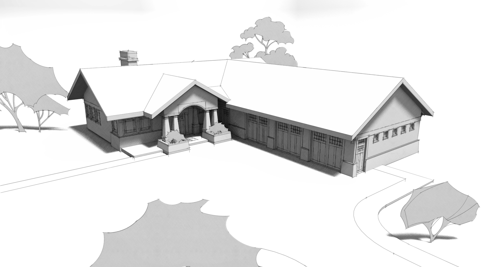
Still a pretty quick process.More contrast with Ambient Occlusion.
-
@unknownuser said:
@dave r said:
And I've made a feature request for that display style several times including in person at 3D BaseCamp last fall.
 Maybe it'll happen.

i just tried a quickie experiment and it went pretty good.. since you seem to be in an experimental mode today, maybe you can mess around with it some..
set the style with thicker profiles and depth cue (maybe around 4px at least) --not sure if this is absolutely necessary, it's just how i set it up..
export a hidden line view .png (doesn't need to be transparent at this point)..
open in photoshop then go Select -> Color Range…
click on the color of the face an/or background..
push delete..you should be left with only the line work on a transparent background..
(adjust fuzziness in the color range select or use refine selection in order to make adjustments as need be)
….
not sure but there might be something useful in there.. -
Jeff, I'll give that a try. Normally I just import the lines image onto a layer set to Multiply and I don't have to monkey with the white background. It doesn't affect the underlying image at all.
Sometimes, as in the case of the image where I show the background with the unsoftened edges, I make several lines exports at different sizes and resize them all down to the same size.
-
oh.. right, i guess i forgot what the context of this thread is

i mean, i think your examples look great as you're showing and there's no need to do what i mentioned above..
that's more/less talking about when you want to have textures in a render but still show some of sketchup's line work.. in which case, the sketchup output of the texture begins to fog the rendered version.. and the darker the you try to make the lines, the more fogged the rendered textures become..
so, on that note, carry on..
-
FWIW, when I want to use textures, too, I export a texture image with edges turned off and a separate image with the edges in hidden line. Then combine those with the render.
-
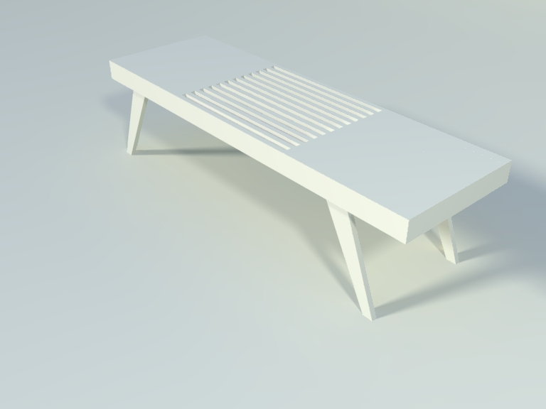
Where do I find Dave's grainy pencil style.
-
Walt, I don't know exactly which line style Peter used but there are a number of my pencil styles here.
FWIW, the pencil shading is not really a style. That part is created outside of SketchUp from either a shadows export from SU or from a clay-rendered image.
-
Oops
 Maybe that one is not readily available. Dave does have several styles for offer in the Sketchucation store.
Edit: it's called Grainy Pencil fine. Yes it is for the linework, not the shading.
Let's just have SU 2013 add AO, soft shadows, and sketchy shadows

-
I looked there but really couldn't tell which one it was I also have Dave's styles from SketchUpArtists.
Hello! It looks like you're interested in this conversation, but you don't have an account yet.
Getting fed up of having to scroll through the same posts each visit? When you register for an account, you'll always come back to exactly where you were before, and choose to be notified of new replies (either via email, or push notification). You'll also be able to save bookmarks and upvote posts to show your appreciation to other community members.
With your input, this post could be even better 💗
Register LoginAdvertisement


