Rendering challenge?
-
[semi-off-topic]
hey steve.. sketchup models generally compress very well and your model is an example of that.. i can zip it with the default mac compressor and get it down to 2.7MB (which is attachable here).. could probably get it smaller than that with a more powerful archiver..
[/semi-off-topic]
-
Hey Jeff! whatever you said mate, sounds good with me, appreciated


-
I can't find it on the 3d warehouse..
-
Here it is. If there is things wrong with it let me know and I will try to fix the model,
-
Fix the reversed faces to start.
-
Booklight faces fived 2.zipFaces fixed.
-
I like your concept, very ironic
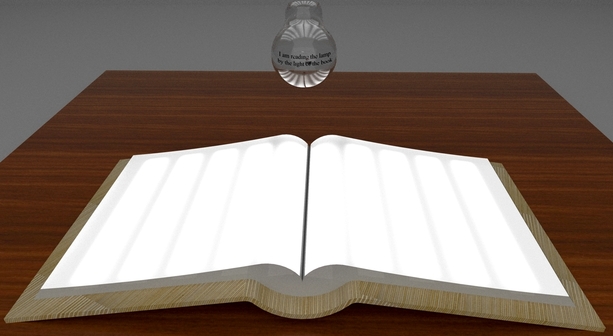
This is certainly a good challenge for rendering because getting that translucent material to behave properly is difficult. I took a stab at it with vray for SU, but ran into problems getting the translucent lens material correct. Then popping it into vray for Blender, I was able to make it look like what I think you have in mind...
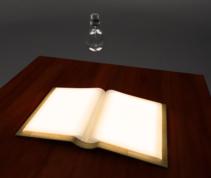
Also, I had to put a semi-enclosed box around the model so there would be some ambient light reflected back on the table, otherwise, all the surfaces render black.
-
Hi and thanks Andy! well if I had received a perfect render on the first go I would have been in two minds....would have been extremly happy to see a photo realistic, nuanced rendition that looks like the object was real.....and on the other hand would have doubted my abilities to even judge how difficult something would be to render. And I think I was correct in my estimation of the challenges this object presents
The solid surface is showing a multitude of colour temperatures, daylight to very warm, very unusual for a single light source.(edited) In reality the light may act like that if the solid surface adds a warm attribute (undesirable) to cool light, the cool light may over power the warm solid surface where it is closest to the light source. Hence the different color temperatures
The light seems to be so warm on the ply it looks burnt.
I just put the ply with little regard to its orientation as I made the material myself and thought someone else would have a better ply end material, that would be better for rendering.
Further thoughts: (Art Direction) if the object were to be in an art gallery or in the foyer of a Library there would be, I expect some ambient light, so the light from the Book light would 'hint' at supplying the light to the lamp.
I also think there is potential for the "book light" to reflect interestingly on the spherical glass, experienced (by the viewer) from certain angles when nearing the object to read the text. That is one of the subtle elements of this piece.If the object were to be visually thoroughly communicated it may take three shots to do it well.(see attached)
The environment in which the object is situated is up to the renderer.
Of course if the piece gets any "airplay" the image will be credited to the producer in all cases.
I thought this would be a challenge

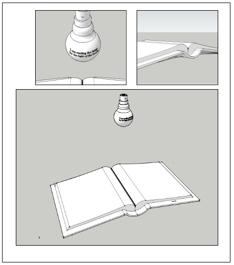
-
Steve, the color was actually from the very yellow color of the plywood material. I reduced the intensity of the texture and it comes out much more even. I did another view looking at the lightbulb - indeed, I like how all the reflections/ refractions are happening in the bulb.
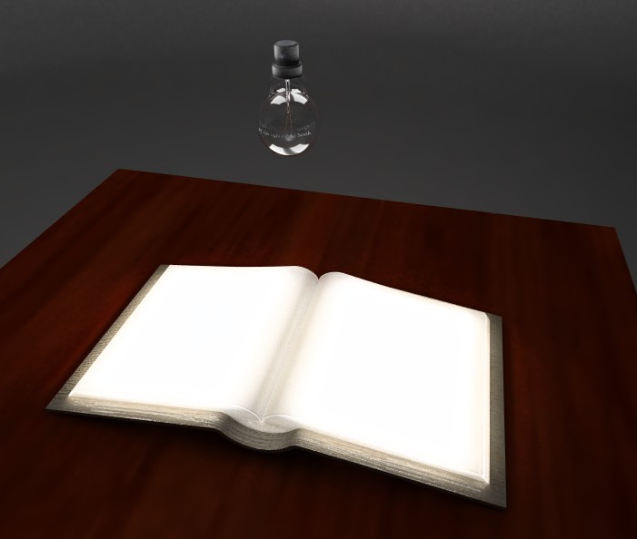
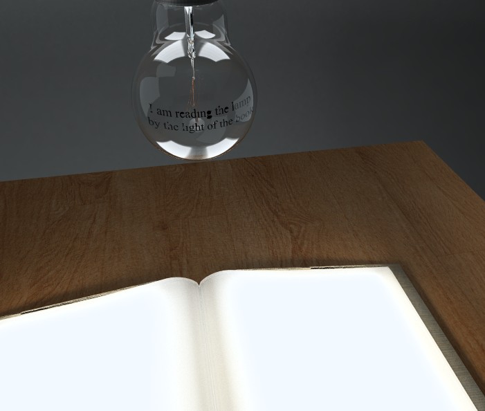
-
Hi Andrew, actually that looks very good indeed. I am thinking that (still got my training wheels on here) That is maybe as far as just rendering can go, and that is what post production is for (Photoshop etc) Is that the case? The glass material and reflections actually look really awesome to me.

Thanks for taking up the challenge Andrew, will PM you with a personal thank you. I am going to take a day to think how to progress this project. And would welcome comments on what potential post processing would have. even if the opinion is just, yes photoshop gimp should take over hereThanks!

-
I expect the lamps will diffuse through the surface with very subtle hot spots
Would be more realistic with hot spots.
Having trouble getting it right though.
Easy to get page top to give light but giving it a translucent look with some hot spots is the key.
Working on it. -
@jpalm32 said:
I expect the lamps will diffuse through the surface with very subtle hot spots
Would be more realistic with hot spots.
Having trouble getting it right though.
Easy to get page top to give light but giving it a translucent look with some hot spots is the key.
Working on it.Hehe, I faked it with this one, I have one plane light underneath each side. I just wanted to see how well I could get a translucent material to work, and that's where things broke down in vray for SU. I could tweak the blender model to better mimic the individual light strips, but I ran out of time to mess with it more. Just wanted to get the concept to work.
If anyone else wants to play with the Blender model, here is what I have. I can imagine Luxrender would do quite a nice job with this.@steved: I think the model could still be refined - like I say, the light strips could be shown more accurately than my single light plane, and the translucency of the cover lens material could be adjusted to get the right consistency. I was more interested in showing the concept because I really like what you came up with as an artistic vision

-
Hot spots, Over head bulb picking the hot spots too much.
Book bulbs too large. I was trying to exaggerate them and triy to play with
emitters, opacity and material. I failed.
Hello! It looks like you're interested in this conversation, but you don't have an account yet.
Getting fed up of having to scroll through the same posts each visit? When you register for an account, you'll always come back to exactly where you were before, and choose to be notified of new replies (either via email, or push notification). You'll also be able to save bookmarks and upvote posts to show your appreciation to other community members.
With your input, this post could be even better 💗
Register LoginAdvertisement


