Highlight or zoom-in small parts (like IKEA does...)
-
I'm pondering for options to highlight some of the smaller / fine parts of TV Stand woodwork project. Something similar to what IKEA does in their Assembly Instructions.
Ideally would like to put a layer of thought circle with the small part highlighed.
Thanks
-
So create scenes in SU that show the details. Then create viewports for them in LO. You can draw a circle or other shape in LO and create a clipping mask with it to create a circular "window" on the viewport. I'll make an example for you.
-
How about something like this?
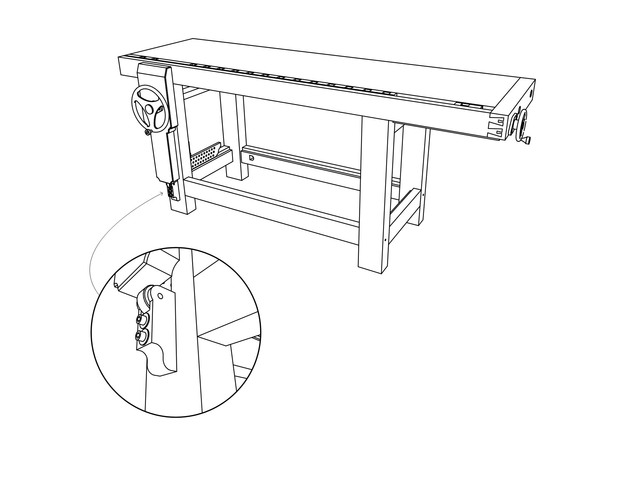
When I make these sorts of insets I draw the shape (circle in this case) and place it over the viewport as needed. There's no fill, just the edge. Select both the shape and the viewport, right click and choose Create Clipping Mask. Then select the clipped viewport and, in Shape Style, enable Stroke and make the desired settings for weight, color dashes, etc.
-
Awesome! This is what I was exactly looking for... In fact I noticed the 'view port' thing in the Tips, but tried to repeat/replay the tip later with no luck.
Thanks
-
That's a nice detail there Dave!
-
Thankee, sir.

-
That's look so good, thanks Dave
-
Dave, as usual, is on the case and makes a great example.
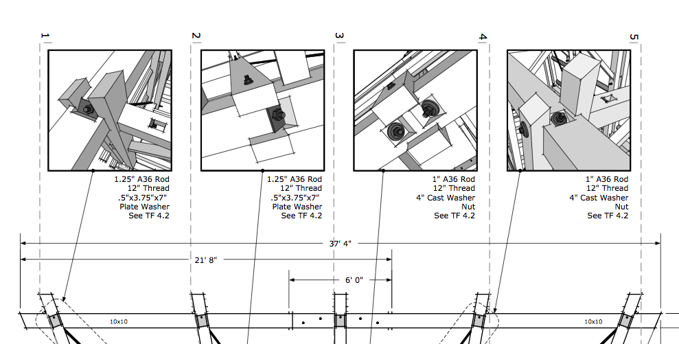
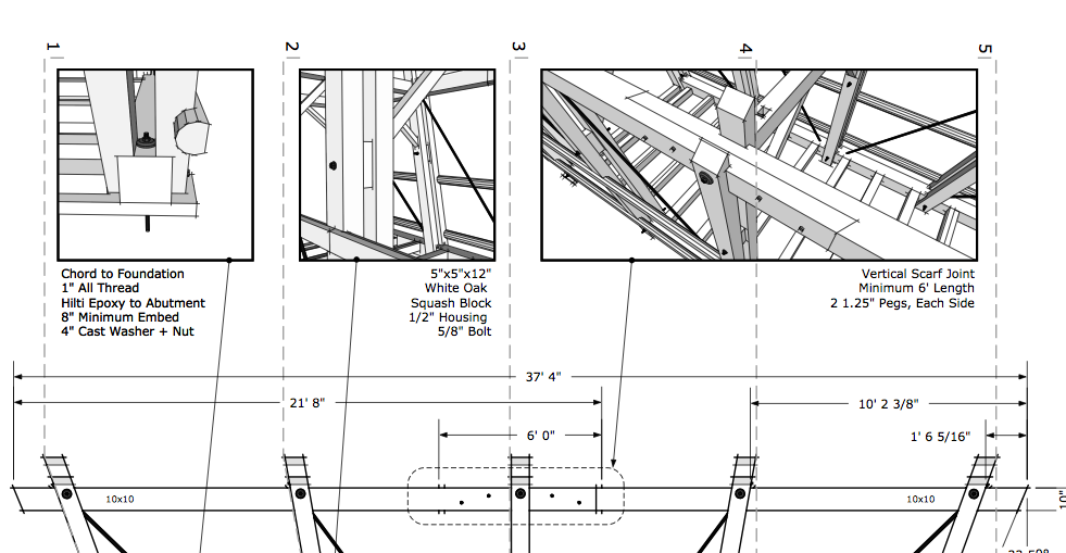
Never used the clipping option in LayOut, opens up possibilities.I tend to do things like this:
-
Thanks, Mike,
Your example looks much nicer than mine. I did just make that example to answer the question, of course, but your is excellent. So are you just making sized viewports with borders?
-
@dave r said:
Thanks, Mike,
Your example looks much nicer than mine. I did just make that example to answer the question, of course, but your is excellent. So are you just making sized viewports with borders?
Thanks Dave.
Yes, just viewports with borders.
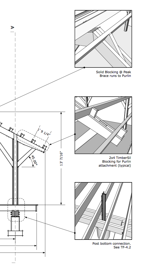
I'll have to try out the viewport and clipping technique sometime.Here are a few more:
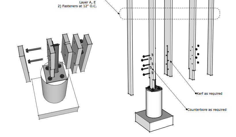
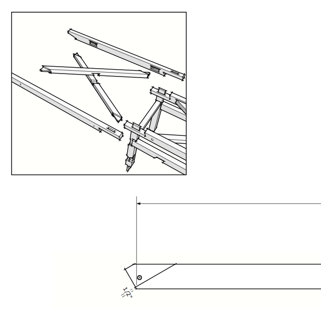
-
I like the squares and it is less work. Of course with the clipping mask you can make it whatever shape you like.
-
Bmike.
Your work is very good.
Thanks for the explanation
Pedro
-
@pedrinalex said:
Bmike.
Your work is very good.
Thanks for the explanation
Pedro
thank you.
note that i often have more than 1 model referenced into my LO file... -
I've been looking how to do these circular view ports and found this reply. Thanks - it woks perfectly !
@dave r said:
How about something like this?
[attachment=0:rtc98blv]<!-- ia0 -->Inset_1_1.jpg<!-- ia0 -->[/attachment:rtc98blv]
When I make these sorts of insets I draw the shape (circle in this case) and place it over the viewport as needed. There's no fill, just the edge. Then I copy the shape before selecting both the shape and the viewport, right clicking and choosing Create Clipping Mask. Then I hit Edit>Paste (Ctrl+V) to paste the circle over the clipping mask. Finally, I select all of it and group it.
-
Shure would be nice if a clipping mask could have a "stroke" option.
Perhaps I missed that.
C
-
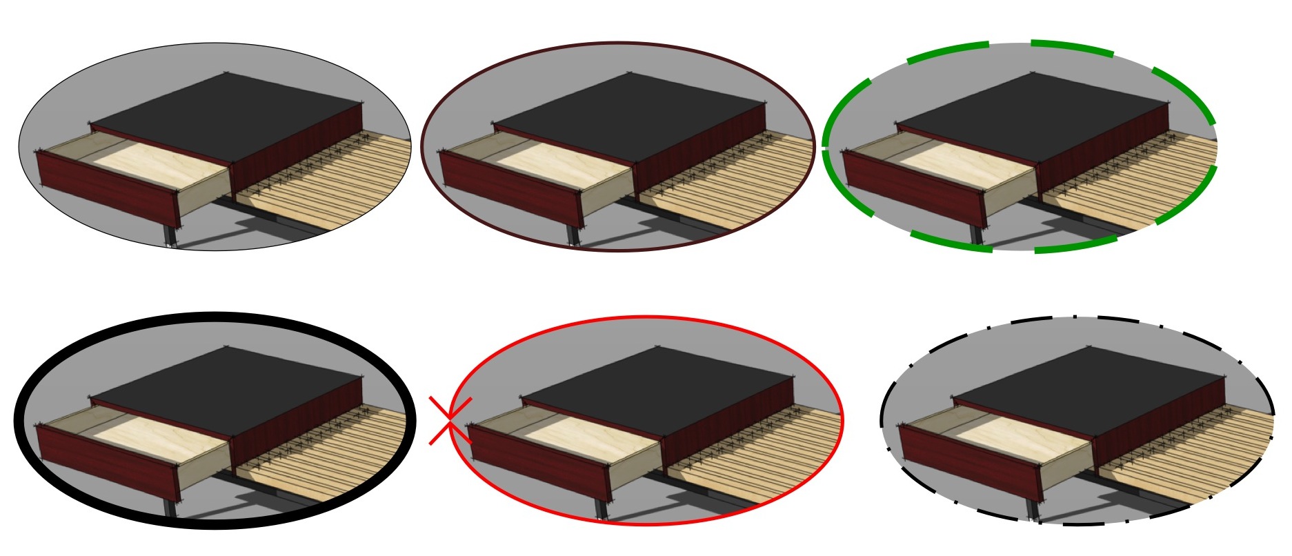
-
DOH!
Thanks Dave.....silly me....I was still doing the copy/paste in place method just the other day.
Charlie
Hello! It looks like you're interested in this conversation, but you don't have an account yet.
Getting fed up of having to scroll through the same posts each visit? When you register for an account, you'll always come back to exactly where you were before, and choose to be notified of new replies (either via email, or push notification). You'll also be able to save bookmarks and upvote posts to show your appreciation to other community members.
With your input, this post could be even better 💗
Register LoginAdvertisement


