....some further thoughts on the new SketchUp Logo!
-
Hi Guys,
I still trying to get used to the new SketchUp Logo and while its growing on me somewhat and I can understand what the brief must have required and designer is trying to achieve, I still feel that there is something missing as the logo for me doesn't 'get the message across totally' as a good logo should.
The original logo, I think, got an obvious message across that SketchUp was somewhat like using a pencil and as we all know the pencil still is one of the simplest man-made tools for drawing apart from the charred twigs our ancestors must have used to get their ideas onto cave walls.
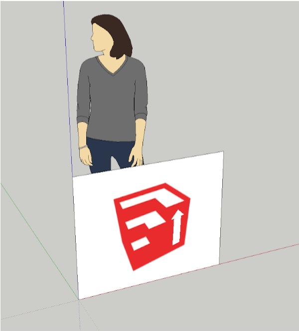
I can appreciate that the new logo shows the results of the push / pull tool in action, SU's main patented tool but it doesn't get the 'easy to use' message across quite so well as the original logo showing that cute little easy to use pencil.
I am now wondering if that simple little vertically pointing red arrow used in the Push ' Pull icon should the incorporated in the new logo somehow to get an 'easy action' message across.
First impressions are so important and a logo often has to take up this responsibility!
Do you guys have any thoughts / design ideas on this ........ or am I flogging a dead horse? I hope I am not

Mike
-
........ further!
Maybe even turn the Push/Pull arrow into a real one with both up and down ends!
-
It could be... maybe...
But I think it is better to wait and see what Trimble is after when they release their version and we can have the global picture .
salud ¡ -
I think the cube illustrates the push-pull nature of SketchUp very well. Don't feel the need to be so literal as to include an arrow.
The old House and Pencil indicated more architecture than push pull. (I have in fact gown to like the new logo - when I think of the elements of the old and new logo I think the new one woks in many more ways than the old.)A strong design is minimalistic - where you've taken away everything that isn't strictly needed - and I don't think the arrow needs to be there to express Push Pull.
-
I agree that the new logo illustrates something that can be achieved by the push / pull but its only folks that are familiar with SU that realise this. It doesn't give the first-time viewer any clues whereas the old logo did give clues to what SU was / does.
To me, looking at the new logo with the fresh eyes of a newcomer, I would be thinking '3 steps', not the movement of the PP tool.
-
Hi,
one could perhaps imagine a simplified symbolic building.
Charly
-
Mike, Logos are really about brand awareness rather than specific product recognition.
A Logo needs to be distinctive and instantly recognisable, but it doesn't have to tell you what the product it is linked to does.
Most logos are descriptive of their "product" but that is mostly because the people who design them are using the product as a starting place. It's almost an inside joke, you usual need to know the product fairly well before you fully appreciate the nuances of the logo's design.A Logo is an eye catcher that instantly strikes a cord in the viewers mind, that is more emotional than it is rational.
A good logo is one that jumps out and hits you over the head and drags you back to it's cave when it is mixed in amongst a screen full of icons. It isn't there to educate you, it just needs to grab you. -
I think they're the worst looking icons i have and the most used
-
can't you all see it's just the 'Superman' logo disguised ?
Total rip off of "Up, up & Away", 'the best' etc. Why do you think they chose red. Notice how in the article on the SketchUp site, where they explain the logo, they 'carefully' introduce it to you in 'black' first to distract you ... and then show you the superman red version. Why was it necessary at all to show it in black first? Companies just change their logo but Google SketchUp is going out to their way to explain their thinking process for arriving at this design - who cares?! Methinks they doth protest too much.
They had to dump the old logo because of the connotations to housing foreclosures (little house) and the red pencil suggesting being in the red accounting wise.
You pay big bucks for these corporate mind-ph** logos and their subliminal messages. Google continues to take whatever it wants - even your gullibility for granted.
-
Interesting that you would appear to have joined the site just to make some rambling rant.
Might help if you actually realised that Sketchup is no-longer part of google!
-
I've grown to like it. And if they hold true to their word and invest time and energy in upgrading and improving SketchUp then I will probably, over time, come to associate the logo with this new period of innovation. Fingers crossed.
-
You know... it is really growing on me... after seeing the full size, glowing model... I think I like it!
Also... I think that we SHOULD have a "Beating a Dead Horse" emoticon.
-
"Also... I think that we SHOULD have a "Beating a Dead Horse" emoticon".
I think a vomiting toad would be sufficient actually.
It hardly matters what the logo is, the program itself is far more important.
-
-
Great, thanks mate.
 - close?
Hello! It looks like you're interested in this conversation, but you don't have an account yet.
Getting fed up of having to scroll through the same posts each visit? When you register for an account, you'll always come back to exactly where you were before, and choose to be notified of new replies (either via email, or push notification). You'll also be able to save bookmarks and upvote posts to show your appreciation to other community members.
With your input, this post could be even better 💗
Register Login


Advertisement