Re-thinking my Roadster
-
Came across my Roadster files the other day and got to looking at it. It was my first attempt at modeling a car from my imagination so considering that I guess it was ok, but there were a lot of things I really didn't like about it. So I thought I'd take a shot at fixing some of them and I'm posting some shots of it to get some feedback on the changes. Things that are better, things that are worse, things that just plain suck.
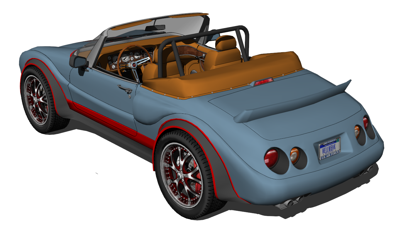
I really didn't like the headlights, hood, windshield, the rear end was way too boxy when the rest of the car was all curves, etc. Added curves to the door molding and the door top, redid the air scoops, and a lot of other little things. Still needs a lot of smoothing (something that takes me forever) and fixing the obvious segmenting in a lot of places.
Please keep in mind that these are changes in progress and you'll probably notice a lot of things that aren't done yet or need fixing.
It's really difficult for me to be objective when dealing with something that just came out of my warped little mind, so please be brutal and let me know what you think.BEFORE
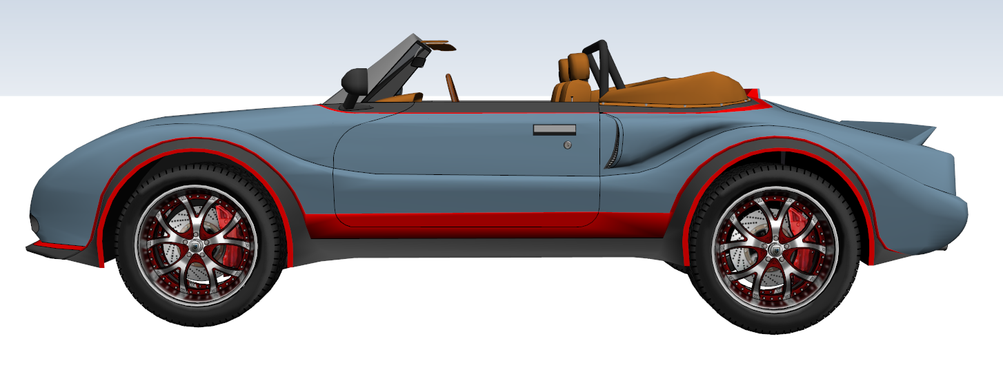
AFTER
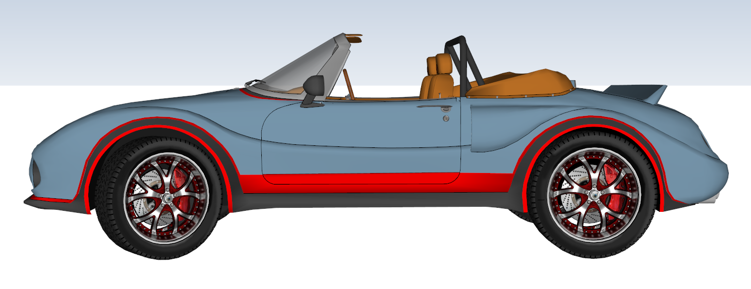
BEFORE
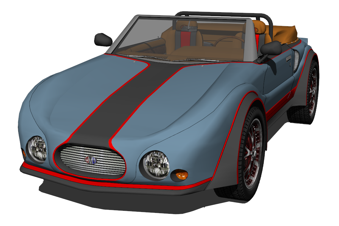
AFTER
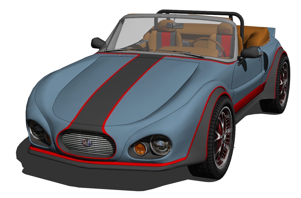
BEFORE
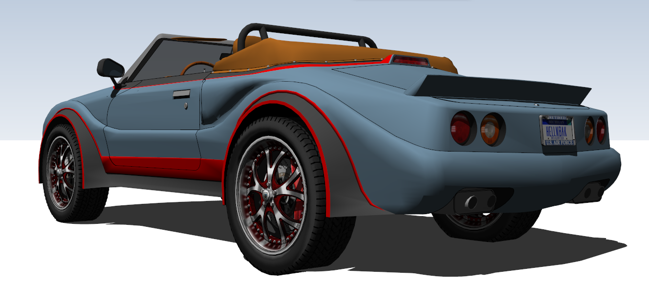
AFTER
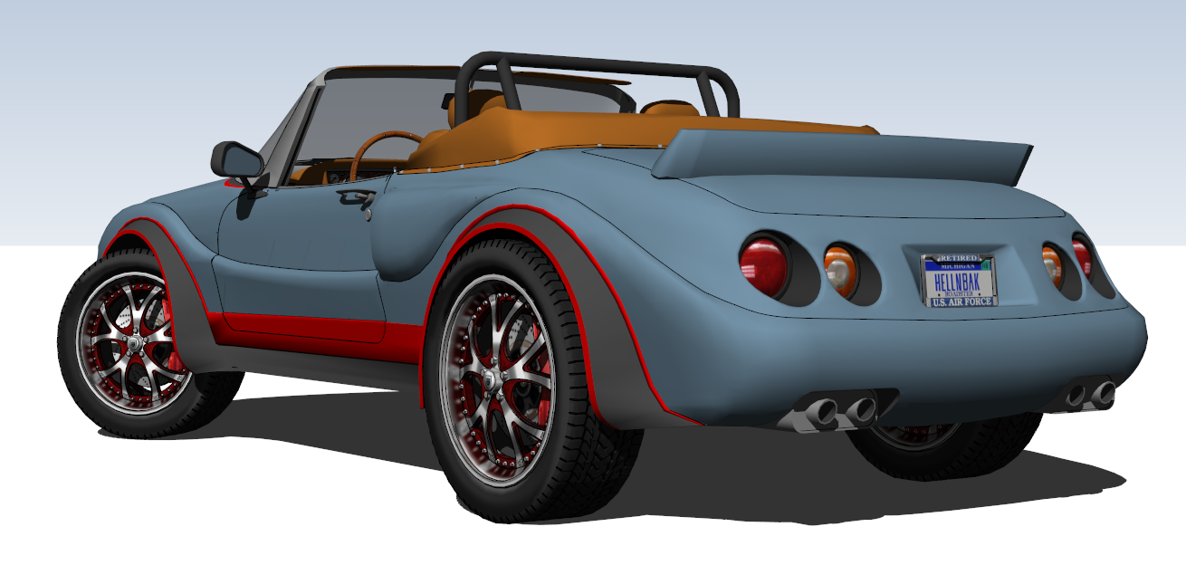
BEFORE
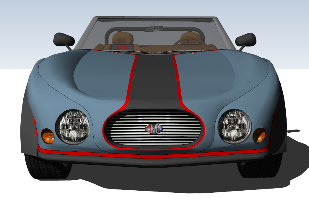
AFTER
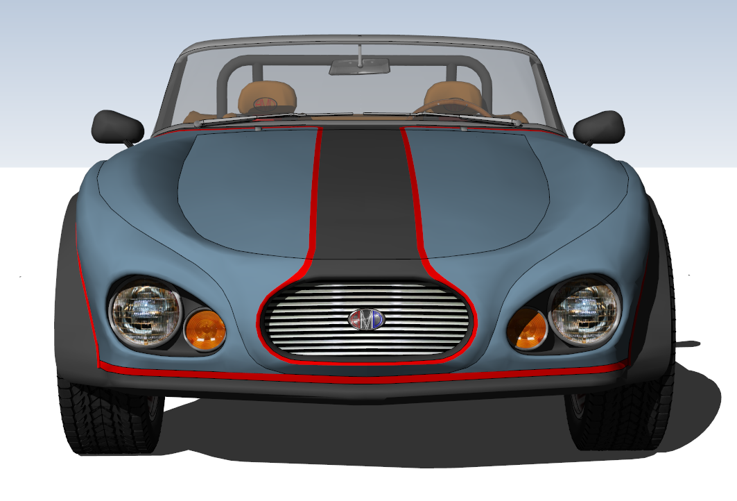
BEFORE
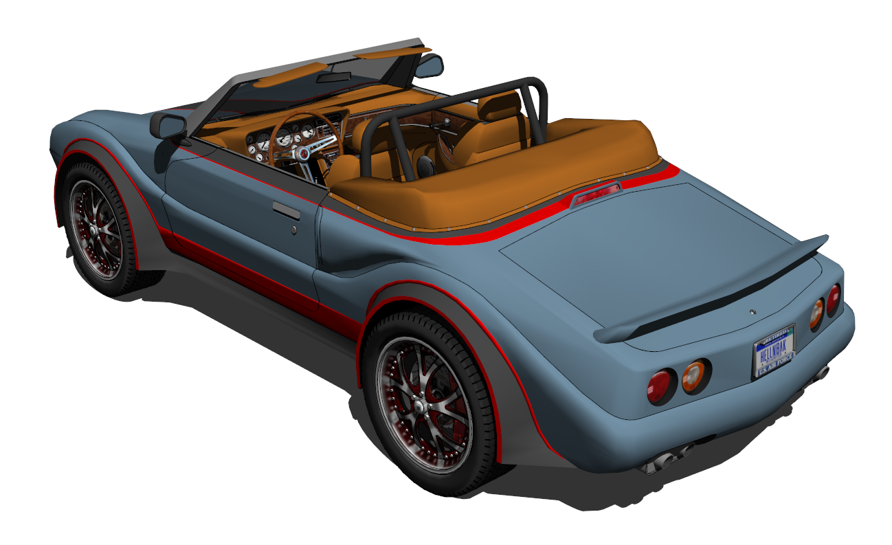
AFTER
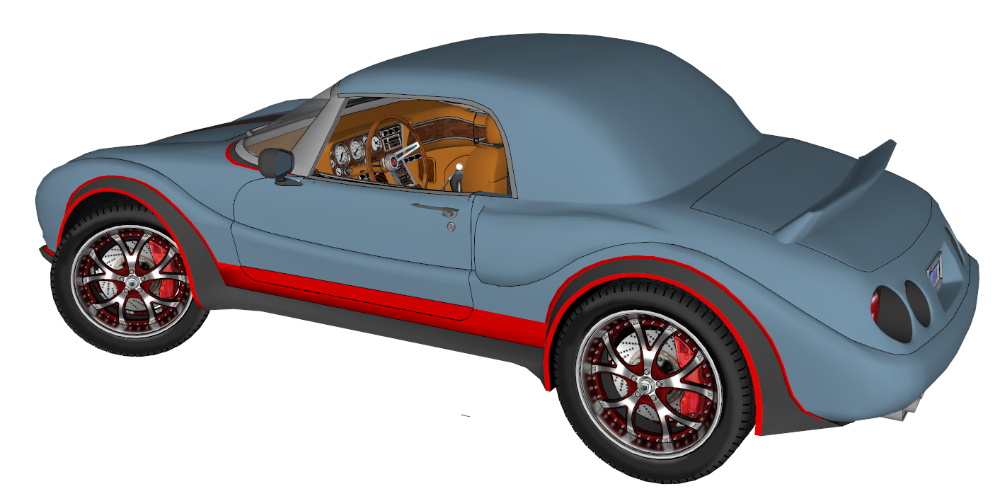
This is something I was playing around with, don't know if it'll go any further. Can't decide on the size and shape of the windows I want to add in the rear and on the side.
-
Neat fluid agressive forms!

-
Much appreciated, Pilou!
-
I like the changes! The side shots are the most impressive. Second form is less pinched and the windshield-door panel swoop more classic and fun. Only thing I noticed was the corvette-like tail lights are like a knock-off. But if that's what you want, it's your roadster.
Thing is it looks like it "could be". All the real modern car detail are there. Very real. I can't imagine how you come up with the scale and proportion... Got a vid?
-
@pbacot said:
I like the changes! The side shots are the most impressive. Second form is less pinched and the windshield-door panel swoop more classic and fun. Only thing I noticed was the corvette-like tail lights are like a knock-off. But if that's what you want, it's your roadster.
Thanks Peter. As far as the tail lights, I know nothing about corvettes, but if they are similar to them I'll take your word for it. I just wanted to keep it simple. The question is, do they detract from the overall design, and do you think the car as a whole would be better if I redesigned them?
@pbacot said:
Thing is it looks like it "could be". All the real modern car detail are there. Very real. I can't imagine how you come up with the scale and proportion... Got a vid?
I just eyeball everything, seems to work most of the time. A video? No, sorry. My methods (if you can call it that) wouldn't lend themself very well to making a video, much too haphazard and unorganized.
Again, thanks for your input.
-
I would be stacking B Bs in a funny farm half way through.
Always enjoy your stuff! -
Did some work on the interior. New steering wheel, shifter handle, other small things. Texture on steering wheel spokes needs a lot of work yet, but I guess I'll just put this thing back on the shelf. Really hoped more people would offer criticisms and suggestions, maybe it's the old "if you can't say anything good....."

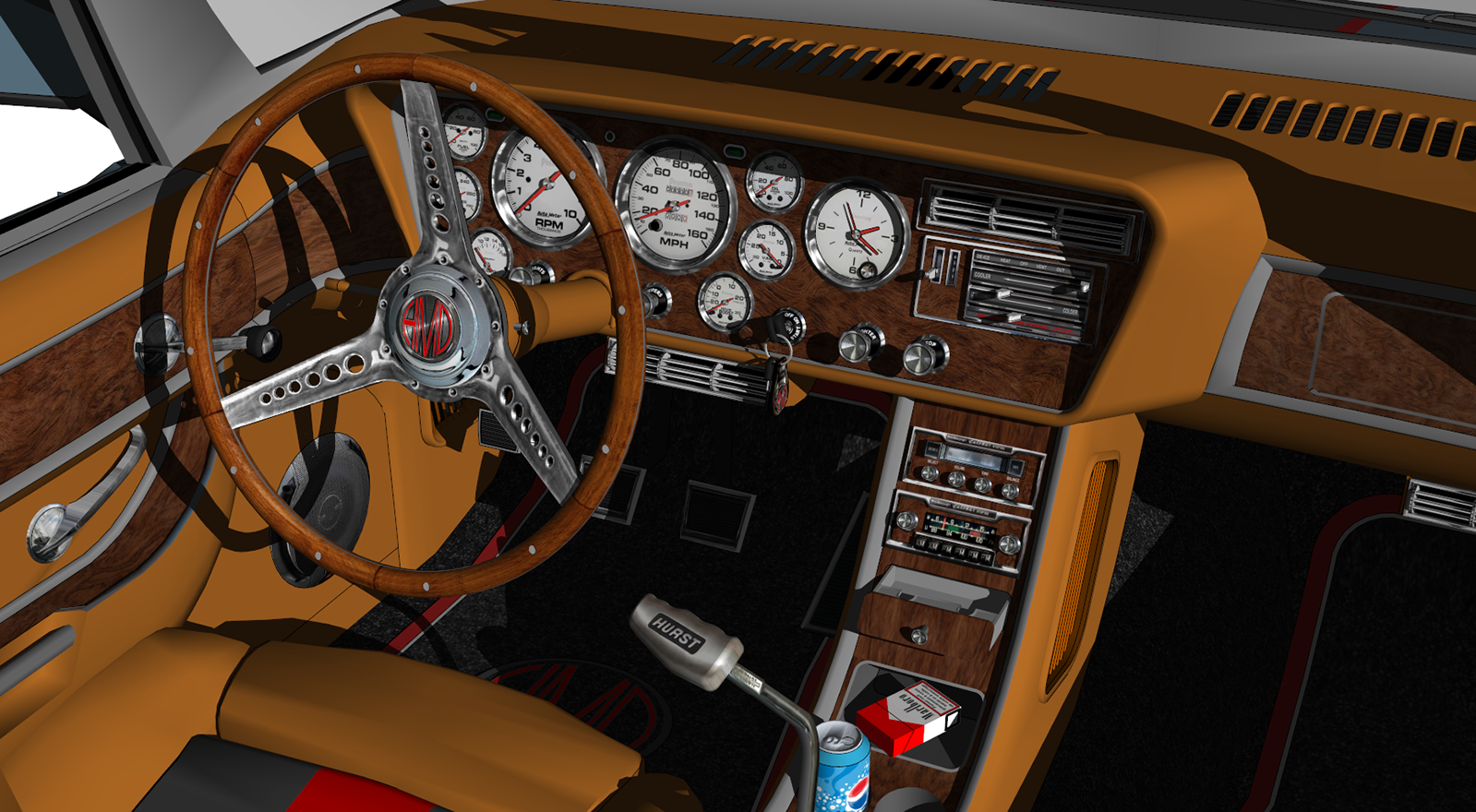
Thanks to those of you who did provide input. -
I don't know, when you look at that interior shot, it's pretty hard to criticize such a masterwork.
I always find it hard to critique something that it would be a stretch for me to accomplish.
If there is one thing I like better than your modeling, it's your sense of humour. Both classic.
-
@dale said:
I don't know, when you look at that interior shot, it's pretty hard to criticize such a masterwork.
I always find it hard to critique something that it would be a stretch for me to accomplish.Thanks Dale. The main thing I need input on is what I've done to the exterior. I know that my imagination isn't that great, that's why I need to tap the imaginations of fellow modelers to see how I could do things better.
@dale said:
If there is one thing I like better than your modeling, it's your sense of humour. Both classic.

My sense of humor has been called many things, but never "classic"

-
What Dale said.
But I do have one little thing: the rear spoiler doesn't do it for me. Maybe the angle is too steep? But love the rest of the changes.
-
Personally I think the wheels are too big in diameter, slightly smaller with it riding slightly lower may look better. The only other thing that caught my eye was that the front turn indicators are inside of the headlights, I think (could be wrong) that they are required to be near the outer edge of the car.
Other than that its looking very good.
-
That interior shot is great. That's a SU picture--I know you don't render? The texturing and modeling are so nice it goes most of the way to rendering. Could you show a wire frame overlay or hidden geometry of the dash?
that's why a video would be nice. I understand you also use few plugins.

-
WOW! Some input
@bryan k said:
What Dale said.
But I do have one little thing: the rear spoiler doesn't do it for me. Maybe the angle is too steep? But love the rest of the changes.
You're right, actually I just plucked the spoiler off the old version and stuck it on for visual reference. It's not modeled into the car and I meant to redo it but just forgot all about it. Thanks for reminding me.
@paul russam said:
Personally I think the wheels are too big in diameter, slightly smaller with it riding slightly lower may look better.
Hmmm....I'll have to think about that one. Now do you mean that car rides too high because the tires are too big, or that they are too big and the car rides too high?
@paul russam said:
The only other thing that caught my eye was that the front turn indicators are inside of the headlights, I think (could be wrong) that they are required to be near the outer edge of the car.
I Googled this and could not find any reference to the legal locations for turn signals, but you may be right. Actually I did try to put them outboard of the headlights in an early version, but didn't like the look at all
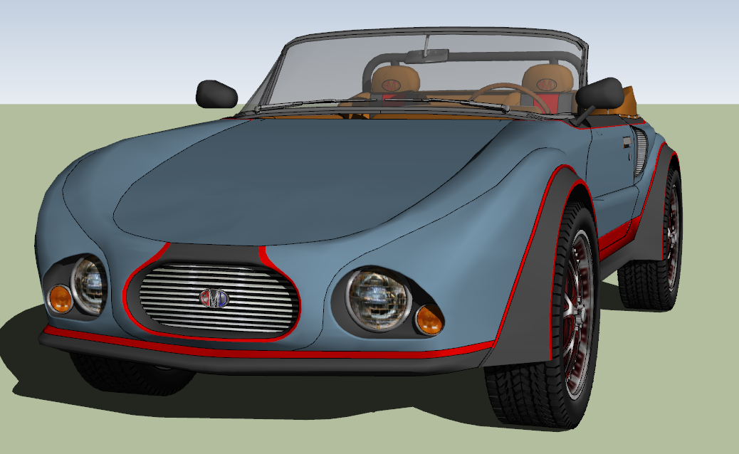
What I may do is make the present turn signal a running light or something and move the actual turn signal towards the outside of the fender somewhere. I'll play with that idea, thanks.@pbacot said:
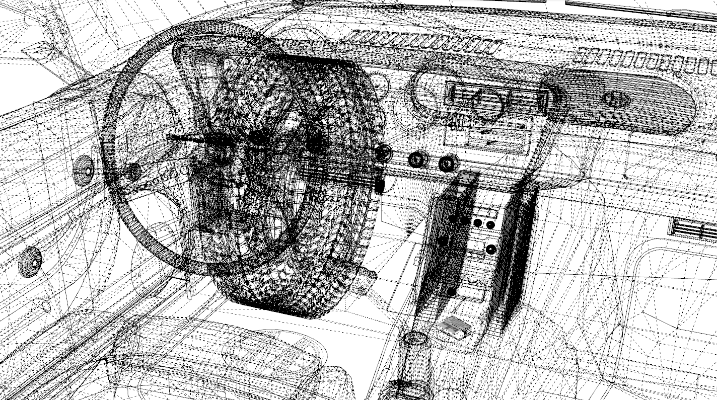
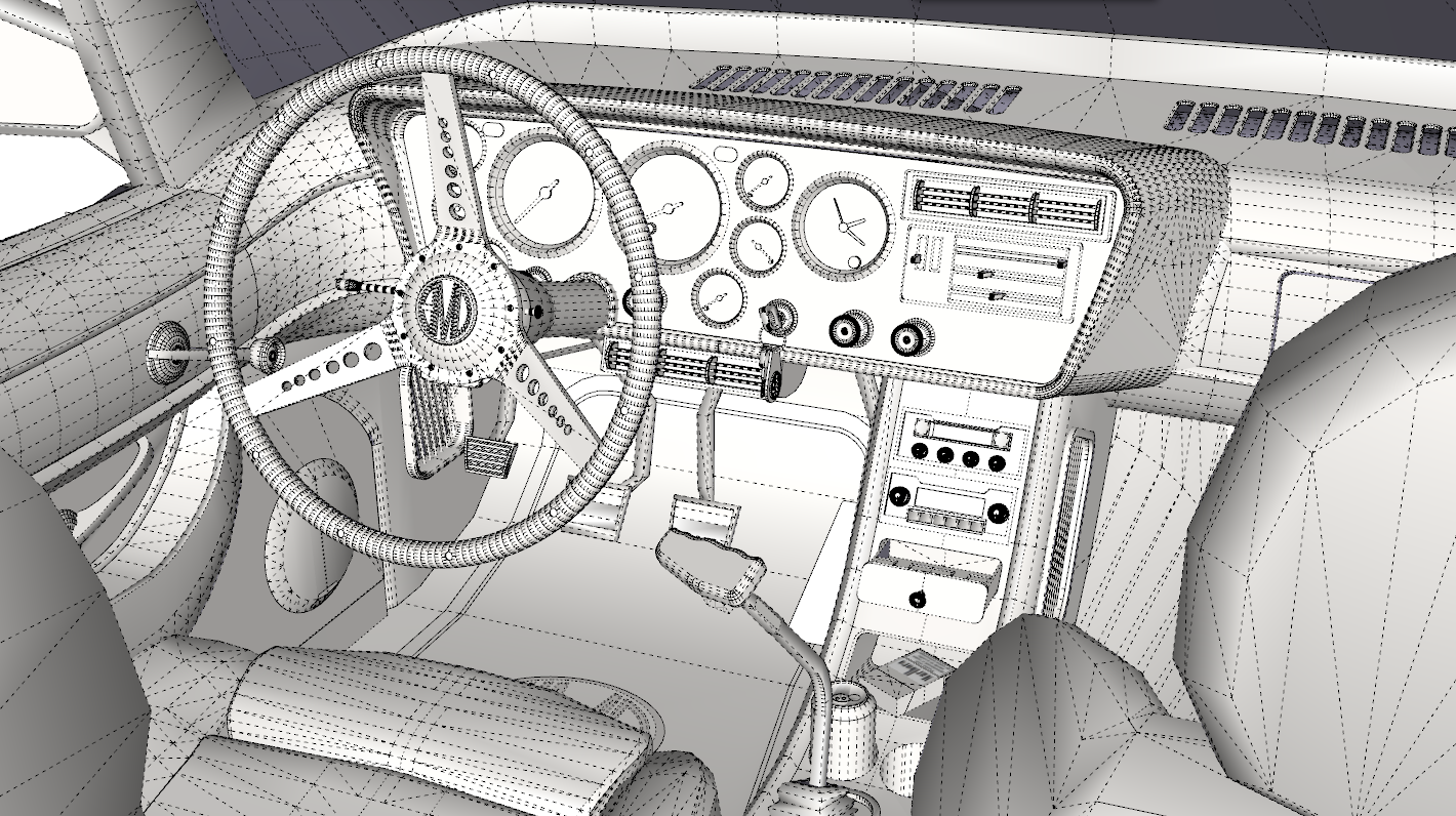
That interior shot is great. That's a SU picture--I know you don't render? The texturing and modeling are so nice it goes most of the way to rendering. Could you show a wire frame overlay or hidden geometry of the dash?
Thanks for the kind words. For me working with textures is half the fun. Unfortunately it also increases the file size considerably.
Here's a wire frame, good luck making any sense of that explosion in a spaghetti factory

and here's a hidden line. I hate to show my hidden lines, they show how hit and miss my modeling techniques are. It's like I told somebody earlier - "If God had intended my hidden lines to be shown he wouldn't have let me hide them in the first place"
@pbacot said:
I understand you also use few plugins.

Yeah, not by choice tho. The best ones are just way too far above my learning curve. Frustrating, but I'll live with it

Thanks again for all the comments and suggestions!
-
What is the file size of such thing ? (Without texture if texture are existing)
-
IDK about the lights. It's hard to say, because my mind goes "oh Corvette", it's the association to a muscle car on a roadster. But say the light cutouts had a more rounded edge? Of itself, I think it's cool the way it lets the other lines run about without interfering or adding too much.
-
@unknownuser said:
What is the file size of such thing ? (Without texture if texture are existing)
Well, there are a bunch of textures, is there an easy way to remove all of them?
-
Your question got me to wondering so I manually deleted all the textures, then purged (using the plugin, not the built in purge).
With textures - 13.9mb
Without textures - 8.6mbSure looks funny without the textures

-
uhuh, very educational. I see some areas are one face but it all flows smoothly.
I love that knob texture. Takes me back. The slider heater controls too.
If I can offer something constructive: The front part of the seat is the only distraction in the image (for me-but I couldn't touch it.)
-
Love your stuff. It would be like stacking bee bees to me.
I want to see some of your work renderd.
Maybe parked in a old Texaco station, car-hop... -
Thx for the Infos: that fixes ideas

Hello! It looks like you're interested in this conversation, but you don't have an account yet.
Getting fed up of having to scroll through the same posts each visit? When you register for an account, you'll always come back to exactly where you were before, and choose to be notified of new replies (either via email, or push notification). You'll also be able to save bookmarks and upvote posts to show your appreciation to other community members.
With your input, this post could be even better 💗
Register LoginAdvertisement


