[Poll] What do you think of the new SketchUp logo color ?
-
Not sure if the logo conveys the direction sketchup is moving towards. I dont think it has a link to what SU currently is.
-
The logo suggests that Sketchup is a piece of software to model 'just' boxy stuff.
The logo totally ignores the richness and capabilities of the software.And it's quite booooring
-
@unknownuser said:
dont think it has a link to what SU currently is.
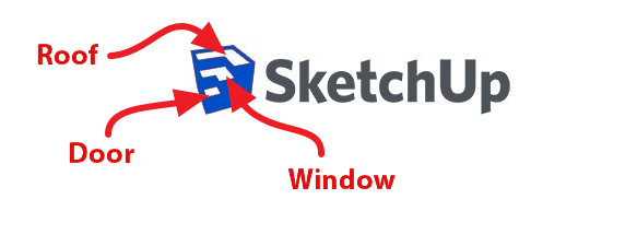
It does display Push Pull very clearly - something which is the core of SketchUp.
-
It's a clever play on 3D and 2D if a little over simplistic but I hate the red, please can we have it in Trimble blue. At least with the new icons I am more likely to click the right one, I was always "blinded" by the pencil in the old icons when clicking in a hurry.
-
@arcad-uk said:
At least with the new icons I am more likely to click the right one, I was always "blinded" by the pencil in the old icons when clicking in a hurry.
That's a very important role of an icon - in which sense it is better.
Like the Adobe Creative Suite - some years ago they had a white tile for background with some graphic on top representing each application in the suite. It was very difficult to quickly find the correct one. I often clicked on the wrong one - usually when I hot the correct one it was because I knew it's position. When they updated to the more recent style, brightly coloured square with a two-letter initial of the application there was a lot of people on the internet crying havoc - saying the icons weren't inspiring them any more etc. But I think they where a very good change - each application was immediately distinguishable. Much more user friendly than before. While not as graphically "arty" - they did their job much better. Icons are like logos - they are not just pretty graphic, they have a though job to do. And SketchUp's icon - it's actually their logo as well.I frowned myself when I saw it the first time - but it's grown on me and when I shake that "everything was better before" feeling and start to think of it as an icon and as a logo I think it's working really well. I never really put much thought to the old one - just accepted it because it was the one SketchUp had when I started using it.
-
More quiet in bleu and more Trimbling

I see some kites flying in the sky
-
@unknownuser said:
More quiet in bleu and more Trimbling
I see some kites flying in the skyVery corporate - the blue. I don't see the need to lean towards Trimble style branding. Their websites etc isn't the best visually nor user friendly.
-
I still see a little house....
...though its fallen over from exhaustion
-
I see 3 Steps of a Library's ladder!
-
Now the logo has a CORPORATE look.
-
Red = 3 steps for the Hell
Blue = 3 steps for the Eden

-
Interesting , mine is Red. Is that a Mac, PC thing?

-
If you didnt already read this, Aidan posted the thought processes behind the new logo. I would not have guessed it from looking at the logo without reading this article:

A brand new brand for SketchUp
Follow the SketchUpdate blog for SketchUp news, modeling tips and tricks, user stories and more.
(sketchupdate.blogspot.com)
-
Just a note, that you can change your vote if the color grows on ya'... or the logo color is revised later.

-
i posted this in the other thread...
-

Whe have in France something like that for a builder company

-
Another use of the new icon:
-
 Looks just like what a bunch of engineers would come up with.
50's graphics and just no fun at all.
Good freeway sign however.
HMMMM -
Man, it's like pullin' teeth to get at least 100 people to cast a vote.
-
Now that I finally upgraded, have to say these icons are the brightest friggin' thing on my dock by a long shot. Can't misplace them anyway...

Hello! It looks like you're interested in this conversation, but you don't have an account yet.
Getting fed up of having to scroll through the same posts each visit? When you register for an account, you'll always come back to exactly where you were before, and choose to be notified of new replies (either via email, or push notification). You'll also be able to save bookmarks and upvote posts to show your appreciation to other community members.
With your input, this post could be even better 💗
Register Login


Advertisement