I need to build this.
-
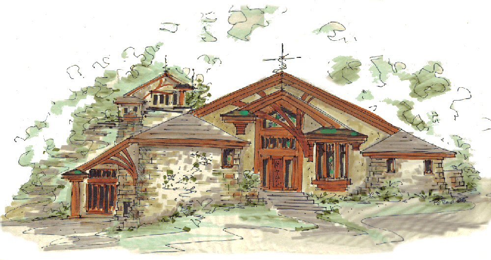
I need to build this... It's a common theme in my designs and It either never gets done or it get's done poorly. this is a wonderful example of the idea.

what would be your suggested method of modeling this feature? Each home will have 2-6 of them in various sizes, scalability and poly efficiency would be a plus. but texture and depth of material is really part of the overall point. looking forward to your point of view on this idea I've played with for some time.
-
Really depends how it will be presented. If you are making close up illustrations you'll need more details and a different approach than if you where to only view it from afar.
Also - are you going to make illustrations from SketchUp directly? Is it for drawing plans? Is it for realistic rendering?
-
all of the above. plans will be made from it. it will be rendered from sketchup and perhaps someone might want photo quality, but not very often from me. and I would say medium/close distance.
-
wow that looks pretty good. I suppose one could take that and then shape bend it or fredo scale it.
Thom has a bmp depth map plugin. I wonder if something like that might work also.
-
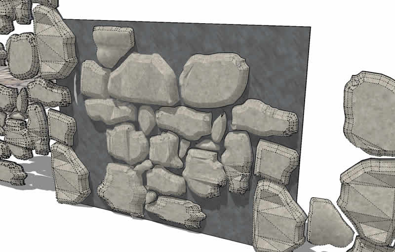
I was having a play with this myself a while ago to get a low poly drystone wall.
This is as far as I got.
Drawn with 'Freehand Line' and 'Round Corner. I think I started playing with scaling the tops too.
Looks OK I think for middle distance.
-
Bending would send the polys thru the roof. Scaling would be ok I guess.
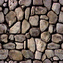
I think my approach would be to draw the 'Skin' of the walls and then draw the individual stone outlines. Then either pushpull or vector pushpull. For the corners? Probly' have to stitch them. But artisan with poly reduce might work.Here's a stone bitmap to try with the ThomThom plugin

-
got some good results from it, but really high poly. need to simplify and perhaps make a custom bmp that is more precise and will create less polys.
-
To create less polys, use a smaller bitmap. Very small.
-
I like that mesh from the bitmap. But yes, too much detail. There are a couple of things that come to mind to make it more manageable... poly reduce and/or selectively make planar the tops in artisan?
But I think designing a specific bitmap,(as you say) would give the most natural result. Then you could isolate individual 'stones', de-poly them, (is that a word? it is now:) and component them.
In my attempt, most of the entities are copied, scaled and rotated from perhaps 3 or 4 base entities.The smaller stones are literally quick fill ins and need no detail.
Go for it Kristoff, model one good patch of stones and you are good to go for many projects.
(You will share, won't you?:)Baz.
PS: you can have my skp. for what it's worth if ya want. -
Here is my attempt at free hand. it turns out well and is fairly low poly. but not in the shape I need.
-
ShapeBender?
-
used that Rocksolver stones to build start a corner by hand. high poly and very time consuming.
next going to try shapebender on the triangular shape drawn in 2D and then bent afterwards...
-
architecturally, what would you call this feature?
-
Chris,
It's called random stacked stone. Looks like some kinda of false buttress.
I don't think you need to go through that much effort with 3d. I would model the basic shape and texture it as you desire. Anything like this can be handle with a good "character refence guide" indicating color,pattern, texture and dimension you require. I good mason should be able to build this with a little art direction in the field. ofcurse the traditional cross section showing construction elements is necessary. -
Lapx,
That's probably the closest thing I've heard to describe it. however what I'm looking for is more natural and random than ordered like buttresses. I know my shape shown in the screenies is rather perfect, but the randomness is what I'm after, I was using that buttress shape as a guide.
I call it a spilling stone corner or a spread stone corner. but searches give me no examples. this is one I happened across on the net and it's close to what I want except it's too narrow through it's length. I would like it to be wider and seem to come up from the ground instead of down into it.
here's one of our sketches.

imagine this wrapping a corner and coming up higher.
[xxl-img:23d2t063]http://1.bp.blogspot.com/-rZ--zwlBk3A/T72Zb1hwU8I/AAAAAAAAB-o/UnPpkFqbmsM/s1600/Retaining+wall+falling+WM.jpg[/xxl-img:23d2t063]
-
Here we call it a 'Dry stone wall'. Dry because no grout or cement is used.
Check this google images page for plenty of examples. Or Google 'dry stone wall'
https://www.google.com.au/search?q=dry+stone+wall&hl=en&client=firefox-a&hs=rHV&rls=org.mozilla:en-US:official&prmd=imvns&tbm=isch&tbo=u&source=univ&sa=X&ei=v1EbULm-HezxmAWL-YHYBA&ved=0CF8QsAQ&biw=1624&bih=845 -
Baz we're more speaking of the wall itself and how it flares out, instead of the form of pattern.
-
Here's a rather quick Artisan attempt.
-
results for use if anyone wants.
-
looking good

Hello! It looks like you're interested in this conversation, but you don't have an account yet.
Getting fed up of having to scroll through the same posts each visit? When you register for an account, you'll always come back to exactly where you were before, and choose to be notified of new replies (either via email, or push notification). You'll also be able to save bookmarks and upvote posts to show your appreciation to other community members.
With your input, this post could be even better 💗
Register LoginAdvertisement


