Maxwell Render For Google SketchUp Competition
-
I just wanted to ask how many hours are left

Thanks for the good news
-
Unfortunetly I didn't see my render in the facebook submission gallery yet
 Will they still be updating it? I'm worried because when submitting the images I got so far as the "thank you for submitting" page, but as I understand, my uploaded images had to be visible at the bottom of the page, but the only thing I saw was the two small image icons as if there had been an error and the page kept on loading... I haven't received an e-mail notice yet also.
Edit: The competition has started and it all went OK
Open for voting until 18th of january
-
The voting is up. There are separate sections for free and licensed versions. It looks like you just "Like" any submissions you're fond of.
Feel free to vote for yours truly

-Brodie
-
I'm glad they cleared up the voting issue, that the public voting decides only one runner up.
-
There is some really fun and fantastic stuff in there -- good luck to all who entered.
Best,
Jason. -
Indeed. And there are some on there that I really liked with either no votes or just a couple which surprised me. I wish we could give them a 1-10 sort of rating. I felt bad giving the same up vote for ones I liked to varying degrees.
-Brodie
-
Some renders seem a bit heavy on the post-procesing side, some really lack it. But the model I love the most is the VW Bus. On the render side what I like the most is Gui Talarico's renders.
-
@speaker said:
Some renders seem a bit heavy on the post-procesing side, some really lack it. But the model I love the most is the VW Bus. On the render side what I like the most is Gui Talarico's renders.
Quite true, all the post-processing doesn't really show off Maxwell much at all IMO. The VW ended up as my favorite too although it was close. I think the little coffee shop ("Forza" or something) was fantastic but had too much noise unfortunately. The VW was an excellent scene but I really wish he'd brightened it up a bit.
-Brodie
-
I have a different criteria when judging Licensed vs Free version renders -- I think the production engine gives a big advantage and the full Maxwell Render Suite tools even more so.
Therefor my expectations are much higher for the Licensed category than the Free.
Best,
Jason. -
I think for me these 3 are my favorites:
Best,
Jason. -
Interesting choices. What do you like about each of those?
-Brodie
-
Is it just me or are there too many grainy renders? and lots of post processing.
Brodie, I actually like your entry, however the exterior looks so blown out which ruins it for me.
I also like Fabiola's lounge but it's sooo grainy.
-
@solo said:
Is it just me or are there too many grainy renders? and lots of post processing.
Brodie, I actually like your entry, however the exterior looks so blown out which ruins it for me.
I also like Fabiola's lounge but it's sooo grainy.
There certainly are a good deal of noisy renders. Not the best commercial for Maxwell in that sense.
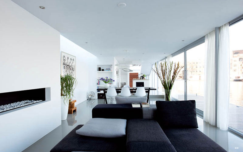
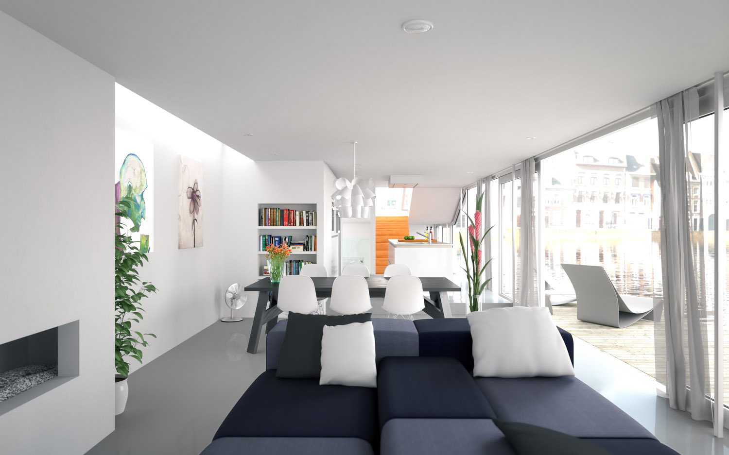
Glad you like it Pete. I wasn't going for an exact photo dup or anything but this is the source image I was basing the camera angle and settings off of for my render (below). I started with properly exposed houses, in fact, but it looked too unrealistic.
-Brodie


-
The first one just excites my imagination in a way the other Licensed entries do not.
The second does something similar for me in the Free category and I have always liked grey color schemes... the graininess here is a result of the draft engines limitations so I will not fault them for that.
The final just screams SketchUp to me in a unique way from the other entries -- and was very well executed.
Best,
Jason. -
Hey Brodie i entered the competition as well ! It's the champagne glasses & bottle (Simon Edwards) Good luck buddy ! I didn't use any post processing so i hope i have a good chance.
-
I think your work would have been the best one if you had used strong DOF, color correction and some other minor tweaks in post, because now the background is too distracting and the contrast seems to be all over the place.
-
Thanks for the feedback Speaker. I am pretty new to maxwell at the moment but i still enjoy using it. In hindsight i think i have done better. This was really an exercise in DOF for me in the beginning.
-
@chedda said:
Hey Brodie i entered the competition as well ! It's the champagne glasses & bottle (Simon Edwards) Good luck buddy ! I didn't use any post processing so i hope i have a good chance.
Your entry looks quite good chedda. The materials are quite good with the possible exception of the champagne foil but I think that would be really difficult to get right, particularly in SU.
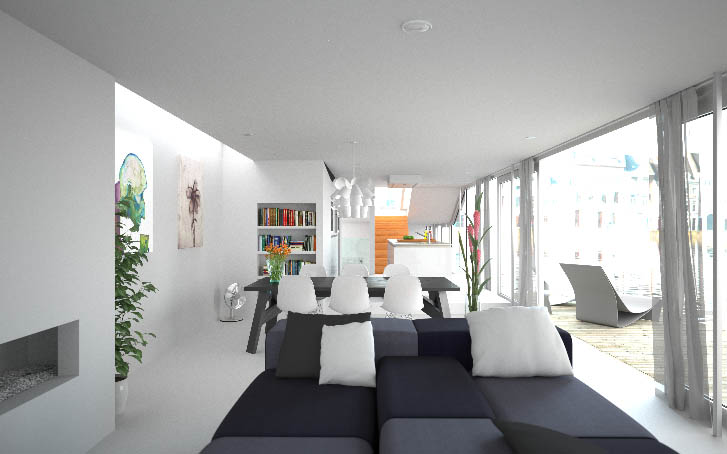
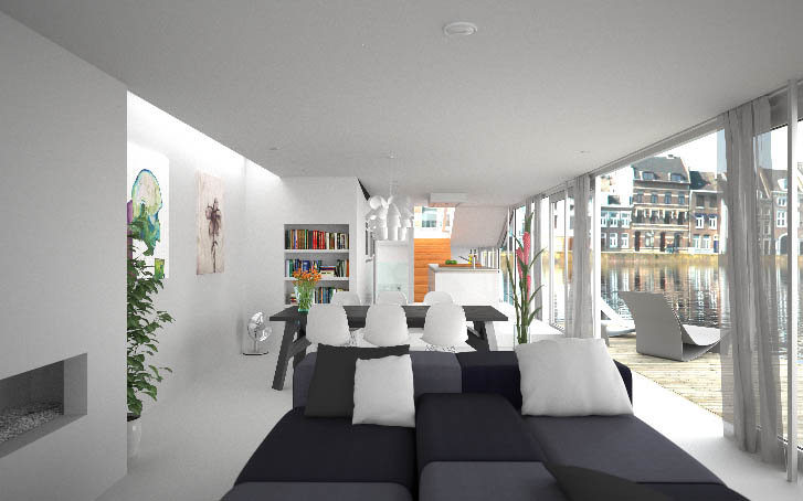
I did very little post processing as well. Here are a couple quick screen grabs (cropped down) from the MXI. The first shows the image w/o any post work. The second shows what it would have looked like had I not over exposed the background as I think Pete had suggested before.
-Brodie


-
I rendered the fish tank after only using Maxwell for a week. That goes to show the learning curve. I wish I had more time to work on the materials but paying deadlines came first.
-
You know Brodie, I also would have opted to use the less blown-out background and just did a DOF blur to it in post to make it fit better into the composition.
However I can't say much more than that since I am architecturally stupid.
Best,
Jason.
Hello! It looks like you're interested in this conversation, but you don't have an account yet.
Getting fed up of having to scroll through the same posts each visit? When you register for an account, you'll always come back to exactly where you were before, and choose to be notified of new replies (either via email, or push notification). You'll also be able to save bookmarks and upvote posts to show your appreciation to other community members.
With your input, this post could be even better 💗
Register LoginAdvertisement


