Maxwell Render For Google SketchUp Competition
-
There is some really fun and fantastic stuff in there -- good luck to all who entered.
Best,
Jason. -
Indeed. And there are some on there that I really liked with either no votes or just a couple which surprised me. I wish we could give them a 1-10 sort of rating. I felt bad giving the same up vote for ones I liked to varying degrees.
-Brodie
-
Some renders seem a bit heavy on the post-procesing side, some really lack it. But the model I love the most is the VW Bus. On the render side what I like the most is Gui Talarico's renders.
-
@speaker said:
Some renders seem a bit heavy on the post-procesing side, some really lack it. But the model I love the most is the VW Bus. On the render side what I like the most is Gui Talarico's renders.
Quite true, all the post-processing doesn't really show off Maxwell much at all IMO. The VW ended up as my favorite too although it was close. I think the little coffee shop ("Forza" or something) was fantastic but had too much noise unfortunately. The VW was an excellent scene but I really wish he'd brightened it up a bit.
-Brodie
-
I have a different criteria when judging Licensed vs Free version renders -- I think the production engine gives a big advantage and the full Maxwell Render Suite tools even more so.
Therefor my expectations are much higher for the Licensed category than the Free.
Best,
Jason. -
I think for me these 3 are my favorites:
Best,
Jason. -
Interesting choices. What do you like about each of those?
-Brodie
-
Is it just me or are there too many grainy renders? and lots of post processing.
Brodie, I actually like your entry, however the exterior looks so blown out which ruins it for me.
I also like Fabiola's lounge but it's sooo grainy.
-
@solo said:
Is it just me or are there too many grainy renders? and lots of post processing.
Brodie, I actually like your entry, however the exterior looks so blown out which ruins it for me.
I also like Fabiola's lounge but it's sooo grainy.
There certainly are a good deal of noisy renders. Not the best commercial for Maxwell in that sense.
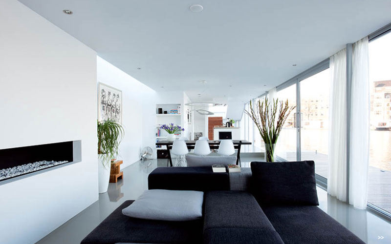
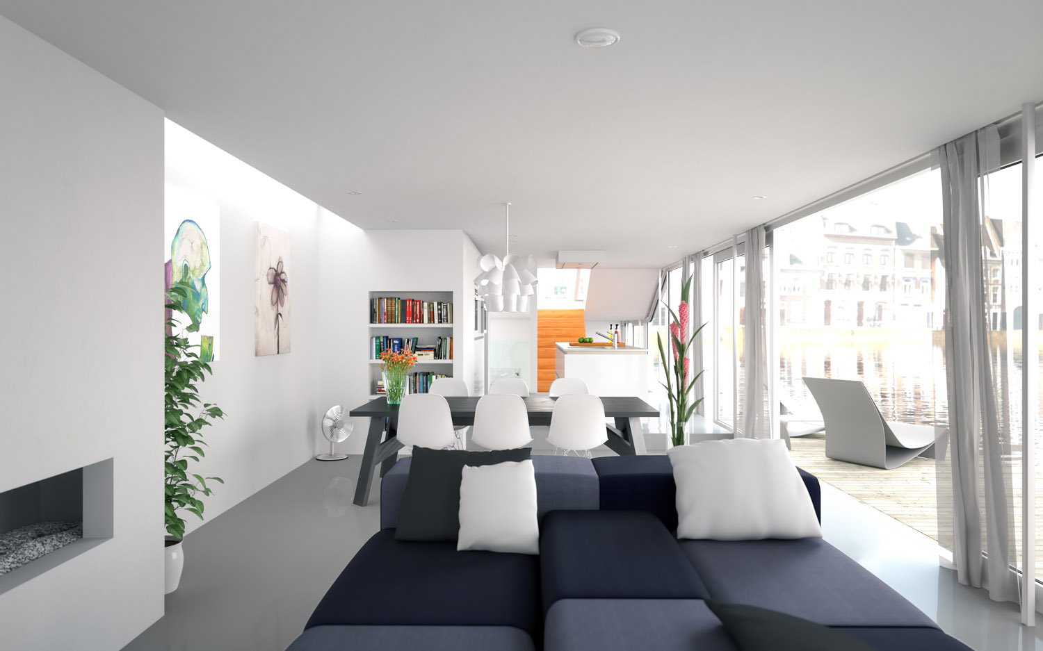
Glad you like it Pete. I wasn't going for an exact photo dup or anything but this is the source image I was basing the camera angle and settings off of for my render (below). I started with properly exposed houses, in fact, but it looked too unrealistic.
-Brodie
-
The first one just excites my imagination in a way the other Licensed entries do not.
The second does something similar for me in the Free category and I have always liked grey color schemes... the graininess here is a result of the draft engines limitations so I will not fault them for that.
The final just screams SketchUp to me in a unique way from the other entries -- and was very well executed.
Best,
Jason. -
Hey Brodie i entered the competition as well ! It's the champagne glasses & bottle (Simon Edwards) Good luck buddy ! I didn't use any post processing so i hope i have a good chance.
-
I think your work would have been the best one if you had used strong DOF, color correction and some other minor tweaks in post, because now the background is too distracting and the contrast seems to be all over the place.
-
Thanks for the feedback Speaker. I am pretty new to maxwell at the moment but i still enjoy using it. In hindsight i think i have done better. This was really an exercise in DOF for me in the beginning.
-
@chedda said:
Hey Brodie i entered the competition as well ! It's the champagne glasses & bottle (Simon Edwards) Good luck buddy ! I didn't use any post processing so i hope i have a good chance.
Your entry looks quite good chedda. The materials are quite good with the possible exception of the champagne foil but I think that would be really difficult to get right, particularly in SU.
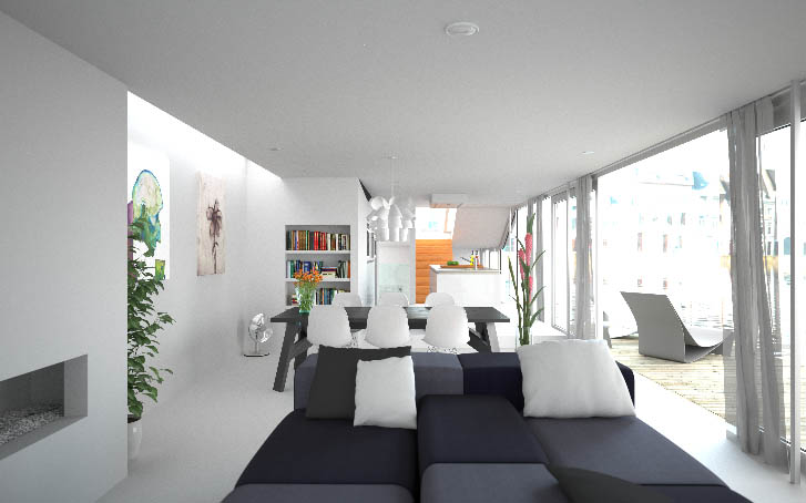
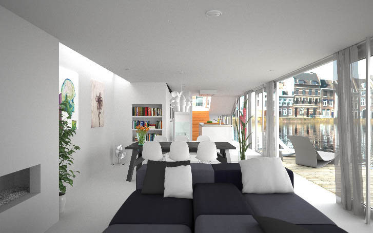
I did very little post processing as well. Here are a couple quick screen grabs (cropped down) from the MXI. The first shows the image w/o any post work. The second shows what it would have looked like had I not over exposed the background as I think Pete had suggested before.
-Brodie
-
I rendered the fish tank after only using Maxwell for a week. That goes to show the learning curve. I wish I had more time to work on the materials but paying deadlines came first.
-
You know Brodie, I also would have opted to use the less blown-out background and just did a DOF blur to it in post to make it fit better into the composition.
However I can't say much more than that since I am architecturally stupid.
Best,
Jason. -
Jason, perhaps. I certainly consternated over it to be sure. I suppose it's kind of a 'damned if you do, damned if you don't' situation. In the end I decided to go for the option that I felt I could at least defend as 'photorealistic.' Given more time, perhaps I could have found a 3rd option. Maybe something more like what you're suggesting but with a different image in the background that, indeed, could have blended better into the image.
-Brodie
-
Brodie, if you compare your render to the reference, then you could see that your interior space is over exposed. In the reference- not even the brightest hot spot is brighter then the exterior space. A good rule of thumb is to keep the interior darker. It looks like you used a sky dome for lighting but for such an open space a physical sky or a HDRI would have been the better choice, because your render looks a bit flat, as if a sepia filter would have been applied, but the reference shows a nice contrast between the blue color that comes from the sky and the warm bounce-light from the sun. The over saturated stairs are also more of a distraction. The background buildings could be left at that exposure but the water is too light so the water line is lost and the reflections in the water are too distinctive.
-
It's funny because I "read" the original source photo as being entirely in shadow (including the dock) meaning that it was lit only by reflected & sky light -- which would explain the generally blue color cast.
My thinking though is that you do not know what Photoshop trickery was used on this photo and therefore we are working on the assumption that it is raw-- which it most assuredly is not.
I always tend to think and work as my eye sees things in the scene and tend to resent the exposure settings imposed upon me by Photos -- so I export HDR/EXR images from Maxwell and do my post processing from those to manipulate the exposure how I see fit as an artist rather than letting the rules of "photography" stop me.
Since HDR is becoming more common in photography as well it seems the days of overexposure/underexposure (without a definite artistic purpose) are numbered.
Best,
Jason. -
@speaker said:
Brodie, if you compare your render to the reference, then you could see that your interior space is over exposed. In the reference- not even the brightest hot spot is brighter then the exterior space. A good rule of thumb is to keep the interior darker. It looks like you used a sky dome for lighting but for such an open space a physical sky or a HDRI would have been the better choice, because your render looks a bit flat, as if a sepia filter would have been applied, but the reference shows a nice contrast between the blue color that comes from the sky and the warm bounce-light from the sun. The over saturated stairs are also more of a distraction. The background buildings could be left at that exposure but the water is too light so the water line is lost and the reflections in the water are too distinctive.
I'm not sure I see the differences you're referring to. To my eye the exposure values are pretty comparable. Doing a few spot checks in photoshop it looks like the lightness values are within about 5 one way or the other. Blurring the images significantly to sort of equalize and average out the image to a unified value produces a similar effect with an overall lightness value difference of 1. The most significant difference, to my eye, is simply the warmer tones in my image which were intentional. The two bright spots in both images seem to be the exterior and the upper left where sun is coming through the skylight. When you say the water is 'too light' I'm not sure what the reference is. It seems to me that the water in my image is pretty comparable, again, to the source image in terms of exposure. Had I darkened it but left the buildings over exposed I'm not sure that would provide a realistic looking effect.
I can understand what you're saying with regards to the stairs. I did have my reasons, but I might agree with you on that one that I should have toned them down a bit. My thinking was to try and balance out an essentially white image with a few stronger colors to provide more visual interest - the intense greens and blues on the left, the orange flowers and books left of center, the stairs leading the eyes through what is essentially a long tunnel of a space, the pink flowers right of center and then the bright exterior on the right.
There are 3 lights in the scene. The primary light is, in fact, an HDRI and the other two are inconsequential. There's a large line plane behind and to the left of the camera to light up that area between the couch and fireplace EVER so slightly (turning it up too much destroyed the shadows on the pillows). And the last light is actually the background for which I used an .hdr emitter so I could control the exposure value in MXI(doing so in PS would have been terribly difficult with the translucent curtains).
-Brodie


Hello! It looks like you're interested in this conversation, but you don't have an account yet.
Getting fed up of having to scroll through the same posts each visit? When you register for an account, you'll always come back to exactly where you were before, and choose to be notified of new replies (either via email, or push notification). You'll also be able to save bookmarks and upvote posts to show your appreciation to other community members.
With your input, this post could be even better 💗
Register Login


Advertisement