Maxwell Render For Google SketchUp Competition
-
I rendered the fish tank after only using Maxwell for a week. That goes to show the learning curve. I wish I had more time to work on the materials but paying deadlines came first.
-
You know Brodie, I also would have opted to use the less blown-out background and just did a DOF blur to it in post to make it fit better into the composition.
However I can't say much more than that since I am architecturally stupid.
Best,
Jason. -
Jason, perhaps. I certainly consternated over it to be sure. I suppose it's kind of a 'damned if you do, damned if you don't' situation. In the end I decided to go for the option that I felt I could at least defend as 'photorealistic.' Given more time, perhaps I could have found a 3rd option. Maybe something more like what you're suggesting but with a different image in the background that, indeed, could have blended better into the image.
-Brodie
-
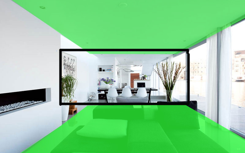
Brodie, if you compare your render to the reference, then you could see that your interior space is over exposed. In the reference- not even the brightest hot spot is brighter then the exterior space. A good rule of thumb is to keep the interior darker. It looks like you used a sky dome for lighting but for such an open space a physical sky or a HDRI would have been the better choice, because your render looks a bit flat, as if a sepia filter would have been applied, but the reference shows a nice contrast between the blue color that comes from the sky and the warm bounce-light from the sun. The over saturated stairs are also more of a distraction. The background buildings could be left at that exposure but the water is too light so the water line is lost and the reflections in the water are too distinctive.
-
It's funny because I "read" the original source photo as being entirely in shadow (including the dock) meaning that it was lit only by reflected & sky light -- which would explain the generally blue color cast.
My thinking though is that you do not know what Photoshop trickery was used on this photo and therefore we are working on the assumption that it is raw-- which it most assuredly is not.
I always tend to think and work as my eye sees things in the scene and tend to resent the exposure settings imposed upon me by Photos -- so I export HDR/EXR images from Maxwell and do my post processing from those to manipulate the exposure how I see fit as an artist rather than letting the rules of "photography" stop me.
Since HDR is becoming more common in photography as well it seems the days of overexposure/underexposure (without a definite artistic purpose) are numbered.
Best,
Jason. -
@speaker said:
Brodie, if you compare your render to the reference, then you could see that your interior space is over exposed. In the reference- not even the brightest hot spot is brighter then the exterior space. A good rule of thumb is to keep the interior darker. It looks like you used a sky dome for lighting but for such an open space a physical sky or a HDRI would have been the better choice, because your render looks a bit flat, as if a sepia filter would have been applied, but the reference shows a nice contrast between the blue color that comes from the sky and the warm bounce-light from the sun. The over saturated stairs are also more of a distraction. The background buildings could be left at that exposure but the water is too light so the water line is lost and the reflections in the water are too distinctive.
I'm not sure I see the differences you're referring to. To my eye the exposure values are pretty comparable. Doing a few spot checks in photoshop it looks like the lightness values are within about 5 one way or the other. Blurring the images significantly to sort of equalize and average out the image to a unified value produces a similar effect with an overall lightness value difference of 1. The most significant difference, to my eye, is simply the warmer tones in my image which were intentional. The two bright spots in both images seem to be the exterior and the upper left where sun is coming through the skylight. When you say the water is 'too light' I'm not sure what the reference is. It seems to me that the water in my image is pretty comparable, again, to the source image in terms of exposure. Had I darkened it but left the buildings over exposed I'm not sure that would provide a realistic looking effect.
I can understand what you're saying with regards to the stairs. I did have my reasons, but I might agree with you on that one that I should have toned them down a bit. My thinking was to try and balance out an essentially white image with a few stronger colors to provide more visual interest - the intense greens and blues on the left, the orange flowers and books left of center, the stairs leading the eyes through what is essentially a long tunnel of a space, the pink flowers right of center and then the bright exterior on the right.
There are 3 lights in the scene. The primary light is, in fact, an HDRI and the other two are inconsequential. There's a large line plane behind and to the left of the camera to light up that area between the couch and fireplace EVER so slightly (turning it up too much destroyed the shadows on the pillows). And the last light is actually the background for which I used an .hdr emitter so I could control the exposure value in MXI(doing so in PS would have been terribly difficult with the translucent curtains).
-Brodie
-
Bah, just went back and I was mistaken. Apparently your eye is better than my memory
 It is indeed lit by skydome. As I recall I tried HDRI first but didn't like the color cast I was getting and didn't find any noticeable difference when switching to skydome other than the fact that I could choose a white light so my final render was already 'white balanced' - a feature I wish I had control over within Maxwell. Both provided the same even light and very soft shadows.
-Brodie
-
I guess I was not clear enough. My main point is that you could make the render realistic but a proper composition is still what defines a good image. You can never fool the eye. For instance what appeals for me more in the reference image is that warm and cold contrast in combination with the tonal contrast leads the eye towards the most detailed- center part of the image. In your image- I feel this is lost and I can not find clear boundarys that would lead my eye around the image.
-
Aw, I see. Interestingly, the concentration of detail in the center of the image is actually one of the things I least liked about the original image. This was the driving force behind most of my changes, not least of which was to zoom in the camera a bit, effectively eliminating much of the negative space around the border in order to fill up the frame more with the more interesting bits.
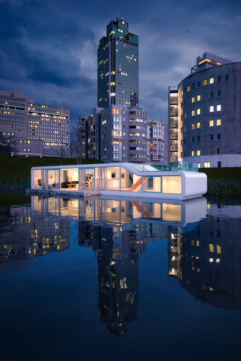
I may have been a bit biased when it comes to the tones. This images sister (the exterior image below) was very difficult in terms of tones and had an aggressive tendency to go from cool to cold as I tweaked it. The warmer overall hues of this image may have been a reaction to this.
-
If this had the option to render edges/lines, i'd buy it. This is very important when using them as textural elements (panel breakup lines, etc).
-
Why not just use SketchUp to export the edges / lines?
-
That's how I would go about it as well. JD has done a great job of matching the SU viewport with the Maxwell output so exporting an image with SU linework and overlaying it in photoshop is a pretty straightforward process. It's a nice trick to have under the belt, I've used it once before. But I can't see Maxwell incorporating something like this as their aim is for photorealism and that's more of a NPR trick.
-Brodie
-
@unknownuser said:
That's how I would go about it as well. JD has done a great job of matching the SU viewport with the Maxwell output so exporting an image with SU linework and overlaying it in photoshop is a pretty straightforward process. It's a nice trick to have under the belt, I've used it once before. But I can't see Maxwell incorporating something like this as their aim is for photorealism and that's more of a NPR trick.
-Brodie
JD?
-
Sorry, JD is the NextLimit employee who has written the script which operates Maxwell through SketchUp (as well as a couple other programs). Things were good before him but since he's come along things have been stupendous in terms of SU/Maxwell integration.
-Brodie
-
JD is the man!

I loved seeing all those great entries... -
Congrats Brodie!

Iwan will be pissed off though
They put my name instead of his. -
Thanks
There were a lot of good entries submitted. I'm very honored to have won.Which entry was your Speaker?
-Brodie
-
Here's the link BTW: http://www.maxwellrender.com/index.php/maxwell_for_google_sketchup/competition
Congrats to those who won.
Best,
Jason. -
I ended up 2nd in both categories
-
@speaker said:
I ended up 2nd in both categories
Oh, haha
Your entry is great. The 'dusty light' effect is really well done.-Brodie
Hello! It looks like you're interested in this conversation, but you don't have an account yet.
Getting fed up of having to scroll through the same posts each visit? When you register for an account, you'll always come back to exactly where you were before, and choose to be notified of new replies (either via email, or push notification). You'll also be able to save bookmarks and upvote posts to show your appreciation to other community members.
With your input, this post could be even better 💗
Register Login


Advertisement