Gothic Cathedral completed
-
truly impressive model - would love to see some higher quality renders though. keep it up man this is madness...
-
Klog, a great thanks for sharing this amazing model... it really deserved to go in the "most impressive sketchup model" topic !
Facing such an interesting space I couldn't resist doing a test render :
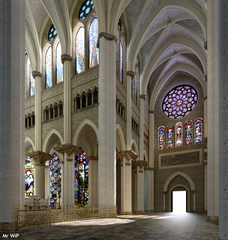
It was done in Thea, with a really short setting time (only adjustment for the stained glass windows and the metal fence), render (3000 pix high) for about 20hours (I actually forgot to stop it during the night, so it should have been good enough after a few hours only...). Really small post pro in PS (mainly some color corrections). Reduce for posting.Some details out of the big image :
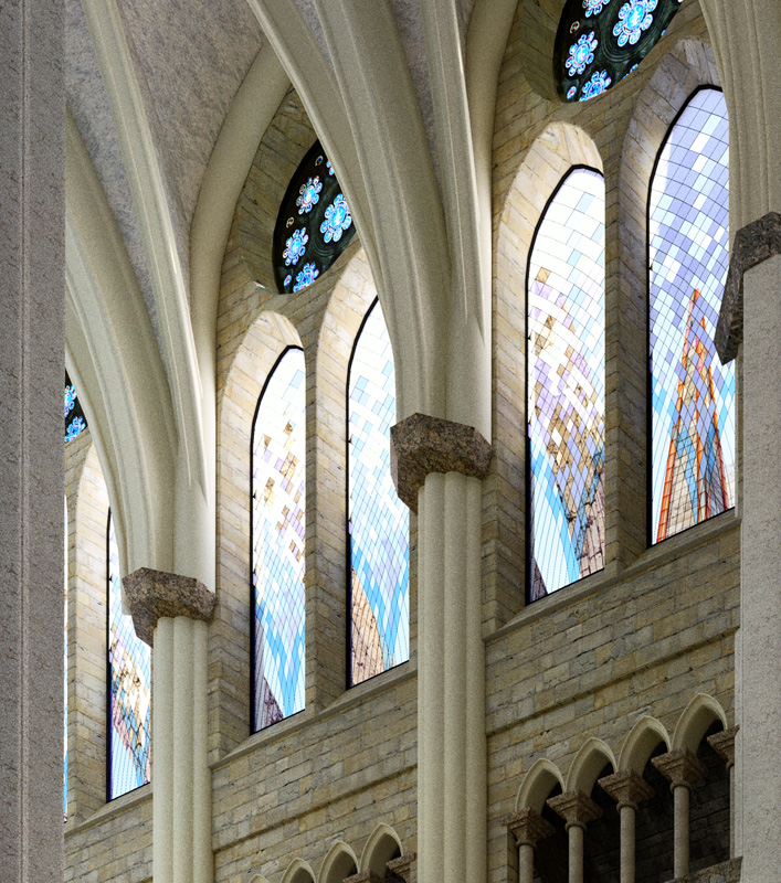
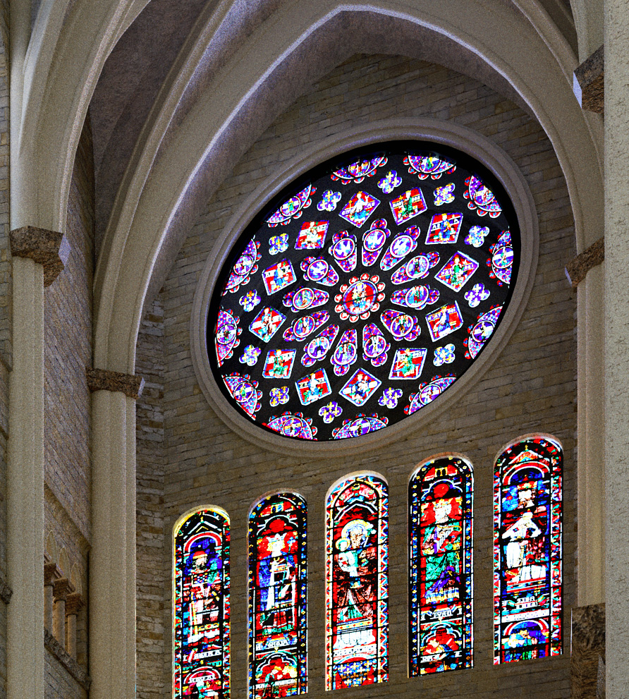
... I'll try to find time to make more images, this model is really inspiring..
By the way, some remarks: the covering of the pillars looks a big large to me, and not so realistic in term of proportions, and their texture is lacking of precision... but this are small problems regarding to the amount of work you put in this cathedral !
Keep up the good work !
-
@mrwip said:
Klog, a great thanks for sharing this amazing model... it really deserved to go in the "most impressive sketchup model" topic !
Facing such an interesting space I couldn't resist doing a test render
Yeah, it is an impressive model. It should go to the "most impressive sketchup model" topic...

Great re-render MrWip!


-
@MrWip --
@unknownuser said:By the way, some remarks: the covering of the pillars looks a big large to me, and not so realistic in term of proportions, and their texture is lacking of precision... but this are small problems regarding to the amount of work you put in this cathedral !
First, these are great "prelimenary" renders. Can't wait to see the results of your tweaking/changing the shaders in the future. Show me your stuff! Yes I too thought the pillars were too large and so they are now 75% of the original and could be smaller yet. And I ran up against the limits of 2GB pagefile for Kerkythea, even with some of the tricks I learned; so I reduced the resolution of all the shaders and chopped avout 15MB out of the source file. Even then I could only render the inside by stripping off the north and south porches, gutting the Royal entry towers, and stripping nearly all the flying buttresses as well as the terraine and exterior shaders. That got it to ~50MB and then Kerkythea could handle the interior with my machine. So I think higher resolution is for someone else to do for this project. Have at it. Thanks for your excitement about this.@Artysmedia -- Thanks for your enthusiasm on this too; show us some re-renders from you, too.
Klog -
Thanks for sharing the model, Klog,
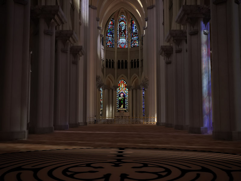
A couple quick renders with Twilight Render.
The old cathedrals always felt to me to have high contrast dark and light areas something like this.
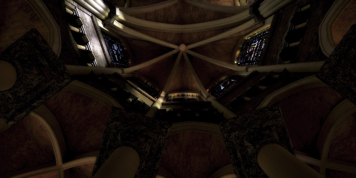
-
Very nice Fletch. I would have fone more of this myself, but I have trouble knowing i9f my (digitasl) computer screen is "telling me the truth" because if I move out of NORMAL to the screen it changes the contrasts. Some earlier ones came out too dark ...
Is it the thin glass that gets so much more light into the building or is it the Gamma?
Thanks and do a lot more -
@unknownuser said:
Is it the thin glass that gets so much more light into the building or is it the Gamma?
I almost always adjust Exposure/Gamma on interior images. (or exteriors for that matter) It's as natural as a normal camera adjusting exposure when inside a building.
In this case, I did some post-pro only to get the lights and darks looking how I wanted them. I have no idea how successful it is (with the image of the choir looking up) on your screen, or anyone's screen for that matter. I'm sure it looks completely different on every screen.
 I only know it looks "good" to me on mine.
If you are interested, here's something about how to calibrate your monitor or screen. See also the basics of screen calibration here.
-
A couple more.
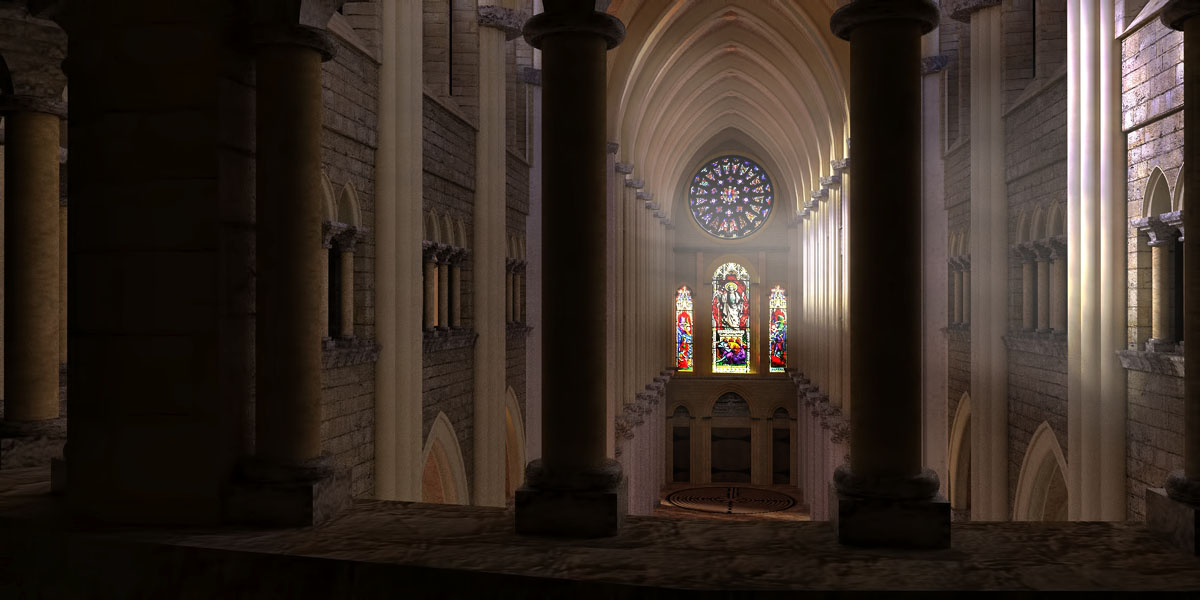
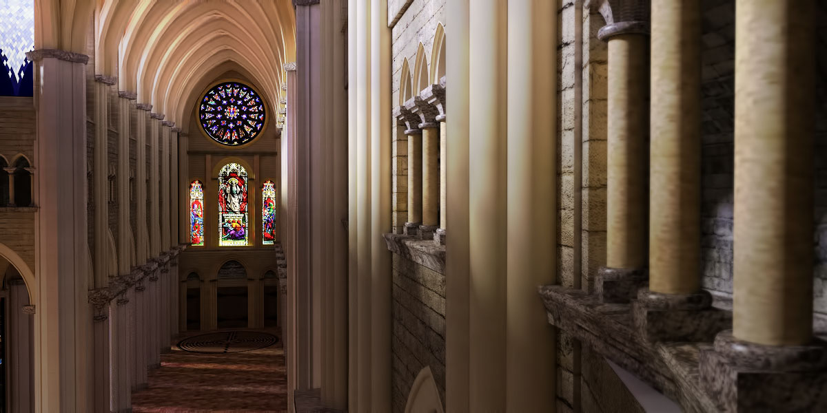
-

Tá sé go hálainn mo chara

-
-
-
I have just created my first video of the Interior of this cathedral and it very clearly shows that is is the first. Created from Kerkythea in 600x800 format (thanks ) and is posted at Yutube site: http://www.youtube.com/watch?v=O8COiJmGZCk . I have a lot to learn about movie making so any comments for improvement to that end are very welcome. View the Youtube video in FULL screen format or you miss half of it ...
-
The camera can't show the full range of color that our eyes see in a stained glass window. When I shoot stained glass windows I shoot a 3 to five stop bracket and layer the images in PhotoShop. Then going pane by pane, I use only the exposure that gives the most representative detail. I the case of this cathedral it would probably take as much time as building the original. So don't feel bad about having to go to extra lengths to handle the dynamics of th exposure range.
-
Thanks klog. However the new file says "7" in the name but is still saved in "8" version.

-
we are using this model in our Facebook challenge. Thanks again Klog for this excellent model.
-
My God,how long did You need to render this movie?
Is there any suggestion for that render? -
Recently I realized that not everyone uses version 8 Sketchup and could not use the available downloading option. I have corrected the omission and here is the link to download a version 7 .skp file of the complete cathedral. http://dl.dropbox.com/u/40864073/v7%20Gothic%20Cathedral%20clean.skp Also Nomeradona informs me he is using this model for the October Challenge of his Sketchup-Vray Facebook group and we shall post the "winners and runners-up" here as well.
EDIT:10/20/11
the above link IS NOW version 7.skp -
Massimo
Thanks for the heads-up. The URL has been corrected as has the version (I checked this time in the "Model info" dialog). Good rendering to you ... -
Nice model. Thanks for sharing.

-
@tomislavm said:
My God,how long did You need to render this movie?
Is there any suggestion for that render?First answer: set it up and go on vacation while it renders. Actually took about 2-1/2 days because it hung about 2/3 of the way through and I had to start and splice from there to finish.
Second answer: I deffinitely suggest not using approximation of "tween" frames, which is one of the options of Kerky animation - while it probably saves time, you get that blinking of transmitted light on and off seen in the video. I used PM medium AA for the renderings which seems good enough for the video mode. Used Virtual Dub (free) for the assembly and recommend you study the "frame ripping" info to avoid the horizontal tearing of image frames I sometimes got. It is a conflict between the different scan rates (I think) of the movie and crt/computer/other devices).There are also plug-ins you can activate as filters on the raw images and advise figuring out how to activate them as one of them allows contrast/brightness adjustment and many others I know nothing about.
I know this sure as hell beats Sketchup's native animation feature for smoothness and AA function. And lastly the use of key-frames is useful for editing out stuff. I didn't use it and got the frame jumps twice when I removed unwanted frames and spliced.
Like I said before, this is my first real attempt at movie making and may we all learn from it.
Thanks for the input.
Hello! It looks like you're interested in this conversation, but you don't have an account yet.
Getting fed up of having to scroll through the same posts each visit? When you register for an account, you'll always come back to exactly where you were before, and choose to be notified of new replies (either via email, or push notification). You'll also be able to save bookmarks and upvote posts to show your appreciation to other community members.
With your input, this post could be even better 💗
Register LoginAdvertisement


