A Tread for anti Design
-
Good idea. Here is one - an entrance gate made of concrete. It weighs a couple of tons and not everyone can open it. They need to keep it open (even in Winter) otherwise visitors would think it is closed.
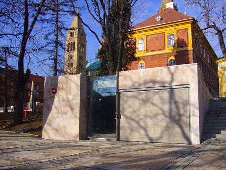
Certainly it can be nice as it is somewhat transparent - I guess the architect here sacrificed usability for being extravagant.
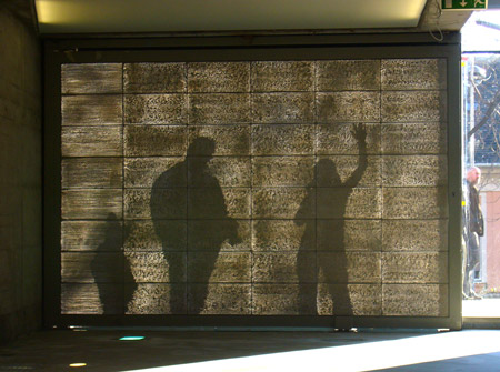
Here is the "success story"
http://www.dezeen.com/2008/01/20/litracon-light-transmitting-concrete/ -
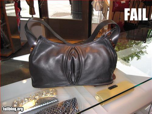
Here's a design fail....
-
Ooh...I'm in!

-
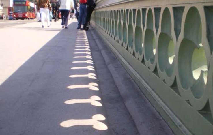
That's.....funny
-
-
Westminster Bridge in London.
-
-
@gaieus said:
Good idea. Here is one - an entrance gate made of concrete. It weighs a couple of tons and not everyone can open it. They need to keep it open (even in Winter) otherwise visitors would think it is closed.
Certainly it can be nice as it is somewhat transparent - I guess the architect here sacrificed usability for being extravagant.
Don't worry, someday they'll bust that concrete out because someone will invent a lighter, cheaper, and more attractive translucent or even transparent material.. oh wait, they have--hundreds of years ago.
-
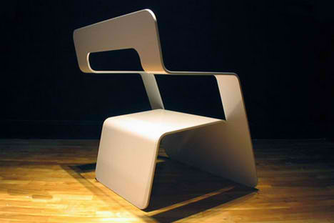
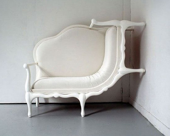
Not sure, but it must fit into this category as well...

-
I've seen that one before - that's what happens when you get Chris Fullmer's ShapeBender tool settings wrong

-

-
I have exactly those. They are at least (somewhat) comfortable and I can leave them out on the terrace day and night, summer and winter.
My mother bought some really expensive ones (of teak wood and all bells and whistles and from some prestigious designer). The only problem is that they are so uncomfortable that when she is not there, we sneak the old ones (like above) out and keep using those.
-
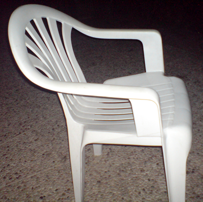
This thread wouldn't be complete without the horror that is the 'Monoblock' chair.
-
There are more Monoblock chairs on the planet than people and it's pretty much the reason that the Panton S chair is so expensive (Vitra are still paying off the cost of the R&D that was ripped off to produce the Monoblock).
Rant over

-

We had something like these in work for ages....

-
I have never been able to type on those...
-
No one can. Horrible idea
-
Bad design for a keyboard, maybe, but why are keyboards so often overlooked? It's the piece of computer hardware we have the most direct connection to and everyone seems to go for the cheapest one ever. Every (arch) firm I've worked for have always just used the free Dell (or equivalent) keyboards while spending thousands every other year on new systems.
I got a nice keyboard at home but don't feel wealthy enough to buy one for work also -- although maybe I should considering the amount of time I'm here using it.
Maybe this should be a separate thread but I'd be curious what keyboards people here (high percentage of designers?) use.
Hello! It looks like you're interested in this conversation, but you don't have an account yet.
Getting fed up of having to scroll through the same posts each visit? When you register for an account, you'll always come back to exactly where you were before, and choose to be notified of new replies (either via email, or push notification). You'll also be able to save bookmarks and upvote posts to show your appreciation to other community members.
With your input, this post could be even better 💗
Register LoginAdvertisement


