A Thread for Fine Design
-
Today's inspiration. Eric Owen Moss http://ericowenmoss.com/
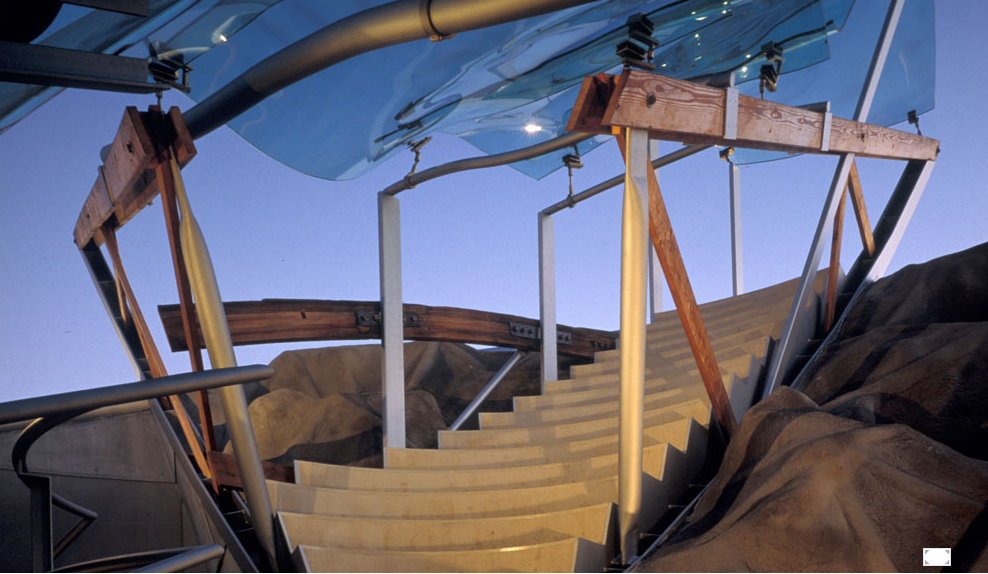
Umbrella is an outdoor performance venue designed for 30 performing musicians, and is part of a re-design of 2 1940's warehouses originally planned to house the Los Angeles Symphony Orchestra.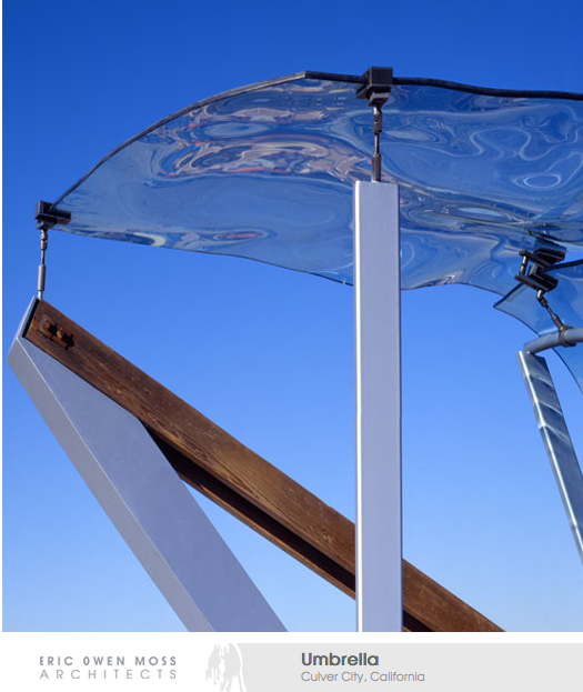


-
-
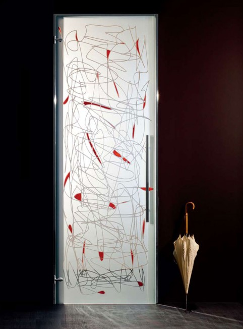
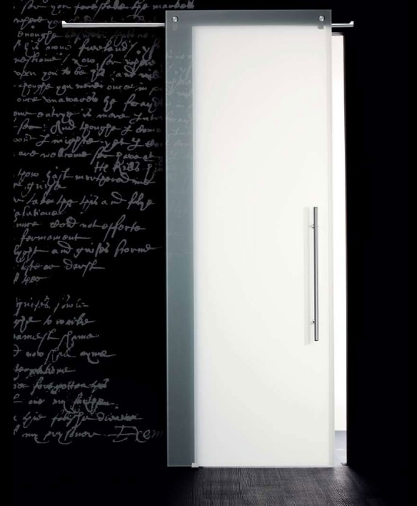
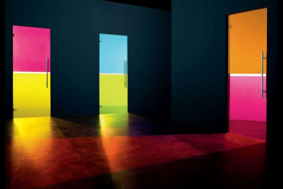
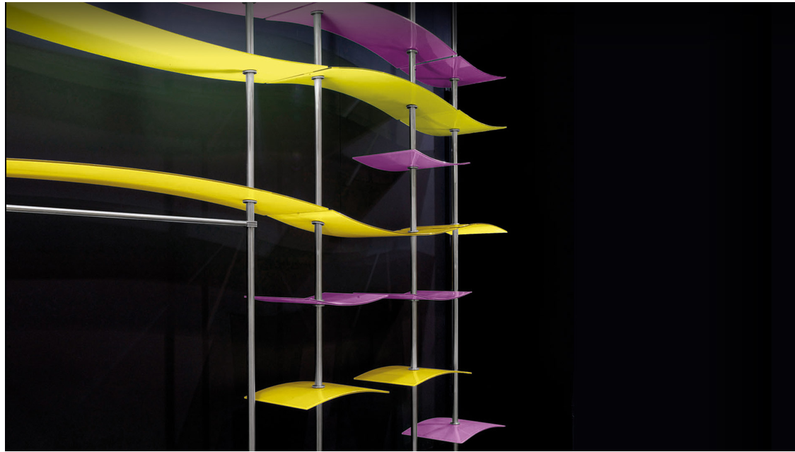
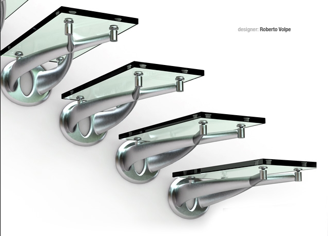
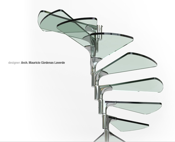
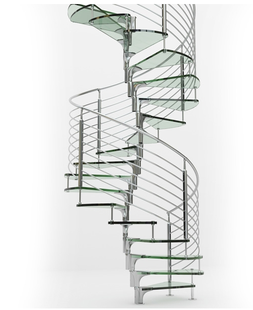
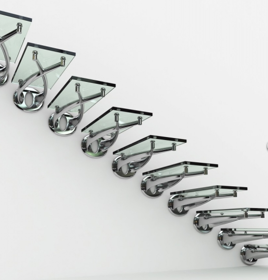
This is in the "Would never get past our building inspector" department
http://www.faraone.it/3a.php[attachment=3:1q9s7dz7]<!-- ia3 -->Screen shot 2012-02-21 at 6.55.39 AM.png[attachment=0]Screen shot 2012-02-21 at 6.55.52 AM.png<!-- ia3 -->[/attachment:1q9s7dz7][/attachment][attachment=2:1q9s7dz7]<!-- ia2 -->Screen shot 2012-02-21 at 6.56.49 AM.png<!-- ia2 -->[/attachment:1q9s7dz7][attachment=1:1q9s7dz7]<!-- ia1 -->Screen shot 2012-02-21 at 6.57.03 AM.png<!-- ia1 -->[/attachment:1q9s7dz7]
-
the upside of owning a staircase like that. . .it would make you want to stick to your diet. . .

-

[url=http://www.nowness.com/day/2012/2/16:3uj0ryuu]Jacob Sutton’s L.E.D. Surfer[/url:3uj0ryuu]

Libraries over the world

[url:3uj0ryuu]http://knstrct.com/2012/01/10/weekly-roundup-libraries/[/url:3uj0ryuu]

[url=http://knstrct.com/2010/11/27/philippe-stark-le-royal-monceau-hotel/:3uj0ryuu]PHILIPPE STARK: le royal monceau hotel[/url:3uj0ryuu]


[url=http://knstrct.com/2011/04/04/the-confederate-120-fighter/:3uj0ryuu]The Confederate 120 Fighter[/url:3uj0ryuu]

 simon
simon -
Thanks Simon
For those not familiar with Philippe Stark. his work is well worth seeing. A renaissance Man.http://www.starck.com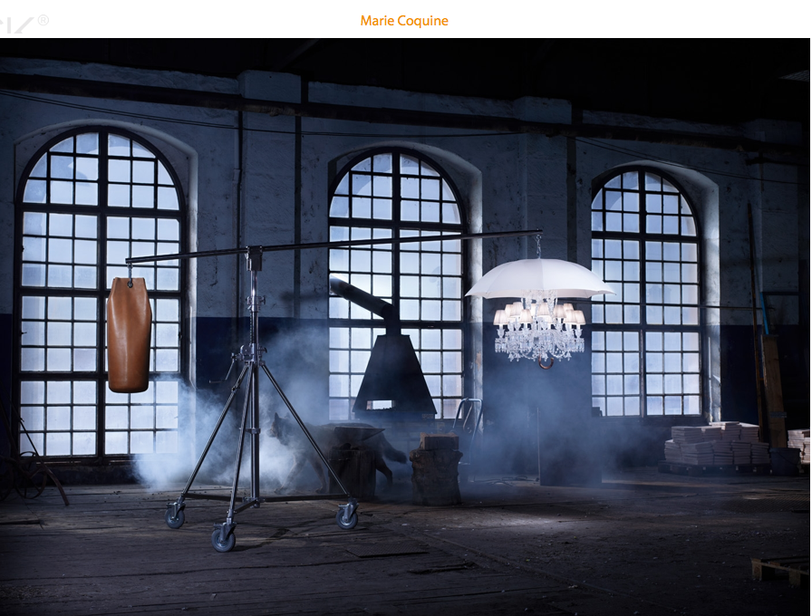
-
Yeah, Philippe is great!

-
Hi Dale and Stefan

I remember many years ago to have visited his house with a tv team . a beautiful house bordered by the river Seine. The entrance walls was absolutely covered with pretty no free space with african masks. Questions about that.. the effect was great: gloomy, a bit stressful, beautiful. And at the same time the personality of each mask was something like denied...
In the main room, a collection of sea scenes earthenware was entirely ringing the room.


This collection of very "kitsch" objects once again was strange.
I'm far to like everything because Starck likes to play around the frontier of "mauvais goût"!!
And at the same time he reach sometime to touch genius.by the way I have discovered the reflective aspect of his work which can lead to a better understanding of his way:
Example: those (seemingly) awful Gun lights:
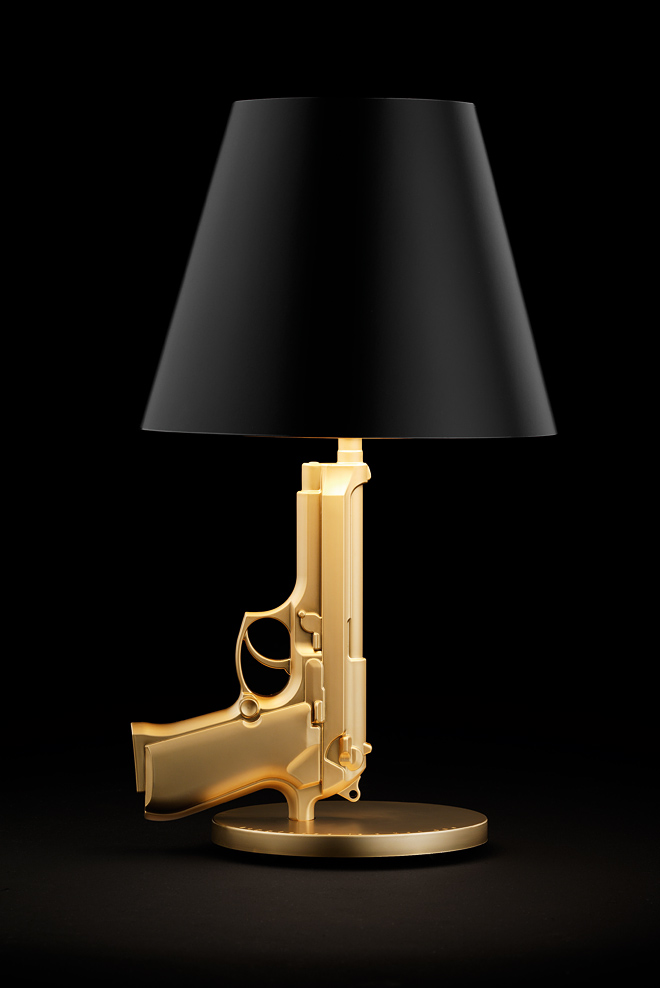

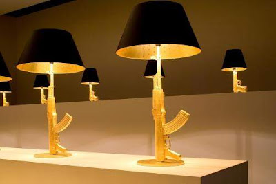
Here is his reflection about Kalashnikov (automated Google translation)
@unknownuser said:
To the Life, To the Death.
Then there have been trials of life, then a
sketch of life, then life.
It was of little value, life and death
confused, somewhat randomly, without
Importance.
But it worked. Much.
We created a civilization for Life
Vive.
Necessarily sublime, becomes sacred, untouchable,
The big, beautiful life, guaranteed for
everyone lived and survived to us, the twenty-first
Century, millennium, coming
of civilization civilized.
Bravo, sleep in peace.
PARATRAS.
It's never as is believed.
Hardly lived a small light cycle,
the shadow returns, fast dense, menacing.
Backspace, death awaits.
Today we kill. Religiously,
Militarily. Civilly. Sometimes
civilly. By ambition.
By greed. For fun. For
Show.
Are banana republics,
Our masters of tyrants.
Created, manufactured, sold, dreamed,
purchased, used, our new
icons are weapons.
Our lives are a carton.
The collection "Gun" is a sign of the times.
It has the symbols we deserve.
Glory to our dictators.
A life and death.
PH. S.
P. S.
Light, functional, low, affordable, stylish, with over 100 million
copies of products difficult, the
Kalashnikov is one of the largest
success of our Industrial Design
generation.
Mr. Kalashnikov receives no
royalties. He does not complain often.
So I will pay a commission to Mr.
Kalashnikov on sales of
representation of his model. The poor.
The rest will be donated to "Doctors Without Borders
International. " I wonder
well why.
Citizens to tears.
Citizens on Patrol.
Explanation:- GOLD weapons represents the ratio between money and war.
- The table represents East Gun.
- Bed Side Gun Europe.
- Gun Lounge West.
- The abajour black represents death.
- The cross inside remind us of our dead.
++simon
-
Another Stark quote:
Because there is different types of design. The one, we can call it the cynical design, that means the design invented by Raymond Loewy in the '50s, who said, what is ugly is a bad sale, la laideur se vend mal, which is terrible. It means the design must be just the weapon for marketing, for producer to make product more sexy, like that, they sell more: it's shit, it's obsolete, it's ridiculous. I call that the cynical design.After, there is the narcissistic design: it's a fantastic designer who designs only for other fantastic designers. After, there is people like me, who try to deserve to exist, and who are so ashamed to make this useless job, who try to do it in another way, and they try, I try, to not make the object for the object but for the result, for the profit for the human being, the person who will use it. If we take the toothbrush -- I don't think about the toothbrush. I think, "What will be the effect of the brush in the mouth?" And to understand what will be the effect of the toothbrush in the mouth, I must imagine: Who owns this mouth? What is the life of the owner of this mouth? In what society [does] this guy live? What civilization creates this society? What animal species creates this civilization? When I arrive -- and I take one minute, I am not so intelligent -- when I arrive at the level of animal species, that becomes real interesting.
-
There's no doubt that Starck is a great designer and his views on design are always memorable and food for thought. Only yesterday I was trying to explain my take on the above quote to a client who was stuck in a 'cynical' mindset - let's just say it didn't go down too well.
Having said that, when it comes to certain Starck designs I sometimes struggle to see how he lives up to his own ideals and it becomes a case of 'do as I say, not as I do'.
-
Thank you Dale,
You make me learn something new with the concept of "Cynical Design". The words bring to consciousness something that basically we suspected isn't it ?.Then we have to re-consider and to think about the concept of "mauvais goût" (a typical french word !)
Making "beautiful" stuff as a "marketing weapon" is what France is specialize in must we admit

++simon
-
Heiru and Simon
I find it refreshing, Starks musings. And totally opposite of some of the "Architect Speak", where questionable concepts are clouded in large words and coined phrases to basically make me feel dumb, and therefore give consent. (This is not intended to single out Architects, as this exists in the design field and many others including product design, interior design, landscape design.....)
I read a little article recently meant to spoof this way of speaking.A Discourse on Emerging Tectonic Visualization and the Effects of Materiality on Praxis
Or an essay on the ridiculous way architects talk.
By Witold RybczynskiBut so much of design is subjective.
My Mother loved Pink.
The bathroom was awash with Pink fluff. To her this was comfortable elegance, and probably was a real luxury for a lower middle class woman.
And think of the era (maybe it did not infect Europe) of Avacado appliances and Orange shag rugs that you could lose a pizza in.
Like so many things in Society we endorsed, and bought right in.
And now it is rising up again as Retro (ORIGIN from Latin retro ‘backward.’)So it is nice to have a Stark who is contemplating the fine details.
And it is nice to have the ability to say we don't agree with his interpretation.As for "mauvais goût" (which I believe can be roughly translated as "Bad taste"
Perhaps it is there for contrast.
-
I know plenty of people who find Starck's use of language to be impenetrable, but I understand what you mean Dale.
The key difference for me is that despite Starck's eccentric use of language, he expresses himself in a manner that is very humanistic and sympathetic to how we interact with one another and our environment - which does of course include a desire to surround ourselves with beautiful stuff.
Some designers and companies are so self absorbed they forget that people have actually got to use these products and live with them on a daily basis.
-
Hi Dave and Hieru,
interesting sequence of this thread isn't it?
Thank you again Dale for the reflections and the (pink) souvenirs!-
- we also (in France) had been "infected" by "Orange shag rugs that you could lose a pizza in."

- we also (in France) had been "infected" by "Orange shag rugs that you could lose a pizza in."
It comes to me that the system is incredibly adaptive. The new "Bad Taste" (well wrapped) seems to me becoming the new "weapon for marketing"
I don't know as much as you both about PH. Starck
agree with your Hieru that "he expresses himself in a manner that is very humanistic and sympathetic"
for me those two pictures express that feeling:
The article Dale you were talking about:
http://www.slate.com/articles/arts/architecture/2011/02/a_discourse_on_emerging_tectonic_visualization_and_the_effects_of_materiality_on_praxis.htmlI'm actually reading with great interest a book from another free thinking architect :Entretiens sur l'architecture par Eugène Viollet Le Duc.
Here is the link to read it and download it translated into English:
[url=http://www.archive.org/details/discoursesonarc00violgoog:2wqzmau8]Discourses on architecture (1959)[/url:2wqzmau8]++simon
-
-
Thanks for the link to the Eugène Viollet Le Duc book Simon.
I am aware that he was criticized for "altering" the restorations he worked on, so it would be interesting to see his point of view.
Watch out, if you keep up this reading pattern you will be reading Leon Battista Alberti before you know it>
Cheers -
It is not hard to see the major progress that, in particular, the introduction of new materials and technology, has allowed the field of design, in all it's aspects, to make.
Then: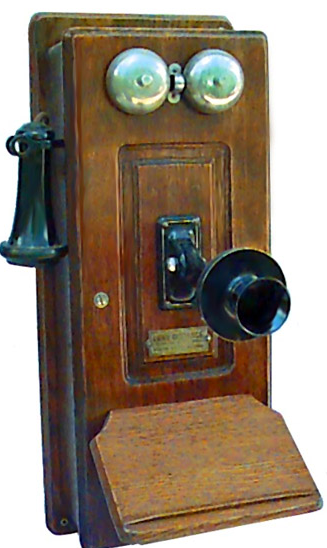
Now:

But some of the most innovative have adopted a new future.
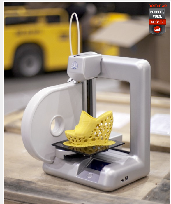
My interest was piqued after seeing the lamp Marcus designed and then followed through by having 3D printed. http://forums.sketchucation.com/viewtopic.php?p=384833#p384833I stumbled upon the company "Freedom of Creation". I can't help but think that the developing technologies around 3D printing are going to have as big an impact on the design of products and the way they are manufactured and marketed as those PDA's we all rely on have had on our lives.

From Cad...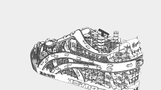
To Product...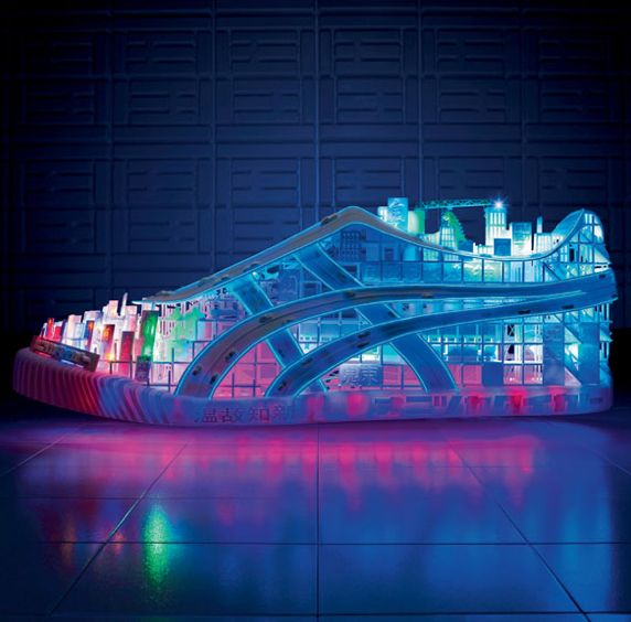
And here is something they are working on at the moment. 3 Dimensional Fabric.
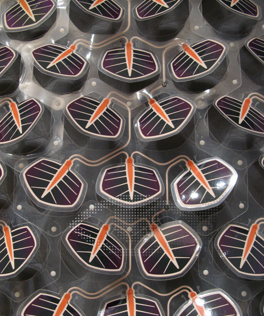
If you are a talented modeler, or a creative designer, I can't help feel your future is bright. -
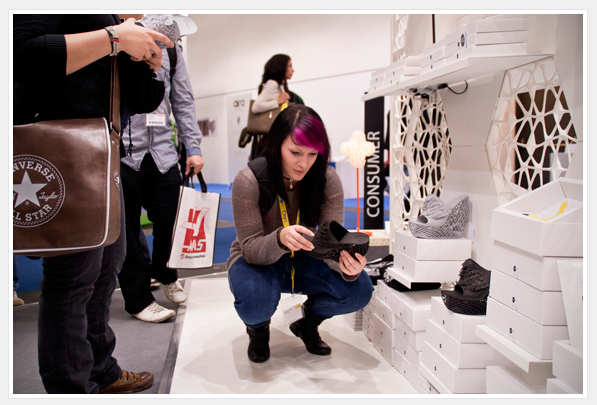
And this is where it leads.

-
More research into Digital Prototyping lead me to the website of Scott Eaton.
I was intrigued by this little guy, his ipod docking station.
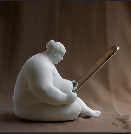
His education which includes a Masters from MIT Media Lab, and also traditional studies at the Florence Academy of Art, have certainly combined to bring about some interesting career choices, including work with Steven Spielberg, and on the Harry Potter films.
What may be of real interest to some on this Forum, are his Tutorials. http://www.scott-eaton.com/tutorials
Much on sculpting (digitally) the human form, mostly in ZBrush.
And should you really wish to up the anti, he is offering an online course in figure sculpture starting in April. http://www.scott-eaton.com/digital-figure-sculpture
-
Hi, dale:
I am still following your excellent thread. Keep up the good work. -
Dear Dale,
Let me prefer the first one



Concerning Alberti, Leo Battista (1404-1472)
This link, especially for collectors:De re ædificatoria libri decem

and these interesting articles about him (in french I'm sorry)
http://architectura.cesr.univ-tours.fr/traite/Images/ENSBA208/B_751062305_20_0001.jpg
Lire Alberti aujourd'hui simon
simonPS: Thank you for the sculpture turorials +++
Hello! It looks like you're interested in this conversation, but you don't have an account yet.
Getting fed up of having to scroll through the same posts each visit? When you register for an account, you'll always come back to exactly where you were before, and choose to be notified of new replies (either via email, or push notification). You'll also be able to save bookmarks and upvote posts to show your appreciation to other community members.
With your input, this post could be even better 💗
Register LoginAdvertisement
