A Thread for Fine Design
-
True, not really fine design. I hope I haven't rained on Dale's parade

-
@unknownuser said:
True, not really fine design. I hope I haven't rained on Dale's parade

Let it pour Rich.
Actually I have built the stair drawers many times. Don't know who originally thought of it, but it is a damn fine use of space. -
Rich, when my daughter was a baby we had springs under the feet of her crib. Great idea indeed.
These are pretty cool:
Anatomical Cross-Sections Made with Quilled Paper by Lisa Nilsson


-
A quote from the always quotable atomic physicist Niels Bohr:
" To think about the paradoxical truths of quantum mechanics is to think in images, because the only way to know anything about the invisible is to create an image of it that is by definition a human construct, a model, a half-truth trying to hint at the real truth."
He also collected cubist paintings by the likes of Picasso... thought provoking.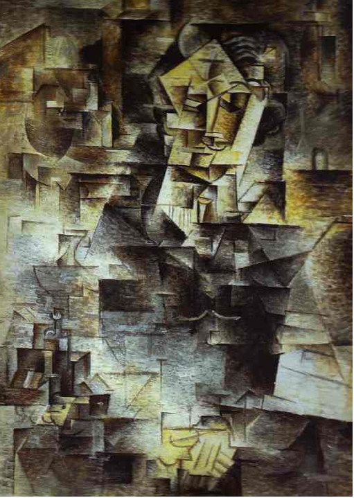
-
Another fine piece from Marcus (d12dozr), who you all know for his contributions to SketchUcation.
Here is a link to the Thread in case you haven't seen it. http://forums.sketchucation.com/viewtopic.php?p=383931#p383931
In my own experience, there is nothing more exciting than seeing something you envision come to life. It's a big undertaking, and I congratulate Marcus on bringing this little gem to life.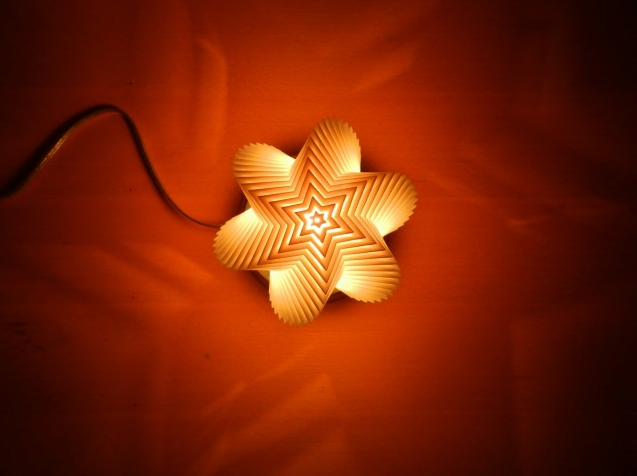
-
-
This guy does some neat work.
His Hawaiian Pineapple Resort

-
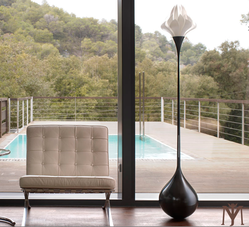
Jordi Mila http://jordimila.com/en/the-collection.html
Mountain Diva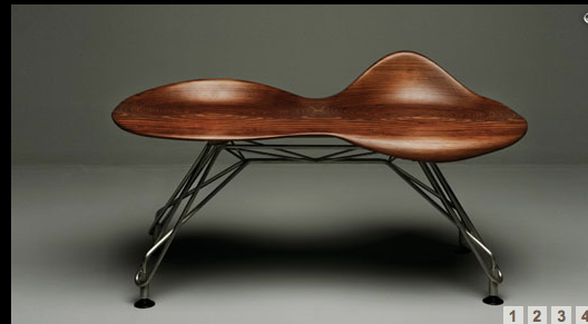
Four Seasons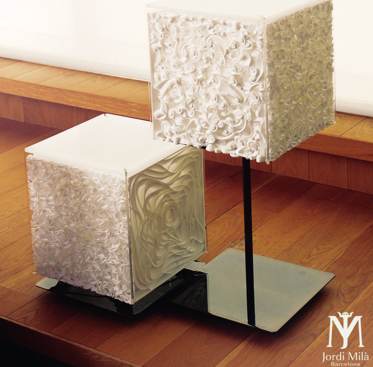
Light Boxing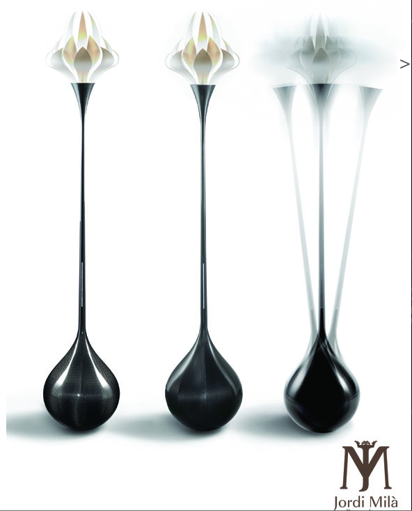
-
-
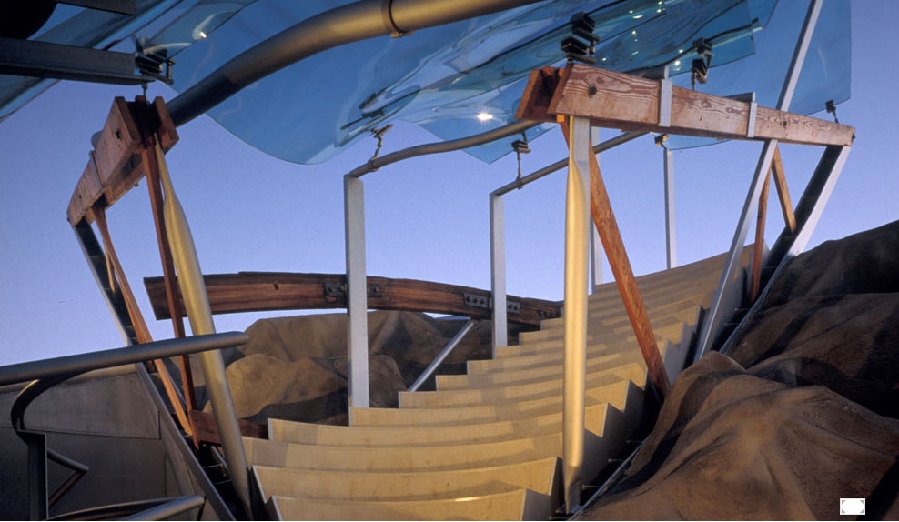
Today's inspiration. Eric Owen Moss http://ericowenmoss.com/
Umbrella is an outdoor performance venue designed for 30 performing musicians, and is part of a re-design of 2 1940's warehouses originally planned to house the Los Angeles Symphony Orchestra.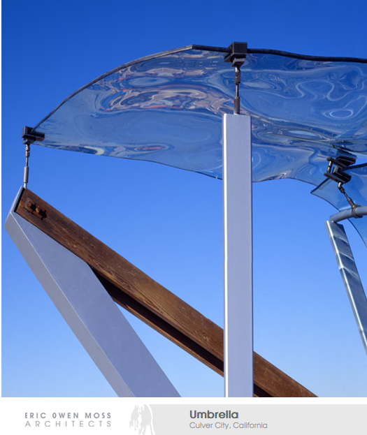


-
-
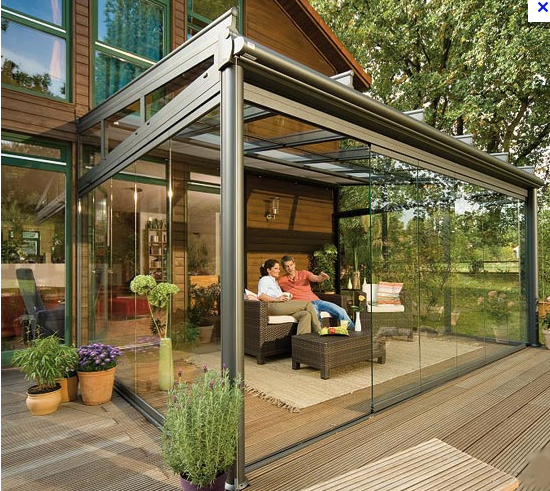
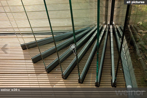
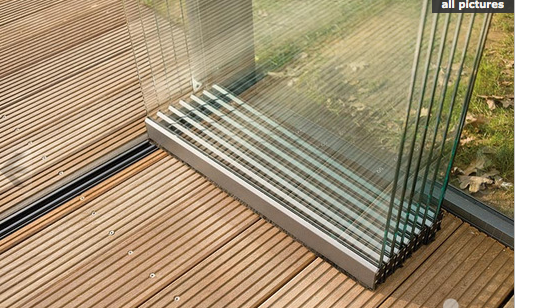
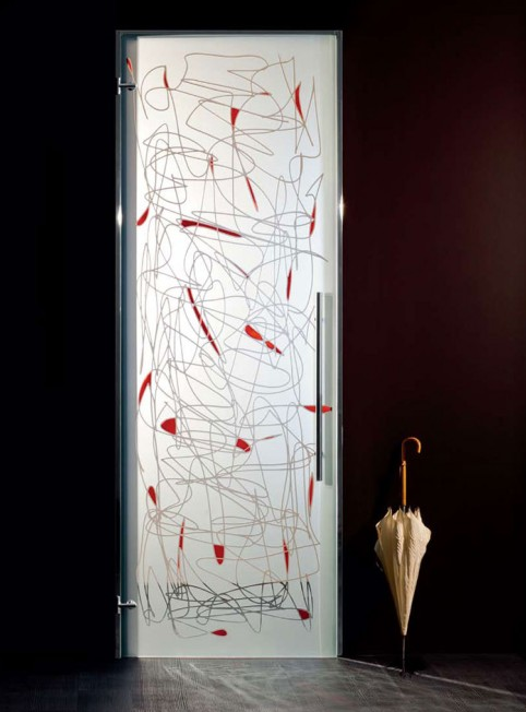
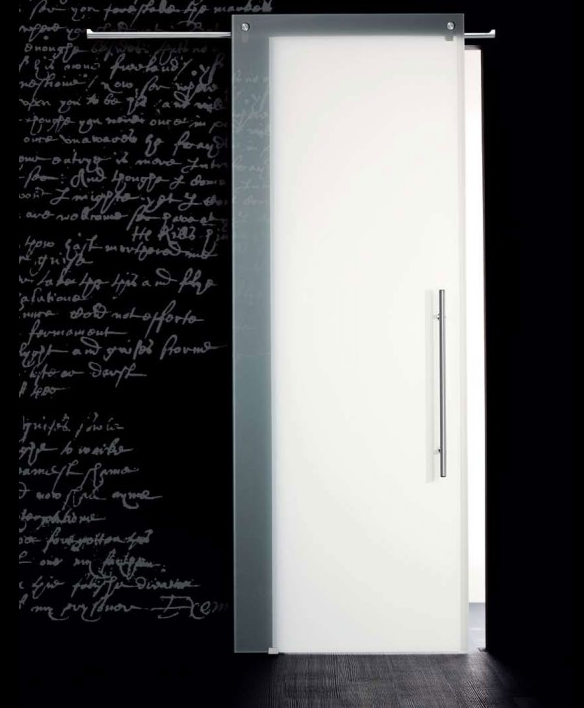
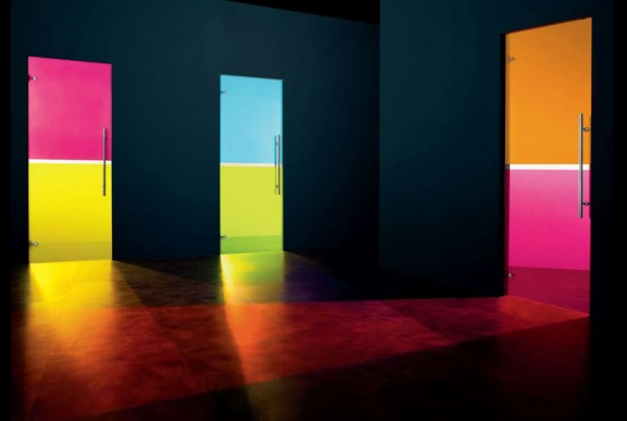
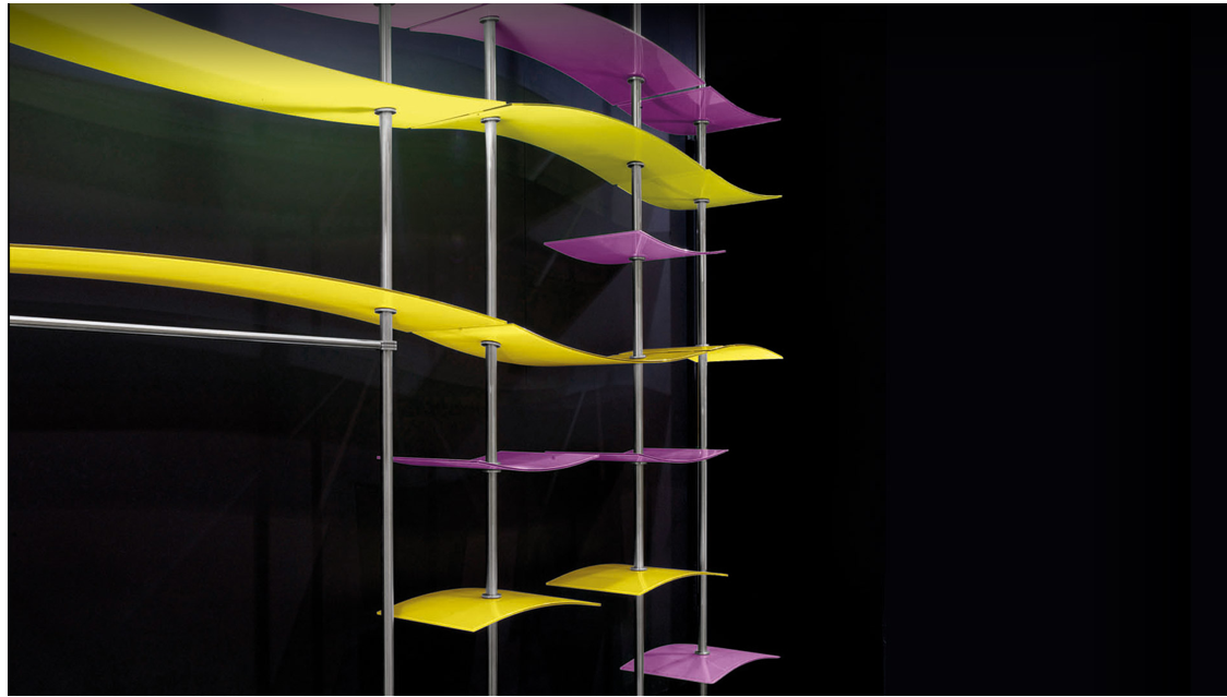
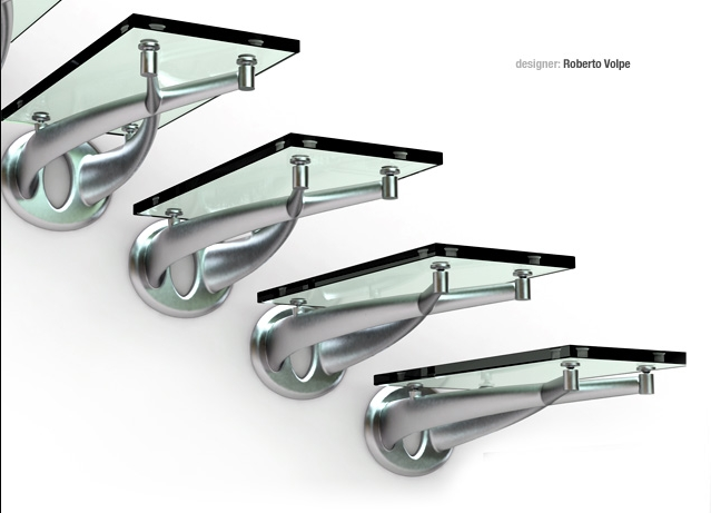
This is in the "Would never get past our building inspector" department
http://www.faraone.it/3a.php[attachment=3:1q9s7dz7]<!-- ia3 -->Screen shot 2012-02-21 at 6.55.39 AM.png[attachment=0]Screen shot 2012-02-21 at 6.55.52 AM.png<!-- ia3 -->[/attachment:1q9s7dz7][/attachment][attachment=2:1q9s7dz7]<!-- ia2 -->Screen shot 2012-02-21 at 6.56.49 AM.png<!-- ia2 -->[/attachment:1q9s7dz7][attachment=1:1q9s7dz7]<!-- ia1 -->Screen shot 2012-02-21 at 6.57.03 AM.png<!-- ia1 -->[/attachment:1q9s7dz7]
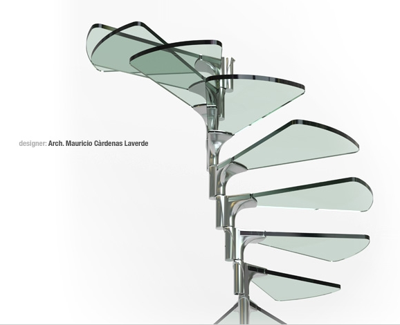
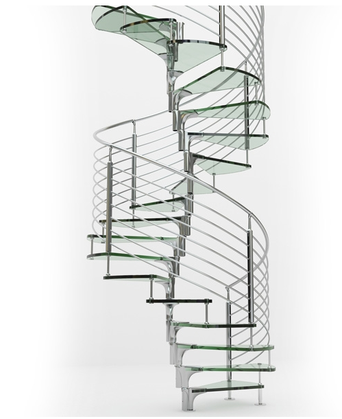
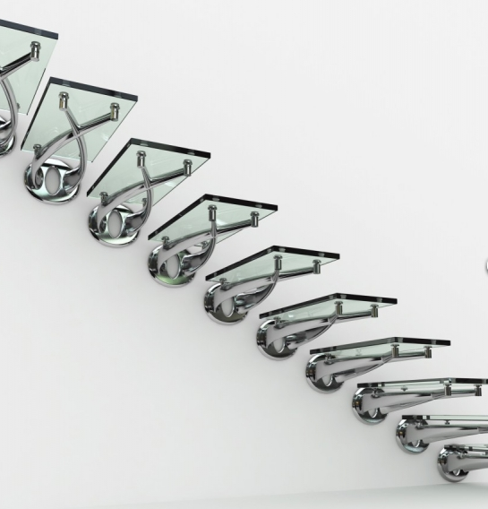
-
the upside of owning a staircase like that. . .it would make you want to stick to your diet. . .

-

[url=http://www.nowness.com/day/2012/2/16:3uj0ryuu]Jacob Sutton’s L.E.D. Surfer[/url:3uj0ryuu]

Libraries over the world

[url:3uj0ryuu]http://knstrct.com/2012/01/10/weekly-roundup-libraries/[/url:3uj0ryuu]

[url=http://knstrct.com/2010/11/27/philippe-stark-le-royal-monceau-hotel/:3uj0ryuu]PHILIPPE STARK: le royal monceau hotel[/url:3uj0ryuu]


[url=http://knstrct.com/2011/04/04/the-confederate-120-fighter/:3uj0ryuu]The Confederate 120 Fighter[/url:3uj0ryuu]

 simon
simon -
Thanks Simon
For those not familiar with Philippe Stark. his work is well worth seeing. A renaissance Man.http://www.starck.com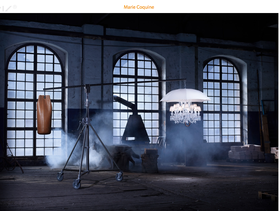
-
Yeah, Philippe is great!

-
Hi Dale and Stefan

I remember many years ago to have visited his house with a tv team . a beautiful house bordered by the river Seine. The entrance walls was absolutely covered with pretty no free space with african masks. Questions about that.. the effect was great: gloomy, a bit stressful, beautiful. And at the same time the personality of each mask was something like denied...
In the main room, a collection of sea scenes earthenware was entirely ringing the room.


This collection of very "kitsch" objects once again was strange.
I'm far to like everything because Starck likes to play around the frontier of "mauvais goût"!!
And at the same time he reach sometime to touch genius.by the way I have discovered the reflective aspect of his work which can lead to a better understanding of his way:
Example: those (seemingly) awful Gun lights:
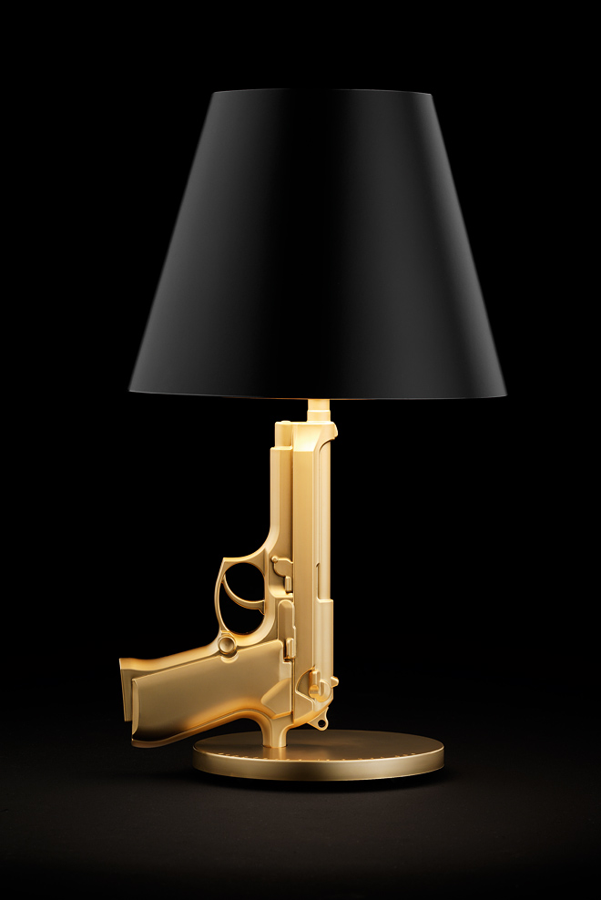

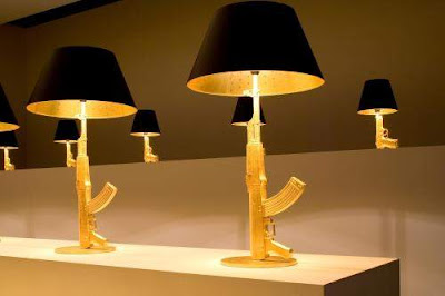
Here is his reflection about Kalashnikov (automated Google translation)
@unknownuser said:
To the Life, To the Death.
Then there have been trials of life, then a
sketch of life, then life.
It was of little value, life and death
confused, somewhat randomly, without
Importance.
But it worked. Much.
We created a civilization for Life
Vive.
Necessarily sublime, becomes sacred, untouchable,
The big, beautiful life, guaranteed for
everyone lived and survived to us, the twenty-first
Century, millennium, coming
of civilization civilized.
Bravo, sleep in peace.
PARATRAS.
It's never as is believed.
Hardly lived a small light cycle,
the shadow returns, fast dense, menacing.
Backspace, death awaits.
Today we kill. Religiously,
Militarily. Civilly. Sometimes
civilly. By ambition.
By greed. For fun. For
Show.
Are banana republics,
Our masters of tyrants.
Created, manufactured, sold, dreamed,
purchased, used, our new
icons are weapons.
Our lives are a carton.
The collection "Gun" is a sign of the times.
It has the symbols we deserve.
Glory to our dictators.
A life and death.
PH. S.
P. S.
Light, functional, low, affordable, stylish, with over 100 million
copies of products difficult, the
Kalashnikov is one of the largest
success of our Industrial Design
generation.
Mr. Kalashnikov receives no
royalties. He does not complain often.
So I will pay a commission to Mr.
Kalashnikov on sales of
representation of his model. The poor.
The rest will be donated to "Doctors Without Borders
International. " I wonder
well why.
Citizens to tears.
Citizens on Patrol.
Explanation:- GOLD weapons represents the ratio between money and war.
- The table represents East Gun.
- Bed Side Gun Europe.
- Gun Lounge West.
- The abajour black represents death.
- The cross inside remind us of our dead.
++simon
-
Another Stark quote:
Because there is different types of design. The one, we can call it the cynical design, that means the design invented by Raymond Loewy in the '50s, who said, what is ugly is a bad sale, la laideur se vend mal, which is terrible. It means the design must be just the weapon for marketing, for producer to make product more sexy, like that, they sell more: it's shit, it's obsolete, it's ridiculous. I call that the cynical design.After, there is the narcissistic design: it's a fantastic designer who designs only for other fantastic designers. After, there is people like me, who try to deserve to exist, and who are so ashamed to make this useless job, who try to do it in another way, and they try, I try, to not make the object for the object but for the result, for the profit for the human being, the person who will use it. If we take the toothbrush -- I don't think about the toothbrush. I think, "What will be the effect of the brush in the mouth?" And to understand what will be the effect of the toothbrush in the mouth, I must imagine: Who owns this mouth? What is the life of the owner of this mouth? In what society [does] this guy live? What civilization creates this society? What animal species creates this civilization? When I arrive -- and I take one minute, I am not so intelligent -- when I arrive at the level of animal species, that becomes real interesting.
-
There's no doubt that Starck is a great designer and his views on design are always memorable and food for thought. Only yesterday I was trying to explain my take on the above quote to a client who was stuck in a 'cynical' mindset - let's just say it didn't go down too well.
Having said that, when it comes to certain Starck designs I sometimes struggle to see how he lives up to his own ideals and it becomes a case of 'do as I say, not as I do'.
-
Thank you Dale,
You make me learn something new with the concept of "Cynical Design". The words bring to consciousness something that basically we suspected isn't it ?.Then we have to re-consider and to think about the concept of "mauvais goût" (a typical french word !)
Making "beautiful" stuff as a "marketing weapon" is what France is specialize in must we admit

++simon
Hello! It looks like you're interested in this conversation, but you don't have an account yet.
Getting fed up of having to scroll through the same posts each visit? When you register for an account, you'll always come back to exactly where you were before, and choose to be notified of new replies (either via email, or push notification). You'll also be able to save bookmarks and upvote posts to show your appreciation to other community members.
With your input, this post could be even better 💗
Register LoginAdvertisement

