Estudio Nómada v6
-
-
-
-
wow artys, very close indeed!!
I would suggest more vartiation in teh timbers (could do this in photoshop quite easily) and add some age. the cobbles especially could benefit from this, also the streaks to the timber facade.....great work though. those cobbles must have been a nightmare!! whats with the blur?
-
I love it!!!
-
wow artys, an interesting exercise! did you use photo match at all, for the modelling?
also about the cobbled road, did you place the stones manually? it looks very tiring, I would have thrown a displacement map on it! wouldnt have looked as good obviously
-
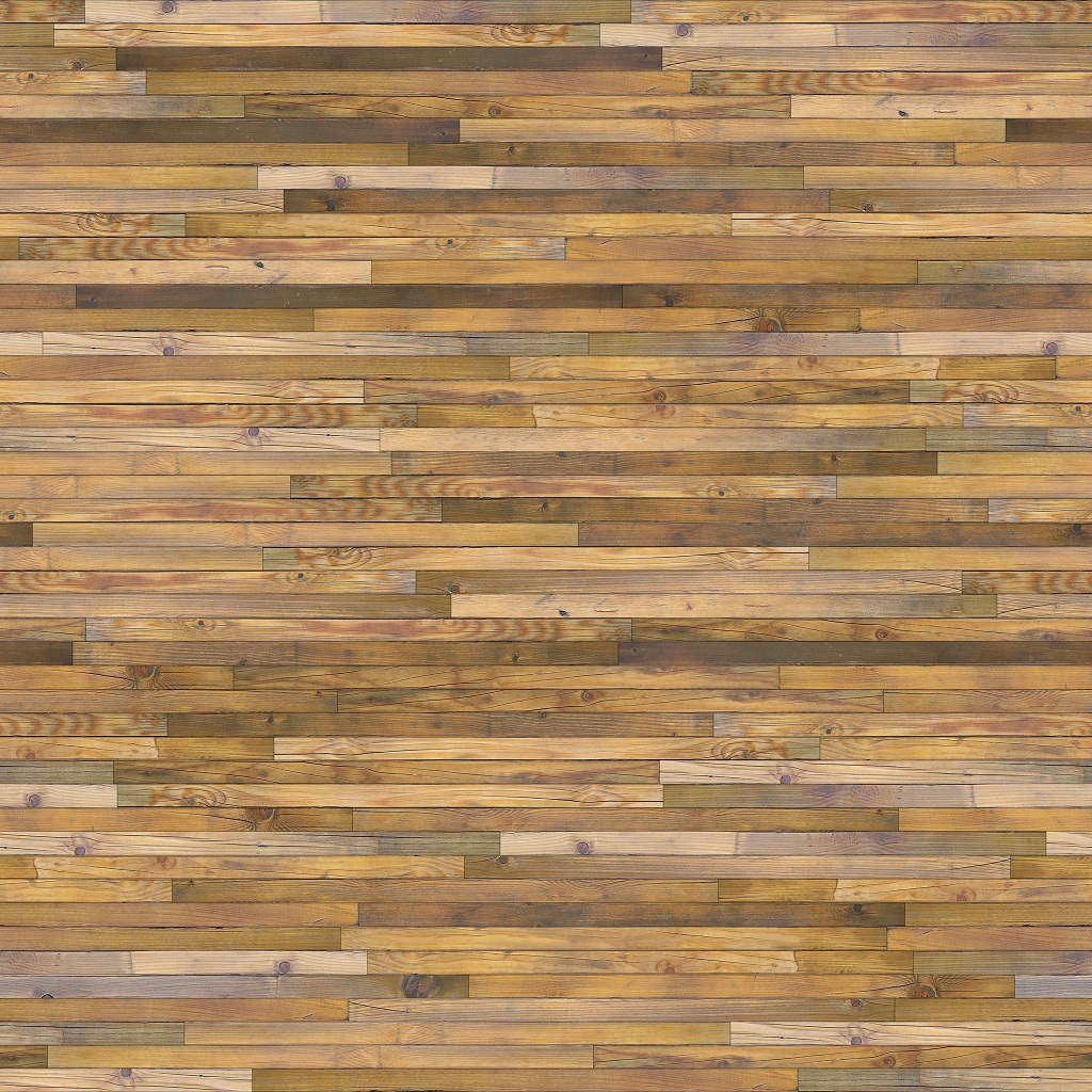
Roberto, would you try with this texture I've made? Perhaps you can change the color and add some straining and a bit of dirt in photoshop. Nice work so far.


-
@olishea said:
wow artys, very close indeed!!
I would suggest more vartiation in teh timbers (could do this in photoshop quite easily) and add some age.
I have used 11 different textures for the timbers. The facade is not a plane. Each wooden plank was modeled independently.
@olishea said:
the cobbles especially could benefit from this
Yeah the cobbles aren't great!

@olishea said:
those cobbles must have been a nightmare!! whats with the blur?
Yeah!
It is a simple gaussian with a mask.@jopsa2 said:
did you use photo match at all, for the modelling?
I have never used photo match, sorry
@jopsa2 said:
did you place the stones manually?
Yes. in the end I was tempted to put a displacement map
@massimo said:
Roberto, would you try with this texture I've made?
Thanks for the txeture, but i think it is too little. All of the wooden planks are larger than you texture but maybe i will make a try later
Thanks to all!
-
Artys,
Nice work indeed. I like how you even went ahead and made it into a magazine cover to match the original.
You did miss a groove in the right side of the structure near the door. One thing that I notice is that your windows are not recessed as much as the original structure. The wall on the far left of the image has a gap too large from the original image. I am not sure if there was supposed to be cables on that side to match the side with the cobblestones but I can not see the cables. A little weathering to the structure would help too. Like olishea said this could easily be done in post with photoshop.
All in all really nice work and a good example that projecting textures on to a box will never come close to good modeling.
Scott
-
@unknownuser said:
You did miss a groove in the right side of the structure near the door. One thing that I notice is that your windows are not recessed as much as the original structure. The wall on the far left of the image has a gap too large from the original image. I am not sure if there was supposed to be cables on that side to match the side with the cobblestones but I can not see the cables. A little weathering to the structure would help too. Like olishea said this could easily be done in post with photoshop.
Thanks for the critiques. I will see if i can find time to fix some errors.

@unknownuser said:
All in all really nice work and a good example that projecting textures on to a box will never come close to good modeling.
I'm not so sure about that, Scott

Hello! It looks like you're interested in this conversation, but you don't have an account yet.
Getting fed up of having to scroll through the same posts each visit? When you register for an account, you'll always come back to exactly where you were before, and choose to be notified of new replies (either via email, or push notification). You'll also be able to save bookmarks and upvote posts to show your appreciation to other community members.
With your input, this post could be even better 💗
Register LoginAdvertisement


